Anthony Hobday Profile picture
Apr 17, 2023 16 tweets 7 min read Read on X
The @stripe sessions website goes hard. It demonstrates the lengths Stripe is willing to go to when it comes to web design. Here are the details that catch my eye.

I'll get the small details out of the way first, before I spend far too long on colour, which is the star here. Image
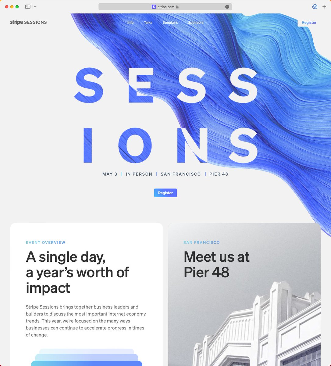
1) The swirly thing that's impossible to miss is animated. The Stripe logo and "Register" button on the right hand side have "hidden" rectangles behind them in case the swirly-thing comes into contact. This helps readability, but doesn't affect the design otherwise. Image
2) The Register button goes from gradient text on a white background to white text on a gradient background when you scroll and the navigation bar becomes solid. Simple, but I love it. ImageImage
3) There's a subtle noise effect used throughout. You can see it in the swirl, some photos, and the "Sessions" text as it disappears. ImageImageImage
4) The "Sessions text" is white when it's over the swirl, and is swirly when it's over white. This echos the button I mentioned before. Image
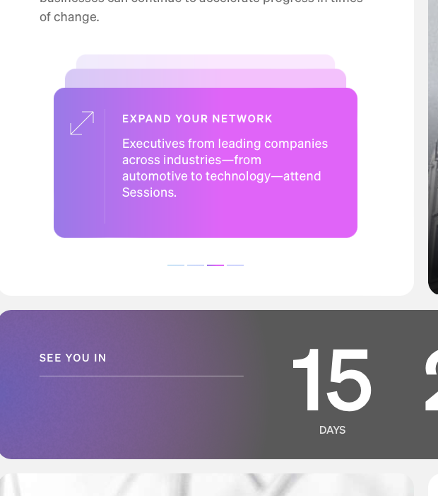
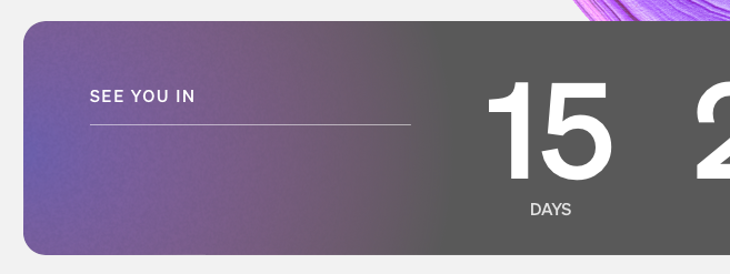
5) This container fill is reducing towards the left as the countdown lowers. Basically no-one will see this change, but they still took the time to code the fill reducing. Image
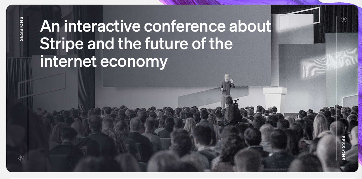
6) The title flexes and disappears in one way as you scroll down, and it flexes in another way as you scroll past the top point of the website. A subtle hint that you've reached the top.
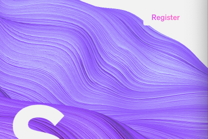
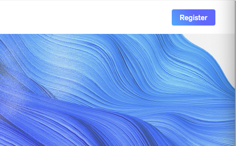
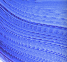
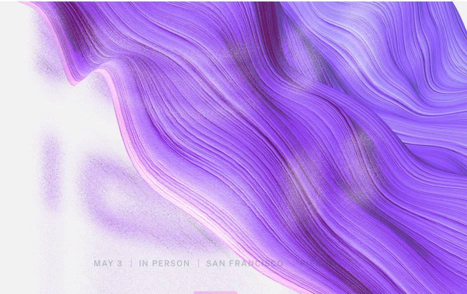
OK, on to colour, which is the start of the show. You might have noticed that the swirl colour shifts over time. But you might not have noticed that this colour is the ONLY colour used throughout the site (with one small exception. See if you can spot it).
7) That means that every colour used on the website, e.g. these stacked containers and the gradient on the left of the countdown container, shift along with the swirl. Image
8) Everything else on this website is black and white, so that the single, shifting colour gradient can be the star of the website. So that it can make everything feel coherent.

I love that they leaned into this idea so much. It's simple, and effective. ImageImageImageImage
9) Notice that these three dividers are each a different colour. They represent the shifting gradient as a group, not individually. Lovely attention to detail. Image
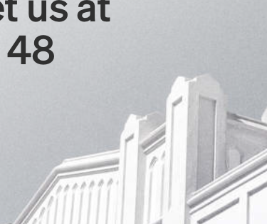
10) Colour is even used to liven up these black and white photographs again. But only the one that's currently fully displayed, so that it's highlighted more than the other photos peaking out from the rest of the series. Image
I don't normally do this, but here's what I think could be improved.

1) The small time/location text doesn't reverse to have better contrast against the swirl. They do this elsewhere, so you'd think they could do it here. And it feels more important with smaller text. Image
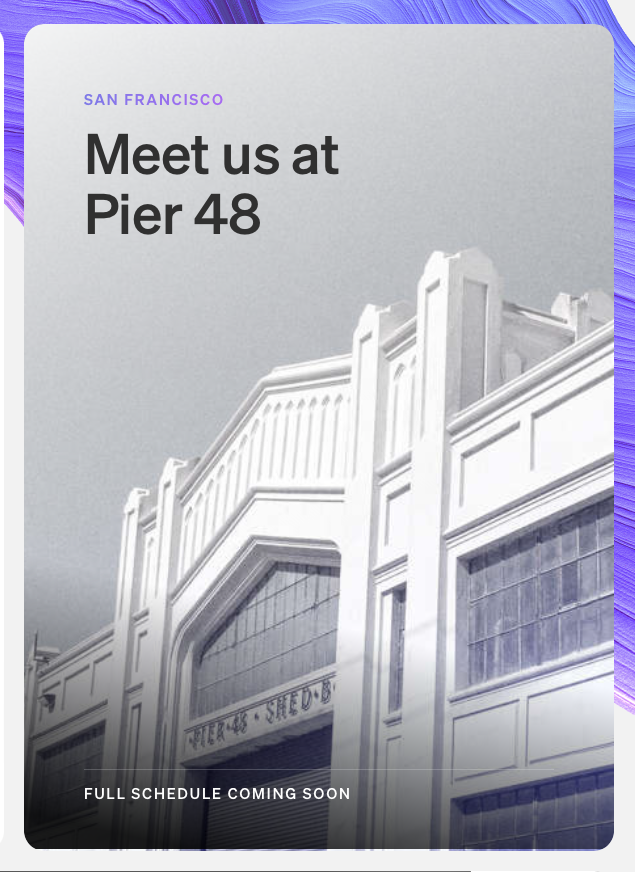
2) This gradient to grey transition doesn't look good. I think any gradient mixed with grey will probably feel dull. Image
3) As far as I can tell the blue in the bottom right of this image is the only colour on the website that doesn't change with the swirl. I assume there's a technical reason they couldn't do it, but they added dynamic colour to the speaker photos below, so it stood out. Image
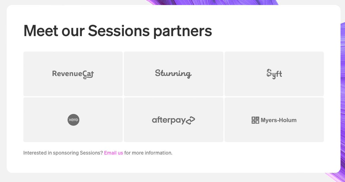
4) Compared to the rest of the website, this sponsor section is oddly uninteresting. A colour stripe is added when you hover over one of the sponsor containers, but it feels like less thought went into this section than the rest of the website. Image

• • •

Missing some Tweet in this thread? You can try to force a refresh
 

Keep Current with Anthony Hobday

Anthony Hobday Profile picture

Stay in touch and get notified when new unrolls are available from this author!

Read all threads

This Thread may be Removed Anytime!

PDF

Twitter may remove this content at anytime! Save it as PDF for later use!

Try unrolling a thread yourself!

how to unroll video
  1. Follow @ThreadReaderApp to mention us!

  2. From a Twitter thread mention us with a keyword "unroll"
@threadreaderapp unroll

Practice here first or read more on our help page!

More from @hobdaydesign

Jan 19, 2024
These days it feels like the word "skeuomorphic" is used to cover all of these things:
1) Visually rich vs. visually simple
2) Depth effects vs. flat
3) Mimics physical materials vs. doesn't
4) Mimics physical appearances like light effects
It feels like "skeuomorphism" is too vague. By the original definition I don't think e.g. a button that looks like it's made of wood is skeuomorphic.
I say that because I don't think anyone's familiar with buttons made of wood, pre-software (ignoring wood veneer on plastic).
To put that another way, when I see an image of a button that looks like it's made of wood, it doesn't remind me of some physical device I once knew. It reminds me of iOS 6, when designers took things a bit too far in applying textures to interfaces.
Read 4 tweets
Sep 28, 2023
Here are 12 of my favourite light websites, in alphabetical order.
1) @attio's website is full of fine detail and interesting touches. They use colour only when they have to. Nowhere to hide, and they pulled it off. Image
2) @calcom picked a bold visual style, with even less colour than Attio, and leant into it fully. A balance of "bold" and "fun" that must have been hard to strike. Image
3) @heyequals' mix of retro styles, big blocks of colour, and excellent use of a spreadsheet grid motif shows that every detail was considered. Image
Read 12 tweets
Jun 23, 2023
I've seen career advice from a lot of respected designers over the years. It might help if I summarise it here:

If you don't learn business, product management, research, facilitation, high fidelity wireframing, advanced sketching, advanced Figma features, graphic design, ...
... how to sell your work to your colleagues, visual design, design systems, animation, 3D modelling, Origami prototyping, HTML/CSS, coding, no-code tools, and public speaking, you're falling behind as a designer.
Interestingly I think you can look at what people DON'T say you should learn to figure out the skills that are actually needed to be a designer.

As far as I can tell the two skills that are never mentioned are ideation and interaction design.
Read 6 tweets
Jun 21, 2023
When I see a video like this, I'm struck by the fact that a good film director finds it easy to talk about the mechanics, the inspiration, the decisions behind every frame of the entire film. They're can explain it all.

I see that so rarely in interface design.
And I know that interface design is usually not art in the same way that a film is. But I'd argue there are still hundreds if not thousands of decisions in every interface that can be explained, and that aren't obvious to a casual observer.
So the market for "explain every centimetre of this interface, please" is probably not as large. But it is just as possible.

I pull this video out whenever I can, but it's a good example of what I mean (from @trafnar).

Read 4 tweets
Jun 21, 2023
It feels like there's a broad split when it comes to interface design decisions?

"Here's the purpose of the design, what styles can I use to suit that purpose?"

"I want to use this specific element, so what styles will support that and suit the purpose?"
It's easy to assume that the second approach is less good because you're starting with the solution, not with the purpose.

But I think for any given purpose, there's probably many solutions that work well. So maybe it's just as valid?
e.g. "I want to use this interesting typeface for the headline, and I want it to be massive. What overall style will work with these needs?"

This is basically an example of setting constraints to make design work easier.
Read 6 tweets
Jun 21, 2023
I found the @rekkiapp website. I like it.

It triggered a memory and I realised this was the company that made some waves in the design community with an earlier version of their website.

So let's talk about that, and make some possibly-wrong assumptions on the way.
The new website is full of colourful photography that relates strongly to the purpose of the app: restaurants use it to order food. Lots of text as well to explain that concept.

I went through the Wayback Machine to see earlier versions of their website.
The first is 2019. The second is 2020. The third is 2021.

The first did little to communicate the purpose of the app. The second did more, but kept the overall style. The third added colour photos of products/distributors, which helps you understand much quicker.


Read 8 tweets

Did Thread Reader help you today?

Support us! We are indie developers!


This site is made by just two indie developers on a laptop doing marketing, support and development! Read more about the story.

Become a Premium Member ($3/month or $30/year) and get exclusive features!

Become Premium

Don't want to be a Premium member but still want to support us?

Make a small donation by buying us coffee ($5) or help with server cost ($10)

Donate via Paypal

Or Donate anonymously using crypto!

Ethereum

0xfe58350B80634f60Fa6Dc149a72b4DFbc17D341E copy

Bitcoin

3ATGMxNzCUFzxpMCHL5sWSt4DVtS8UqXpi copy

Thank you for your support!

Follow Us!

:(