
I think about interface design all day. Visit my website for paid design advice, side projects, blog posts, and my books.
 2) @calcom picked a bold visual style, with even less colour than Attio, and leant into it fully. A balance of "bold" and "fun" that must have been hard to strike.
 The new website is full of colourful photography that relates strongly to the purpose of the app: restaurants use it to order food. Lots of text as well to explain that concept.
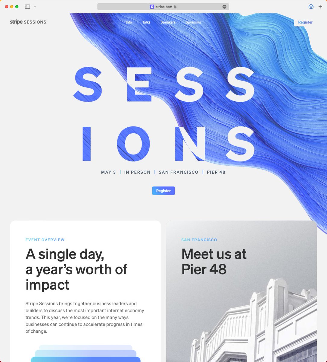 1) The swirly thing that's impossible to miss is animated. The Stripe logo and "Register" button on the right hand side have "hidden" rectangles behind them in case the swirly-thing comes into contact. This helps readability, but doesn't affect the design otherwise.
 2) You might have noticed in the previous tweet that the product screenshot is angled towards the top of the screen in the first view, then as you scroll down it straightens out. The angled screenshot acts as almost a literal visual "ramp" to the next section of the website.
 Now let's switch from the divider to a background colour fill for the menu section. There's a noticeable benefit in that you've added depth: the main section feels closer because it's lighter, and therefore more important.
 To show you how much darker it is, I've overlaid it with a white layer set to 50% opacity and a background blur value of 20.
 2) Part dividers, which stretch from edge to edge but have gaps at either end.
 But as you scroll down to the bottom the bottom-right button fades out to make way for this giant "Join beta" action.


 2. A tweak on that approach is to match the imagery on the right to the shape of the text on the left.


