 Read on Twitter
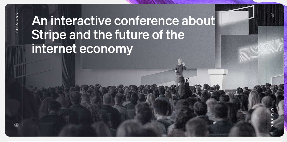
The @stripe sessions website goes hard. It demonstrates the lengths Stripe is willing to go to when it comes to web design. Here are the details that catch my eye.
I'll get the small details out of the way first, before I spend far too long on colour, which is the star here.
I'll get the small details out of the way first, before I spend far too long on colour, which is the star here.
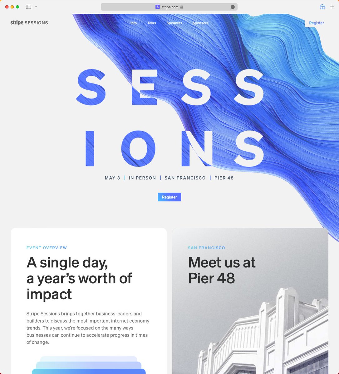
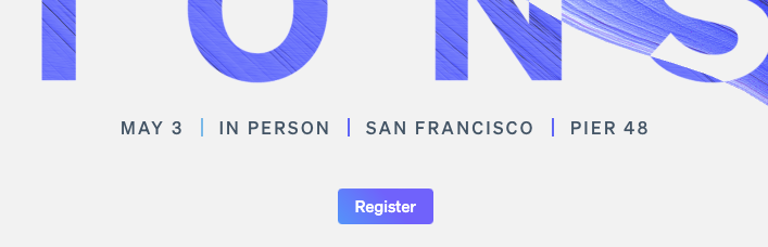
1) The swirly thing that's impossible to miss is animated. The Stripe logo and "Register" button on the right hand side have "hidden" rectangles behind them in case the swirly-thing comes into contact. This helps readability, but doesn't affect the design otherwise.

2) The Register button goes from gradient text on a white background to white text on a gradient background when you scroll and the navigation bar becomes solid. Simple, but I love it.
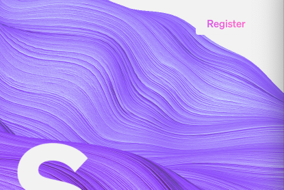
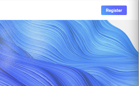
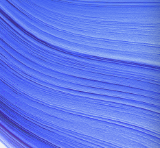
3) There's a subtle noise effect used throughout. You can see it in the swirl, some photos, and the "Sessions" text as it disappears.
4) The "Sessions text" is white when it's over the swirl, and is swirly when it's over white. This echos the button I mentioned before.

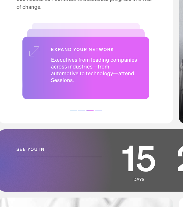
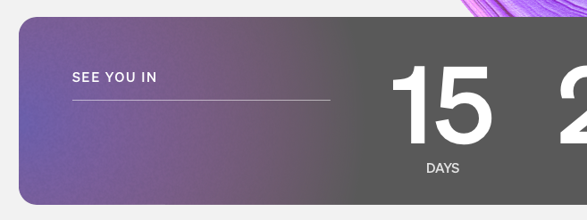
5) This container fill is reducing towards the left as the countdown lowers. Basically no-one will see this change, but they still took the time to code the fill reducing.

6) The title flexes and disappears in one way as you scroll down, and it flexes in another way as you scroll past the top point of the website. A subtle hint that you've reached the top.
OK, on to colour, which is the start of the show. You might have noticed that the swirl colour shifts over time. But you might not have noticed that this colour is the ONLY colour used throughout the site (with one small exception. See if you can spot it).
7) That means that every colour used on the website, e.g. these stacked containers and the gradient on the left of the countdown container, shift along with the swirl.
8) Everything else on this website is black and white, so that the single, shifting colour gradient can be the star of the website. So that it can make everything feel coherent.
I love that they leaned into this idea so much. It's simple, and effective.
I love that they leaned into this idea so much. It's simple, and effective.


9) Notice that these three dividers are each a different colour. They represent the shifting gradient as a group, not individually. Lovely attention to detail.
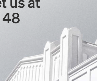
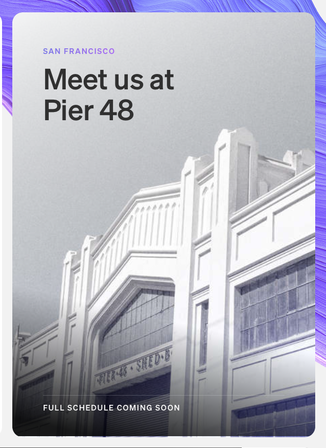
10) Colour is even used to liven up these black and white photographs again. But only the one that's currently fully displayed, so that it's highlighted more than the other photos peaking out from the rest of the series.

I don't normally do this, but here's what I think could be improved.
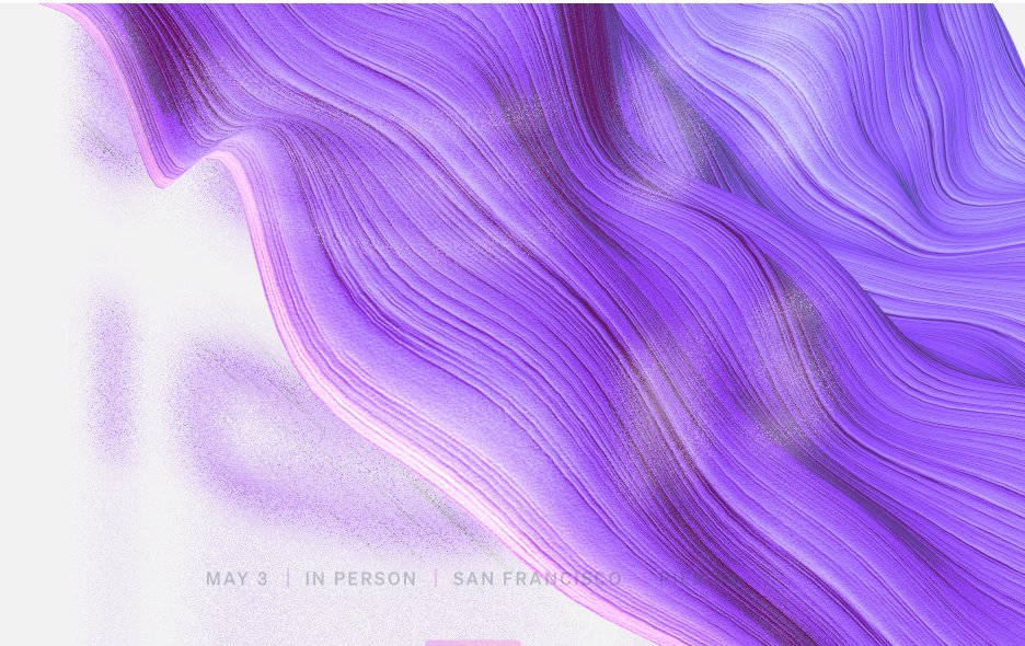
1) The small time/location text doesn't reverse to have better contrast against the swirl. They do this elsewhere, so you'd think they could do it here. And it feels more important with smaller text.
1) The small time/location text doesn't reverse to have better contrast against the swirl. They do this elsewhere, so you'd think they could do it here. And it feels more important with smaller text.

2) This gradient to grey transition doesn't look good. I think any gradient mixed with grey will probably feel dull.
3) As far as I can tell the blue in the bottom right of this image is the only colour on the website that doesn't change with the swirl. I assume there's a technical reason they couldn't do it, but they added dynamic colour to the speaker photos below, so it stood out.

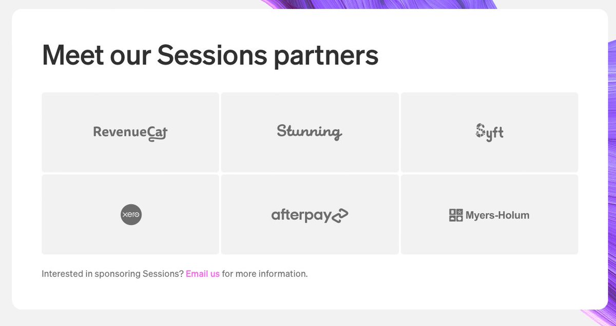
4) Compared to the rest of the website, this sponsor section is oddly uninteresting. A colour stripe is added when you hover over one of the sponsor containers, but it feels like less thought went into this section than the rest of the website.
• • •
Missing some Tweet in this thread? You can try to
force a refresh