🧪 House of Prompts Vol. 1
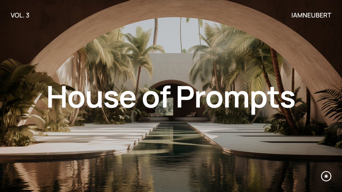
Last week I had the idea to gather some creators from our community and to create a building filled with diversity and different creative spirits.
Explore the different rooms in the thread below!👇🏼
#midjourney #AIphotography #architecture twitter.com/i/web/status/1…
Last week I had the idea to gather some creators from our community and to create a building filled with diversity and different creative spirits.
Explore the different rooms in the thread below!👇🏼
#midjourney #AIphotography #architecture twitter.com/i/web/status/1…

✨ Entry + Kitchen
We enter the family room designed by @JoaoSan89 Natural light fills the room to create a space where everyone likes to hang out! Right next to the room, the kitchen expands into a glass-roofed wing.

We enter the family room designed by @JoaoSan89 Natural light fills the room to create a space where everyone likes to hang out! Right next to the room, the kitchen expands into a glass-roofed wing.


✨ Office
Next is the office designed by @TheAI_Architect. The panoramic glass front is sure to inspire everyone to achieve great things!


Next is the office designed by @TheAI_Architect. The panoramic glass front is sure to inspire everyone to achieve great things!


✨ Children's Room
Also, the little ones need a place of inspiration. We enter the children's room by @hanne_van_briel. It’s the perfect place to start a new adventure!


Also, the little ones need a place of inspiration. We enter the children's room by @hanne_van_briel. It’s the perfect place to start a new adventure!


✨ Master Suite
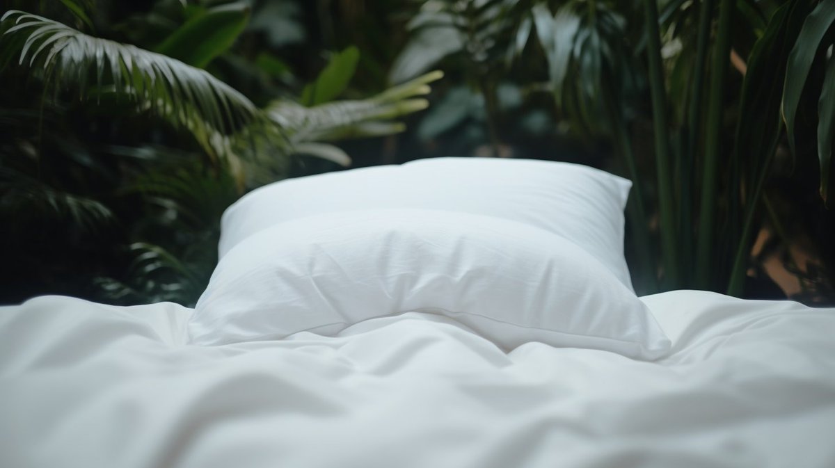
When things get exhausting, we enter the master suite crafted by @ciguleva. The space’s blend with nature will guarantee everyone finds their inner zen.


When things get exhausting, we enter the master suite crafted by @ciguleva. The space’s blend with nature will guarantee everyone finds their inner zen.


✨ Bathroom
Next up is the meticulously designed bathroom by @gen_ericai. Surrounded by beauty, it’s a place where everyone enjoys starting or ending their day.

Next up is the meticulously designed bathroom by @gen_ericai. Surrounded by beauty, it’s a place where everyone enjoys starting or ending their day.


✨ Living Room
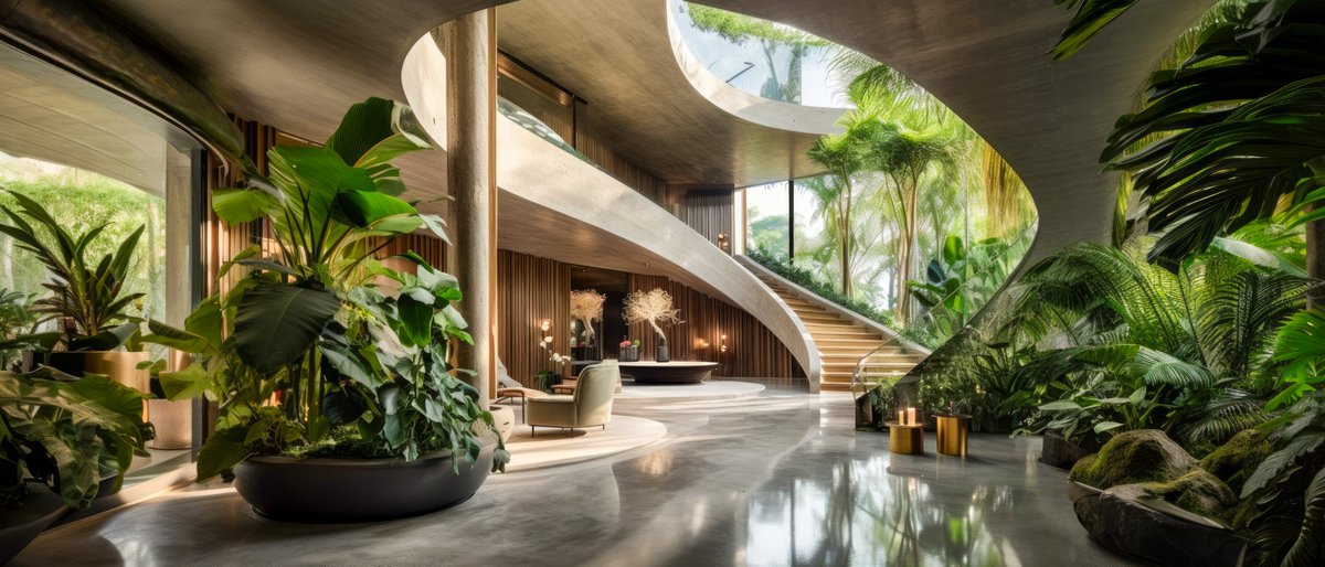
Back into the main quarters, we peek into the lounge designed by @WorldEverett. Luxury and organic materials fuse to create a space suitable for the finest events.

Back into the main quarters, we peek into the lounge designed by @WorldEverett. Luxury and organic materials fuse to create a space suitable for the finest events.


✨ Basement
Below the house lives a place of meditation and tranquillity. The space designed by @archi_reum is carved right out of the house's stone foundation.


Below the house lives a place of meditation and tranquillity. The space designed by @archi_reum is carved right out of the house's stone foundation.


✨ Mystery
Every house holds its own secret. @WorldEverett tells stories of a hidden passage in the basement leading towards a world of wonders.

Every house holds its own secret. @WorldEverett tells stories of a hidden passage in the basement leading towards a world of wonders.


Thank you to the following creators: @gen_ericai @ciguleva @WorldEverett @hanne_van_briel @JoaoSan89 @TheAI_Architect @archi_reum
Follow them, as they might share more info on their rooms! I look forward to doing more community-driven events in the future.
❤️🙏🏼
Follow them, as they might share more info on their rooms! I look forward to doing more community-driven events in the future.
❤️🙏🏼
• • •
Missing some Tweet in this thread? You can try to
force a refresh


![Cinematic Closeup, Astronaut heading to launchpad, [Photography of Mass + Scale], Futuristic LED, vast loneliness, muted tones --style raw --ar 16:9](https://pbs.twimg.com/media/F4E4vHmaAAI4yDc.jpg)


