🧪 House of Prompts Vol. 2
It's that time again! The next edition of #HouseOfPrompts arrives, taking us to a villa high up in the mountains!
Explore the different rooms in the thread below!
#Prompt 👉🏼 ALT
#midjourney #AIphotography #architecture twitter.com/i/web/status/1…
It's that time again! The next edition of #HouseOfPrompts arrives, taking us to a villa high up in the mountains!
Explore the different rooms in the thread below!
#Prompt 👉🏼 ALT
#midjourney #AIphotography #architecture twitter.com/i/web/status/1…

✨ENTRY HALL
We start in the majestic entry hall by @storybyphil setting the scene of this remarkable space.


We start in the majestic entry hall by @storybyphil setting the scene of this remarkable space.


✨ LOUNGE
From the entry hall, we continue in the luxurious lounge designed by @WorldEverett. Truly the perfect place to welcome your guests!


From the entry hall, we continue in the luxurious lounge designed by @WorldEverett. Truly the perfect place to welcome your guests!
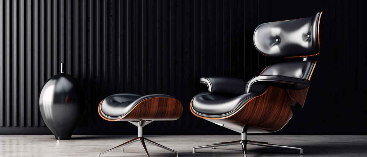
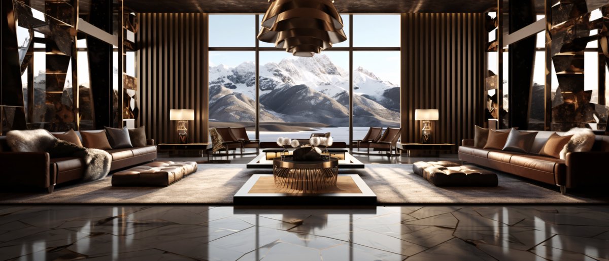


✨ FAMILY ROOM
Next up is the family room crafted by @LinusEkenstam. The heart of the house combines cosiness with inspiring views for the whole family!


Next up is the family room crafted by @LinusEkenstam. The heart of the house combines cosiness with inspiring views for the whole family!


✨ KITCHEN
From the family room, we enter the open kitchen by @JoaoSan89. We are curious to know if it makes your food tastier. However, you will definitely have more fun preparing it!


From the family room, we enter the open kitchen by @JoaoSan89. We are curious to know if it makes your food tastier. However, you will definitely have more fun preparing it!


✨ OFFICE
Next, we enter the office, which is fabulously staged by @TheAI_Architect! It's the perfect space to get work done and start new endeavours!


Next, we enter the office, which is fabulously staged by @TheAI_Architect! It's the perfect space to get work done and start new endeavours!


✨ CHILDREN'S ROOM
The little ones also need a space of inspiration! Enter the children's room designed by @hanne_van_briel!


The little ones also need a space of inspiration! Enter the children's room designed by @hanne_van_briel!
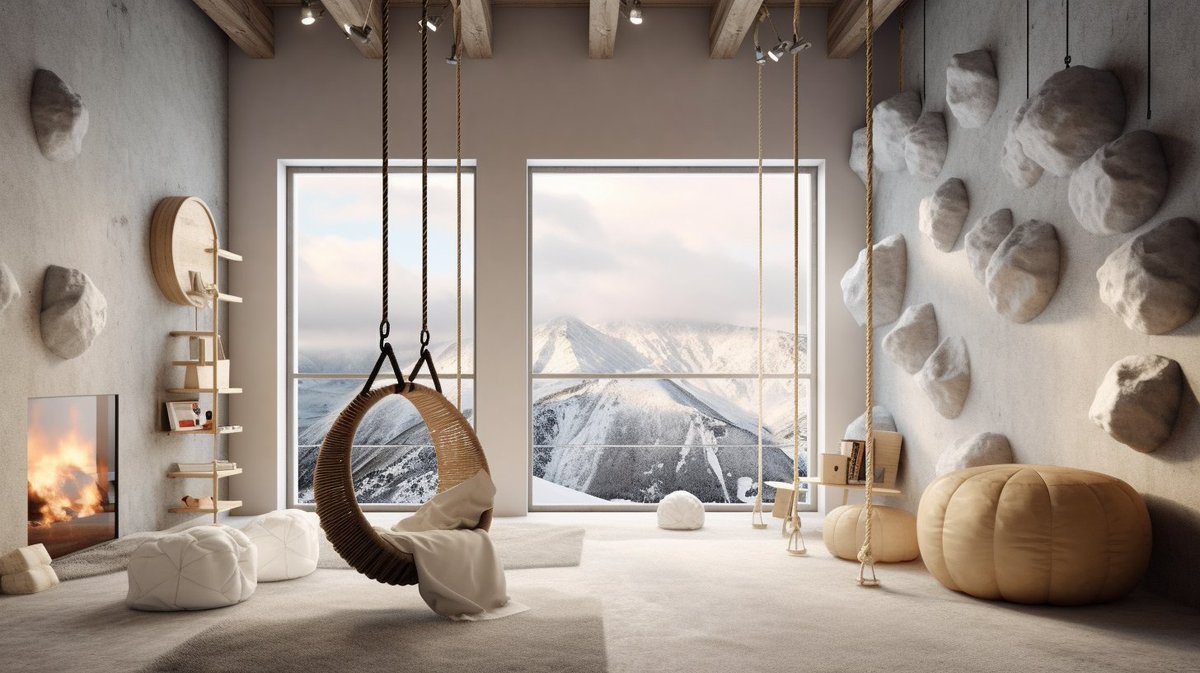


✨ MASTER SUITE
For the owners of this house, @ciguleva has prepared a stunning primary suite. It's the perfect room to wind down after a long day!


For the owners of this house, @ciguleva has prepared a stunning primary suite. It's the perfect room to wind down after a long day!


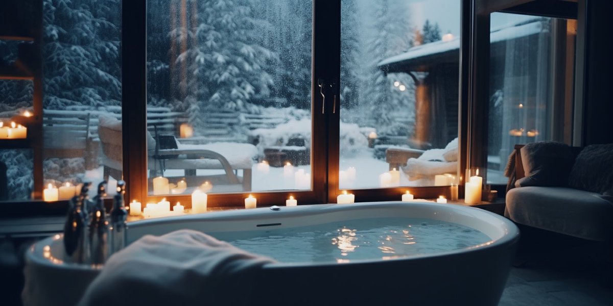
✨ BATHROOM
@gen_ericai has crafted the perfect space to start and end the day. Enjoy the icy outside while enjoying a hot bath!


@gen_ericai has crafted the perfect space to start and end the day. Enjoy the icy outside while enjoying a hot bath!


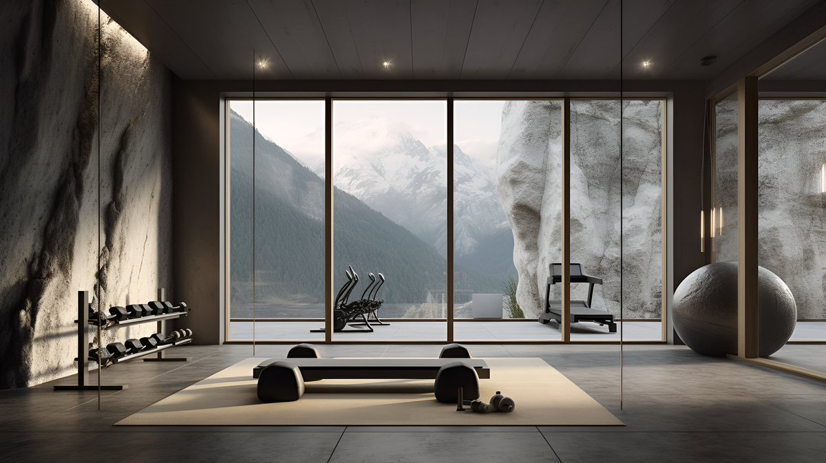
✨ GYM & WELLNESS
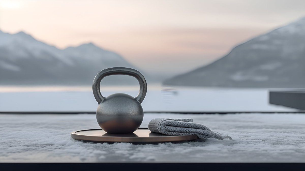
This space takes you every reason to skip that daily workout. @archi_reum has made sure to make a space which invites you to stay healthy!


This space takes you every reason to skip that daily workout. @archi_reum has made sure to make a space which invites you to stay healthy!


✨ PRIVATE POOLS
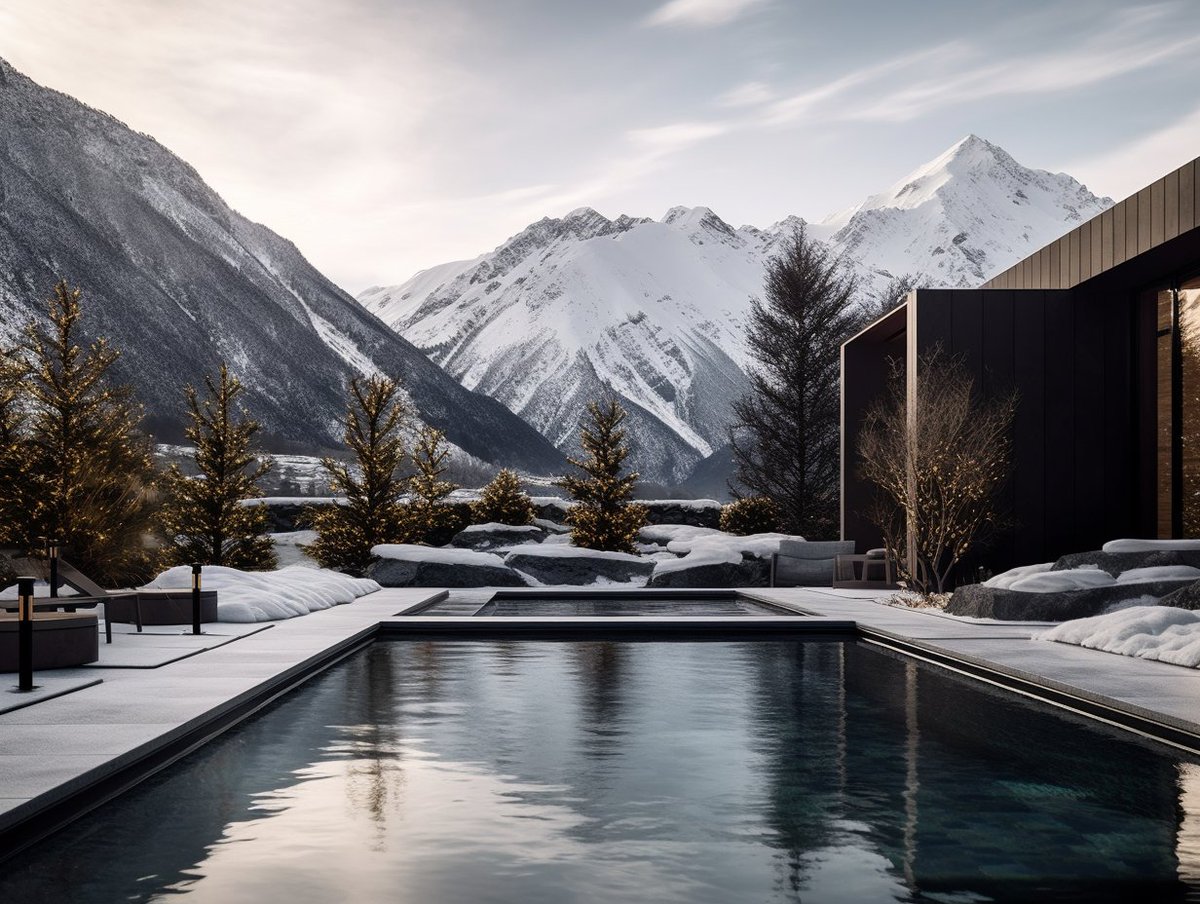
Last but certainly not least, @followmarcos has crafted an in- and outdoor pool landscape to die for!


Last but certainly not least, @followmarcos has crafted an in- and outdoor pool landscape to die for!


And that wraps it up!
A huge thank you to the incredibly talented creators above! You have raised the bar and pushed the limits creating a result that I am genuinely proud of!
Please go follow these incredible people!!
Thank you so much! ❤️
A huge thank you to the incredibly talented creators above! You have raised the bar and pushed the limits creating a result that I am genuinely proud of!
Please go follow these incredible people!!
Thank you so much! ❤️
We invite all architecture lovers to experience this collaborative project!!
@ArchDaily @dwell @dezeen @Framepublishers @designboom @elonmusk @icreatelife @HBCoop_ @DanielLibeskind @ZHA_News @NormanFosterFdn @BjarkeIngels @abduzeedo
@ArchDaily @dwell @dezeen @Framepublishers @designboom @elonmusk @icreatelife @HBCoop_ @DanielLibeskind @ZHA_News @NormanFosterFdn @BjarkeIngels @abduzeedo
• • •
Missing some Tweet in this thread? You can try to
force a refresh


![Cinematic Closeup, Astronaut heading to launchpad, [Photography of Mass + Scale], Futuristic LED, vast loneliness, muted tones --style raw --ar 16:9](https://pbs.twimg.com/media/F4E4vHmaAAI4yDc.jpg)


