10 years ago Apple killed Skeuomorphism with the release of iOS 7.
Let's explore the trend that helped shape modern computing before becoming an obscure joke.
🧵
Let's explore the trend that helped shape modern computing before becoming an obscure joke.
🧵
The first iPhone launched in 2007.
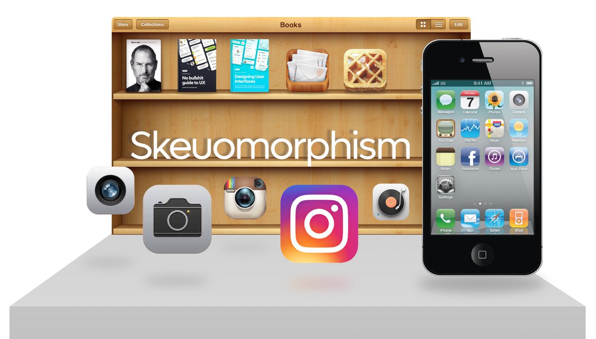
To make it easier for people to understand a completely new type of interface and interaction skeuomorphic design was used.
It mimics real-world objects, so the interface feels familiar.
Books are on a wooden shelf, notes on paper.
To make it easier for people to understand a completely new type of interface and interaction skeuomorphic design was used.
It mimics real-world objects, so the interface feels familiar.
Books are on a wooden shelf, notes on paper.

That led to some truly beautiful uses of depth and pixel-perfect interfaces like this:

But sometimes also went really over the top like this photo app for the iPhone.

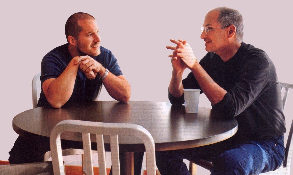
Steve Jobs was a big fan of Skeuomorphism, seeing how an interface has to be truly crafted down to the smallest detail.
Jony Ive, inspired heavily be Dieter Rams preferred minimalism.
Jony Ive, inspired heavily be Dieter Rams preferred minimalism.
iOS 7 was announced on June 10th 2013 and introduced a super minimal, bold new look and style.
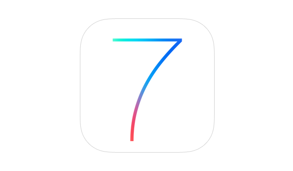
The difference was striking.
Gone was realism, replaced by ultra-minimal styling.
Notice how colors were extremely vibrant in that first iteration of flat design.
Gone was realism, replaced by ultra-minimal styling.
Notice how colors were extremely vibrant in that first iteration of flat design.

Realistic buttons and navbars were replaced by text-links and flat surfaces.
Realistic icons - by thin outlines.
Fonts were also made dramatically thinner, because the retina displays allowed for sharper text on mobile devices.
Realistic icons - by thin outlines.
Fonts were also made dramatically thinner, because the retina displays allowed for sharper text on mobile devices.

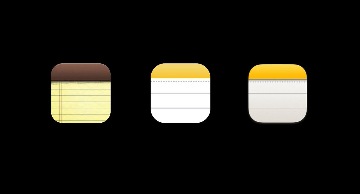
Since then Apple has reverted some of the changes bringing back a little more depth and thicker, more readable fonts.
Check how the notes icon regained some shadows and gradients after ios 7 in the middle.
Check how the notes icon regained some shadows and gradients after ios 7 in the middle.
That shift was a VERY important milestone for UI design - but that part I'll cover separately.
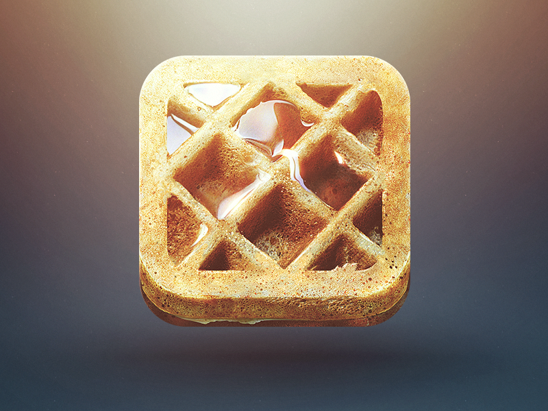
One thing that definitely got lost somewhere in the process was delight and uniqueness.
Just look at these app icons:
One thing that definitely got lost somewhere in the process was delight and uniqueness.
Just look at these app icons:

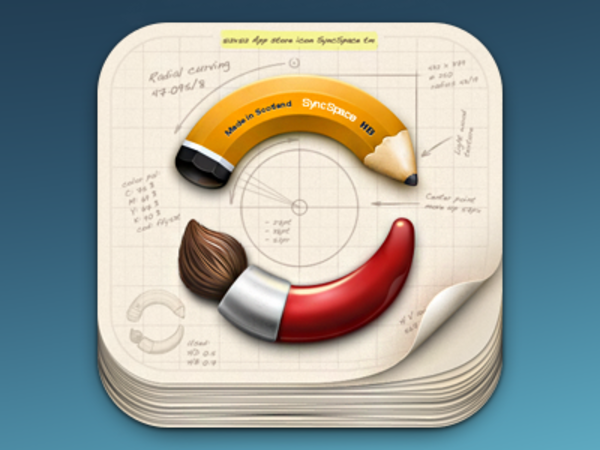
Sure - this one doesn't make sense - but the sheer level of detail here is mindblowing.
An email app icon - doesn't that look a lot more inviting than a flat envelope on a blue background?

Or this one? Beautiful!
If that transition to flat design didn't happen, we'd be in a much, much different world.
I'll tell you more about it soon, but you can watch my video on Skeuomorphism genesis here:
I'll tell you more about it soon, but you can watch my video on Skeuomorphism genesis here:
And if you liked that trip down memory lane, share the thread :)
And follow me @michalmalewicz for more :)
And follow me @michalmalewicz for more :)
• • •
Missing some Tweet in this thread? You can try to
force a refresh