Michal Malewicz Profile picture
Designer. Biohacker. Longevity + productivity apps Created Glassmorphism. Sold $1.5M of digital products. Sharing how. 43 y.o. RHR 40 • HRV 100-280 • VO2Max 55
Mar 19, 2024 10 tweets 3 min read
Master Hierarchy in Forms with my unique method.

Breaking it down in a thread 🧵👇 ui design login form Don't start with fonts, colors etc.

Start with groups. Image
Feb 16, 2024 11 tweets 4 min read
We designed over 150 landing pages and for almost all of them we used this same layout formula.
Here it is: Image 
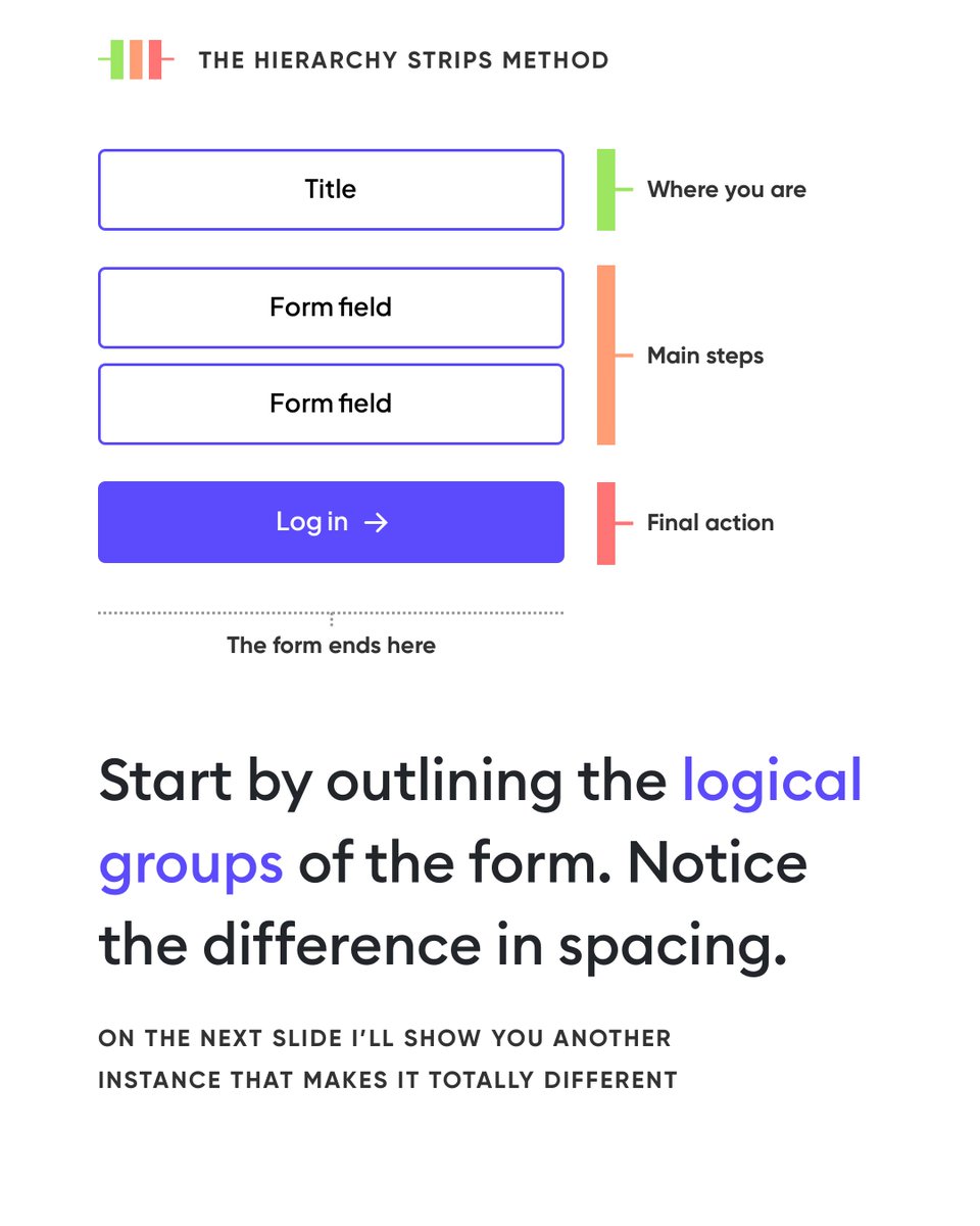
We worked on a wide range of websites.

From nickelodeon campaigns for SpongeBob and Ninja Turtles, all the way to Car Sharing app sites (if you're from poland you know this one) and big fintechs / banks.

They all have one thing in common. Image
Aug 28, 2023 8 tweets 3 min read
A beautiful interface doesn’t mean that it’s flashy. It’s not about using all the available effects, colors, fonts and gradients 🎨 Image 
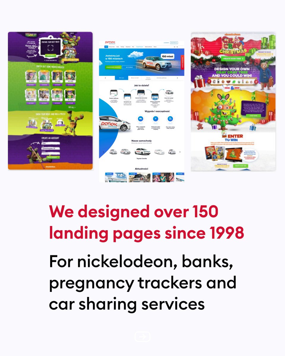
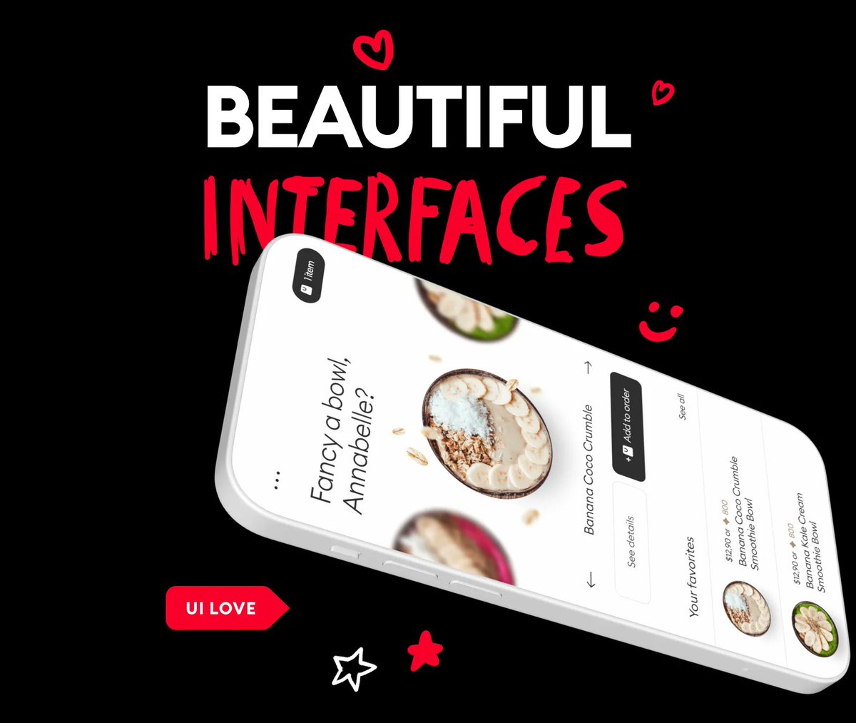
Beauty lies in simplicity, proper hierarchy and a sense of ease when using a product 📱 Image
Jun 15, 2023 10 tweets 4 min read
The problem with Auto-Layout.

Junior designers take the wrong route here, so let's explain why with Teslas and Ducks!

A 🦆ing thread 🧵 auto layout explained with ... This is a Tesla.

It can drive itself (self-driving AI)

Now hear me out. Image
Jun 14, 2023 10 tweets 4 min read
The Deep Glass Material. 🧊

While exploring spatial design I accidentaly created a slightly different glass material.

It's glassmorphism with a touch of clay-like structure.

Here's how to make it yourself.

A 🦆ing thread 🧵 This is a graphics design exploration.

Non UI design related but FUN!

I used @sketch and it has a couple of benefits like shadow overlays and background blur saturation.

You can use other tools if you like - it will be similar anyway. Image
Jun 13, 2023 6 tweets 2 min read
There are 5️⃣ Spatial Design principles that Apple shared in their guidelines.

Let's explore them without the jargon.

A 🦆ing thread 🧵 Spatial Design Principles 
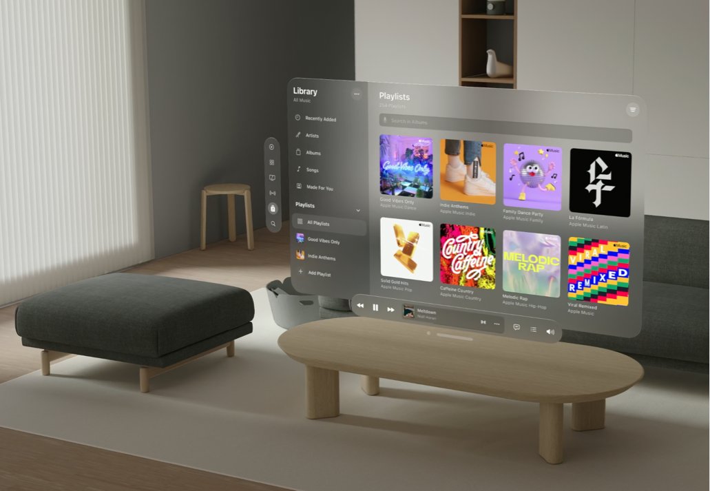
Let's start by saying how important it is to start your spatial explorations with these.

Many example interactions/animations shared on social media go against these rules and do random stuff.

There will be time to experiment with the goggles on! Image
Jun 12, 2023 13 tweets 4 min read
Skeuomorphism icons were true works of art.

Let's explore some interesting visual ideas that can all fit in a rounded square.

A 🦆ing thread 🧵 Skeuomorphism app icons I'll start with one of my favorite apps of all time - Wunderlist.

This icon and the way the skeuo version of the app were designed was extraordinary!

Down to sub-pixel precision! Image
Jun 11, 2023 11 tweets 4 min read
10 years ago flat design changed everything.

Apple debuted iOS 7 and let go of Steve Jobs' favorite - Skeuomorphism.

But there's one thing most people don't realise.

That change is PROFOUND on a cultural level.

A 🧵 skeuomorphism flat design When the first iPhone came out, it redefined an entire industry.

Most people don't realise how important Skeuomorphic UI was to achieving that.

👇 Image
Jun 11, 2023 15 tweets 5 min read
10 years ago Apple killed Skeuomorphism with the release of iOS 7.

Let's explore the trend that helped shape modern computing before becoming an obscure joke.

🧵 Skeuomorphism The first iPhone launched in 2007.

To make it easier for people to understand a completely new type of interface and interaction skeuomorphic design was used.

It mimics real-world objects, so the interface feels familiar.

Books are on a wooden shelf, notes on paper. Image
Jun 9, 2023 10 tweets 3 min read
Here's a quick exploration of Spatial UI design.

Having a DARKER card on top of a lighter card?

Isn't it dark mode heresy?

Let me explain 🧵 Apple Spatial OS UI If you remember my flat UI dark mode diagram, we simulate depth by using lightness.

Things that are darker are further away from the light source, things that are lighter are closer to us.

So does it mean that... Image
Jun 9, 2023 7 tweets 2 min read
Most case studies are 🦆ing BORING 🥱 that’s because designers take the wrong approach to them. Image 
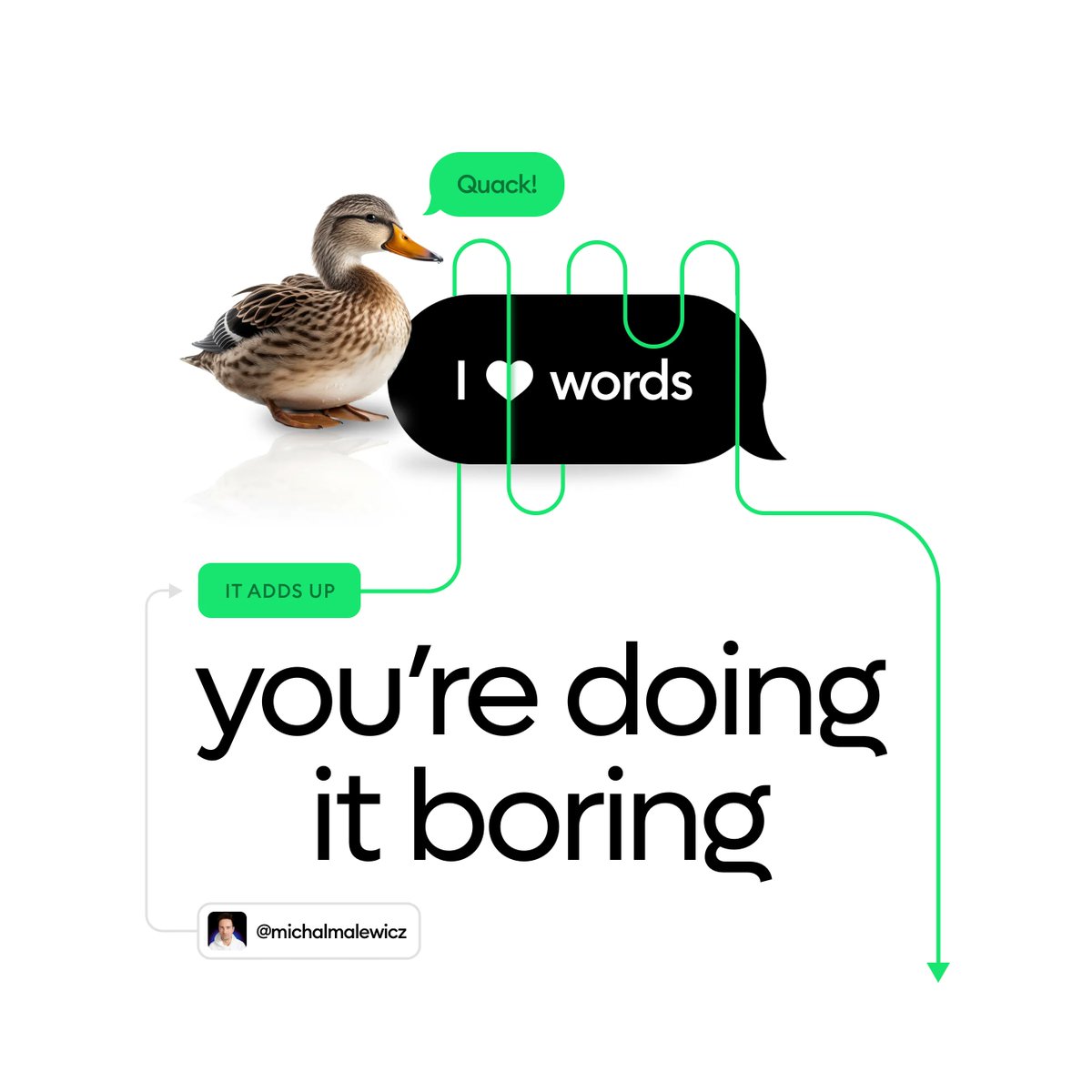
Lengthy case studies are not any 🦆ing better. Image
Mar 23, 2023 6 tweets 2 min read
Who's hungry for some UI?

Let's have some fun with this one 👇 Simple Card UI Design As always start by defining the individual groups of the interface.

It really helps the users take action when they can focus on it easier. hierarchy strips UI
Mar 10, 2023 6 tweets 1 min read
“Let’s trust the well established institutions”

the institutions:

abcnews.go.com/Business/wireS… It’s really important to be aware how these are connected and:

➡️ Don’t hold money above guarantee limit in one bank (usually €100k)

➡️ Don’t hold crypto on exchanges

➡️ Be smart
Mar 10, 2023 6 tweets 2 min read
Today let’s look at two examples of a simple feedback form ui/ux design. 👇 Form hierarchy 
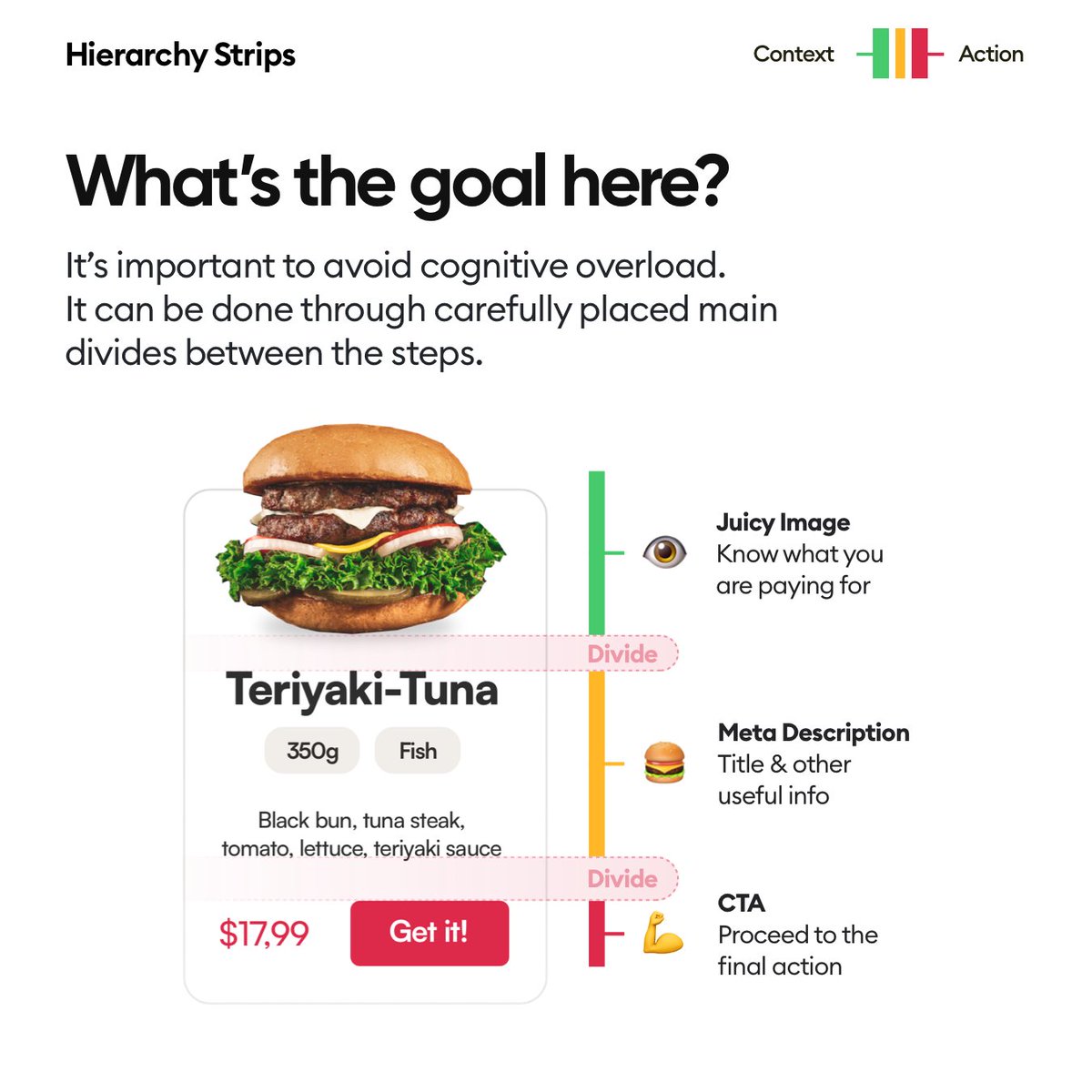
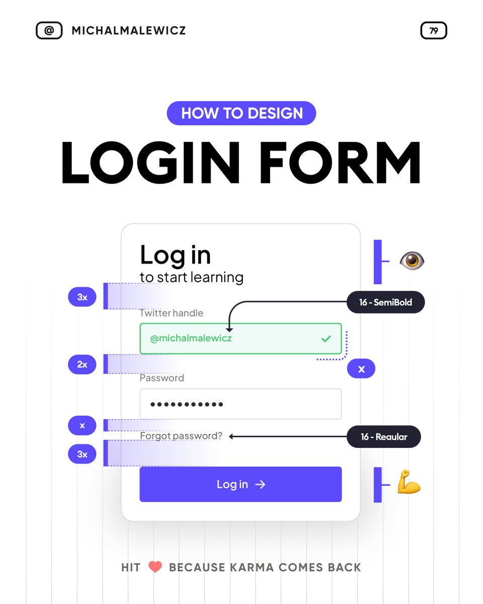
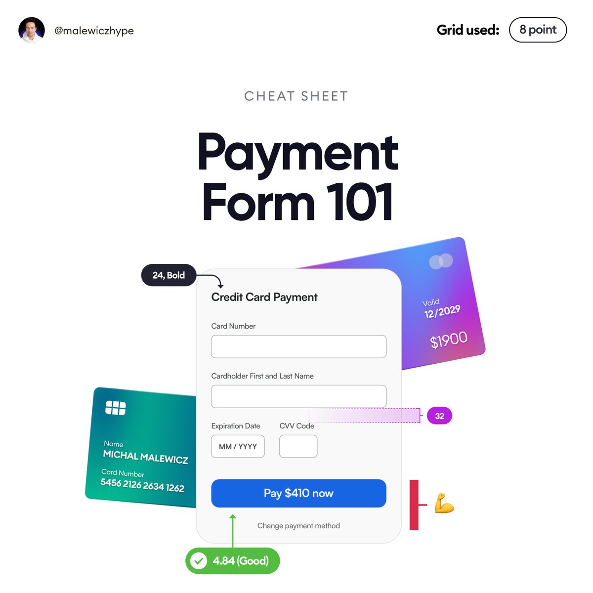
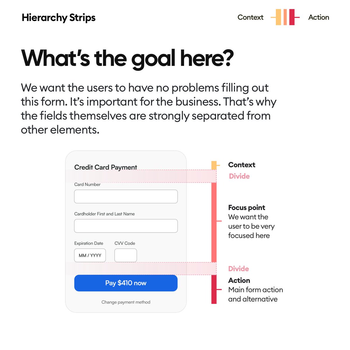
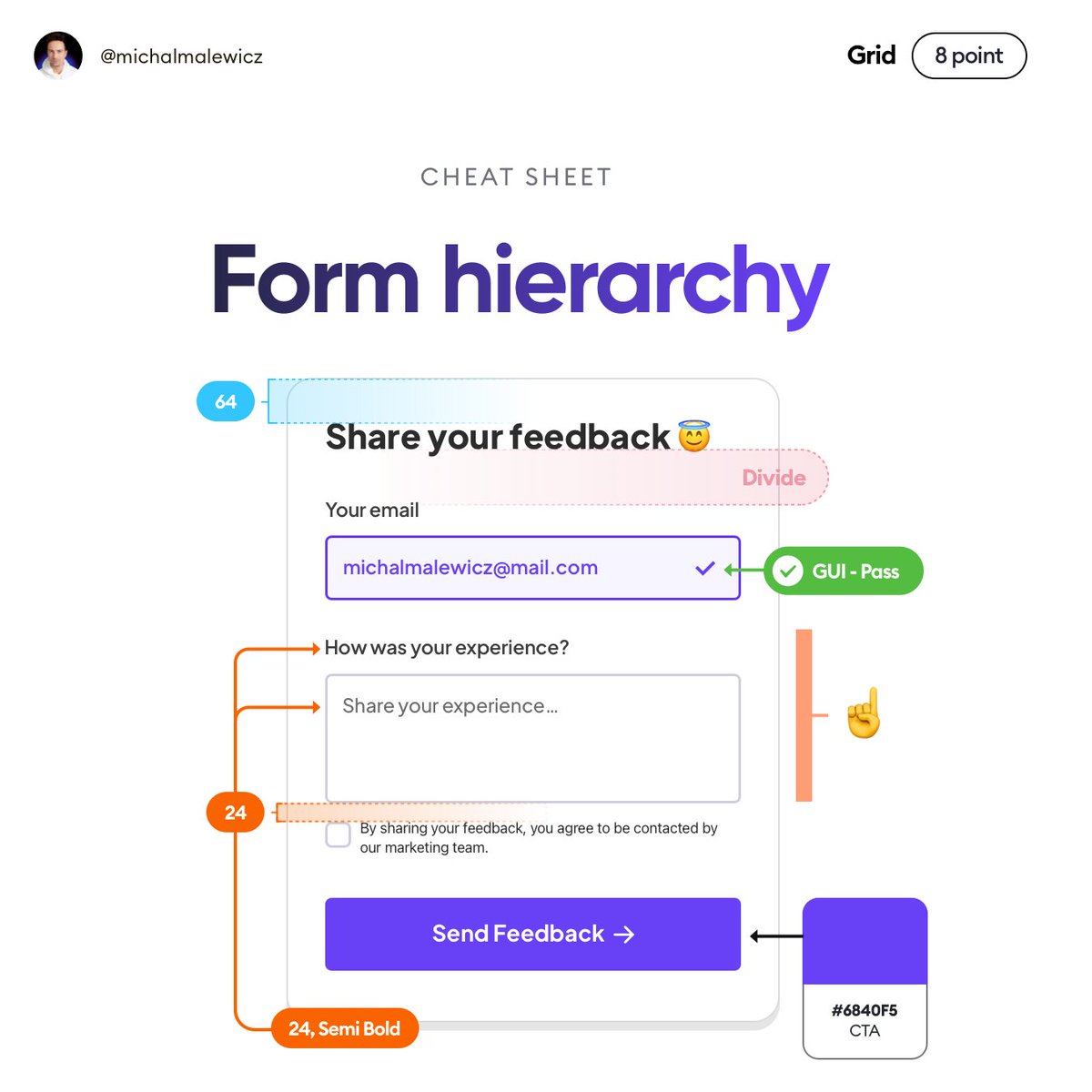
First off divide your form into logical groups:
✅ Title for context
✅ two fields grouped together
✅ main action separated

That allows for focusing on each one separately while filling the form. hierarchy strips in user interfaces
Mar 9, 2023 4 tweets 2 min read
Here we are. A channel I started as an experiment in getting out of the comfort zone in mid 2020 has now reached 100K subscribers.

This is insane... 100K youtube I wanted to really thank everyone who cheered me on during that journey, because as an introvert it was difficulty after difficulty.

I am also super happy that so many people truly benefited from these videos and managed to get jobs, promotions and progress ❤️ youtube
Mar 8, 2023 7 tweets 3 min read
Today a quick example of creating simple, minimal product cards that can work in a carousel, or as a grid.

Let's go 👇 product card UI design 
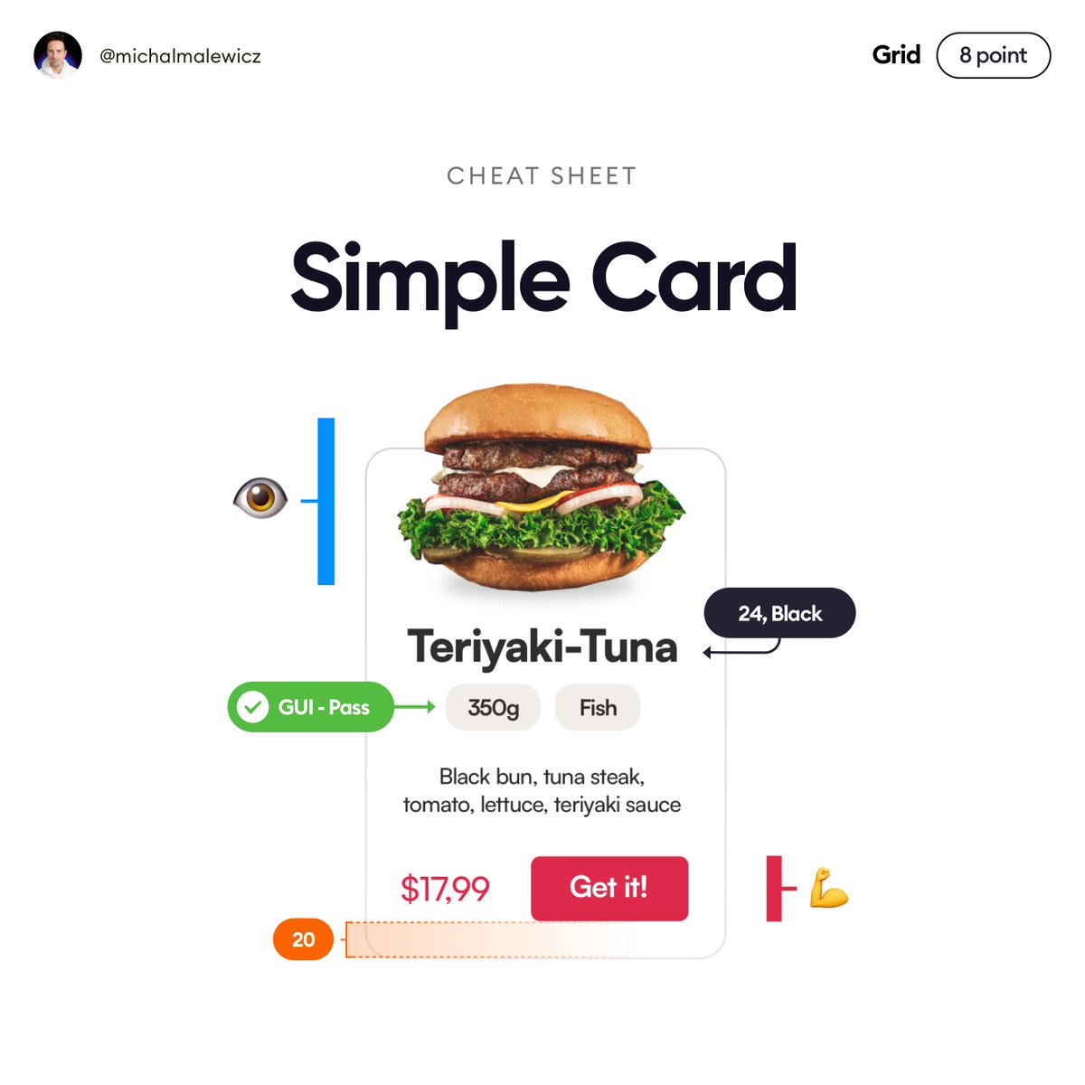
As always, when planning your card start by dividing it into logical groups.

Here it's easy:
✅ Image to catch attention
✅ Description is short so it can be merged with options
✅ Clearly separated CTA so all focus ends up there hierarchy strips in UI design
Mar 7, 2023 7 tweets 3 min read
This is tricky! I am a strong believer in practicing the visual design skills, but at some point you need to grasp the difference between an artsy "shot" and something that can work as a real product.

How? 👇 stop designing interfaces 
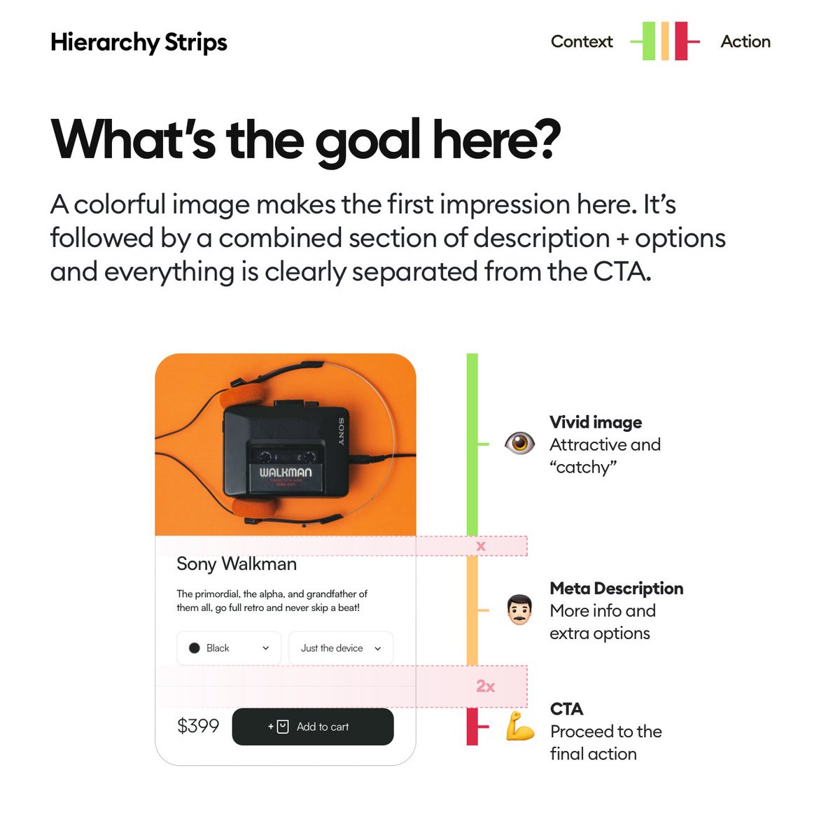
It's very easy to sink into the trap of designing beautiful, well-liked "shots" but the issue is that you'd be moving away from the real world towards just eye-candy.

Things you design should be both beautiful AND functional. Not just one of the two.

👇 Image
Feb 24, 2023 7 tweets 3 min read
Gradients can look great, but most designers actually make their designs WORSE by using them.

Here's a quick tip thread on how to make awesome gradients! 👇 gradients best practices 
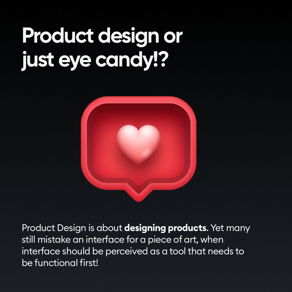
Keep in mind that this thread is intended for beginners and with more experience you can break or bend some of the rules and still achieve great results.

If you're a junior designer however... let's jump in! 👇 gradients in ui design
Feb 23, 2023 7 tweets 3 min read
A payment form is one of the most important UI components out there. After all, it’s required for someone to get the money and keep the internet running :)

Let's explore some essentials 🧵👇 payment form ui design hierarchy strips
Feb 22, 2023 11 tweets 4 min read
Today let's get creative! Learn how to create this in your Design Tool

(Figma, Sketch, Adobe XD, Penpot or Lunacy)

A tutorial thread 👇 vector illustration tutorial 
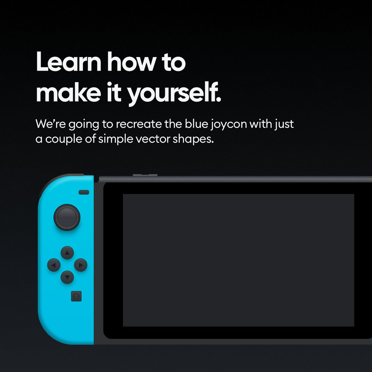
In this tutorial we'll focus on just the blue joycon, but once you get that done doing the rest of the console should be easy.

Ready?

Let's begin! 👇 nintendo switch on vectors
Feb 21, 2023 4 tweets 1 min read
Hustle culture may be "toxic" or "harmful" but it seems like the only way to achieve great things.

Binging tv shows precisely 8 hours (and zero minutes) after work is done may be good for most people's mental health but it won't lead them anywhere good. Sadly you either work hard (and smart) or you want an easy life right now, which will mean you'll never really have an "easy" life in the future.