10 years ago flat design changed everything.
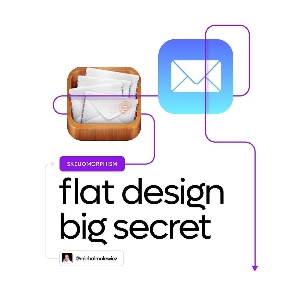
Apple debuted iOS 7 and let go of Steve Jobs' favorite - Skeuomorphism.
But there's one thing most people don't realise.
That change is PROFOUND on a cultural level.
A 🧵
Apple debuted iOS 7 and let go of Steve Jobs' favorite - Skeuomorphism.
But there's one thing most people don't realise.
That change is PROFOUND on a cultural level.
A 🧵
When the first iPhone came out, it redefined an entire industry.
Most people don't realise how important Skeuomorphic UI was to achieving that.
👇
Most people don't realise how important Skeuomorphic UI was to achieving that.
👇

It used familiar metaphors like bookshelfs, realistic microphones or torn paper notebooks so new users can easily understand the UI.

And it 🦆ing worked!
People of all ages were using these devices with ease.
Naturally.
So why change it?
People of all ages were using these devices with ease.
Naturally.
So why change it?

Jony Ive took over software design in early 2010's and with his love of minimalism pushed it towards flat design.
Most people initially hated it...
Most people initially hated it...

But the reasoning was sound:
people got used to the phones already, they don't need to be guided be real life metaphors anymore.
Realistic looking buttons gave way to simple text links.
Flat, clean, minimal.
people got used to the phones already, they don't need to be guided be real life metaphors anymore.
Realistic looking buttons gave way to simple text links.
Flat, clean, minimal.

And at the surface level that's it.
But flat design did something else.
Something truly 🦆ING PROFOUND!
👇
But flat design did something else.
Something truly 🦆ING PROFOUND!
👇

Before flat design, typical UI's were a series of complex, very visual bitmaps.
Creating them required A LOT of skill.
Learning design was SUPER DIFFICULT.
Creating them required A LOT of skill.
Learning design was SUPER DIFFICULT.

Flat design introduced UI's primarily made of vectors.
This is where @sketch and later also Figma and others allowed people to use familiar shapes like ovals and rectangles to create a UI.
No need to "paint the pixels" anymore!
More people could now do it!
This is where @sketch and later also Figma and others allowed people to use familiar shapes like ovals and rectangles to create a UI.
No need to "paint the pixels" anymore!
More people could now do it!

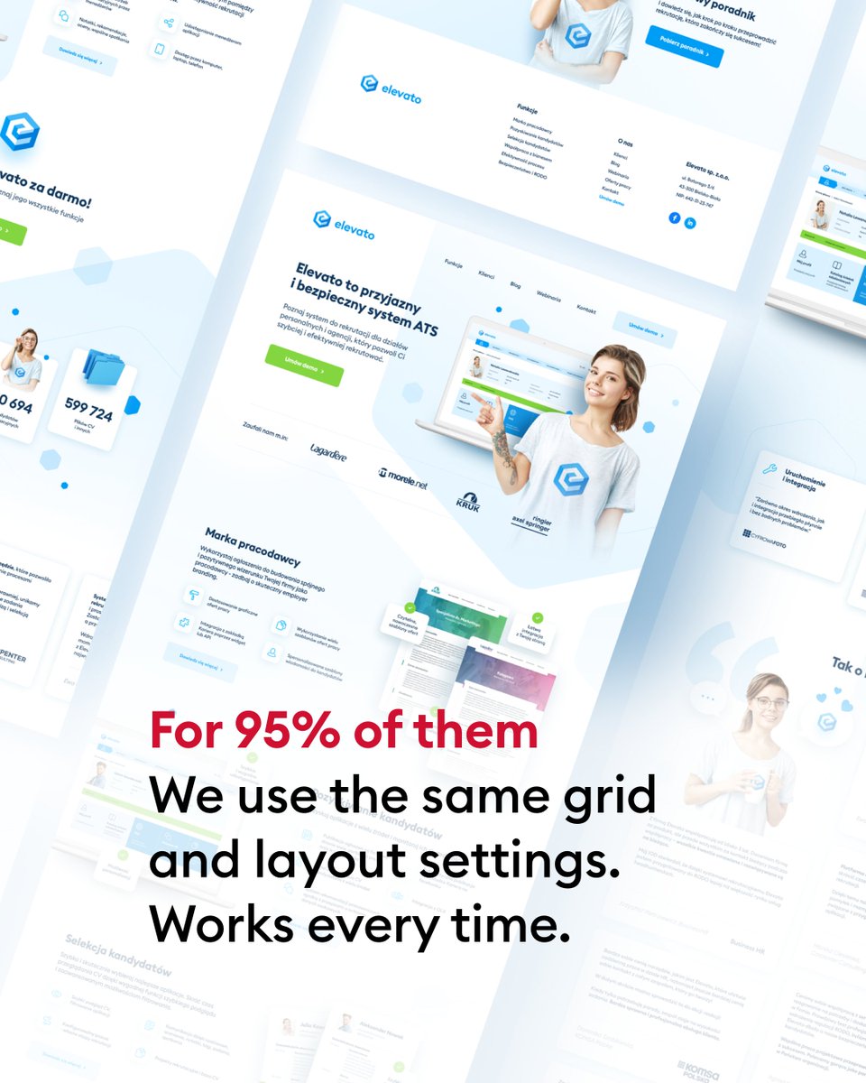
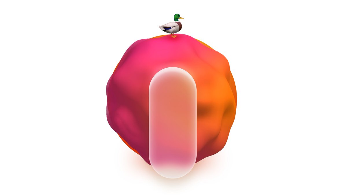
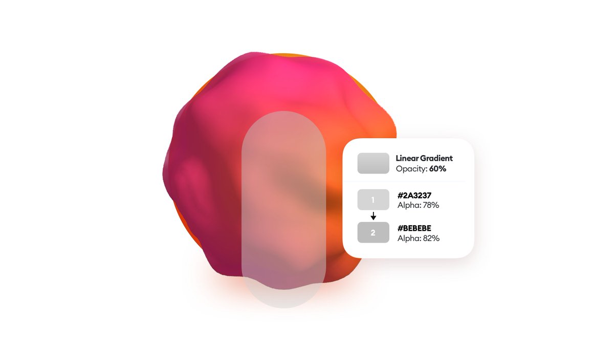
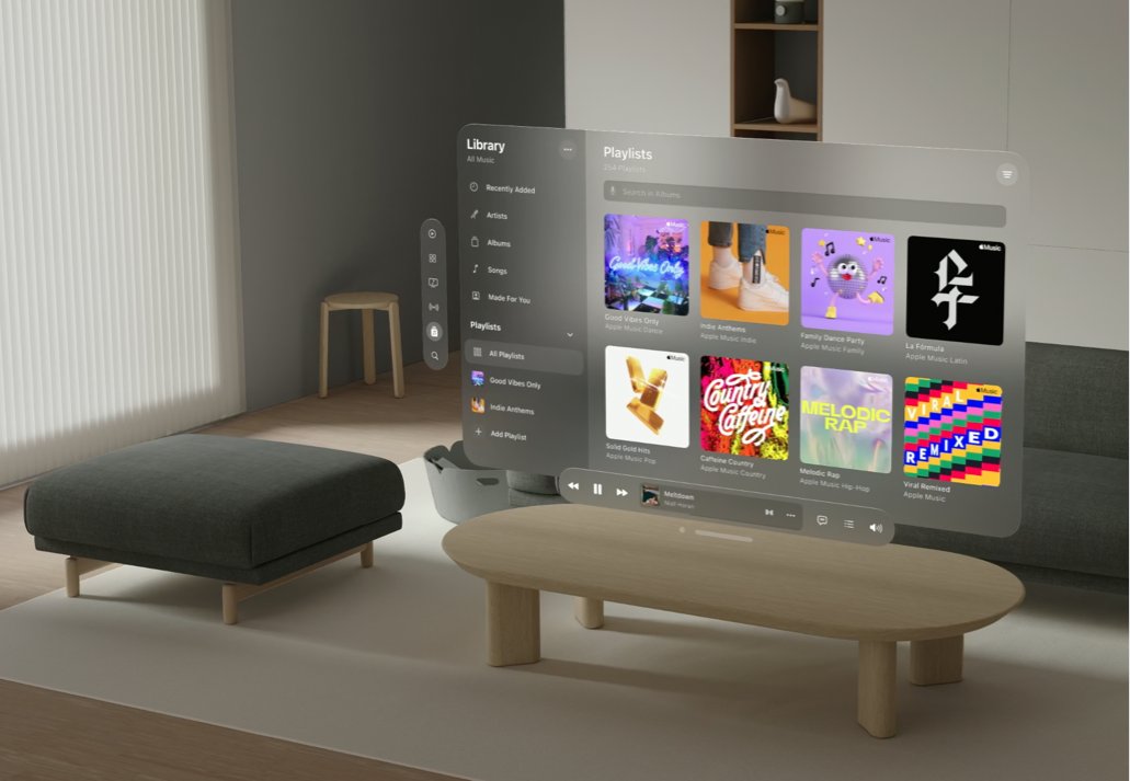
Parts of skeuomorphism are still here with us.
Modern design styles tend to mix flat design with other concepts like brutalism, glassmorphism, aurora gradients and even some oldschool skeuomorphism.
Which style is your favorite? Let me know!
Modern design styles tend to mix flat design with other concepts like brutalism, glassmorphism, aurora gradients and even some oldschool skeuomorphism.
Which style is your favorite? Let me know!

Have a beautiful day, and make sure to follow me @michalmalewicz to stay in the loop of these industry shifts.
I named and explained glassmorphism and neumorphism after all ;-)
I named and explained glassmorphism and neumorphism after all ;-)
• • •
Missing some Tweet in this thread? You can try to
force a refresh