
Here's a thread in pictures about the Atlantic overturning circulation #AMOC which is making headlines this week. I've studied this topic since 1991 and will show key data and models & some video.
Let's go: observed temperature trend since 1901 from 🧵1/x nature.com/articles/nclim…

Let's go: observed temperature trend since 1901 from 🧵1/x nature.com/articles/nclim…
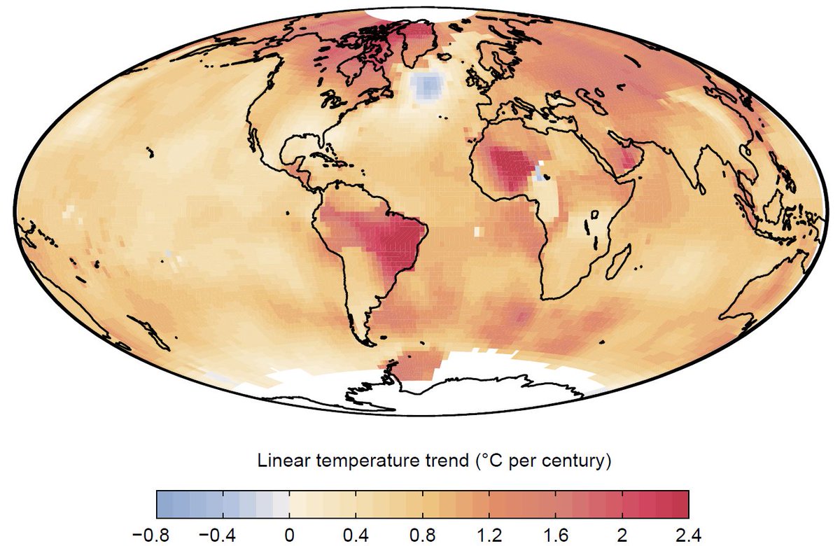
The northern Atlantic stands out as the only region that has defied global warming and actually cooled. Here a couple of further views with different data, from Zeke Hausfather and Ed Hawkins. 2/x
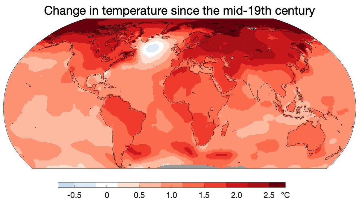

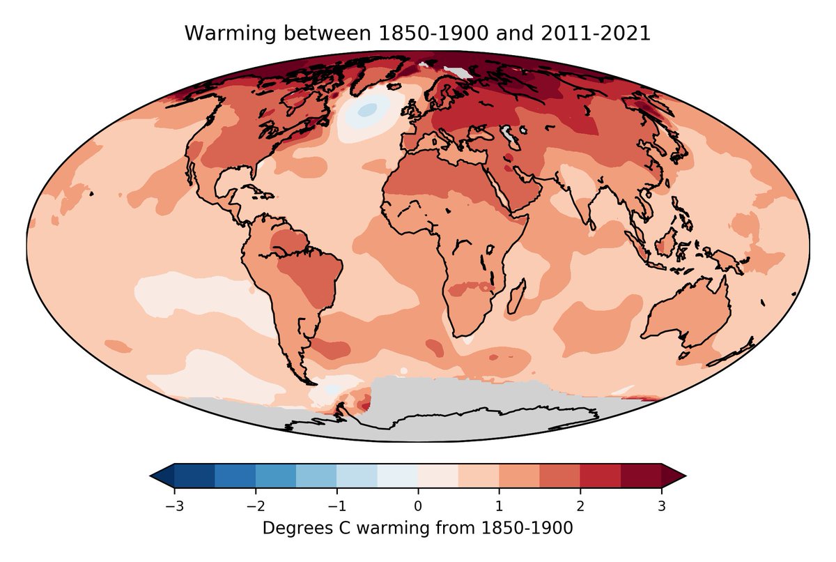
And a couple more short-term snapshots from NOAA and NASA. 3/x


That was air temperatures, but the literally underlying cause is low sea surface temperatures. Here is the sea surface temperature change in the ERA5 reanalysis data. 4/x
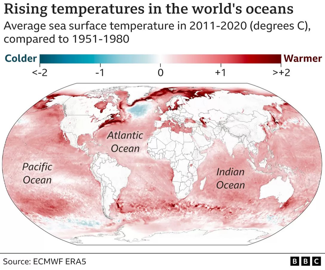
And the satellite data from Copernicus from the European Atlas of the Seas. 5/x

And here the observed sea surface temperature trends from 1870 to 2016 (HadISST data) from our 2018 Nature paper, .
We take this 'cold blob' as a symptom of a slowing of the #AMOC, the Atlantic overturning circulation, shown schematically. 6/x https://t.co/FVDsOwtpGLnature.com/articles/s4158…
We take this 'cold blob' as a symptom of a slowing of the #AMOC, the Atlantic overturning circulation, shown schematically. 6/x https://t.co/FVDsOwtpGLnature.com/articles/s4158…

So what is this #AMOC? It's a near-surface northward flow along the Atlantic, from the far south up to the high north. There the water gives off its heat to the atmosphere, sinks down and returns south in 2-3 km depth. A schematic animation from NASA. 7/x
The AMOC is part of the global overturning circulation driven by density differences. It supplies the deeper waters with oxygen. Schematic from my 2002 Nature article; yellow dots is where the water sinks into the deep. 8/x https://t.co/JPvIaBWT2inature.com/articles/natur…

In reality the ocean circulation looks rather more complex and turbulent! Here an animation of the ocean in the CM2.6 climate model of NOAA's Geophysical Fluid Dynamics Lab in Princeton. 9/x https://t.co/Shev0iGVElgfdl.noaa.gov/high-resolutio…
Now if you add CO2 to the atmosphere in that model you get the sea surface temperature change pattern shown on the left. The data you saw earlier are on the right - in this case both normalised (divided by global mean change). 10/x

Key point: both the 'cold blob' and the excessive warming along the American coast are a telltale 'fingerprint' pattern of an #AMOC slowdown. The theory behind this is explained in Rong Zhang 2008, . (Graph for increase > reverse.) 11/x https://t.co/L62Ksx8Tfpagupubs.onlinelibrary.wiley.com/doi/full/10.10…

So the high-resolution climate model predicts this fingerprint in a CO2 scenario. The observed temperature trend since 1870 shows it. But so do the Copernicus satellite data shown earlier. Here a graph by Ruijian Gou. 12/x

And the standard CMIP6 models used for simulations of historic climate & future projections (e.g. in IPCC reports) show this fingerprint (left) is correlated with the #AMOC (overturning stream function, right). From Latif et al. 2022, . 13/x https://t.co/WvrlZ3qnwRnature.com/articles/s4155…

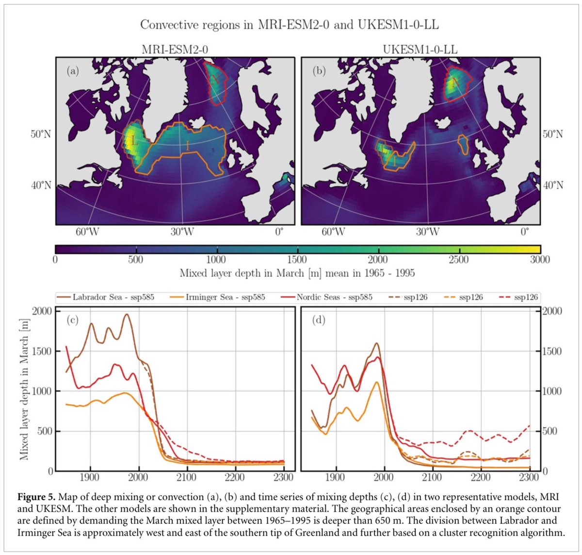
Let's get on to time evolution. In Caesar et al. 2018 we used the 'cold blob' sea surface temperature for winter (Nov-May) to reconstruct the #AMOC since 1870. Blue curve is for the cold blob area. 14/x https://t.co/38DWD0kMkQnature.com/articles/s4158…

Independently, paleoclimate colleagues using sediment and other kinds of proxy data have published their AMOC reconstructions. We compiled them in a 2021 paper: . Light blue is our curve from the previous tweet. 15/xnature.com/articles/s4156…
Let's look at the same results in another way. These use very different methods. Nutrient content in the water, sediment grain sizes where the deep southward return flow passes, etc. The give rather consistent results: the #AMOC is now at its weakest in a millennium. 16/x


Or zoom into the time since 1950 (for those proxies going so close to present) and compare to the measurements from the RAPIC project and modern reconstructions using hydrographic, satellite & cable data (red, orange). From . Looks quite consistent. 17/x https://t.co/v6lNZxvTz1nature.com/articles/s4156…

Now to the elephant in the room: the tipping point. The current IPCC report explains what a tipping point is with this graph. Basically a point beyond which the system moves by itself into a very different state without being pushed further. 18/x

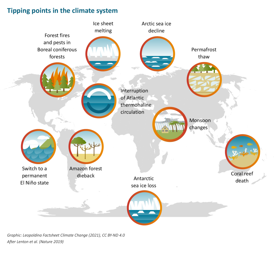
The climate system has a number of "tipping elements" (subsystems with tipping points). Here's a nice overview from Germany's national science academy Leopoldina. 19/x https://t.co/VMRLA5lk98leopoldina.org/fileadmin/reda…

The possible #AMOC tipping point was first described in a very simple feedback model by Henry Stommel in Tellus 1961. The northern Atlantic is rather salty because of the AMOC, and the AMOC works because it's rather salty there (and the water thus dense enough to sink). 20/x

Wally Broecker called this feedback a "chicken and egg situation" and famously warned about "unpleasant surprises" in Nature 1987. 21/x

Broecker was an ocean and paleoclimate scientist, and his concern was raised by abrupt regional climate changes particularly focused on the northern Atlantic, most likely due to abrupt AMOC transitions. I wrote a review on those in Nature 2002: . 22/x https://t.co/55DgnnVBPBnature.com/articles/natur…

Stommel's simple model has a quadratic solution with a bifurcation point, which depends on how much freshwater (from rain, rivers and ice melt) dilutes the salty ocean in the northern Atlantic. Too much and it breaks down. (AMOC flow rate is labelled 'NADW' here.) 23/x

Now Stommel's model is very simple, but complex climate models can trace that bifurcation diagram by very slowly ramping up freshwater until the AMOC breaks down, than ramping down the freshwater again. You get this 'hysteresis'. 24/x From https://t.co/aHgJPSVU1wagupubs.onlinelibrary.wiley.com/doi/10.1029/20…

Afaik this behaviour is robust across all models where it has been tested. The tipping point is real, but models differ greatly how close we are. And there are indications most models are too stable. They predict the 'cold blob' for the future, see this IPCC graph. 25/x

But the models don't expect it to appear already now. Another IPCC graph comparing historic simulations to observations. More discussion on why models are too stable here in our RealClimate blog: 26/x https://t.co/7PxvfuVK50realclimate.org/index.php/arch…

A paper by Liu et al. 2007 corrected for inaccurate salinities in a model and found the AMOC collapsed in a CO2 experiment (orange), while the uncorrected model did not (blue). The collapse caused NW Europe to cool. From . 27/x https://t.co/Hkk4K37cUzscience.org/doi/10.1126/sc…


Enter methods from nonlinear physics, looking for Early Warning Signals (EWS) in the variability, before a tipping point is reached, as in Boers 2021. The tipping point is where lambda reaches zero. More on that also at Realclimate. 28/x https://t.co/ajf3QLTLR1nature.com/articles/s4155…

The new Uni Copenhagen study making headlines now uses a similar EWS approach on the Caesar 2018 AMOC reconstruction discussed above, and predicts a tipping point in the time range 2025-2095. Earlier than we all thought a few years ago. 29/x https://t.co/HxMVF3BEBAnature.com/articles/s4146…

Did I talk about impacts yet? Consequences of an #AMOC breakdown would be desastrous. Not just cooling (left) but also major shifts in tropical rainfall belts (right), here from the recent OECD report on Climate Tipping Points, 30/x https://t.co/LKLI2Azbmgoecd-ilibrary.org/sites/abc5a69e…

Also major dynamic sea level changes on top of the global rise due to warming and ice melt. From Levermann et al. 2005, . Plus reduced ocean CO2 uptake, ecosystem disruption, loss of oxygen in the deeper ocean, extreme weather events, ... 31/x https://t.co/ImruuGix7qlink.springer.com/article/10.100…

I must come to a close. Two weeks ago I gave the introductory keynote for a two-day AMOC session at the IUGG Conference in Berlin, and here is my conclusion slide. The point on Antarctica refers to the Nature cover story of Li et al, 32/x https://t.co/jZMzISWl18nature.com/articles/s4158…

Even though it is uncertain exactly how close we are to tipping points, the consequences would be so serious that we must try to absolutely minimise the risk. It's one more reason to stick to the Paris 1.5 °C goal. The latest IPCC report has sent out a clear warning. 33/x

And finally, the OECD Climate Tipping Points Report also states it very clearly. Don't take my word for it. I really hope that those playing down tipping point risks have studied the evidence carefully enough to know what they are talking about. 🧵34/end

Here's a 10-minute video on the #TippingPoint risk of the Atlantic overturning circulation #AMOC: my keynote at the Tipping Points conference in Exeter last September.
• • •
Missing some Tweet in this thread? You can try to
force a refresh


