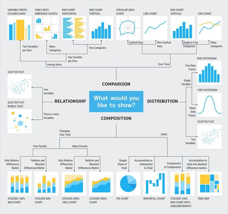
Do you want to describe a single variable ?- use a BAR CHART
Do you want to visualize the distribution of a variable? - use a HISTOGRAM
Do you want to compare the strength of association between 2 variables ? - use SCATTER PLOT
Thread of data visualization.. RETWEET 🙏🏻
Do you want to visualize the distribution of a variable? - use a HISTOGRAM
Do you want to compare the strength of association between 2 variables ? - use SCATTER PLOT
Thread of data visualization.. RETWEET 🙏🏻
I have a YouTube playlist where I talked about some very popular data visualization tools we see everyday.
You can check it out below ⬇️
Let’s go 😎youtube.com/playlist?list=…
You can check it out below ⬇️
Let’s go 😎youtube.com/playlist?list=…
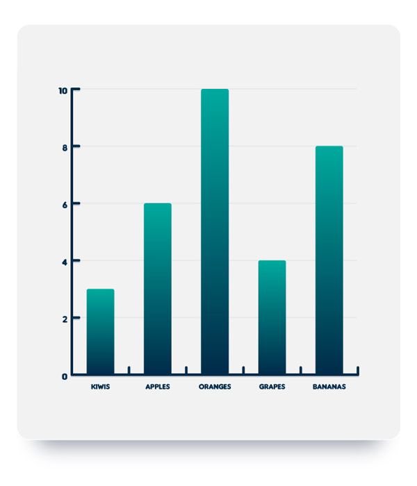
SINGLE BAR CHART
This is basically used to visualize a single categorical variable (univariate analysis)
On the horizontal axis, we have the variable… on the vertical axis, we have the frequency.
This is basically used to visualize a single categorical variable (univariate analysis)
On the horizontal axis, we have the variable… on the vertical axis, we have the frequency.
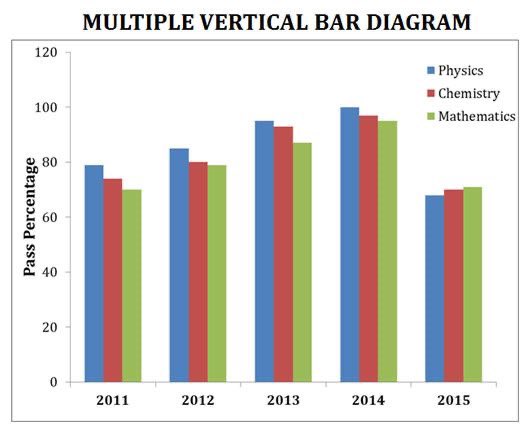
MULTIPLE / GROUPED BAR CHART.
This is a bar chart that we can use to visualize two categorical variables (bivariate analysis)
We plot the bars next to each other.
This is a bar chart that we can use to visualize two categorical variables (bivariate analysis)
We plot the bars next to each other.
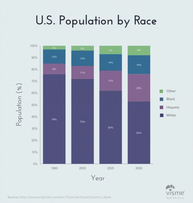
COMPONENT/STACKED BAR CHART
Just like the multiple bar chart… also used to compare two categorical variables.
The bars are stacked on each other.
The MBC and CBC are literally the same… using any boils down to preference
Just like the multiple bar chart… also used to compare two categorical variables.
The bars are stacked on each other.
The MBC and CBC are literally the same… using any boils down to preference
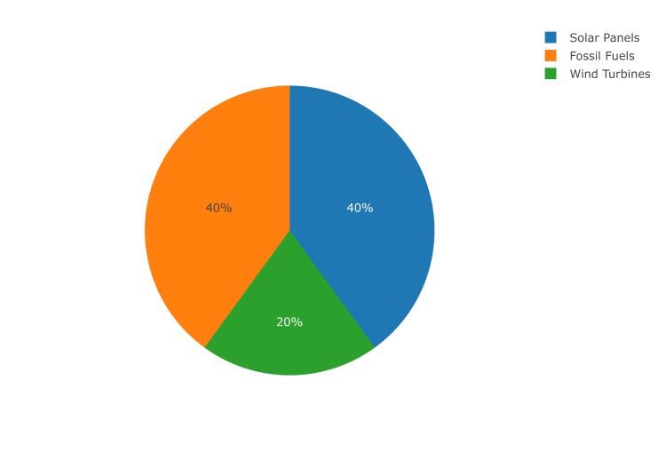
PIE CHART / DONUT CHART
This is just like the bar chart, it is use to visualize single categorical variables.
Bar charts make use of bars, pie chart uses sectors.
This is just like the bar chart, it is use to visualize single categorical variables.
Bar charts make use of bars, pie chart uses sectors.
HISTOGRAM
This is one powerful tool that can be used to visualize the distribution of a single variable.
By knowing the distribution of a data, you can tell a lot about it.
This is one powerful tool that can be used to visualize the distribution of a single variable.
By knowing the distribution of a data, you can tell a lot about it.
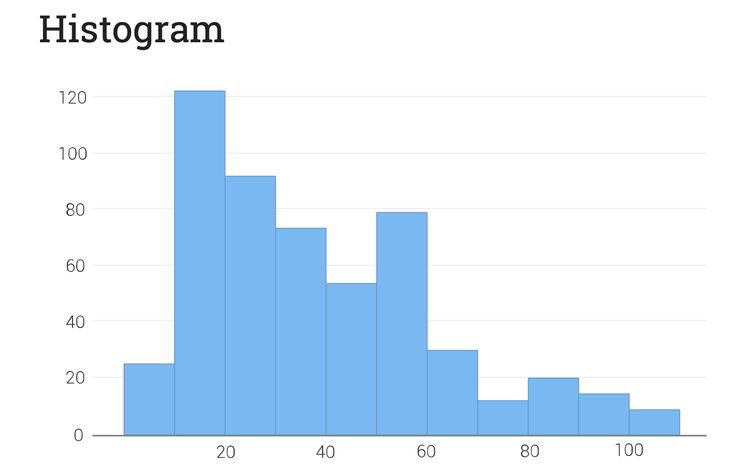
Comparing the histogram with the bar chart and quote or reply with their similarities and differences 👀
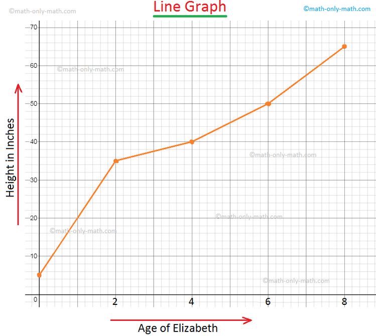
SINGLE LINE CHART/ GRAPH
This is basically use to visualize the change of a variable over a TIME.
This is basically use to visualize the change of a variable over a TIME.
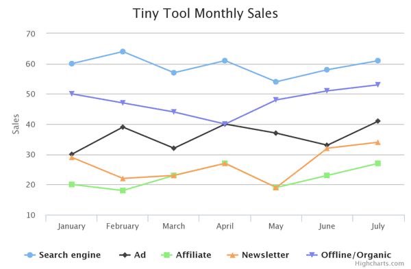
MULTIPLE LINE CHART
If you want to compare 2 variables and how they change with time, then we use a multiple line chart.
If you want to compare 2 variables and how they change with time, then we use a multiple line chart.
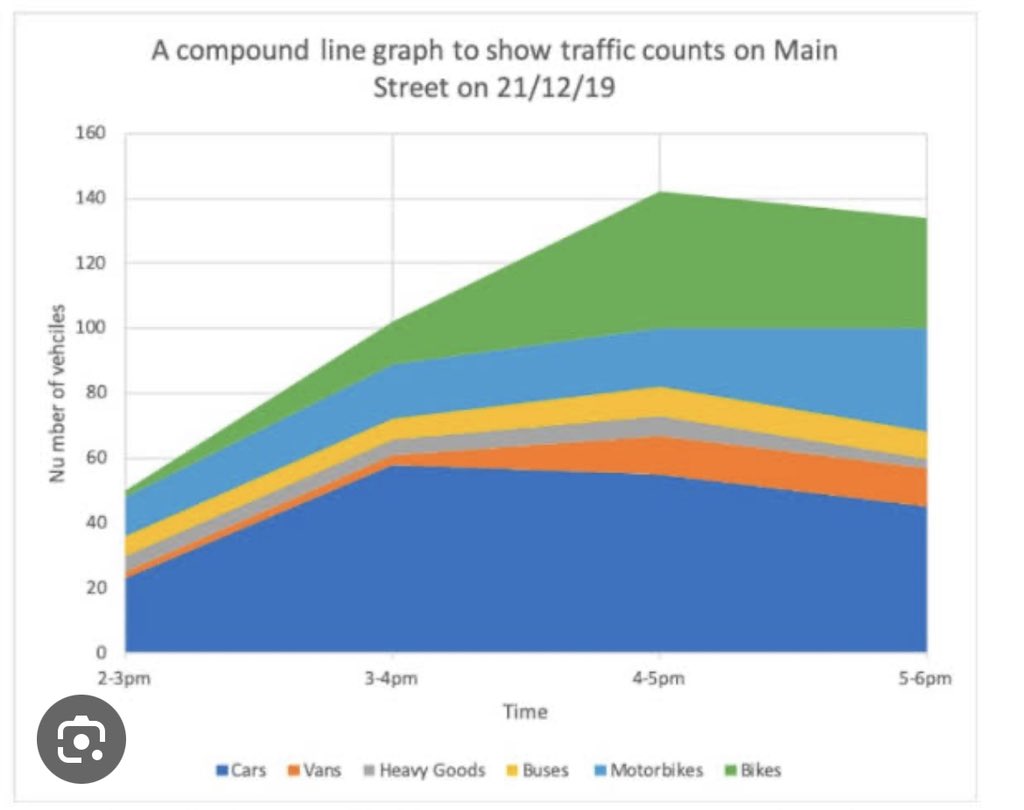
COMPOUND LINE CHART.
This is use to visualize layers of data and also the proportion that makes up the total data.
This is use to visualize layers of data and also the proportion that makes up the total data.
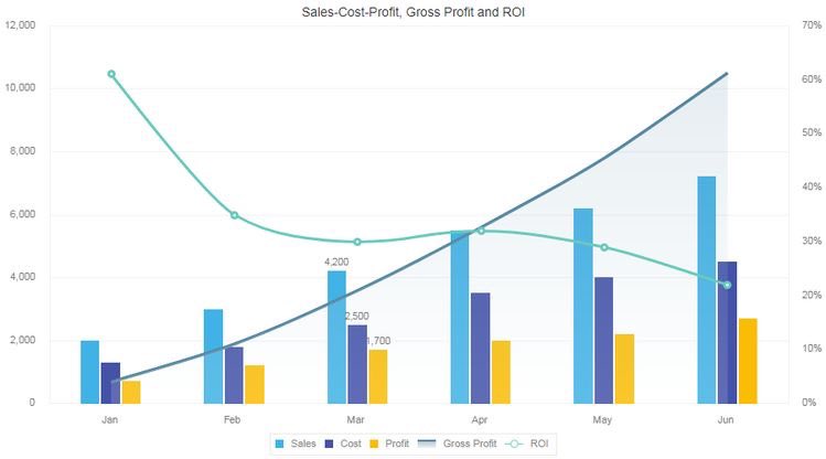
You can combine 2 charts to form a single one, this is known as COMBINATION CHART (combo chart for short)
For example, you can combine a single line and bar chart
This way you see how the variables changes over a period of time and also how it distributes itself at the same time
For example, you can combine a single line and bar chart
This way you see how the variables changes over a period of time and also how it distributes itself at the same time
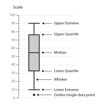
BOX PLOT.
This is one special and powerful tool.
Special in the sense that it is a bit different from others in terms of how it is structured but powerful cos it can visualize spread of data.
It can also detect and remove outliers
This is one special and powerful tool.
Special in the sense that it is a bit different from others in terms of how it is structured but powerful cos it can visualize spread of data.
It can also detect and remove outliers
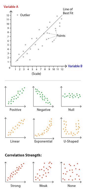
SCATTER PLOT.
This is basically used for bivariate analysis when we want to compare the strength of association between 2 numerical variable.
This is basically used for bivariate analysis when we want to compare the strength of association between 2 numerical variable.
We actually have couple of data visualization tools here and there but these are the popular ones that we see in everyday dashboards.
Thanks for making it to the end of this thread.
Please retweet, like and follow me for more threads like this 🥰
Thanks for making it to the end of this thread.
Please retweet, like and follow me for more threads like this 🥰
I also share resources for data analysis and data science and have a YouTube channel where I teach statistics needed for DA and DA… you can check out the link below
youtube.com/playlist?list=…
youtube.com/playlist?list=…
I can also perform both statistical and data analysis for your project and research.
My DM is opened for work 🎉.
We see in the next one and have a nice day ahead 😇
My DM is opened for work 🎉.
We see in the next one and have a nice day ahead 😇
• • •
Missing some Tweet in this thread? You can try to
force a refresh