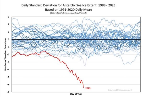
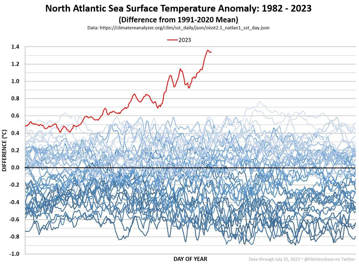
1-7
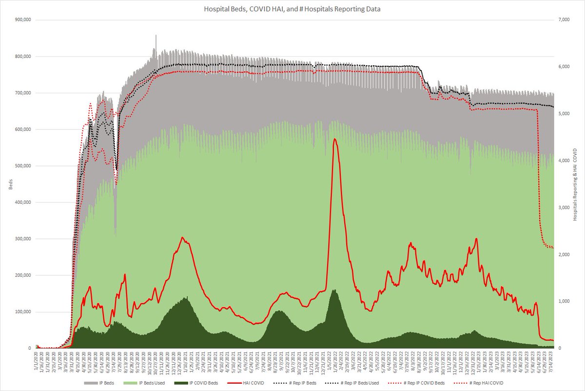
US. This is disturbing. This is a graph of total IP beds, occupied beds, and COVID beds (L axis). The number of hospitals reporting this data are the black dotted lines (R axis).
US. This is disturbing. This is a graph of total IP beds, occupied beds, and COVID beds (L axis). The number of hospitals reporting this data are the black dotted lines (R axis).
2-
The solid red line is the number of hospital acquired COVID cases. The dotted red lines are the number of hospitals reporting HAI COVID and COVID cases overall (all R axis). Look at the drop in the number reporting.
The solid red line is the number of hospital acquired COVID cases. The dotted red lines are the number of hospitals reporting HAI COVID and COVID cases overall (all R axis). Look at the drop in the number reporting.
3-
Given the steep drop, I somewhat suspect that the CDC is no longer requiring this data to be reported.
Given the steep drop, I somewhat suspect that the CDC is no longer requiring this data to be reported.
4- This while:
a. "CDC/HICPAC proposes 3 levels of aerosol protection. Commentators disagreed with that approach because it maintains existing recommendations that reserve N95 respirators for only select pathogens."
infectioncontroltoday.com/view/one-step-…
a. "CDC/HICPAC proposes 3 levels of aerosol protection. Commentators disagreed with that approach because it maintains existing recommendations that reserve N95 respirators for only select pathogens."
infectioncontroltoday.com/view/one-step-…
5-
b. "CDC/HICPAC continued to propagate watered-down crisis standards by proposing only a minimal standard for infection control programs."
c. "CDC/HICPAC did not discuss updates for source control recommendations that would reflect the lessons learned...
b. "CDC/HICPAC continued to propagate watered-down crisis standards by proposing only a minimal standard for infection control programs."
c. "CDC/HICPAC did not discuss updates for source control recommendations that would reflect the lessons learned...
6-
...from the COVID-19 pandemic. Source control is essential to prevent respiratory virus transmission, especially for viruses with significant presymptomatic transmission, such as influenza and SARS-CoV-2. This is especially important for children and people with...
...from the COVID-19 pandemic. Source control is essential to prevent respiratory virus transmission, especially for viruses with significant presymptomatic transmission, such as influenza and SARS-CoV-2. This is especially important for children and people with...
7-
...disabilities who cannot wear masks and immunocompromised individuals."
I guess if the data is hidden, it doesn't exist, right? 😡
...disabilities who cannot wear masks and immunocompromised individuals."
I guess if the data is hidden, it doesn't exist, right? 😡
• • •
Missing some Tweet in this thread? You can try to
force a refresh