
Epidemiologist blocked by Prasad & Ghandi.
Ko-fi: maolesen
Threads: olesen5170
@molesen@mas.to
Bluesky: @molesen.bsky.social
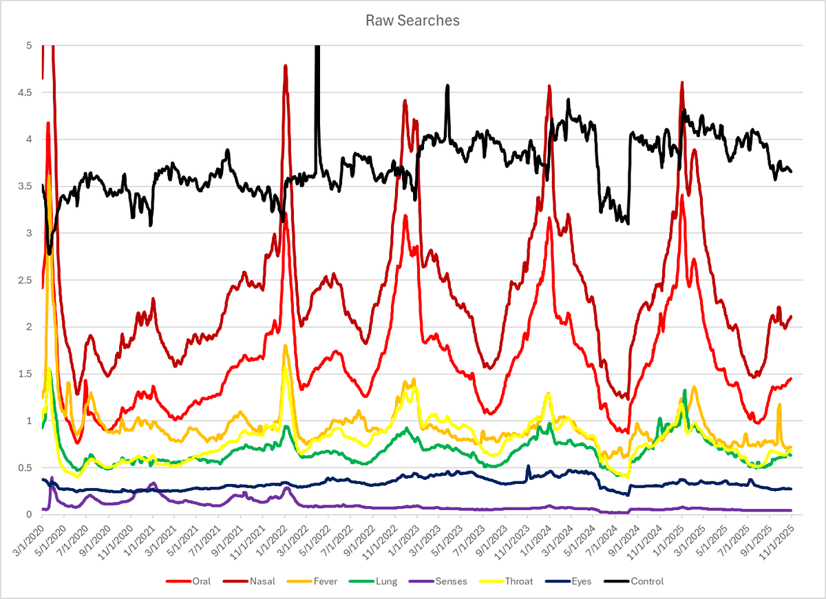
See URL for COVID data viz.


 2-4 I can make a claim to back this increasing climb in autism cases...


 2- Add equal parts of a major healthcare worker shortage.
 2- Look at the big jump once COVID came into play. That in itself is alarming.
 2- The importance of that is a little bit more subtle. Typically, human and avian influenza viruses don't cross between those species. That has a little bit to do with receptors and body temperatures, among other things.
 2-
2-

 2-3 The orange line is simply to make it easy to look at the year 2000 on all three. The drop in air and road miles is expected, but the big jump in mortality is telling.
 2- The blue line with the red section is the rate of TB per 100,000 population. It has been going downward for decades, which is exactly what we want to see. This also can be visualized as the percentage change (yellow line), which we want to maintain below zero (dashed line).
