12 of the most interesting charts surfaced over the weekend 🧵
1/ Record US Treasuries inflows for 2023
"Inflows to Treasuries have totalled $127bn YTD and are on track for a record $206bn in 2023".
1/ Record US Treasuries inflows for 2023
"Inflows to Treasuries have totalled $127bn YTD and are on track for a record $206bn in 2023".

2/ Also in the news, the iShares 20+ Year Treasury Bond ETF $TLT witnessed its largest weekly outflow ($1.8 billion) since March 2020 last week.

3/ The US 10Y has been on the move this week, climbing back to 4.17%.
Back to levels last seen last November, and before that, mid-2008.
Back to levels last seen last November, and before that, mid-2008.

4/ Wells Fargo thinks the probability of a soft landing has increased.
"We still think it is more likely than not that the economy experiences a few quarters of negative GDP growth and declining employment early next year. But - the probability of a soft landing has increased".
"We still think it is more likely than not that the economy experiences a few quarters of negative GDP growth and declining employment early next year. But - the probability of a soft landing has increased".

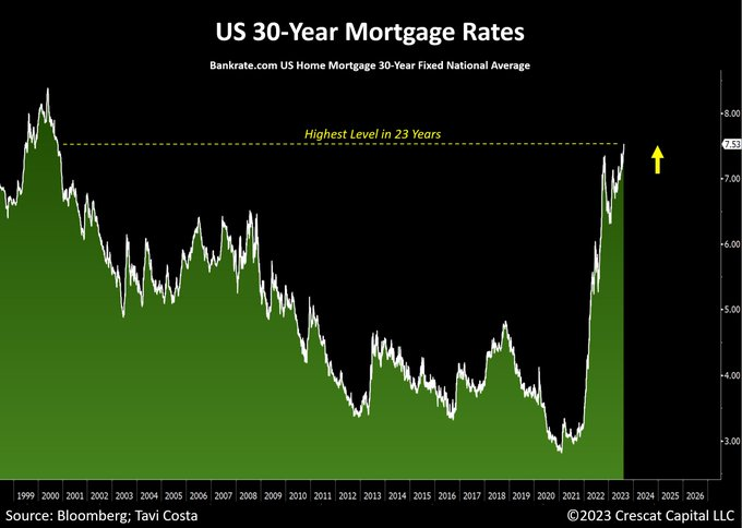
@MTSInsights 5/ US 30Y Mortgage rates surpassed 7.5% recently, marking the first time in 23 years they have been so high.
"The economy is currently experiencing a significant tightening of financial conditions, largely driven by the persisting fragility in the Treasury market".
"The economy is currently experiencing a significant tightening of financial conditions, largely driven by the persisting fragility in the Treasury market".
6/ Six-figure households are witnessing the slowest wage growth according to BofA.

7/ Don't be distracted by scary debt level statistics, debt servicing burdens remain low.
"Debt payments consumed just 9.6% of disposable income in Q1, slightly below the pre-pandemic level and well below the long-run norm".
"Debt payments consumed just 9.6% of disposable income in Q1, slightly below the pre-pandemic level and well below the long-run norm".

@MTSInsights 8/ The incredible rise of unprofitable companies.
As a percentage of publicly listed firms, unprofitable companies have grown from ~40% to ~50% in the last three decades.
As a percentage of publicly listed firms, unprofitable companies have grown from ~40% to ~50% in the last three decades.

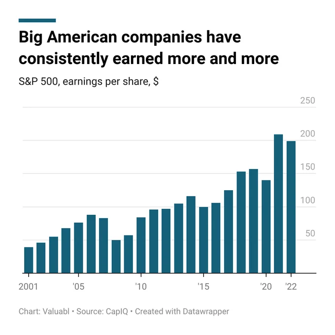
@MTSInsights @SnippetFinance 9/ Big American companies have consistently earned more and more.
"Some analysts expect corporate earnings to fall dramatically over the next few years. Even if they're right and earnings fall, they should recover within a few years, as they've always done historically".
"Some analysts expect corporate earnings to fall dramatically over the next few years. Even if they're right and earnings fall, they should recover within a few years, as they've always done historically".
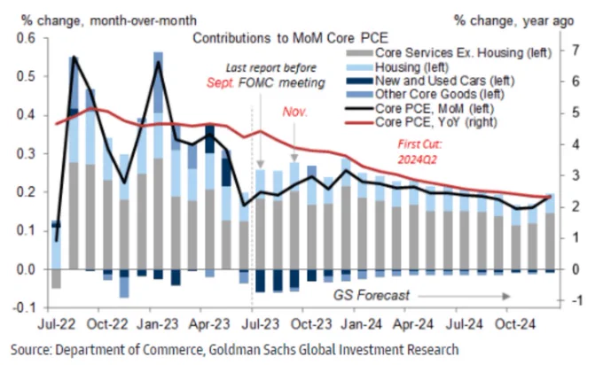
@MTSInsights @SnippetFinance @ValuablOfficial 10/ No Hike Needed?
"The latest inflation data support our expectation that the core trend will have slowed enough by November for the FOMC to conclude that a final hike is unnecessary - we expect the first cut in 2024Q2 with core PCE inflation below 3% YoY."
"The latest inflation data support our expectation that the core trend will have slowed enough by November for the FOMC to conclude that a final hike is unnecessary - we expect the first cut in 2024Q2 with core PCE inflation below 3% YoY."
11/ With a little over a month until the next FOMC meeting, the market is anticipating a pause to rate movement activity from the Fed.
However, a lot can change in 37 days.
However, a lot can change in 37 days.

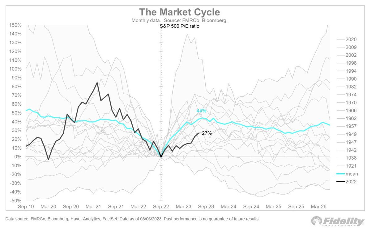
12/ The valuation component of this year's stock-market rally may be ending.
@TimmerFidelity: "That means earnings will need to do the heavy lifting from here. The forward P/E ratio for the S&P 500 has expanded by 27%. Timing for a valuation peak is about right".
@TimmerFidelity: "That means earnings will need to do the heavy lifting from here. The forward P/E ratio for the S&P 500 has expanded by 27%. Timing for a valuation peak is about right".
• • •
Missing some Tweet in this thread? You can try to
force a refresh