Most academics have the same boring PowerPoint presentations.
Before academia I worked for 8+ years in web design.
Here are 10 design guidelines and resources for an outstanding presentation:
👇
Before academia I worked for 8+ years in web design.
Here are 10 design guidelines and resources for an outstanding presentation:
👇

Some might dismiss design as unimportant in academia.
But it is not.
Bad design distracts and confuses your audience.
Good design stands out, it makes you memorable and the content simpler to grasp for your listeners.
This doesn't take much, so let's get started!
But it is not.
Bad design distracts and confuses your audience.
Good design stands out, it makes you memorable and the content simpler to grasp for your listeners.
This doesn't take much, so let's get started!
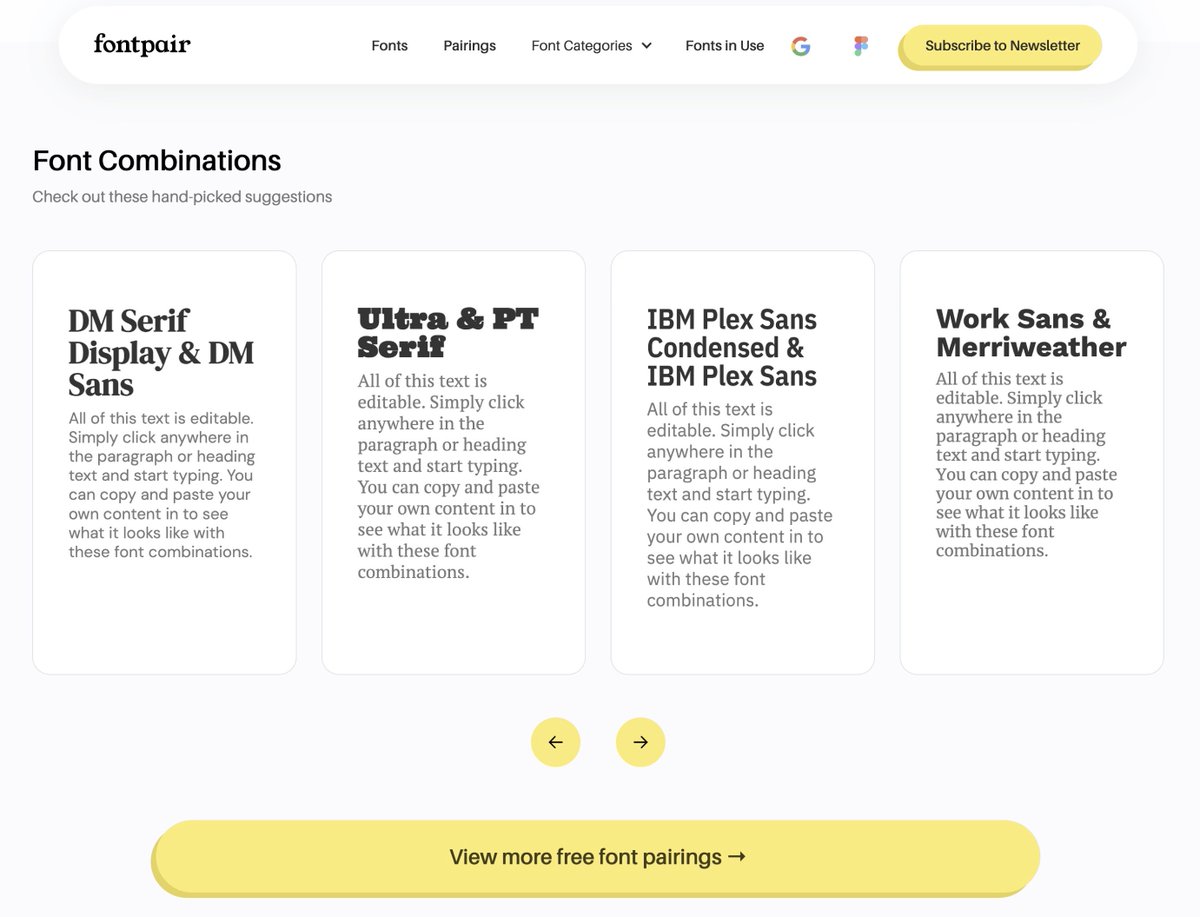
1. Picking the right fonts
❌ Don't pick fonts at random (and don't use Comic Sans!).
✅ Find harmonic pairings with Fontpair (Link at the end)
Rule of thumb: One font for headings, one font for running text.
Get free fonts from Google Fonts (1561 families currently).
❌ Don't pick fonts at random (and don't use Comic Sans!).
✅ Find harmonic pairings with Fontpair (Link at the end)
Rule of thumb: One font for headings, one font for running text.
Get free fonts from Google Fonts (1561 families currently).
2. Picking the right font sizes
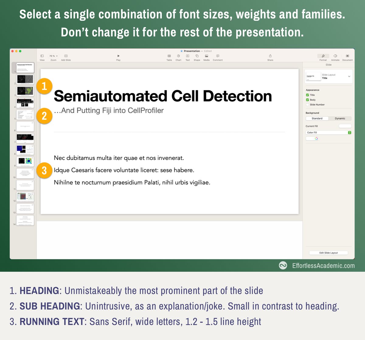
❌ Adjusting font size to "fit content"
✅ Pick 2-3 font sizes (heading, sub-heading, text), adjust your text to the size instead
Font size tells the reader what is more/less important. Different/random sizes are therefore confusing and noisy.
❌ Adjusting font size to "fit content"
✅ Pick 2-3 font sizes (heading, sub-heading, text), adjust your text to the size instead
Font size tells the reader what is more/less important. Different/random sizes are therefore confusing and noisy.
Join the EffortlessAcademic(dot)com to upgrade your experience as a student, lecturer or professor.
- Note Taking
- AI tools for Review and Synthesis
- Guides like this one
- Visual Thinking
- Note Taking
- AI tools for Review and Synthesis
- Guides like this one
- Visual Thinking
3. Picking a color palette
❌ Use the color picker in powerpoint
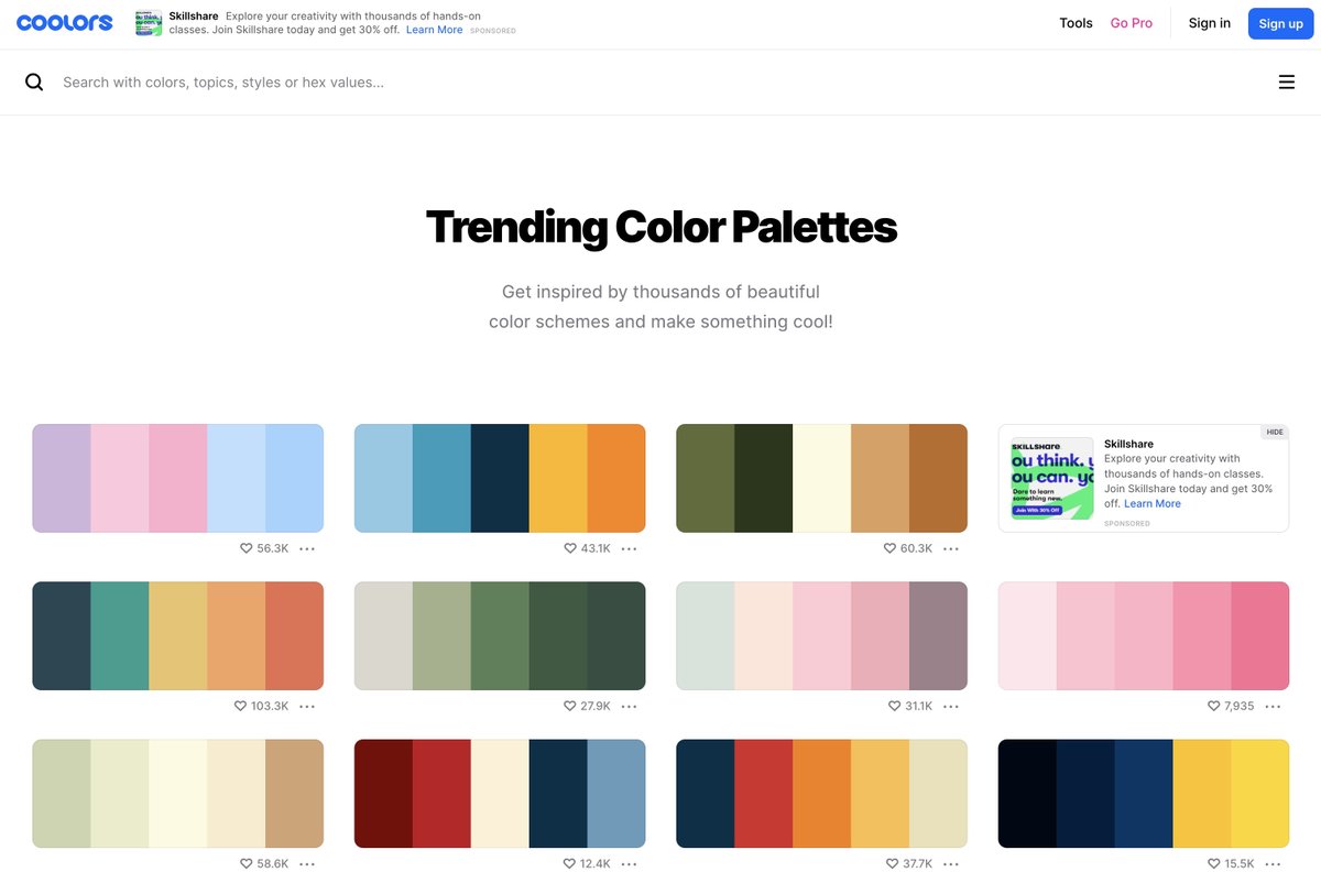
✅ Use a palette generator like colors(dot)co to pick harmonic combinations.
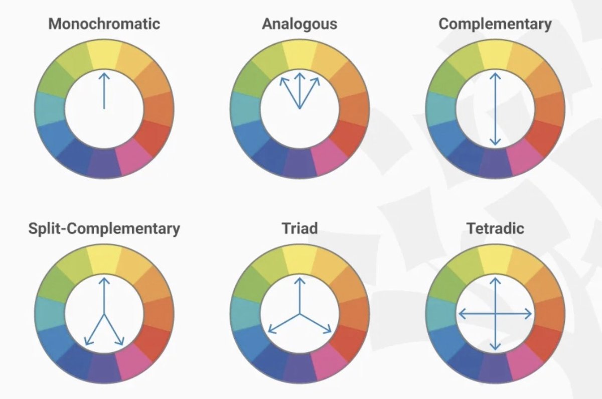
Designers arrange colors on a circle.
Starting at a base color you "rotate" a fixed number of degrees to get contrasts/compliments.


❌ Use the color picker in powerpoint
✅ Use a palette generator like colors(dot)co to pick harmonic combinations.
Designers arrange colors on a circle.
Starting at a base color you "rotate" a fixed number of degrees to get contrasts/compliments.
4. Use an off-white background
❌ Use default white background
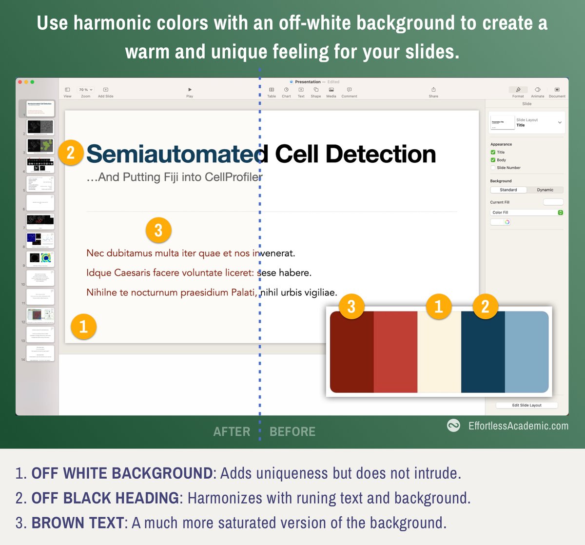
✅ Use a "washed out" version of your main color
The harshness of black-on-white disappears as colors start to harmonize.
Picking harmonic colors is like playing a harmonic chord on a guitar. It just sounds good.
❌ Use default white background
✅ Use a "washed out" version of your main color
The harshness of black-on-white disappears as colors start to harmonize.
Picking harmonic colors is like playing a harmonic chord on a guitar. It just sounds good.
5. Embrace empty space
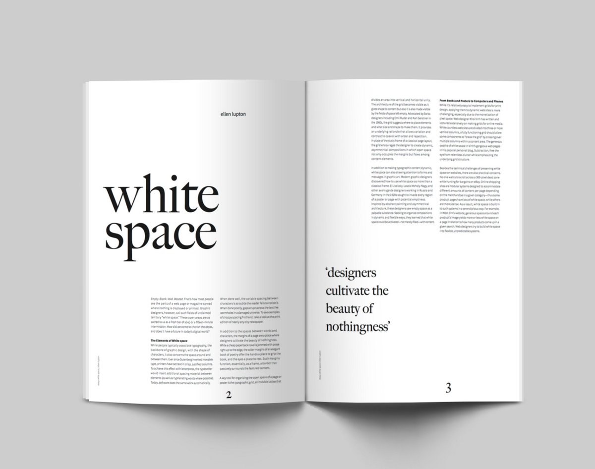
White space is not nothing.
It is a form of HIGHLIGHTING something.
Add as much whitespace as possible, without compromising the message.
Sometimes it is better to write LESS, invest in whitespace and get the message across.
White space is not nothing.
It is a form of HIGHLIGHTING something.
Add as much whitespace as possible, without compromising the message.
Sometimes it is better to write LESS, invest in whitespace and get the message across.
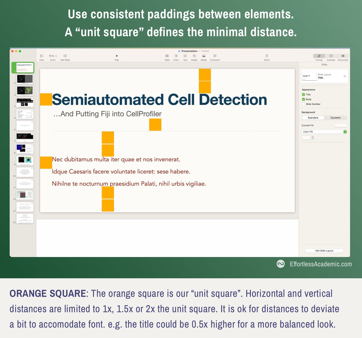
6. Consistent padding
This is the most common mistake, but very easy to correct.
Pick a SINGLE width that separates elements e.g.:
text to heading // paragraph to edge // image to text etc.
Use this "unit distance" for ALL paddings.
This is the most common mistake, but very easy to correct.
Pick a SINGLE width that separates elements e.g.:
text to heading // paragraph to edge // image to text etc.
Use this "unit distance" for ALL paddings.
7. Alignment
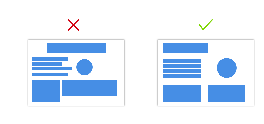
Whenever you have multiple elements, align them along one side.
This creates an axis of alignment, that makes your design more "stable".
(Avoid centered text as it is harder to align.)
Whenever you have multiple elements, align them along one side.
This creates an axis of alignment, that makes your design more "stable".
(Avoid centered text as it is harder to align.)
7b. Use align and distribute functions of Powerpoint
PowerPoint (and most other presentation software) has an alignment and distribute function.
Alignment: Aligns all elements on a single edge.
Distribute: Makes the spacing between elements uniform.
Here is how:
PowerPoint (and most other presentation software) has an alignment and distribute function.
Alignment: Aligns all elements on a single edge.
Distribute: Makes the spacing between elements uniform.
Here is how:
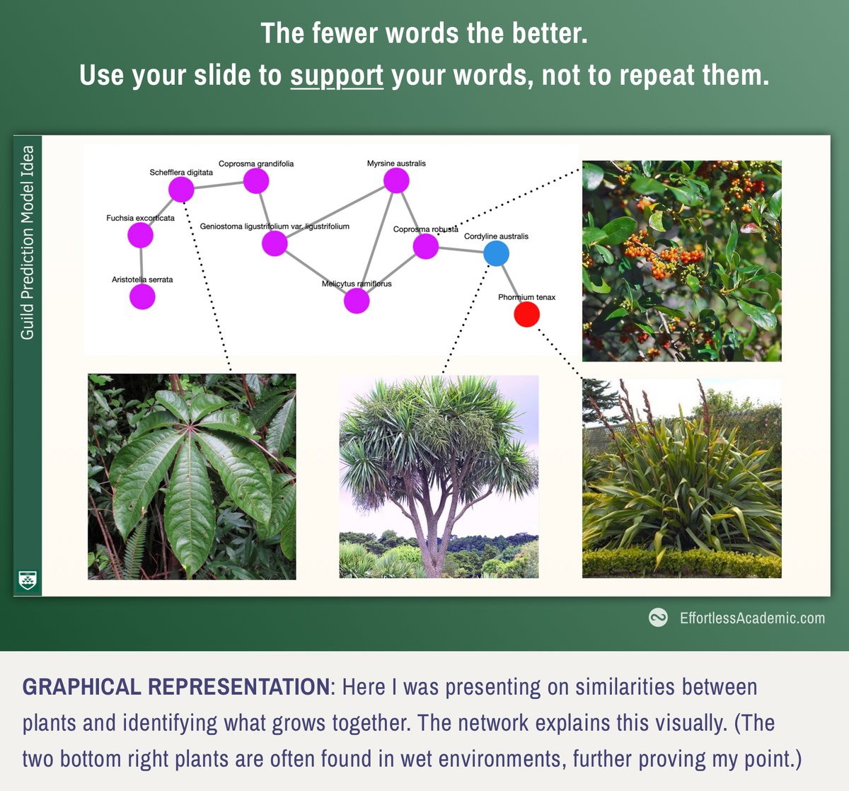
8. Less is always more
Every element on your slides competes with YOU.
Whenever you switch a slide, you will see listeners attention going there.
They stop listening for a second.
Instead: Support/summarize your words, don't replace them with the text on the slides.
Every element on your slides competes with YOU.
Whenever you switch a slide, you will see listeners attention going there.
They stop listening for a second.
Instead: Support/summarize your words, don't replace them with the text on the slides.
9. Avoid animations
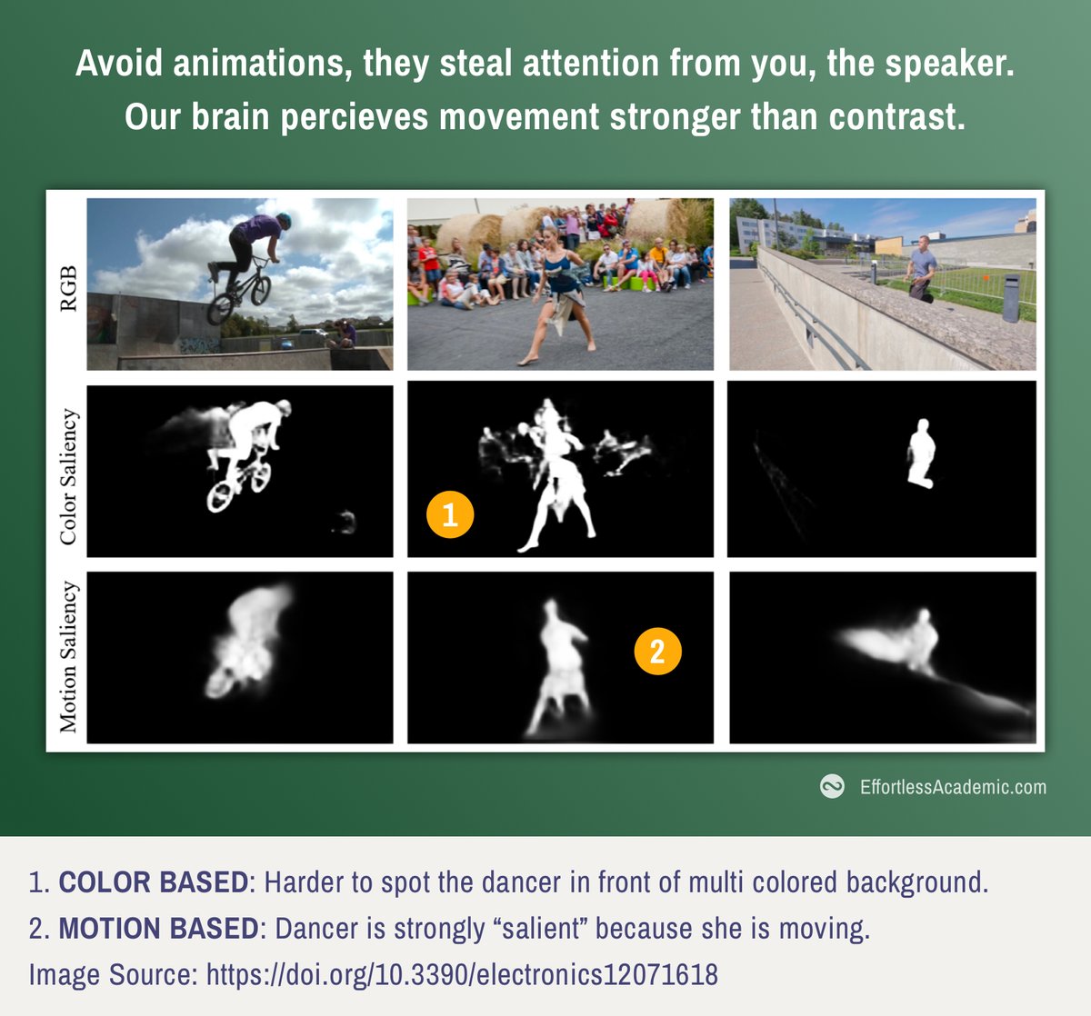
Our brain perceives movement MUCH stronger than colors/shapes or sizes.
Animations therefore are the strongest form of highlight.
Just like in previous point, it competes with YOU as the speaker.
Keep the reader captivated, not excited.
Our brain perceives movement MUCH stronger than colors/shapes or sizes.
Animations therefore are the strongest form of highlight.
Just like in previous point, it competes with YOU as the speaker.
Keep the reader captivated, not excited.
10. Skip the Thank you slide
The audience should thank the speaker, not vice versa.
You give your audience a gift.
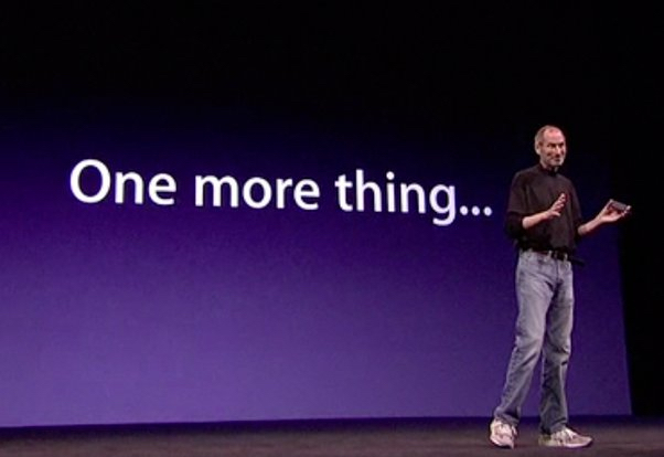
Instead end on a peak like Steve Jobs famously used to:
- A visionary statement
- An exciting announcement
- A memorable joke
- A provocative question
The audience should thank the speaker, not vice versa.
You give your audience a gift.
Instead end on a peak like Steve Jobs famously used to:
- A visionary statement
- An exciting announcement
- A memorable joke
- A provocative question
Summary:
- Use harmonic font and color combinations
- Pick a size/weight for fonts and stick to it
- Be generous with white space
- Consistently pad using a "unit square"
- Align elements along edges
- Use as few words as possible
- Avoid animations
- End on a peak
- Use harmonic font and color combinations
- Pick a size/weight for fonts and stick to it
- Be generous with white space
- Consistently pad using a "unit square"
- Align elements along edges
- Use as few words as possible
- Avoid animations
- End on a peak
Links:
Color Pairing:
Free Fonts:
Font Pairing:
-
My Courses/Newsletter: coolors.co
fonts.google.com
fontpair.co
effortlessacademic.com
Color Pairing:
Free Fonts:
Font Pairing:
-
My Courses/Newsletter: coolors.co
fonts.google.com
fontpair.co
effortlessacademic.com
Please consider following my work here on Twitter or checking out the link in my profile.
I would also love to see some of your presentations. Upload a screenshot, and I will give you some feedback on how to improve.
I would also love to see some of your presentations. Upload a screenshot, and I will give you some feedback on how to improve.
• • •
Missing some Tweet in this thread? You can try to
force a refresh

 Read on Twitter

