PMC C0VID-19 Tracker, Aug 30, 2023
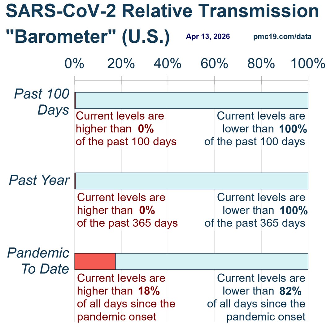
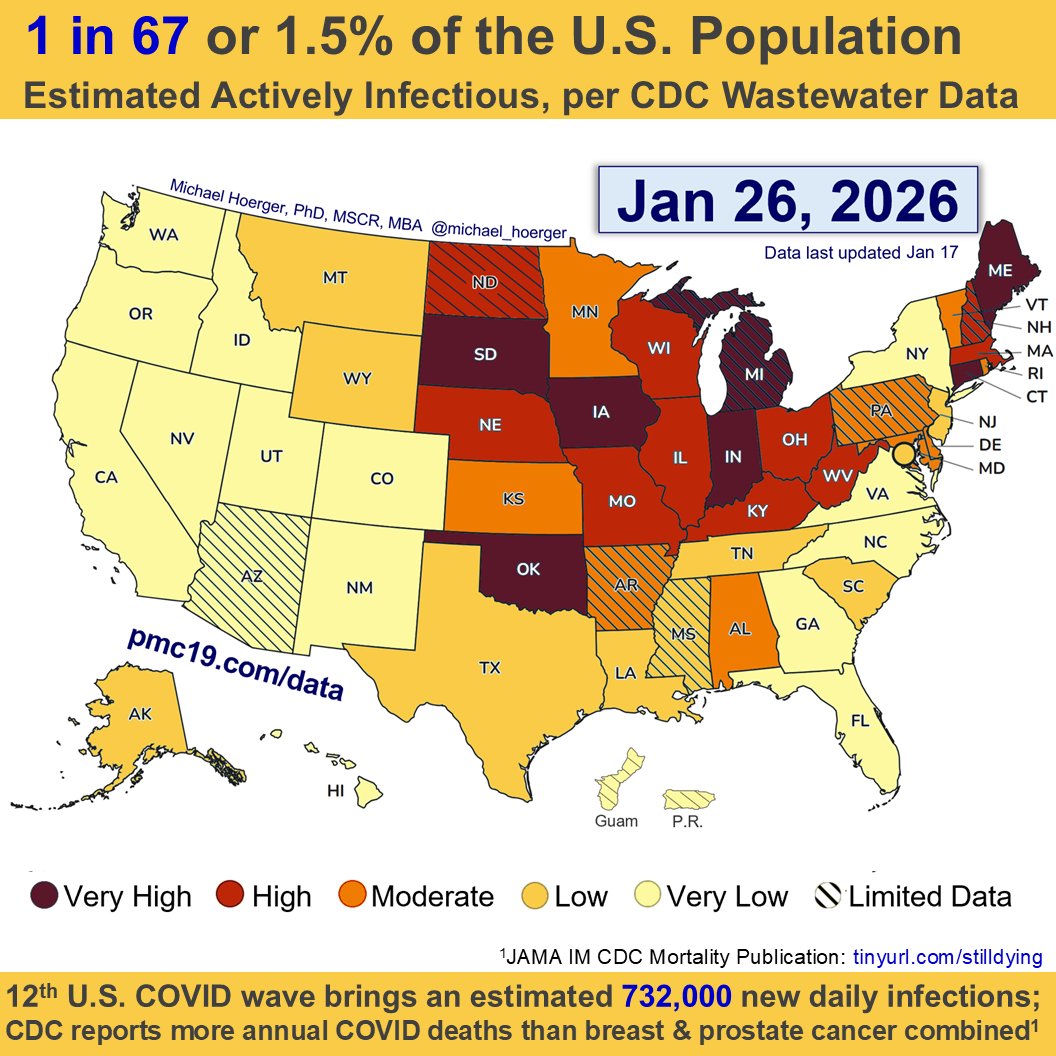
U.S. #wastewater levels are higher than during the majority (63.1%) of the pandemic:
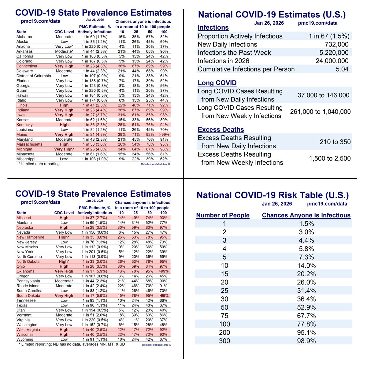
🔹1.69% (1 in 59 people) are infectious
🔹800,000 new daily COVID-19 cases
🔹Causing 40-160K #LongCOVID cases per day
Technical details follow...
1/
U.S. #wastewater levels are higher than during the majority (63.1%) of the pandemic:
🔹1.69% (1 in 59 people) are infectious
🔹800,000 new daily COVID-19 cases
🔹Causing 40-160K #LongCOVID cases per day
Technical details follow...
1/

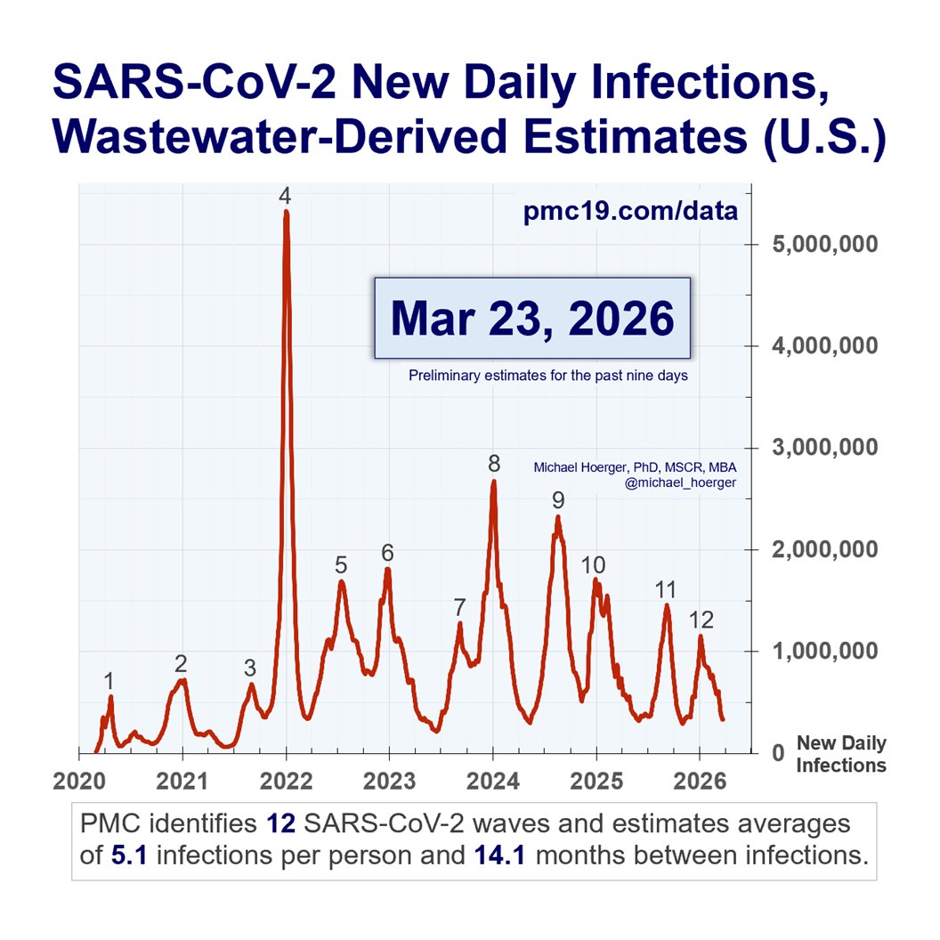
What’s the Current State of the Pandemic?
We are near the peak (hopefully) of a 7th U.S. C0VID wave.
Transmission remains very high. The U.S. has seen >165 million infections this year, leading to at least 8 million #LongCOVID cases.
2/
We are near the peak (hopefully) of a 7th U.S. C0VID wave.
Transmission remains very high. The U.S. has seen >165 million infections this year, leading to at least 8 million #LongCOVID cases.
2/

How Well are the PMC Models Performing?
Deep dive:
3/
When our models are supplied with accurate real-time data, they are extremely accurate forecasting (e.g., R^2 = 96% for 1-week predictions).
Unfortunately, the Biobot real-time wastewater reports are often corrected substantially. If we had been supplied with the “correct” wastewater levels last week, we would have accurately predicted this week’s wastewater levels for the first time with 0% error (predicted: 554 copies/mL, actual: 554 copies/mL).
The PMC models place a huge emphasis on recent reports, so if recent reports are bad, this throws off the models. Indeed, prior Biobot data suggested the summer wave had peaked recently, and now it seems about 2 weeks away (if no surge).
These are actually quite marginal errors -- hopefully. Predicting the exact day of a “peak” amid a wide plateau is hard and of marginal relevance to decision making. It's like predicting the hottest day of the summer when it's about 100 degrees F for two months straight.
But even with these rough data, the overall pattern and levels remain close to predictions and historical averages.
The pandemic is not “over.”
When describing the current wave to people, it’s useful to characterize as “we’re somewhere between 2/3 Delta and Delta at present.” Avoid understating or overstating, as it will undermine credibility.
The point is to get the models as accurate as possible, even while the broader story remains unchanged (bad situation like Delta, worse than much of the past 6 months, hopefully peaking soon, better October, then 3 very bad months).
Given the issues with the real-time Biobot data, we’re updating the models in a few ways:
1) offering a few models and a composite
2) incorporating models that work around potential issues with the real-time reports (described next), and
3) adding additional external data (future models, which may incorporate air travel data, weather data, and more).
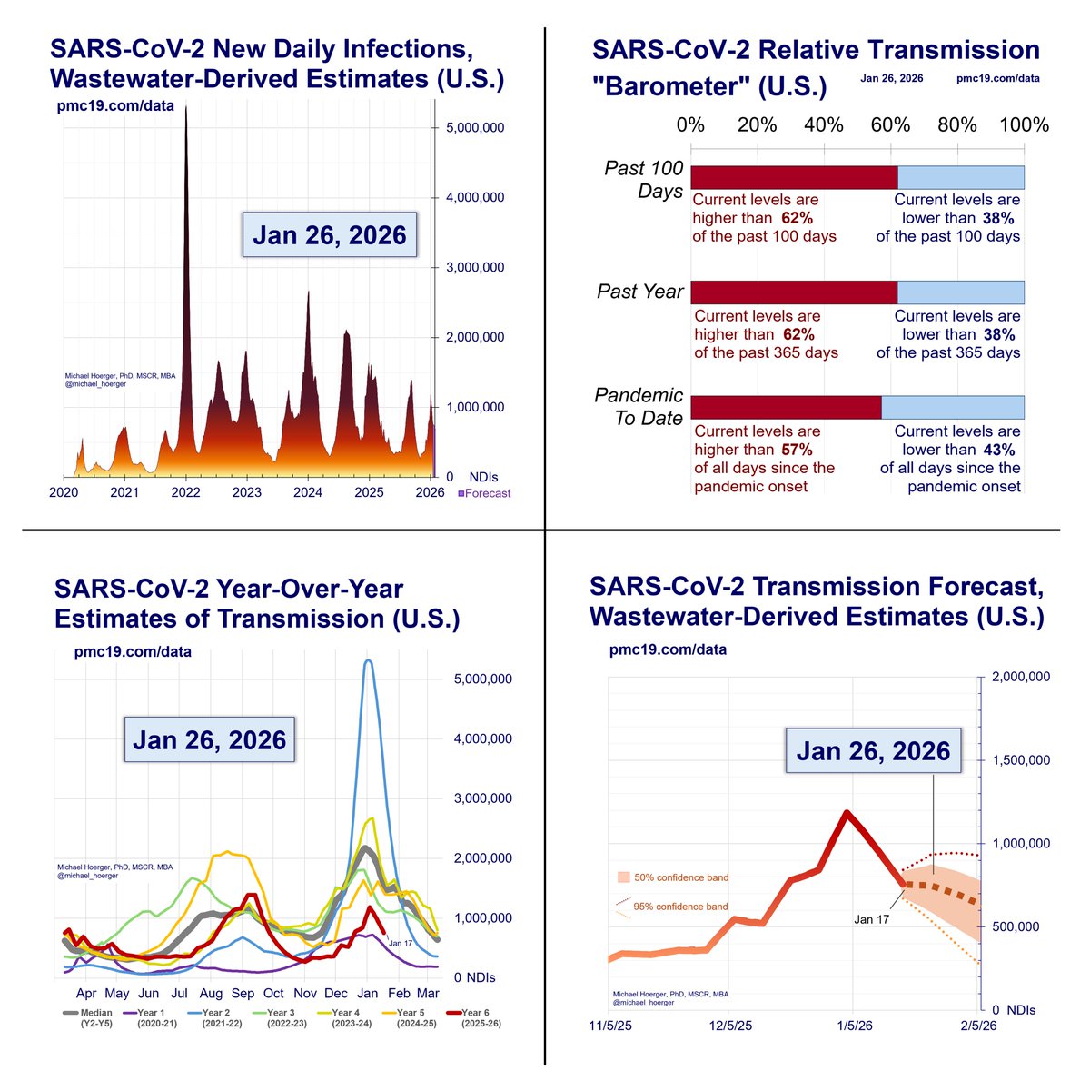
What’s the C0VID Forecast for the Next Month?
If there’s no immune-evading surge, there should be a rise in cases and then decline to the current levels. Historically, October sees a large drop, and we’d expect the same if no immune-evading surge.
4/
Details...
You’ll see several different forecasting models that have different peaks but the same overall pattern.
The models:
-General update:
All models incorporate historical data and recent data. Previously, we used historical data on monthly variation in levels and recent data on levels the past 4 weeks. Current models have two updates. One, they include the year (2020, 2021, 2022, 2023), though this improves precision quite marginally. Two, instead of monthly variation, they use half-month variation (imagine each year chopped into 24 “half months,” with annualized averages across the pandemic, e.g., a 2nd-half of September estimate). This is very important. Historically, September has lower levels than August. BUT levels in early September are much higher than late September (think school transmission). If this specification had been incorporated sooner, we’d have expected a slower decline in the late-summer wave. Instead of a gradual decline in September, imagine a plateau from mid-Aug to mid-Sep, following by a steeper decline.
-Real-time model: ⌚️
This is the standard model. It assume biobot’s real-time wastewater levels are accurate.
-Turtle model (slow, conservative): 🐢
This model ignores the most recent week of biobot data, essentially deeming it useless. You will notice the real-time (red) and turtle (green) forecasts overlap exactly. This is because the turtle model ignoring this week’s data predicted it exactly accurately based on last week’s data. Expect more divergence in the future. This was a weird fluke.
-Cheetah model (fast, aggressive): 🐆
This model aims to get ahead of biobot real-time mistakes. If biobot’s real-time reports were underestimates by 15% last week, it assumes the current week’s reports are an underestimate of 15%. Think more aggressive models. We presented this previously as an alternative model, then dismissed it, and now have brought it back.
-Composite model: ⌚️🐢🐆
It’s the arithmetic average of the three models, used for generating the other statistics.

As of Aug 30, What’s the Risk in an Office or in a Classroom?
The office and classroom risks remain quite bad.
🔥🔥🔥
5/
Details...
In a group of 10 people (daycare, team meeting, etc.), there’s a >15% chance someone will have infectious COVID. In a group of 20-25 people (e.g., K-12 classroom, department meeting, busy hospital waiting room, etc.), there’s about a 30% chance someone would have infectious COVID. In a university classroom of 40 people, it should be assumed someone has infectious COVID. This is quite troubling for instructors or students who mix time with multiple groups of classmates each week.
Not all classrooms and meetings are the same. Virtual meetings reduce risk close to zero. Outdoor meetings are often safer than indoors. Testing reduces risk, as do policies that encourage people to stay home when symptomatic. High-quality, well-fitting masks greatly reduce risk. Air quality monitoring and improved air cleaning reduce risk. Recent boosters reduce risk. It remains troubling that elected leaders and public health officials choose to model poor mitigation when ongoing risk is so high.

• • •
Missing some Tweet in this thread? You can try to
force a refresh