The most important graph in the world has been updated to include the last 150,000 years!
📄 Benthic δ¹⁸O records Earth’s energy imbalance
Great work by Sarah Shackleton, Alan Seltzer, Daniel Bagenstos and Lorraine Lisiecki (2023) in @NatureGeosci
1/
nature.com/articles/s4156…
📄 Benthic δ¹⁸O records Earth’s energy imbalance
Great work by Sarah Shackleton, Alan Seltzer, Daniel Bagenstos and Lorraine Lisiecki (2023) in @NatureGeosci
1/
nature.com/articles/s4156…
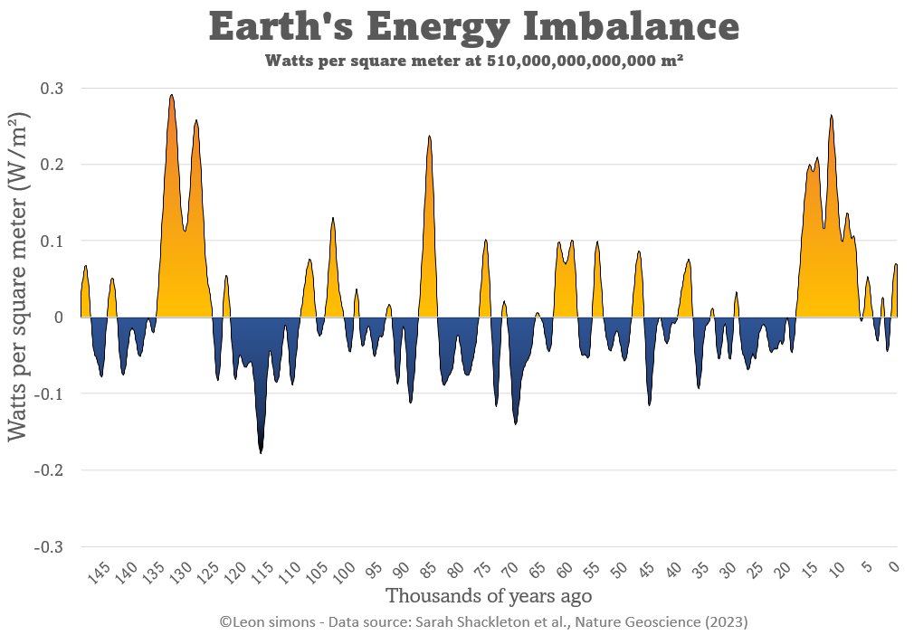
This shows the Earth's Energy Imbalance from a new perspective.
We have changed the rate at which heat accumulates on our planet beyond anything ever before.
We are finding out what this means together.
And we better pay attention.
Rapid changes come with great risks!
2/2
We have changed the rate at which heat accumulates on our planet beyond anything ever before.
We are finding out what this means together.
And we better pay attention.
Rapid changes come with great risks!
2/2

The paper has a very insightful "agnostic" approach to Earth's Energy Imbalance of the past, by looking at differences in oxygen isotopes from a sea level (water turning to ice and vice versa) and global ocean temperature perspective.
It doesn't seem to matter very much what the heat was directed towards, if you mainly care about the absolute Earth Energy Imbalance numbers.
More in this infographic and description:
Agnostic reconstruction of Earth’s energy imbalance (EEI) from δ18Obenth. Here we outline the steps taken to calculate EEI from δ18Obenth (left to right), which are described in detail in the methods. Briefly, δ18Obenth21 (left) is converted into sea level (second panel, top in yellow) and ocean temperature (second panel, bottom in green) using the assumption that the δ18Obenth signal is entirely attributed to one or the other. We then calculate the energy change associated with ice sheet buildup/melting from the sea level reconstruction (third panel, yellow) and with ocean warming/cooling from the ocean temperature reconstruction (third panel, green). EEI is then calculated by taking the time derivative of the energy changes and averaging over Earth’s surface area (panel 4). The gray lines in panels 3 and 4 show the calculated the global energy change (ΔEglobal) and EEI if we assume a constant 60/40 split of δ18Obenth between ice volume and ocean temperature changes.

The 150,000 year Earth's Energy Imbalance figure (c) from the paper:

@MartinWermuth @WeatherProf ceres-tool.larc.nasa.gov/ord-tool/jsp/E…
Here I've added the +0.5 W/m² average Earth's Energy Imbalance from 1971-2020 from von Schuckmann et al. (2023)

• • •
Missing some Tweet in this thread? You can try to
force a refresh