In this THREAD I will explain the following points:
1. What is a Heatmap?
2. Bubbles of liquidity and Time Frames
3. Liquidation Profile
4. Cumulative Liquidation Levels Delta
5. $BTC and $ETH analysis on-chain
(1/11) 🧵
1. What is a Heatmap?
2. Bubbles of liquidity and Time Frames
3. Liquidation Profile
4. Cumulative Liquidation Levels Delta
5. $BTC and $ETH analysis on-chain
(1/11) 🧵

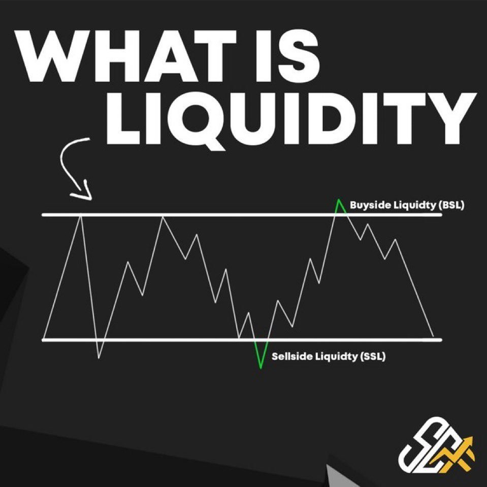
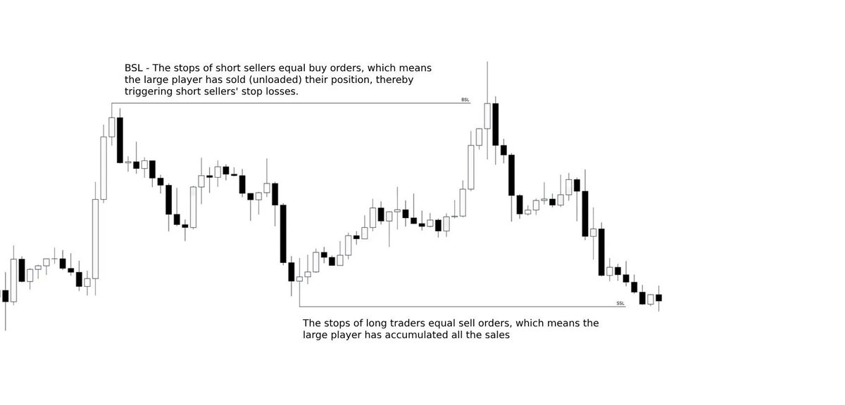
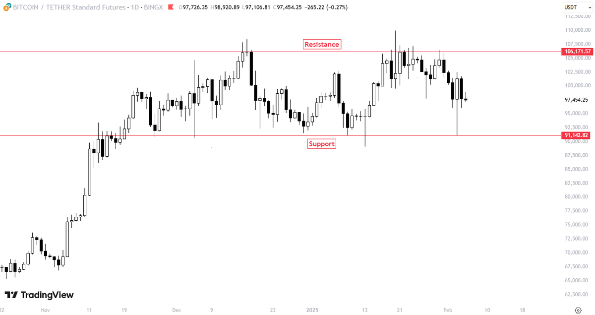
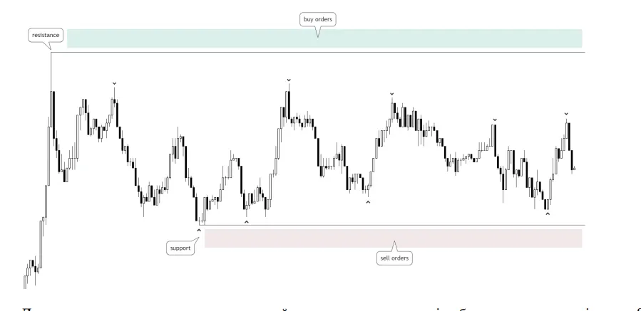
Concepts: Liquidations and stops of leveraged positions are usually placed below supports and above resistances.
This leads to an accumulation of stops and liquidations at specific areas, at certain prices.
These zones are of great interest for traders.
This leads to an accumulation of stops and liquidations at specific areas, at certain prices.
These zones are of great interest for traders.
As millions of dollars are concentrated on those areas, big leveraged positions start to appear, in order to frontrun that liquidity.
Additionally, these levels can cause great pressure on one side of the orderbook causing price to reverse.
Additionally, these levels can cause great pressure on one side of the orderbook causing price to reverse.
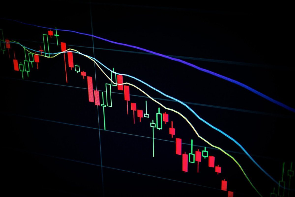
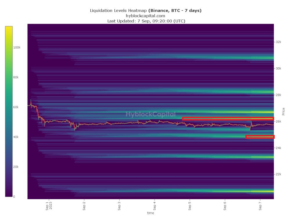
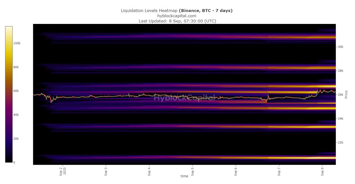
1. Heatmaps: The heatmap is a visual representation of the limit orders put into the order book. It’s a color-coded display of activity of pending orders.
The brighter the color on a zone, the more millions accumulated that zone. There are Heatmaps in various TF: LTF and HTF.
The brighter the color on a zone, the more millions accumulated that zone. There are Heatmaps in various TF: LTF and HTF.

The Liquidation Heatmap: Enables traders to identify areas of high liquidity, which can be helpful in different ways:
- Magnetic Zones: A high concentration of potential liquidation levels at a specific price range
- Forms Support/Resistance Zones.
- Magnetic Zones: A high concentration of potential liquidation levels at a specific price range
- Forms Support/Resistance Zones.
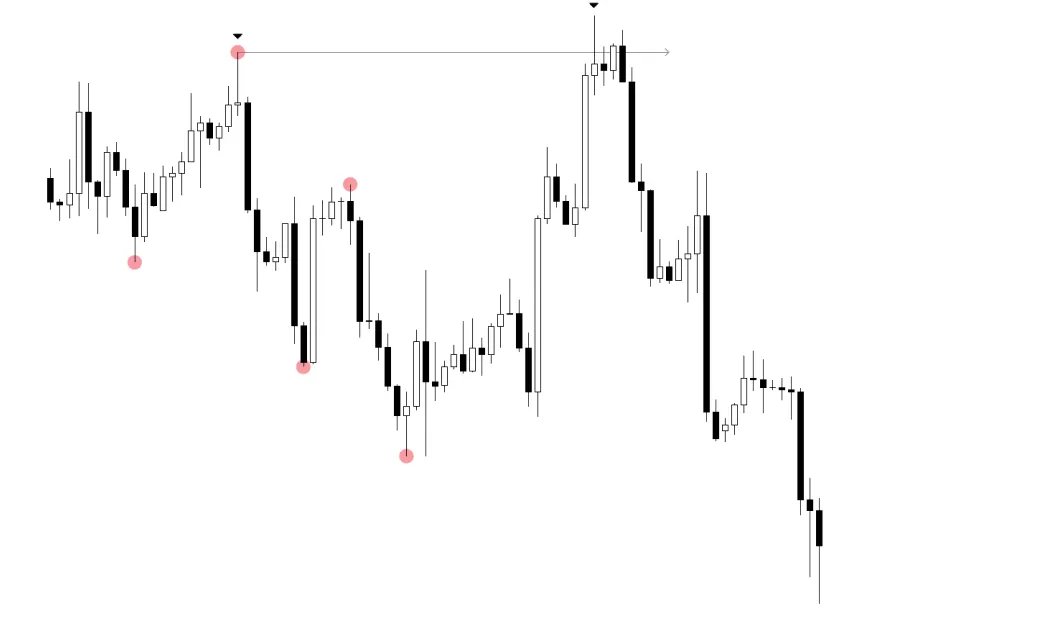
2. Liquidation Levels / Bubbles of liquidity:
It’s similar to a heat map, but they are more complex:
- The bubbles are showing new positions and their liquidation level.
- The bigger the bubbles, the bigger the positions.
- Different colors are showing different leverages.
It’s similar to a heat map, but they are more complex:
- The bubbles are showing new positions and their liquidation level.
- The bigger the bubbles, the bigger the positions.
- Different colors are showing different leverages.

3. The Liquidation Profile: Shows the size of liquidation levels that have not been hit.
The bigger the spike, the bigger the positions.
I marked with a red box, where the liquidation profile is at. Is representend in MILLIONS of DOLLARS.
The bigger the spike, the bigger the positions.
I marked with a red box, where the liquidation profile is at. Is representend in MILLIONS of DOLLARS.
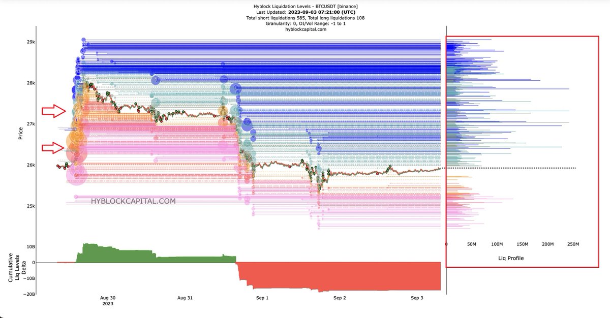
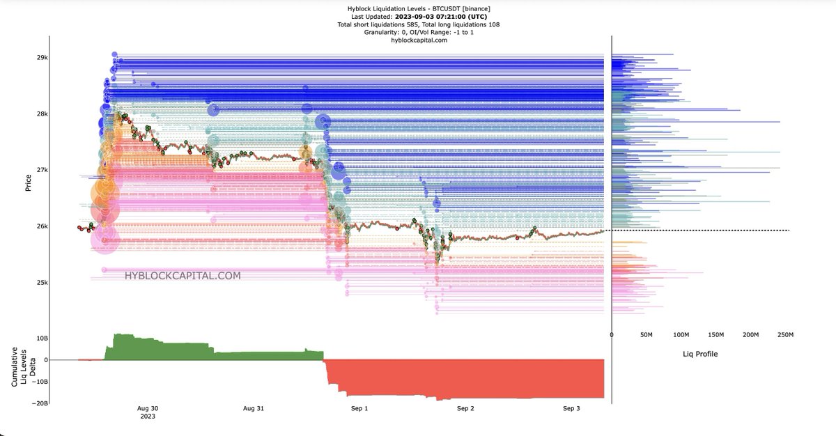
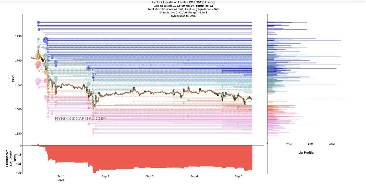
4. Cumulative Liquidation Levels Delta: Shows the difference of long and short liquidations.
In this example, there are: $4B more LONG than SHORT LIQUIDATIONS to hit in this timeframe.
Cumulative Liquidation Levels is represented in BILLIONS, of LONG and SHORT LIQUIDATIONS.
In this example, there are: $4B more LONG than SHORT LIQUIDATIONS to hit in this timeframe.
Cumulative Liquidation Levels is represented in BILLIONS, of LONG and SHORT LIQUIDATIONS.
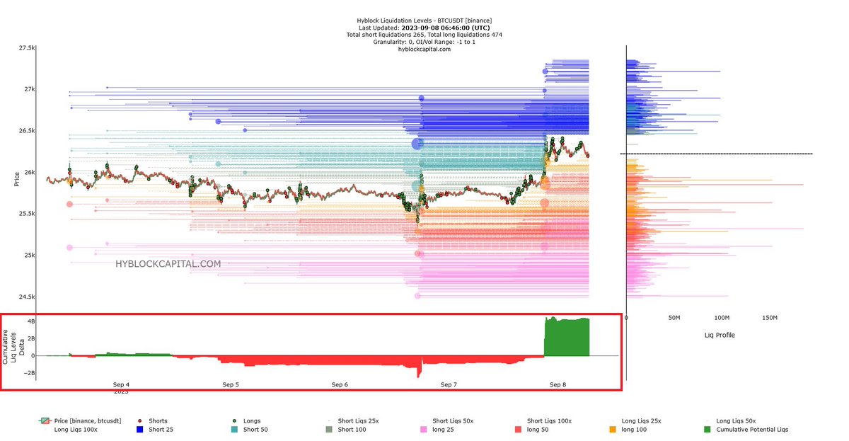
The DELTA indicates which side has a greater presence of liquidity.
When the delta becomes very large (for example, $10 billion), it is likely that the price will move in that direction.
More short liquidations → price moves higher, hitting the liquidations.
When the delta becomes very large (for example, $10 billion), it is likely that the price will move in that direction.
More short liquidations → price moves higher, hitting the liquidations.
5. $BTC and $ETH analysis on-chain:
Through on-chain analysis, you will be able to anticipate the market, by knowing how many millions are being traded in the market, and in what trend
Heatmaps and Liquidation levels are available for $BTC and $ETH.
Through on-chain analysis, you will be able to anticipate the market, by knowing how many millions are being traded in the market, and in what trend
Heatmaps and Liquidation levels are available for $BTC and $ETH.
I hope this THREAD has helped you to understand Liquidation Levels and Heatmaps.
If you have any doubt, ask in the comments.
RT and FAV to spread the THREAD is appreciated.
If you have any doubt, ask in the comments.
RT and FAV to spread the THREAD is appreciated.
• • •
Missing some Tweet in this thread? You can try to
force a refresh