 Read on Twitter
Introducing #Harmony, a new UI color palette for product designers.
Harmony combines cutting-edge color technology, providing precise UI element contrast control, extremely consistent color shades, and P3 gamut support.
It’s free and available in Figma Community.
Harmony combines cutting-edge color technology, providing precise UI element contrast control, extremely consistent color shades, and P3 gamut support.
It’s free and available in Figma Community.
Begin here:
You’ll discover the palette neatly organized in the “Harmony Primitives” collection. Utilize it to craft aliases for your semantic tokens and set up UI theming modes.
P. S. Keep mirrored contrast pairs in mind (we’ll delve into these later).figma.com/community/file…
You’ll discover the palette neatly organized in the “Harmony Primitives” collection. Utilize it to craft aliases for your semantic tokens and set up UI theming modes.
P. S. Keep mirrored contrast pairs in mind (we’ll delve into these later).figma.com/community/file…
So, what makes it so special?
Harmony’s primary focus is accessibility, specifically visual contrast. It’s designed to enhance control over the contrast between UI elements, which is especially useful for designing both light and dark themes.
Let’s dive into features!
Harmony’s primary focus is accessibility, specifically visual contrast. It’s designed to enhance control over the contrast between UI elements, which is especially useful for designing both light and dark themes.
Let’s dive into features!

1/7
Equal contrast within lightness levels
UI color palettes offer various levels of lightness for each color, such as Blue 100, Blue 200, Blue 300, and so on.
Equal contrast within lightness levels
UI color palettes offer various levels of lightness for each color, such as Blue 100, Blue 200, Blue 300, and so on.
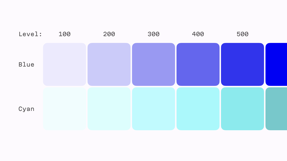
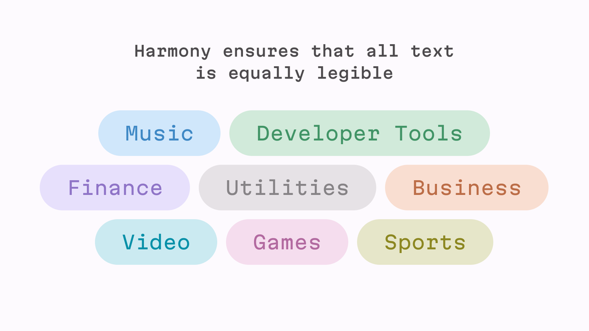
The problem arises when you expect that text set in Blue 600 will be equally readable as text set in Cyan 600 because they both have a lightness level of 600.
Sadly, this is not true for 9 out of 10 UI palettes.
Sadly, this is not true for 9 out of 10 UI palettes.
However, it is true for Harmony.
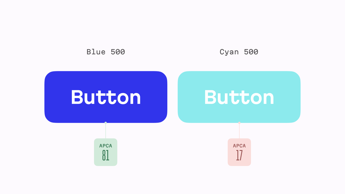
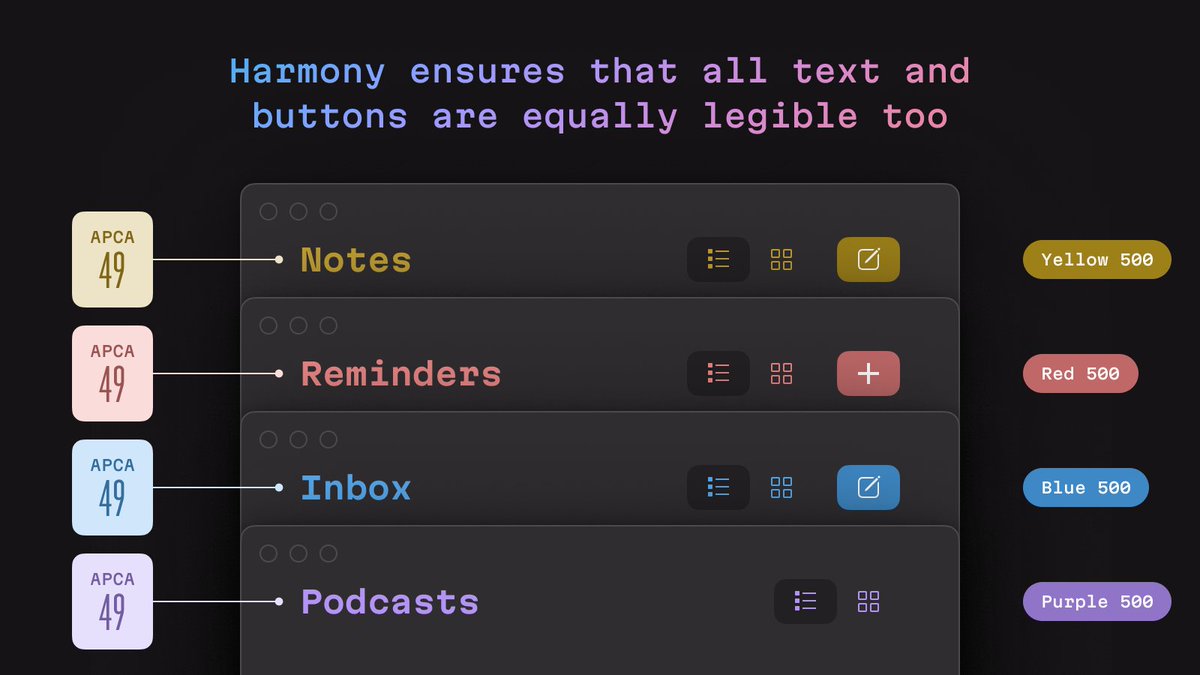
Here, all colors within the same lightness group—Blue 600, Cyan 600, and even all grays at the 600 level—have identical contrast (65) with a white background.
Here, all colors within the same lightness group—Blue 600, Cyan 600, and even all grays at the 600 level—have identical contrast (65) with a white background.
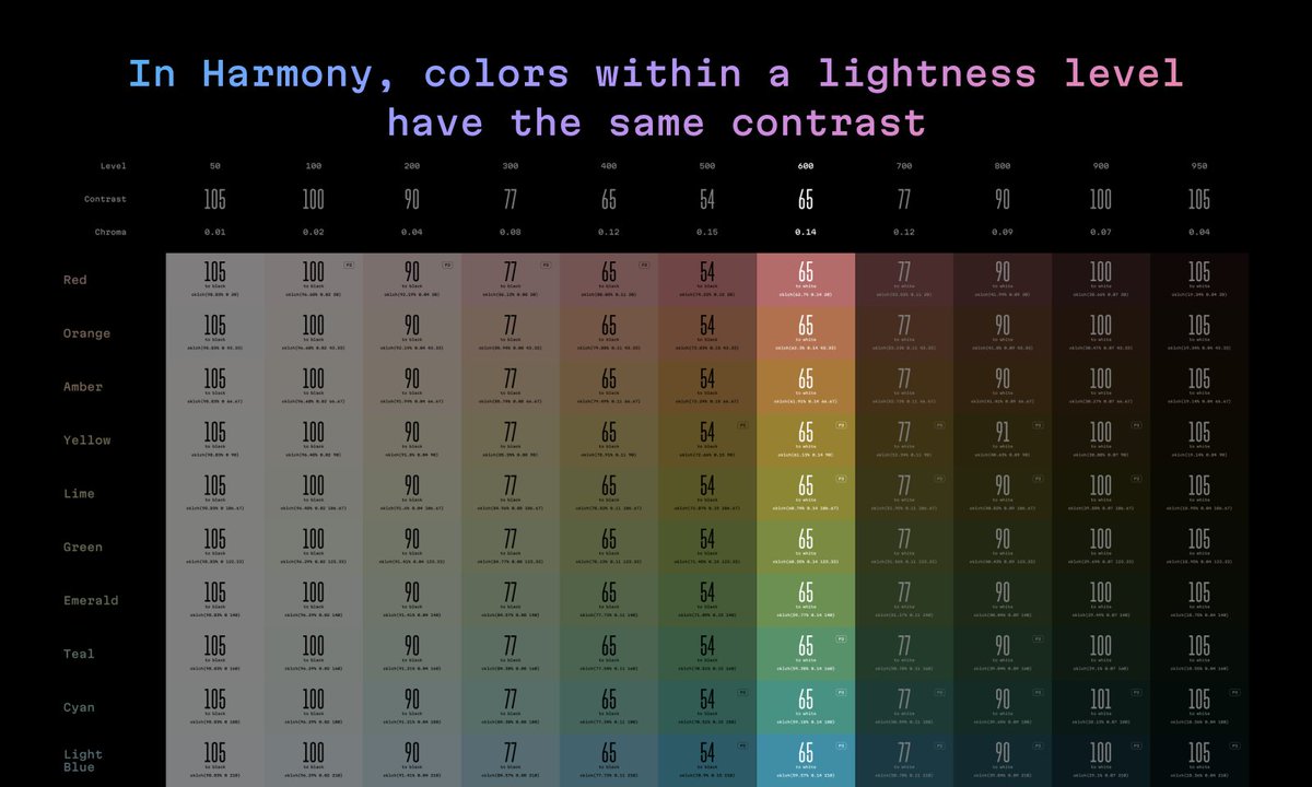
So, you can confidently use different colors for notification types, tags, or user avatars.
Harmony ensures that the APCA contrast value between the color and its background remains consistent.
Harmony ensures that the APCA contrast value between the color and its background remains consistent.
This also means that if your UI allows users to switch between multiple accent colors, like macOS and iOS do, all your text and buttons will remain equally legible too.
2/7
Mirrored contrast pairs
Dark shades in UI palettes are typically associated with light UI themes, while light shades are linked to dark themes, right?
Mirrored contrast pairs
Dark shades in UI palettes are typically associated with light UI themes, while light shades are linked to dark themes, right?
The Harmony palette takes precision to a new level in this regard. Notice that every color column on the left, except the central one, has a pair with the same contrast level on the right: 65 and 65, 77 and 77, and so on.
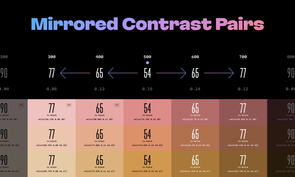
I’m sure you’ve already grasped this: using colors from mirrored columns not only simplifies the process of creating semantic token aliases for UI themes but also ensures identical color contrast for text and buttons.
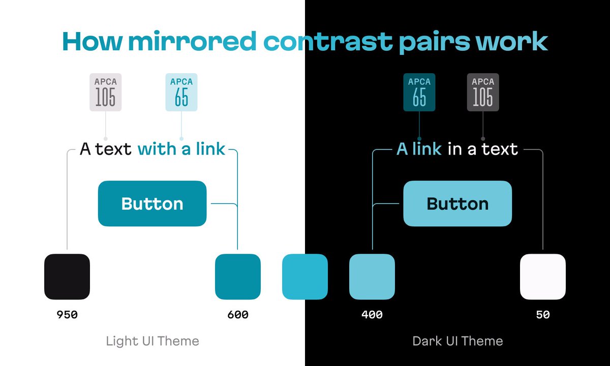
The contrast levels in these mirrored columns aren’t random; they align with APCA guidelines, and they even exceed them.
You can find more information about these guidelines on the APCA calculator website by @MyndexResearch: myndex.com/APCA/
You can find more information about these guidelines on the APCA calculator website by @MyndexResearch: myndex.com/APCA/
3/7
P3 gamut for maximum color
Let’s face it: many accessible palettes look somewhat dull. This is an inevitable consequence of maintaining consistent chroma and lightness within a palette.
P3 gamut for maximum color
Let’s face it: many accessible palettes look somewhat dull. This is an inevitable consequence of maintaining consistent chroma and lightness within a palette.
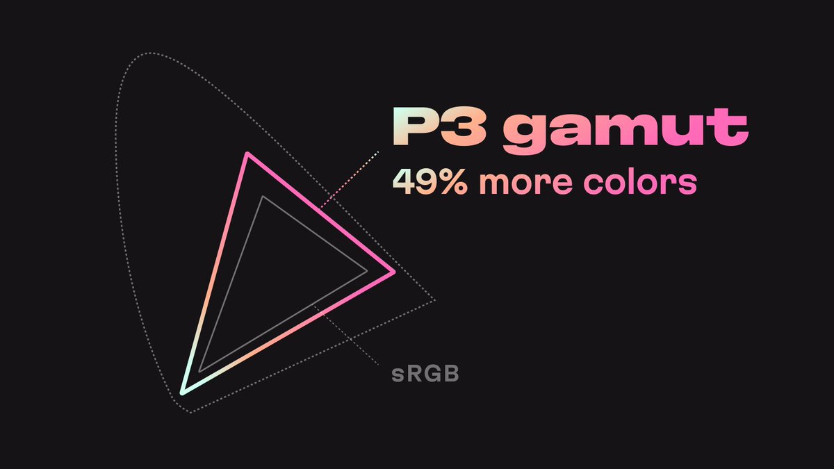
However, thanks to the introduction of new colors from the P3 gamut and Figma’s support for them, we’ve managed to maximize colorfulness for every color sample in Harmony.
Make sure to use the Display P3 color profile in Figma to access all those vibrant colors.
Additionally, look for the seventh feature to discover the best strategy for transferring colors from Figma to CSS.
help.figma.com/hc/en-us/artic…
Additionally, look for the seventh feature to discover the best strategy for transferring colors from Figma to CSS.
help.figma.com/hc/en-us/artic…
4/7
Consistent chroma for similar objects
In Harmony, the Chroma parameter, which controls color vibrancy, remains consistent within a lightness group.
Consistent chroma for similar objects
In Harmony, the Chroma parameter, which controls color vibrancy, remains consistent within a lightness group.
This means that semantically similar but differently colored objects, such as user avatars, tags, and notifications, will share a cohesive appearance, even if they are placed in various parts of the UI.

Let me emphasize this once more: take a moment to appreciate how consistent these colors appear!
Our brains recognize this similarity and consider even multicolored objects as part of the same family. Designers often overlook this level of detail.
Our brains recognize this similarity and consider even multicolored objects as part of the same family. Designers often overlook this level of detail.
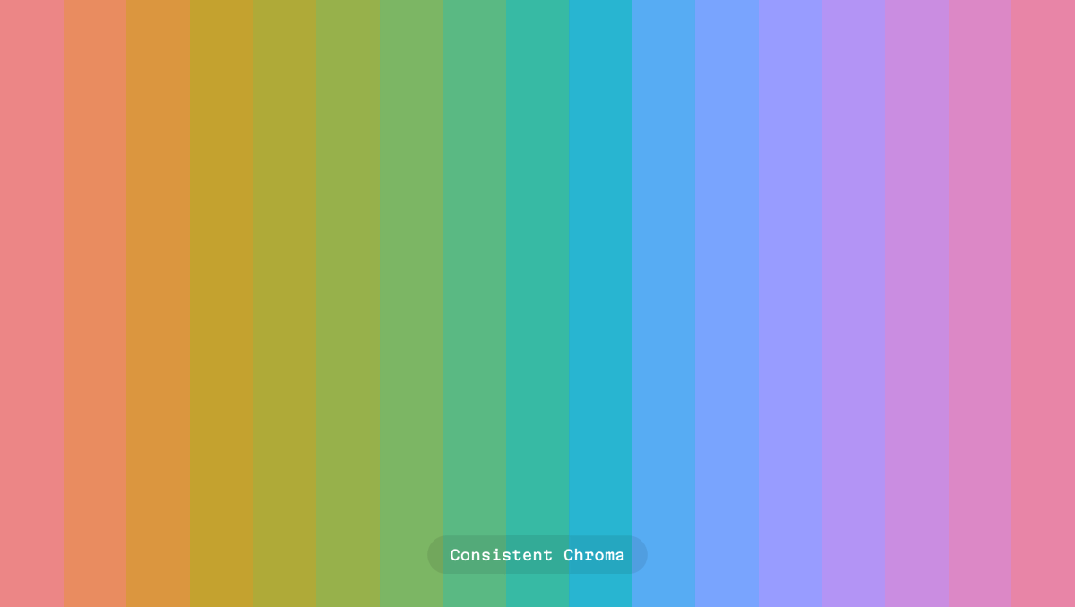
Equal chroma and perceptual lightness are responsible for this effect. This is achieved thanks to OKLCH color space and APCA algorithm that powers Harmony under the hood.
If you’d like to delve deeper into OKLCH, read this post on the @evilmartians blog.
evilmartians.com/chronicles/okl…
If you’d like to delve deeper into OKLCH, read this post on the @evilmartians blog.
evilmartians.com/chronicles/okl…
5/7
Figma variables support
As mentioned before, Harmony can be found in the “Harmony Primitives” collection of Figma variables. All you need to do is assign these variables to your semantic tokens and set up UI theming modes.
Figma variables support
As mentioned before, Harmony can be found in the “Harmony Primitives” collection of Figma variables. All you need to do is assign these variables to your semantic tokens and set up UI theming modes.
I strongly recommend transitioning from styles to variables in Figma, as variables support aliasing, a crucial feature for creating scalable and adaptable design systems.
For more detailed information, refer to the Figma documentation.
help.figma.com/hc/en-us/artic…
For more detailed information, refer to the Figma documentation.
help.figma.com/hc/en-us/artic…
6/7
Tailwind compatibile
The Harmony palette is completely compatible with the Tailwind palette. It aligns perfectly with its color count, lightness levels, and naming conventions.
Migrating to Harmony within an established Figma project should be a smooth transition.
Tailwind compatibile
The Harmony palette is completely compatible with the Tailwind palette. It aligns perfectly with its color count, lightness levels, and naming conventions.
Migrating to Harmony within an established Figma project should be a smooth transition.
7/7
OKLCH format for CSS
The HEX color format is slowly becoming obsolete. Furthermore, if you’re utilizing Display P3 mode in your Figma desktop app, copying and pasting HEX codes into CSS might not yield the desired results.
OKLCH format for CSS
The HEX color format is slowly becoming obsolete. Furthermore, if you’re utilizing Display P3 mode in your Figma desktop app, copying and pasting HEX codes into CSS might not yield the desired results.
To maintain color consistency between Figma and CSS, I strongly recommend using OKLCH color codes as the primary reference.
Harmony offers these codes for each color sample, so be sure to inform your frontend team.
Harmony offers these codes for each color sample, so be sure to inform your frontend team.
That’s Harmony!
I want to give credit to all Evil Martians designers who worked on the palette: @antiflasher and @strongeron.
Please share your feedback with us; we’re open and ready to help.
I want to give credit to all Evil Martians designers who worked on the palette: @antiflasher and @strongeron.
Please share your feedback with us; we’re open and ready to help.
One more thing! 😁
While developing Harmony, the Evil Martians design team created a color palette generator capable of producing Figma files similar to Harmony, but with a multitude of customizable parameters.
⬇️
While developing Harmony, the Evil Martians design team created a color palette generator capable of producing Figma files similar to Harmony, but with a multitude of customizable parameters.
⬇️
If you’d like us to release it to the public for free, please let us know by retweeting the initial tweet in this thread.
Here’s the deal: if we reach 100 retweets, we’ll share our UI color palette generator with everyone 🙌
Here’s the deal: if we reach 100 retweets, we’ll share our UI color palette generator with everyone 🙌
https://twitter.com/romanshamin_en/status/1707756732674416806
• • •
Missing some Tweet in this thread? You can try to
force a refresh