Our new article is out documenting the burden of the #pandemic on food service workers.
What it boils down to is fighting an #AIRBORNE virus with droplet dogma.
I will walk you through some of the more shocking highlights. 1/ 🧵
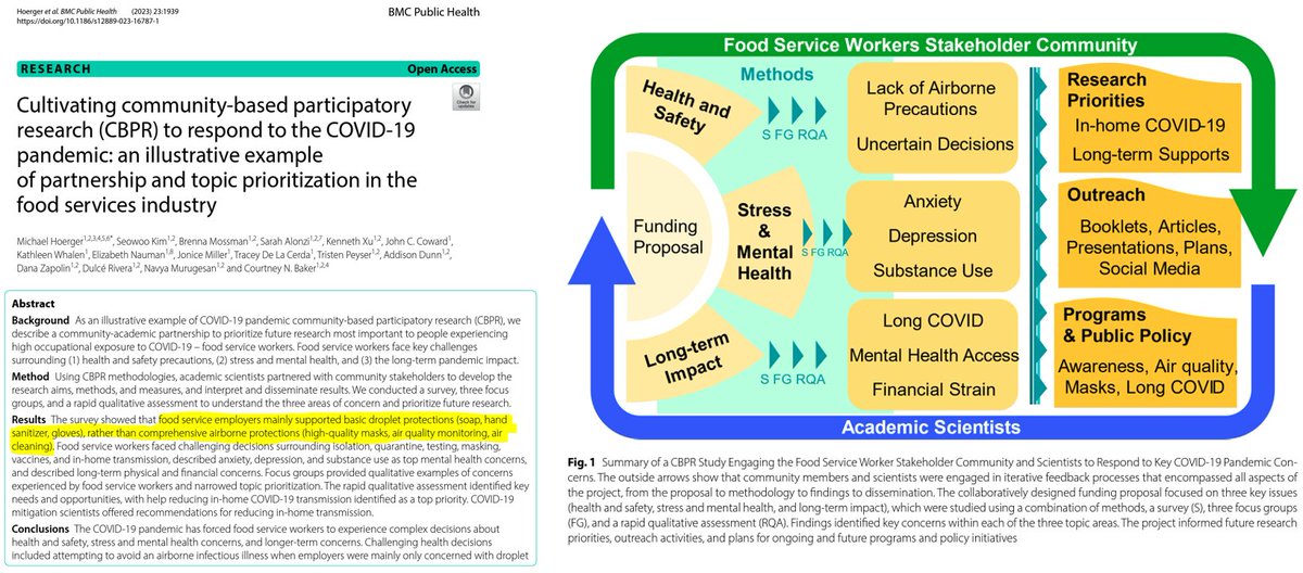
During the BA.1 Omicron wave, for example, food service workers could often get free #HandSanitizer.
Yet, free high-quality masks (e.g., #N95) were hard to come by.
N95s prevent people from inhaling airborne virus into their lungs. Hand sanitizer does not.
2/
With a lack of #PublicHealth guidance, many in the food service industry have faced decision fatigue in handling C0VID-related issues.
Participants said co-workers struggle with what to do if sick (87%), when to return to work (83%), or whether to get a booster (61%). 3/
Food service workers have expressed that C0VID has had a big impact on co-workers' #MentalHealth.
Anxiety, depression, and substance use lead the way. However, many respondents also noted a co-worker dealing with #bereavement, suicidal ideation, or violence (17-36%). 4/
Shortly after the BA.1 Omicron surge, many in the food service industry were aware of a co-worker dealing with #LongCOVID.
"Fatigue" (often EXHAUSTION) led the way. Many knew a co-worker with prolonged loss of taste or smell, which are huge to that occupation. 5/
In the more recent days of the pandemic, food service workers emphasized that a key priority was reducing in-home spread of C0VID.
Experts you know from Twitter provided their guidance on reducing in-home spread. Here's a link to another resource.
Biobot (blue) versus Verily (black) #wastewater data.
You'll see Verily data suggest the most recent wave (#7) has had considerably more transmission than Delta (#3). And that last winter (#6) was similar (or worse!) than the prior winter's BA.1 surge (#4).
Who wins?
1/
Here are the correlations among Biobot levels, Verily levels, & IHME true cases for the 1st of each month from Jan '21 to Apr '23.
Biobot correlates r=.94 (freakish) with IHME. Verily only correlates r=.67.
Either Biobot is much better, or Verily knows something we don't. 2/
The CDC awarded Biobot's contract to Verily.
Once Verily brings on Biobot's former CDC-contracted wastewater sites, that should help. Case estimation will be easier if they fold in the historic data to more accurately represent the nation.
U.S. #wastewater levels are higher than during 58% of the pandemic:
🔹 1.56% (1 in 64) are infectious
🔹 >745,000 C0VID cases/day
🔹 37,000+ #LongCovid cases/day
Click the full Tweet for more details on each forecast... 1/5
Wastewater levels are up from 505 copies/mL last week to 512 copies/mL this week. Before one screams "SURGE!!!," let's dig into the details. That's about as small an increase as possible, and well within the range of data corrections to real-time reports.
The Real-time model (red line):
It assumes that real-time data reports are accurate. However, real-time data often get corrected. Biobot and the CDC are currently in a transitionary phase of modifying when and which sites report, so I take the real-time data with a grain of salt. If it is accurate, however, the model suggests a rebound in cases, peaking around Oct 11, before bottoming out around Nov 1, before cases begin rising again for the winter wave.
Alt Model #1, Turtle (green line):
The turtle model ignores the most recent week's worth of data from Biobot, treating it as unreliable. Thus, it assumes that rather than a small increase this week, levels are actually continuing to decline and that corrections to real-time reports will later reflect that. It's essentially saying that the bump you're seeing in the real-time model is just noise. Cases will stay almost completely flat the next 6 weeks, with an official low point around Oct 25, before cases begin rising again for the winter wave.
Alt Model #2, Cheetah (orange line):
The cheetah model aims to correct for biases in real-time data reports. If last week's real-time report overestimated levels by 10% upon correction, it assumes this week's real-time report suffers the same bias. Last week's real-time report was quite accurate, so the cheetah model just looks close to the real-time model, same mini-peak, same valley, same rise in November for the winter wave.
Composite Model (black line):
This is the average of the three models. It's what's used for deriving all of the statistics reported. It basically suggests that cases will be mostly level at a high rate the next 6 weeks with minor fluctuations up or down. The composite model's take-home points are 1) continued high cases the next 6 weeks, 2) minimal fluctuation on a day-to-day basis during that time, 3) a low for the remainder of the year around Oct 25, and 4) a winter wave starting to pick up in mid-November.
Next Tweet, let's examine regional variation.
Regional variation suggests the need to pay attention for an increase unanticipated by the models.
The northeast is still rising steadily, and they are seeing 3-4x more FL 1.5.1 than other regions.
Caveat: this occurs during a time of Biobot/CDC reporting delays/issues.
2/5
Zooming out from the 6-month & regional views to the full pandemic, note we're in a steady state of high transmission between the 7th & 8th waves of the U.S. pandemic.
We will likely see at least 1.4% of the population actively infectious every day for the rest of 2023.
U.S. #wastewater levels are higher than during 58% of the pandemic:
🔹 1.55% (1 in 65) are infectious
🔹 >740,000 C0VID cases/day
🔹 37,000+ #LongCovid cases/day
Expect a high trough (600-750K cases/day) until a winter wave. 1/4
Let's zoom out from the 6-month view to the full pandemic.
The 7th U.S. C0VID wave has been huge, slightly smaller than Delta, & is now on the decline nationally.
We're seeing 5 million infections/week nationally, much higher than people realize, so continue with advocacy. 2/4
1.55% of the U.S. population is actively infectious with C0VID (Sep 20).
Schools and in-person work remain extremely risky.
If in the U.S., schedule a #booster. Go remote. #MaskUp. Read up on and improve indoor air quality. Avoid indoor dining. #RapidTest. 3/4
U.S. #wastewater levels are higher than during 64% of the pandemic:
🔹 1.8% (1 in 57) are infectious
🔹 >800,000 C0VID cases per day
🔹 >40,000 #LongCovid cases per day
Let's look at the good and bad of where we're heading....
The "Good" News:
Peaking. Transmission is slowing down a little and forecasted to decline further over the next month. If the Biobot data hold up against data corrections, the late summer wave peaked on August 30 at approximately 931,000 cases per day. By October 11, we expect to be closer to 700,000 cases per day. Less morbidity and mortality are always good news.
Modeling. Our models generally predicted that the peak would be sometime between Aug 23 and Sep 14, even amid some noisy wastewater data from Biobot. We regularly predicted that wastewater levels would fluctuate between 400-700 copies/mL from August to October, even amid much scolding and taunting from people who believed it would be much better or worse. The current forecasts show much convergence. The composite (black line) forecast is comprised of a real-time forecast (assumes Biobot's real-time wastewater data are accurate), turtle forecast (ignores the most recent week's Biobot data), and cheetah forecast (corrects the most recent week's Biobot data), all of which are quite similar at the moment. At present, this looks like a win for forecasting, with more improvements on the way. Good forecasts can help people make better predictions in an uncertain world.
Dissemination. The final bit of good news is that people are using this data to inform friends, their workplaces, and schools. In this regard, the time to act is NOW. People who do not follow wastewater are watching the anecdotal evidence in their lives pick up (personal reinfection, friends and coworkers infected, more masking, near-misses at schools, etc.). As reality glimmers through denial, now is the time to show people the data that validates what they are subjectively experiencing (still amid much second-guessing and gas-lighting). Anyone "flipped" toward watching the data will be much better prepared for the winter.
The Bad News:
High valley. Although a decline in transmission is always good, we're headed toward what is likely a very high valley in October at 700,000 infections per day, and then the picture will likely get much worse in November, December and January, unless we see an unanticipated level of vaccinations.
Grim Implications. In the "good" times of October, we will still see 1.5% of Americans (1 in 69) actively infectious at any given moment. Our low-end estimate suggests 35,000 new Long C0VID cases from such infections. That's grim.
Media narrative. The psychological dynamics are bleak. Expect the news media to focus on the fact that transmission is going down (the "good" news) instead of the much bigger picture that it's leveling off at very high rates (the very bad news). The over-optimism will likely undermine vaccinations and masking. The narrative should be "plan to take multi-layered precautions like using masks, getting boosters, and using remote options through January," but will more likely be "cases are headed back down."
If you're not mathematically inclined, use this table. Look up your county's #wastewater levels (on Biobot only, not other sites), and simply convert it to the % infectious estimate.
If wastewater levels are 1000 copies/mL, 3% of the county is infectious with C0VID. 2/
To precisely convert Biobot #wastewater levels to the % infectious, just take the Biobot levels and divide by 328. You'll get a percentage.
For example, national levels are at 641 copies/mL. 641/328 = 1.95. So, 1.95% of the U.S. is infectious. 3/
U.S. #wastewater levels are higher than during 70% of the pandemic:
🔹1.95% (1 in 51) are infectious
🔹Nearly 1 million C0VID cases per day
🔹Causing >40,000 #LongCovid cases per day
Let's look at these wildly divergent forecasts for the next 4 weeks.
Real-time Model: If you assume Biobot is reporting accurate real-time wastewater data each week, follow the red line. This says we have peaked on our late summer wave. That would be great news in terms of less morbidity and mortality. The problem is that real-time reports have been prone to error lately, more often than not underestimating wastewater levels, and then corrected later.
Alt Model 1 (Turtle): The turtle model moves slow, like a turtle. It assumes the most recent week's data from Biobot are useless and ignores them. By ignoring the most recent data, it will be slow to detect a quick change in transmission, like a peak. It basically expects "more of the same" for a little longer. See green line.
Alt Model 2 (Cheetah): The cheetah model moves fast, like a cheetah. It assumes that if last week's Biobot wastewater data underreported levels by X% that this week's current real-time data are also underreporting by that same percent. Last week's real-time data were corrected upward by 15%, which makes a huge difference in forecasting whether we're leveling off or on a steep incline. The cheetah model has us getting up to 1.4 million cases/day, so this is a good model for a worst-case scenario. See yellow line.
Composite Model: This is the average of the three models. It's what we use in the red box for estimating cases 4 weeks from now. It's a good estimate if trying to cite a point estimate to coworkers (e.g., "The U.S. will see about 1 million new cases/day the next several weeks). However, from a forecasting perspective, it's less useful because the underlying models are so divergent. See black line.
Big-Picture Framing
The current state of the pandemic is extremely bad. Expect approximately 1 million new U.S. cases per day the next several weeks. Less if we're lucky, and more if we're not. As a psychologist, I would characterize denial about the current C0VID wave to peak in the next couple weeks. Most people believe "the pandemic is over" and we're "after C0VID." Expect further gaslighting for now.