Mike Hoerger, PhD MSCR MBA Profile picture
Oct 17, 2023 11 tweets 4 min read Read on X
Did you know, you can still access recent national C0VID #wastewater data in the U.S.?

I'll walk you though it.

🧵
1/ Verily national wastewater graph
First, go to Verily's #wastewater website.


Click on the little Line Graph icon on the left side.

2/ data.wastewaterscan.org
Click the line graph icon
When you click on the Line Graph icon, it makes an annoying pop-up.

In the 1st menu, choose SARS-CoV-2.

In the 2nd menu, click *ANY* location. We want national, but they don't include it there. So pick anywhere, and we'll fix it later.

3/ Useless pop-up window
Click the "Get Started" button. Then you'll see something like this. It's the recent wastewater data at whatever rando site you selected.

Again, this is not what we want yet.

4/ Recent wastewater data at one rando site
Now, click to the right of the magnifying glass by "Location(s)" --> then "National" --> then "All Wastewater Sites"

5/ Location pop-up menu
The graph that will come up is overwhelming. No data synthesis. We're getting closer though.

Click the little crossed out eyeball I've circled in red.

6/ Graph of all wastewater data. No national average.
Woo-hoo. We finally have a national average line. I can see why the CDC prefers this over Biobot. 🤣

Click a number on the vertical access and drag up or down (it moves opposite of how I expect). Play around with the start date too. See red circles.

7/ Verily data with national average.
I like to see either the entire pandemic (big picture) or the last 6-7 months (current wave, shown).

8/ Data focused on the current wave
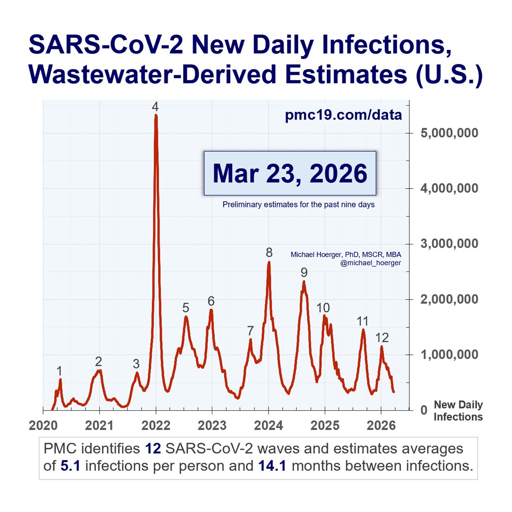
If you zoom out to see the entire pandemic, you'll find a similar picture relative to what you may have been tracking with Biobot, Walgreens, etc.

The waves show up. The estimates of magnitude vary by methodology.

9/

I hope to post an interim Biobot-to-Verily PMC forecast Monday.

I stand by prior forecasts. We'll reach the bottom of the current (very high) valley in 1-2 wks. Cases will pick up noticeably so around mid-November and get very very bad in Dec/Jan.

10/
Point of clarification: Verily data are included in this dashboard, but others have noted Verily does not own the dashboard. The language on their website is ambiguous in this regard, IMO (pic below). It's the first link on Verily's page.

Others report that as CDC Biobot sites come on, they will be included in a Verily-specific dashboard, independent of that above. It seems that rather than harmonizing and unifying data, we are at risk of proliferating more and potentially lower quality dashboards.

11/
Verily's web page begins by linking to a comprehensive dashboard that they reportedly do not own. Their own limited dashboard follows below on the page.

• • •

Missing some Tweet in this thread? You can try to force a refresh
 

Keep Current with Mike Hoerger, PhD MSCR MBA

Mike Hoerger, PhD MSCR MBA Profile picture

Stay in touch and get notified when new unrolls are available from this author!

Read all threads

This Thread may be Removed Anytime!

PDF

Twitter may remove this content at anytime! Save it as PDF for later use!

Try unrolling a thread yourself!

how to unroll video
  1. Follow @ThreadReaderApp to mention us!

  2. From a Twitter thread mention us with a keyword "unroll"
@threadreaderapp unroll

Practice here first or read more on our help page!

More from @michael_hoerger

Sep 7
#DuringCOVID is today.

Image pack 1 of 9 🧵 Graph of the 11 waves of the pandemic in the U.S., tailored to a key message noted in the post.
1 million New Daily Infections.

Today!

Image pack 2 of 9 🧵 Graph of the 11 waves of the pandemic in the U.S., tailored to a key message noted in the post.
Where are the free vaccines, N95s, and tests?

Image pack 3 of 9 🧵 Graph of the 11 waves of the pandemic in the U.S., tailored to a key message noted in the post.
Read 9 tweets
Sep 3
PMC Dashboard Update (U.S.) 🧵1 of 8

The 11th wave is still rising.
🔥23 states/territories High/Very High
🔥Very High: Alabama, DC, Guam, Hawai'i, Louisiana, Nebraska, Nevada, South Carolina, Texas, Utah
🔥1 in 56 estimated actively infectious
🔥876,000 new daily infections CDC heat map, very high states noted in post. PMC estimate of 1 in 56 actively infectious nationwide
PMC Dashboard Update (U.S.) 🧵2 of 8

Note that the CDC has modified 📉 how transmission levels correspond to the categorical bins.

Take California. We estimate 1 in 30 actively infectious statewide. This would have previously been "Very High," now just "High."
#NewNormal CDC heatmap, with PMC estimate of 1 in 30
PMC Dashboard Update (U.S.) 🧵3 of 8

Here are the prevalence estimates for the first half of states/territories.

Notice how high the levels are in some of the "Moderate" states. State	CDC Level Alabama	Very High Alaska	High Arizona	High Arkansas	Moderate California	High Colorado	Moderate Connecticut	High Delaware	High District of Columbia	Very High Florida	High Georgia	Moderate Guam	Very High Hawaii	Very High Idaho	High Illinois	Very Low Indiana	Moderate* Iowa	Low Kansas	Low Kentucky	High Louisiana	Very High Maine	Low Maryland	Moderate Massachusetts	Moderate Michigan	Very Low Minnesota	Moderate Mississippi	High*
Read 9 tweets
Aug 21
During times like these when COVlD transmission heats up in the U.S., expect to see a lot more angry outbursts for three central reasons.

First, "displacement," or people trying to deny the reality of their anxiety by taking it out on other people....
Second, a lot of people can sustain a strong denial of reality about the ongoing pandemic during lulls. They suppress the existence of COVlD waves and excess deaths, disability, and retirements.

During waves, those defenses burst. Loss of control = anger...
Third, a lot of people (many reading this) understand COVlD correctly & experience righteous indignation during COVlD waves. We quite reasonably do not like all of the unjust and gratuitous suffering.

I find it helpful to channel that intensity into helping other people....
Read 6 tweets
Aug 19
I submitted my comment to endorse universal high-quality masks (respirators) in healthcare. Today is the final day.

Alt text continues in the following posts. RE: Z94.4, Selection, use, and care of respirators (New Edition)  Dear Colleagues,  As the director of a population science program at a major U.S. cancer center, I strongly endorse this draft proposal to increase the use of high-quality well-fitting masks (respirators) in medical settings. I will comment on the relevance of this proposal mainly for cancer care. In the U.S., cancer care is commonly more organized than other specialty care and, thus, often leads the way on policy initiatives, which then translate to other elements of care over time.  1. COVID-19 continues to cause excess dea...
They put forth projections, with the most granular detail for the U.S. and U.K., suggesting excess deaths will persist through at least 2033. Their projections do not show excess deaths stopping in 2033; that is simply the final year of their current analysis. Moreover, while they provide the most data for the U.S. and U.K., their analysis suggests a more general trend throughout the globe. The COVID-19-associated excess deaths are commonly identified as cardiovascular and cancer causes of death.   Swiss Re Institute. (2024). The future of excess mortality after COVID-19. https://www.swissr...
Alt text continued 2. The SARS-CoV-2 virus that causes COVID-19 continues to transmit at high rates worldwide. Overall, 28 nations continue to use wastewater surveillance to monitor SARS-CoV-2 levels. A directory is available at the dashboard that I oversee (pmc19.com/data). In the U.S., we are currently experiencing our 11th wave of transmission. Many nations are experiencing annual or twice annual waves of transmission.
Alt text continued 3. International consensus standards identify a broad range of patients at known high-risk of severe outcomes of COVID-19. The largest group at known high risk of severe outcomes is patients with cancer. Other diagnoses associated with above average risk include people undergoing transplants or receiving dialysis, and patients with any of these diagnoses: immunodeficiencies, renal disease, systemic-immune mediated or single-site immune-mediated inflammatory conditions, asplenia, anatomical barrier defects, pregnancy, and diabetes. These findings underscore the importance of standards in hea...
Read 7 tweets
Aug 16
🚩🚩🚩
As a vigorous defender of #CDC data, their switch from using normalized to non-normalized COVlD wastewater surveillance data today harms data quality.

"Normalizing" means accounting for basic confounders like rain levels. It is a choice to use worse data.
1/5🧵 Image
Historically, the CDC data have correlated near-perfectly with similar metrics, such as Biobot's wastewater estimates (still active) or the IHME true case estimates (through mid-2023).

The changes reduce those correlations. It's like going from an A+ to a B.

2/5🧵
You can readily see the loss of data quality in the PMC "whole pandemic" graph (preview shown, subject to change) with choppier waves, caused by the CDC adding extra noise to the data and applying retroactively from BA.1 Omicron to present.

3/5🧵 Longitudinal graph of the pandemic waves. Notice how they start becoming choppier in 2022, as a result of today's changes at the CDC
Read 5 tweets
Aug 12
PMC COVID Dashboard, August 11, 2025 (U.S.)

The CDC says transmission is heating up.

"Very High" (3)
🔺Guam
🔺Hawai'i
🔺Louisiana

"High" (12)
🔺Alabama
🔺Alaska
🔺California
🔺Colorado
🔺Delaware
🔺Florida
🔺Indiana
🔺Mississippi
🔺Nevada
🔺S. Carolina
🔺Texas
🔺Utah

🧵1/12Heat map from CDC data. High/Very high states noted in post
Transmission is highest in these regions. Graphics note the CDC levels and PMC prevalence estimates.

🔥Louisiana (Very High): 1 in 19 actively infectious
🔥Guam (Very High): 1 in 26
🔥Hawai'i (Very High): 1 in 28
🔥Texas (High): 1 in 45

🧵2/12 Graphics show heat maps and prevalence estimates, noted in the post
Statewide transmission remains "High" in Florida, according to the CDC. PMC estimates 1 in 50 actively infectious.

Several cities report "Very High" transmission. Several sites are offline.

🧵3/12 Heat map and prevalence estimate noted in the post
Read 12 tweets

Did Thread Reader help you today?

Support us! We are indie developers!


This site is made by just two indie developers on a laptop doing marketing, support and development! Read more about the story.

Become a Premium Member ($3/month or $30/year) and get exclusive features!

Become Premium

Don't want to be a Premium member but still want to support us?

Make a small donation by buying us coffee ($5) or help with server cost ($10)

Donate via Paypal

Or Donate anonymously using crypto!

Ethereum

0xfe58350B80634f60Fa6Dc149a72b4DFbc17D341E copy

Bitcoin

3ATGMxNzCUFzxpMCHL5sWSt4DVtS8UqXpi copy

Thank you for your support!

Follow Us!

:(