The AIDA model is no longer the best layout for your landing pages!
We've reinvented the ATIDCOA model and it converts much, much better.
Steal our model and increase your conversion rates today👇
🧵
We've reinvented the ATIDCOA model and it converts much, much better.
Steal our model and increase your conversion rates today👇
🧵
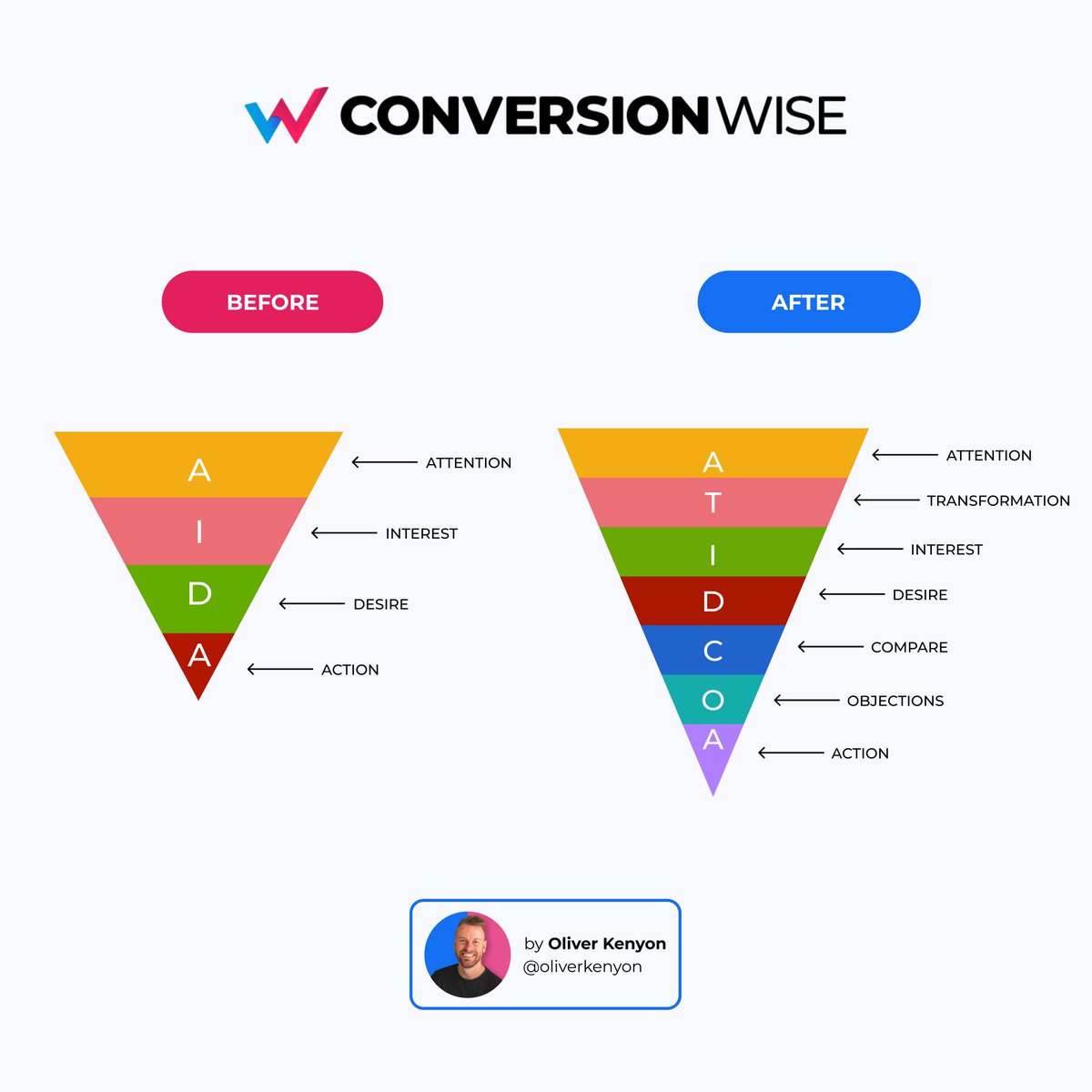
Ok, so AIDA is a VERY effective way of laying out your landing pages. It takes visitors through a specific journey in order to maximise sales.
The old model stands for:
Attention
Interest
Desire
Action
But..
Over the past decade we've built a better model.
Let's dive in.
The old model stands for:
Attention
Interest
Desire
Action
But..
Over the past decade we've built a better model.
Let's dive in.

Introducing ATIDCOA
Attention
Transformation
Interest
Desire
Compare
Objections
Action
After designing over 7000 landing pages and analysing results, we've adapted the AIDA model and made it convert even more.
Let me break down each section for you with examples.
Attention
Transformation
Interest
Desire
Compare
Objections
Action
After designing over 7000 landing pages and analysing results, we've adapted the AIDA model and made it convert even more.
Let me break down each section for you with examples.

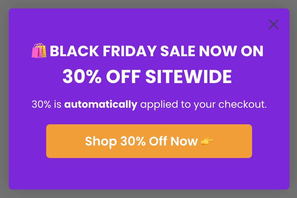
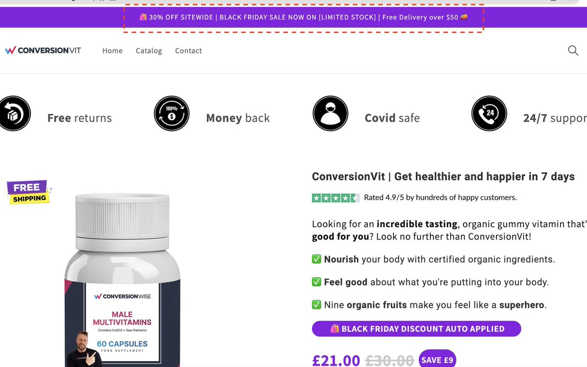
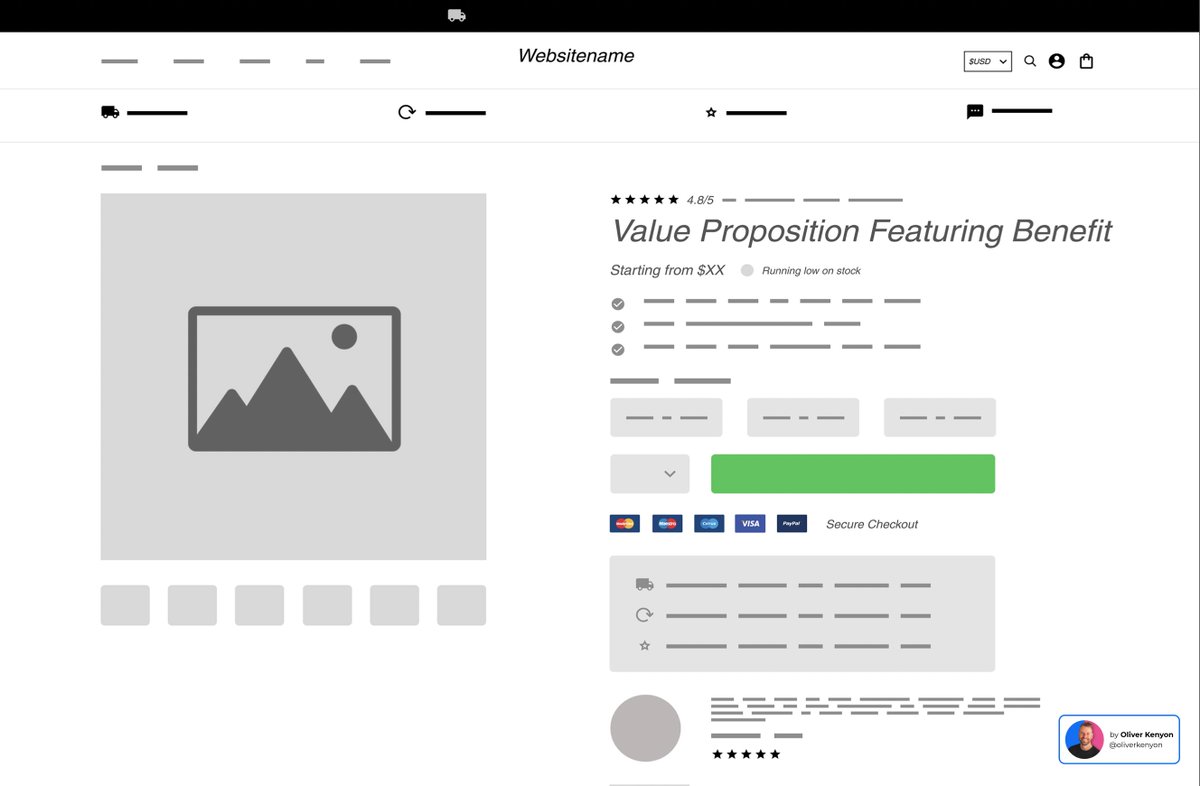
ATTENTION
The only objective of this section (above the fold) is to get the visitors attention. You have between 3-5 seconds to get them sucked in.
Do this with:
1. Strong value proposition
2. Trust and credibility
3. Social proof
4. Grabbing Imagery
5. Call to action
The only objective of this section (above the fold) is to get the visitors attention. You have between 3-5 seconds to get them sucked in.
Do this with:
1. Strong value proposition
2. Trust and credibility
3. Social proof
4. Grabbing Imagery
5. Call to action
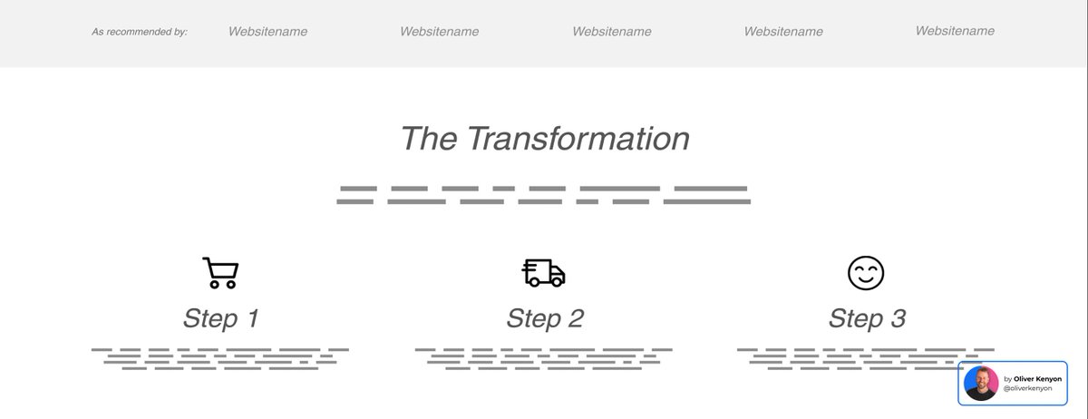
TRANSFORMATION (NEW)
The main objective of this section is to take a visitor on a visual transformation, from not owning your product to owning and benefiting from it.
Use icons, steps and text to walk the buyer through a journey of adding to cart > benefit of product.
The main objective of this section is to take a visitor on a visual transformation, from not owning your product to owning and benefiting from it.
Use icons, steps and text to walk the buyer through a journey of adding to cart > benefit of product.
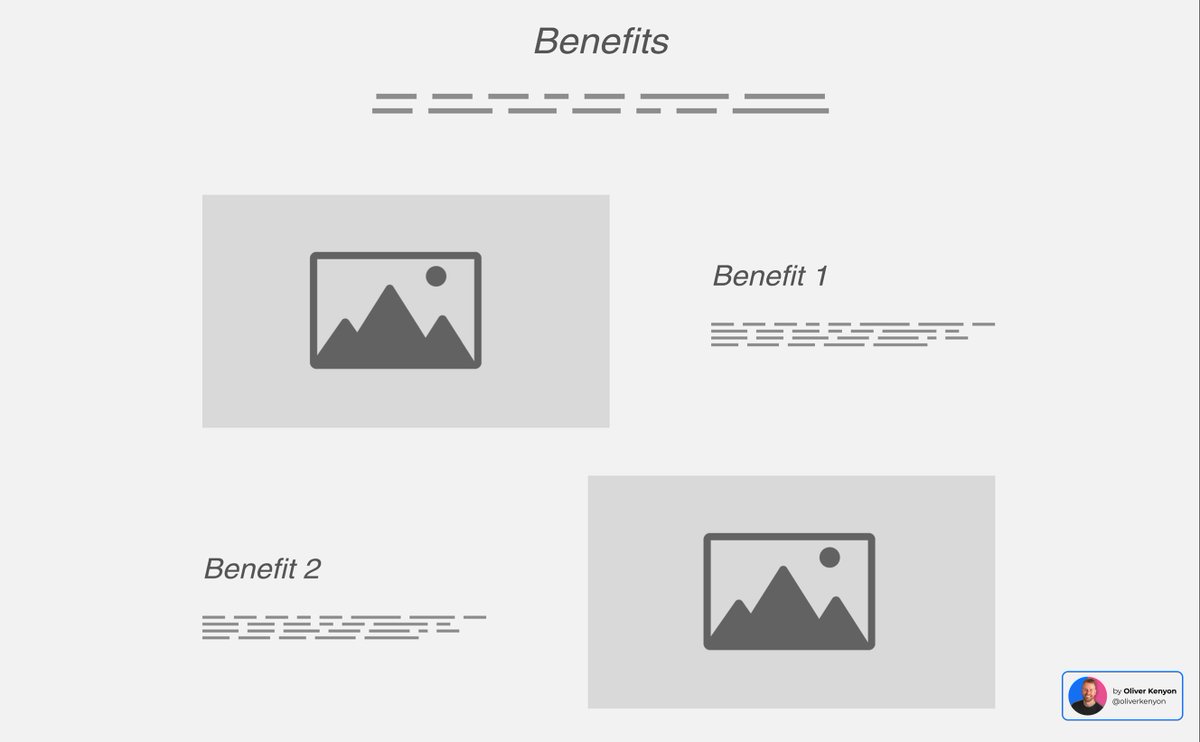
INTEREST PART 1: BENEFITS
First we want to focus on exactly what benefits a potential buyer is going to get from your product.
Think of the exact outcomes your target demographic is looking for.
That could be time, money, freedom, lifestyle and so on.
Benefits sell!
First we want to focus on exactly what benefits a potential buyer is going to get from your product.
Think of the exact outcomes your target demographic is looking for.
That could be time, money, freedom, lifestyle and so on.
Benefits sell!
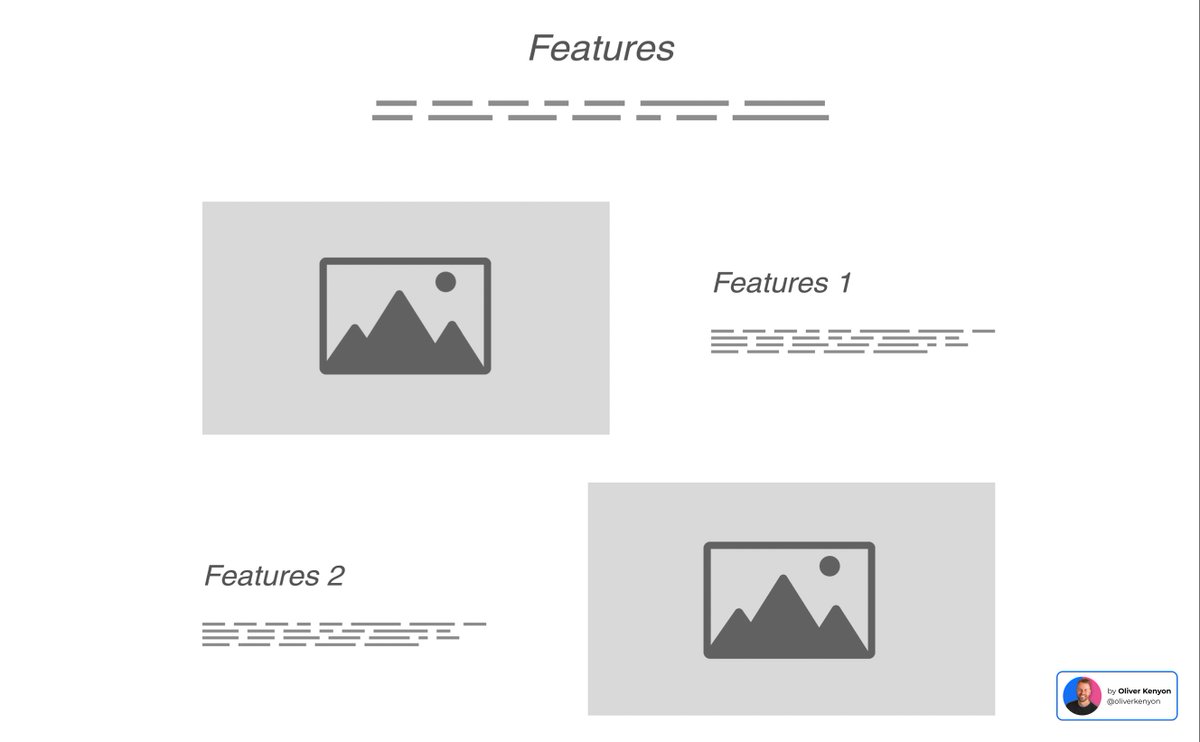
INTEREST PART 2: FEATURES
Next and only once we've helped them visualise the outcome (benefits), we can show how we deliver them.
This is where you can use images/icon/text/videos to really show off all the bells and whistles that your products are made of.
Features tell!
Next and only once we've helped them visualise the outcome (benefits), we can show how we deliver them.
This is where you can use images/icon/text/videos to really show off all the bells and whistles that your products are made of.
Features tell!
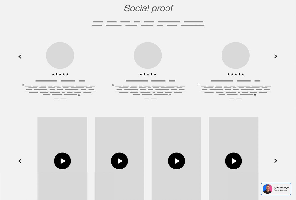
DESIRE
By this stage we've got their attention, we've shown them the outcome and how we're going to deliver it, it's now time to make them desire it using other people.
Here comes the FOMO!
In this section use:
1. Reviews
2. Testimonials
3. Case studies
4. User generated video
By this stage we've got their attention, we've shown them the outcome and how we're going to deliver it, it's now time to make them desire it using other people.
Here comes the FOMO!
In this section use:
1. Reviews
2. Testimonials
3. Case studies
4. User generated video
COMPARE (NEW)
You have 2 options here:
1. Pitch your product against your competitors
2. Pitch your product against a generalisation
Example of point 2 is positioning your product against broader market trends or general consumer needs and expectations.
Use comparison tables.
You have 2 options here:
1. Pitch your product against your competitors
2. Pitch your product against a generalisation
Example of point 2 is positioning your product against broader market trends or general consumer needs and expectations.
Use comparison tables.

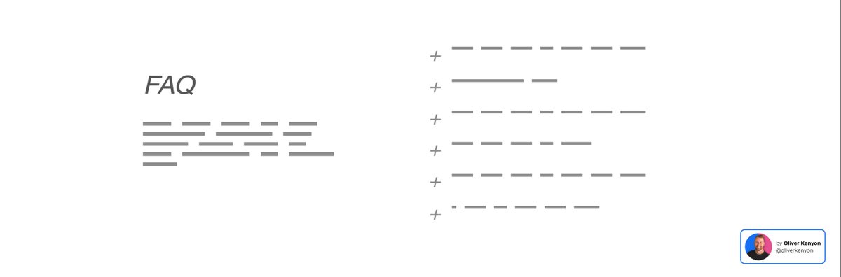
OBJECTIONS (NEW)
If we're lucky enough to get a visitor to scroll down this far then they MUST be interested.
They also likely have questions/objections in their head.
Use a simple FAQ to answer any objections surrounding the ordering/returns/outcomes of your product.
If we're lucky enough to get a visitor to scroll down this far then they MUST be interested.
They also likely have questions/objections in their head.
Use a simple FAQ to answer any objections surrounding the ordering/returns/outcomes of your product.
ACTION
In this section you need one clear button to make them take a very specific action.
If they've scrolled this far, don't make them have to work for the action.
Don't give them an excuse to go looking for it.
Shove it RIGHT in front of their faces.
Add to cart now >
In this section you need one clear button to make them take a very specific action.
If they've scrolled this far, don't make them have to work for the action.
Don't give them an excuse to go looking for it.
Shove it RIGHT in front of their faces.
Add to cart now >

ATIDCOA
Attention
Transformation
Interest
Desire
Compare
Objections
Action
Attention
Transformation
Interest
Desire
Compare
Objections
Action
If you enjoyed this thread, then:
→ Follow me @oliverkenyon for weekly info like this.
→ RT the first tweet to share it with others.
→ Follow me @oliverkenyon for weekly info like this.
→ RT the first tweet to share it with others.
https://twitter.com/oliverkenyon/status/1714623333273051291
I go deep on these types of lessons every Wednesday for over 15,000 online brands in my newsletter.
If you're an online brand or selling anything online then consider joining us.
A 3-minute read or less each week:
conversionwise.com/newsletter
If you're an online brand or selling anything online then consider joining us.
A 3-minute read or less each week:
conversionwise.com/newsletter
• • •
Missing some Tweet in this thread? You can try to
force a refresh