Why can you still smell things wearing an effective mask?
You can smell nasty things like smoke and rotten eggs even with fit tested #N95 respirators which block tiny viruses/bacteria because the smell molecules have atomic masses that are 17 million times less than a virus.🧵1/

You can smell nasty things like smoke and rotten eggs even with fit tested #N95 respirators which block tiny viruses/bacteria because the smell molecules have atomic masses that are 17 million times less than a virus.🧵1/

This long thread (with info from @Wikisteff) explains how molecules detected in our olfactory receptors as #smells can pass through material in #masks, #respirators, and #filters (HEPA/MERV-13/CR Boxes) while still blocking tiny particles like #viruses and #particulate matter. 2/
An unrolled one-page web view for this long thread that may be easier to read or share can be found here ( ). 3/
https://twitter.com/jeffgilchrist/status/1728025254260343179
First, some background information. A dalton (Da) or unified atomic mass unit (u) is commonly used in physics and chemistry to express the mass of atomic-scale objects such as atoms, molecules, and elementary particles ( ). 4/en.wikipedia.org/wiki/Dalton_(u…
Oxygen (O2) that we breathe is 32 Da and carbon dioxide (CO2) that we exhale is 44 Da. Other gases that we smell like hydrogen sulfide (H2S) which smells like rotten eggs is only 34 Da, and sulfur dioxide (SO2) the burning smell after lighting a match is 64 Da. 5/

When you pass gas (fart) the smell comes from a multitude of molecules including:
- Hydrogen Sulfide (H2S) = 34 Da
- Methanethiol (CH3SH)= 48 Da
- Dimethyl Sulfide (CH3)2S = 62 Da
- Indole (C8H7N) = 117 Da
- Skatole (C9H9N) = 131 Da
6/
- Hydrogen Sulfide (H2S) = 34 Da
- Methanethiol (CH3SH)= 48 Da
- Dimethyl Sulfide (CH3)2S = 62 Da
- Indole (C8H7N) = 117 Da
- Skatole (C9H9N) = 131 Da
6/
This is very important to understand because by comparison, a single COVID-19 virus particle (virion) has a mass of 602,217,364 Da or 17 million times more than the rotten egg smelling hydrogen sulfide at 34 Da ( ). 7/pnas.org/doi/10.1073/pn…
It is estimated that a COVID-19 infected person carries between 1 billion and 100 billion virions during peak infection ( ). 8/pnas.org/doi/10.1073/pn…
Viruses don't travel on their own through the air, they actually catch rides in aerosols which also contain water, mucins from the lining of the lungs, deep lung fluid and surfactants to make up the complex blob you see in the image ( ). 9/
https://twitter.com/jeffgilchrist/status/1467582905396432904

Multiple studies have found the highest concentration of virus in aerosol particles are in the smaller size ranges which can stay in the air for extended periods of time and lowest concentration in larger droplets that fall to the ground quickly. 10/
COVID-19 was detected in aerosol particles ranging in size from 0.34 micrometers (um) to larger than 8.1 um with the highest concentrations found in particle sizes ranging from 0.94 um, to 28.8 um ( ). 11/tandfonline.com/doi/full/10.10…
@Wikisteff estimates the molecular mass of a 0.8 um largely water based aerosol (which is at the smaller end of the aerosol size spectrum but with highest concentrations of COVID-19 virus) would be approximately 160,000,000,000 (160 billion) Da ( ). 12/ncbi.nlm.nih.gov/pmc/articles/P…
You can see from the graph there is a monstrous difference in mass between gases you can smell like hydrogen sulfide (34 Da) and the bare COVID-19 virus (602 million Da) and the aerosols that COVID virus are transported in (160 billion Da). 13/
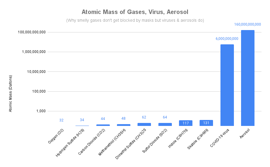
Note the graph is in logarithmic scale so each number on the vertical axis scale is 100x larger than the one below. 14/
We know that people can still breathe while wearing masks and respirators so oxygen (32 Da) and carbon dioxide (44 Da) can pass through the filtering material easily which have similar atomic mass to the smell gases (34 to 131 Da) which can also pass through. 15/
In order for a respirator to be effective at blocking viruses and particulate matter it needs to block particles that are 17 million times larger mass than gas to stop a COVID-19 virus and 4.7 billion times larger mass to stop an aerosol that the virus would be travelling in. 16/
So now you know that smelly gases have a similar mass to oxygen and why they can easily pass through mask/respirator material just like oxygen but can N95 respirators actually filter these million and billion times larger mass particles of viruses and bacteria? Yes! 17/
Scientists and engineers who designed these respirators did actually test them to ensure they did filter viruses and bacteria and even came up with standards for determining the efficiency with real viruses and bacteria. H/T: @ghhughes 18/
Bacterial filtration efficiency (BFE) is tested using the ASTM F2101 standard and multiple tests were conducted in this study using the S. aureus bacteria... 19/
while viral filtration efficiency (VFE) was tested using the single-stranded DNA virus bacteriophage phiX174 ( ). 20/ncbi.nlm.nih.gov/pmc/articles/P…
The study found that the N95 respirators they tested filtered more than 99.62% of the bacteria and more than 99.8% of the virus which is much higher than the required 95% filtration needed by the N95 standard to pass. 21/

So there you have it, N95 respirators can actually filter viruses and bacteria and are actually tested with a standard to ensure so. 22/
To learn more about how N95 respirators and HEPA/HVAC filters can filter out such small particles like virus aerosols and particulate matter from smoke (does not work like a sieve), see this thread which explains the physics ( ). 23/
https://twitter.com/jeffgilchrist/status/1602994049815908353
Ok so we have now confirmed the filtering material itself can filter viruses and bacteria, but what about a respirator on the face of a real person in the real world, does that still work? 24/
Thankfully engineers have also built equipment called a condensation particle counter (CPC) to measure the particles both outside and inside a respirator simultaneously. 25/

This testing occurs while the person is wearing the respirator so they can measure exactly how well the respirator is filtering on your face in the real world. 26/
Some of you may have already experienced this through a respirator fit test. You can learn more about how quantitative fit testing with CPC equipment is done in this thread ( ). 27/
https://twitter.com/jeffgilchrist/status/1652394034055323648
As @ghhughes points out, CPC fit testing equipment can measure particle sizes all the way down to 0.02 um in size, much smaller than the COVID-19 virus on its own and the even larger aerosols the virus travels in. 28/
This also demonstrates that N95 respirators can be tested and shown to filter out tiny 0.07 um size particles the size of individual viruses with good fitting N95s measuring less than 0.5% total inward leakage of particles down to 0.02 um. 29/
Since the CPC is testing the level of particles inside the mask while being worn, the results also take into account any gaps around the mask that might be leaking particles in without being filtered ( ). 30/
https://twitter.com/ghhughes/status/1718129681860530578
The most important factor is how well a respirator fits on your face so there is minimal leakage around gaps as some respirators fit people very well and others very poorly. Click "Show replies" 👇 to continue. 31/
You can learn about my fit testing adventure where I found one mask leaked 70x more than another on my face ( ). 32/
https://twitter.com/jeffgilchrist/status/1655331142990528514
The respirator that fit me best was measured to only have 0.2% leakage on my face so filtering 99.8% of particles but when the major wildfire smoke events were happening this summer I could still smell the smoke outside. 33/
Recall that the smoke gas molecules you can smell are billions of times less mass than the smoke particulate matter so while the N95 respirator is filtering out those toxic PM particles. 34/
N95s are not designed to filter out gases so you can still smell and are being exposed to any toxic gases that are in the air. For that kind of protection you need elastomeric respirators with gas filtering cartridges specifically designed for those gases. 35/
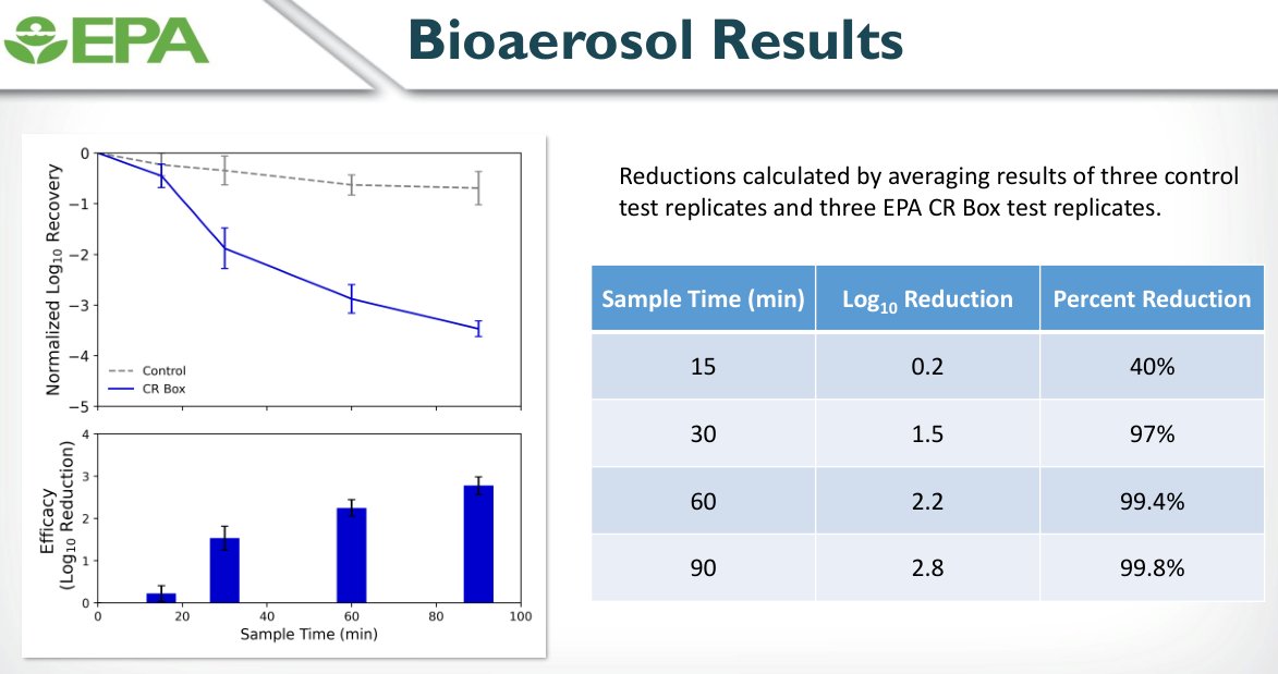
What about HVAC, HEPA, and CR box filtration, do they work to filter viruses from the air as well? Yes! The Environmental Protection Agency (EPA) recently conducted some tests with CR boxes which use MERV-13 HVAC filters ( ). 36/s.uconn.edu/EPAresults
The EPA aerosolized non-pathogenic virus (bacteriophage MS2) and measured particle size (0.01 um to 0.6 um) and concentration during the testing in a 3000 square foot test chamber. 37/
They found the virus particle concentration was reduced by 40% after 15 minutes, 97% after 30 minutes, 99.4% after 60 minutes and 99.8% after 90 minutes. 38/
More details about this EPA CR box testing project are described here ( ). 39/
https://twitter.com/MarinaC_Dyb/status/1719349909210472749
Just like we expect to have access to clean drinking water, we should be demanding that our governments also provide access to clean air. Recently 60-Minutes did an episode on The Air We Breathe which can be seen here ( ). 40/cbsnews.com/video/indoor-a…
Everyone should be aware of the importance of indoor air quality, find out more here ( ). 41/
https://twitter.com/jeffgilchrist/status/1607379781892575234
This thread was inspired by posts made by @jossreimer ( ) and @Wikisteff ( ) on smells while masking. 42/
https://twitter.com/jossreimer/status/1597753734129676288
https://twitter.com/Wikisteff/status/1599187855003521024
@threadreaderapp please unroll
It is important to note that masks can also reduce some smells and block others all together, it all depends on how the smell molecules arrive; if they are tiny gases on their own or if they are larger particles that get filtered. 43/
I forgot to highlight that N95 filtering material has the hardest time with 0.3 um particle size but actually does better with smaller and larger particle sizes as shown here ( ). Thanks @ToshiAkima. 44/
https://twitter.com/ToshiAkima/status/1728312482576613882
The explanation why the filters work better with smaller and larger particles is explained here ( ). 45/
https://twitter.com/jeffgilchrist/status/1602994087514312704
Arg, I added an extra 0 in the graph for the atomic mass of the COVID virus. The text is correct at 602 million Da, but here is the corrected chart.

Arg, I added an extra 0 in the graph for the atomic mass of the COVID virus. The text is correct at 602 million Da, but here is the corrected chart. 46/

• • •
Missing some Tweet in this thread? You can try to
force a refresh