One of the key arguments that Norway uses to continue oil & gas developments, is that under BAU it is expected that oil & gas production will decline in line with <2°C scenarios, even with continued investment.
Let's look closer at these projections & reality...
1/
Let's look closer at these projections & reality...
1/

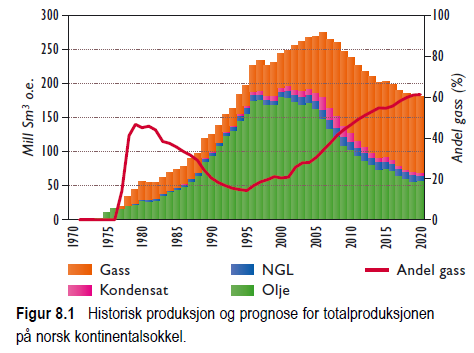
Here is the projections from the 2003 report from the petroleum agency.
In reality (tweet 1) there was a dip around 2010, but production is now up around 250 million cubic again.
The forecast was totally & utterly WRONG!
2/
In reality (tweet 1) there was a dip around 2010, but production is now up around 250 million cubic again.
The forecast was totally & utterly WRONG!
2/
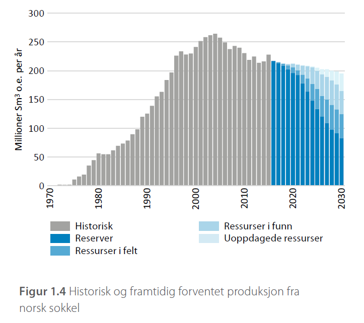
In 2011 there was a forecast for an increase in production to 2020, but then a decline. This is probably since they started to put the Johan Sverdrup field on the books.
The increase in production was way too low, again, they got it wrong.
3/
The increase in production was way too low, again, they got it wrong.
3/

In 2016, the forecast seemed to have lost the peak around 2020, but with a slower decline in production.
Again, according to history, they were wrong, even with a forecast window of only a few years!
4/
Again, according to history, they were wrong, even with a forecast window of only a few years!
4/
And here we are today. With a new high (local minima), currently over 250 million cubic, but an expectation of a decline afterwards.
The forecasts made have so far all been wrong!
Production has not declined as the petroleum agency has predicted.
5/
The forecasts made have so far all been wrong!
Production has not declined as the petroleum agency has predicted.
5/
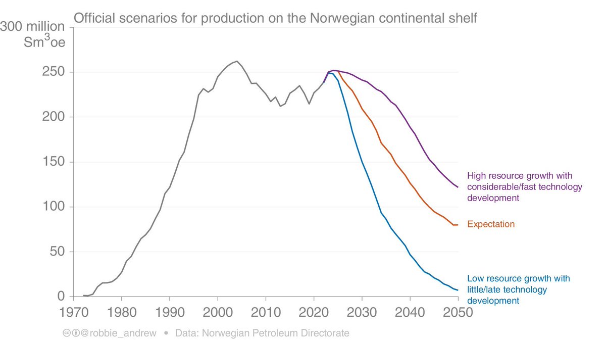
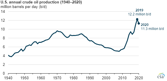
This is not uncommon, Norway is not alone. Everyone thought US oil production had peaked, until they found shale oil / gas.
6/
6/
The important point is that technology constantly proves these forecasts wrong.
Based on history, there is little evidence that Norwegian oil & gas production will fall as forecast.
Continued investment & technology evolution will make these forecasts wrong.
7/
Based on history, there is little evidence that Norwegian oil & gas production will fall as forecast.
Continued investment & technology evolution will make these forecasts wrong.
7/

Norwegian climate policy is currently based on incorrectly telling people these forecasts are accurate, when they know they are not.
8/
8/
See the thread by
and old resource reports can be found here
9/9
npd.no/aktuelt/publik…
and old resource reports can be found here
9/9
https://twitter.com/robbie_andrew/status/1734965127856652471
npd.no/aktuelt/publik…
• • •
Missing some Tweet in this thread? You can try to
force a refresh