1/
PMC COVID-19 Tracker, Dec 18, 2023
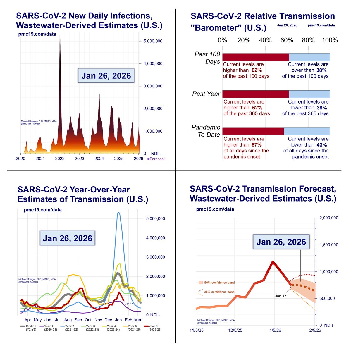
We are headed into potentially the 2nd largest COVID surge all-time in the U.S.
If #wastewater levels follow historic trends, we will reach 2 million infections/day at peak surge with 4.2% of the population actively infectious on Jan 10.
PMC COVID-19 Tracker, Dec 18, 2023
We are headed into potentially the 2nd largest COVID surge all-time in the U.S.
If #wastewater levels follow historic trends, we will reach 2 million infections/day at peak surge with 4.2% of the population actively infectious on Jan 10.

2/
The winter peak should arrive between Jan 3 and Jan 17. The model estimates a peak of 1.7 to 2.2 million infections per day.
If unlucky, 1 in 20 people will be infectious, and it will be the 2nd largest wave. If lucky, more like 1 in 30, and the 4th largest wave.
Consider optimistic and pessimistic scenarios not captured by these models.
Optimism:
A rosy scenario would be that the peak occurs a week earlier at a slightly lower level (1.6-1.7 infections/day like last winter or the preceding summer). The level of acceleration in transmission argues against that, in favor of a higher peak, but Biobot is reporting some unusual regional variation (much lower transmission in the U.S. South and West). Moreover, historical patterns of how transmission should or should not accelerate cannot account for existing variation on population-level immunity due to variation in prior exposure history, recency of vaccination, and how well the current vaccine matches disseminating subvariants relative to prior vaccines. Finally, Biobot wastewater sites could be overreporting, and levels could get corrected downward. Each of these factors is highly plausible, but the “rosy” scenario remains quite bleak and suggests the pandemic remains far from “over.”
Pessimism:
Also, consider more pessimistic scenarios. Current vaccination rates remain extremely low, and several other countries are reporting atypically high acceleration via wastewater data. Placing plausible hypothetical values in the model, it is difficult to imagine a scenario where the U.S. reaches 2.5 million infections/day. Sometimes, people draw graphs showing a continued acceleration like BA.1, but such models seem to reflect imagination rather than data. The data do not suggest an evidence for a BA.1-level surge.

3/
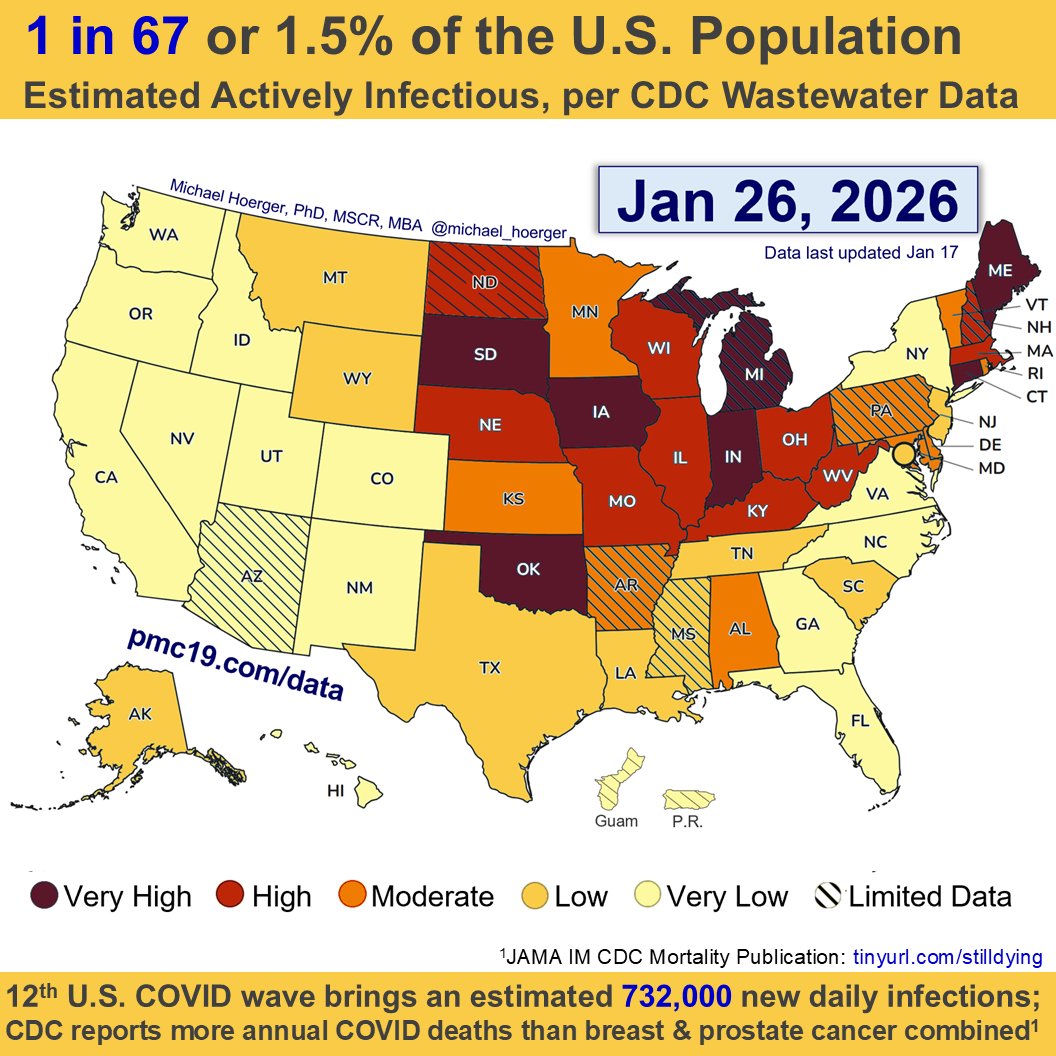
COVID transmission is already very bad in the U.S. and getting worse.
Today:
🔹1.4 million daily infections
🔹1 in 35 infectious (2.9%)
In 4 weeks (Jan 15):
🔹1.9 million daily infections
🔹1 in 24 infectious (4.2%)
COVID transmission is already very bad in the U.S. and getting worse.
Today:
🔹1.4 million daily infections
🔹1 in 35 infectious (2.9%)
In 4 weeks (Jan 15):
🔹1.9 million daily infections
🔹1 in 24 infectious (4.2%)

4/
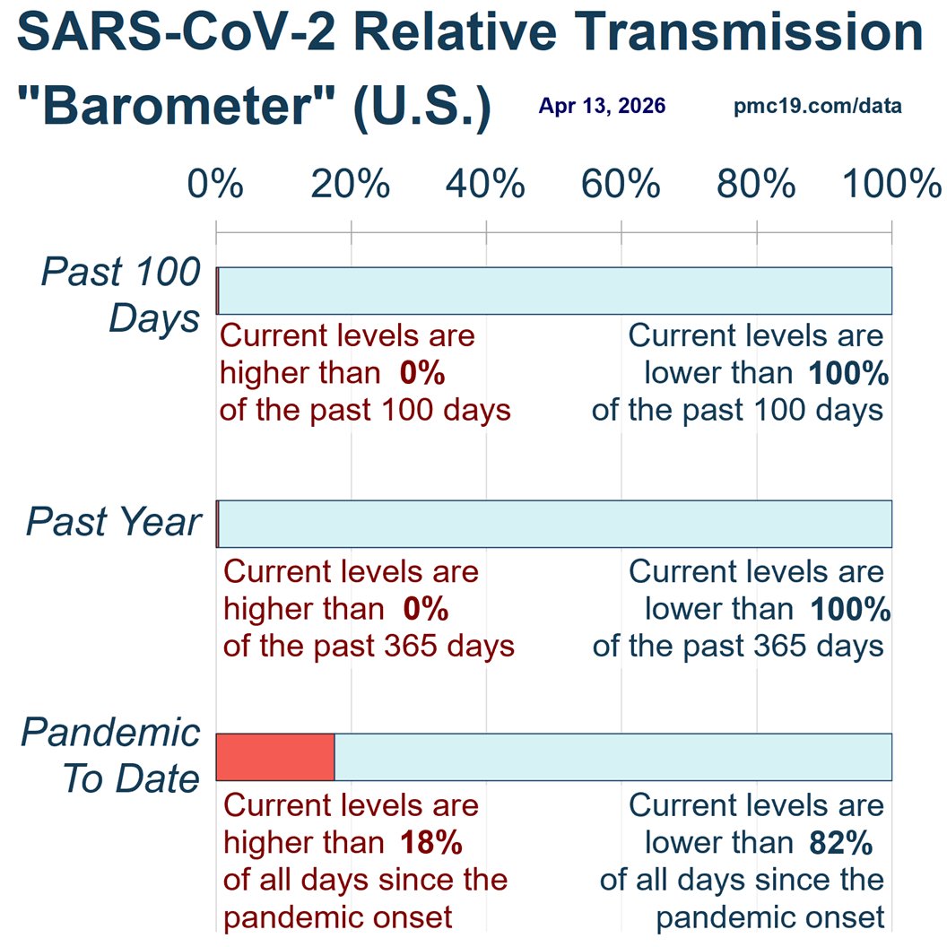
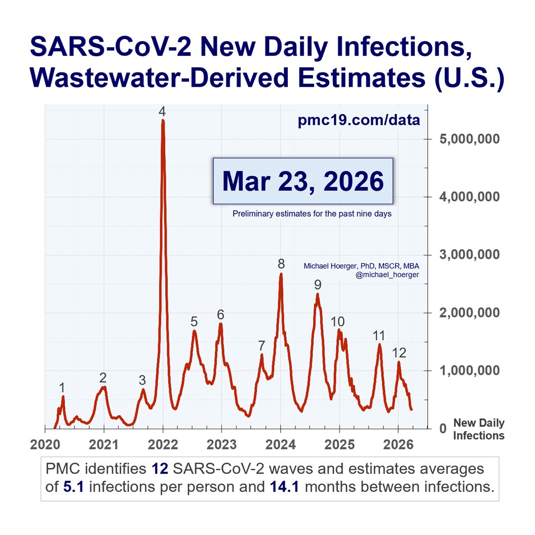
Zooming out to the entire pandemic, we're in the 8th wave. It's likely to be the 2nd-4th biggest all-time and about 1/4 to 1/3 the peak of the horrendous BA.1 surge.
#Wastewater shows that transmission today is worse than during 90% of the entire pandemic.
Zooming out to the entire pandemic, we're in the 8th wave. It's likely to be the 2nd-4th biggest all-time and about 1/4 to 1/3 the peak of the horrendous BA.1 surge.
#Wastewater shows that transmission today is worse than during 90% of the entire pandemic.

5/
We are at nearly 10 million U.S. COVID infections per week. Conservatively, such infections alone would result in nearly a half-million #LongCOVID cases.
Experts agree. You do not want Long COVID.
We are at nearly 10 million U.S. COVID infections per week. Conservatively, such infections alone would result in nearly a half-million #LongCOVID cases.
Experts agree. You do not want Long COVID.
https://twitter.com/michael_hoerger/status/1736640106511901074

6/
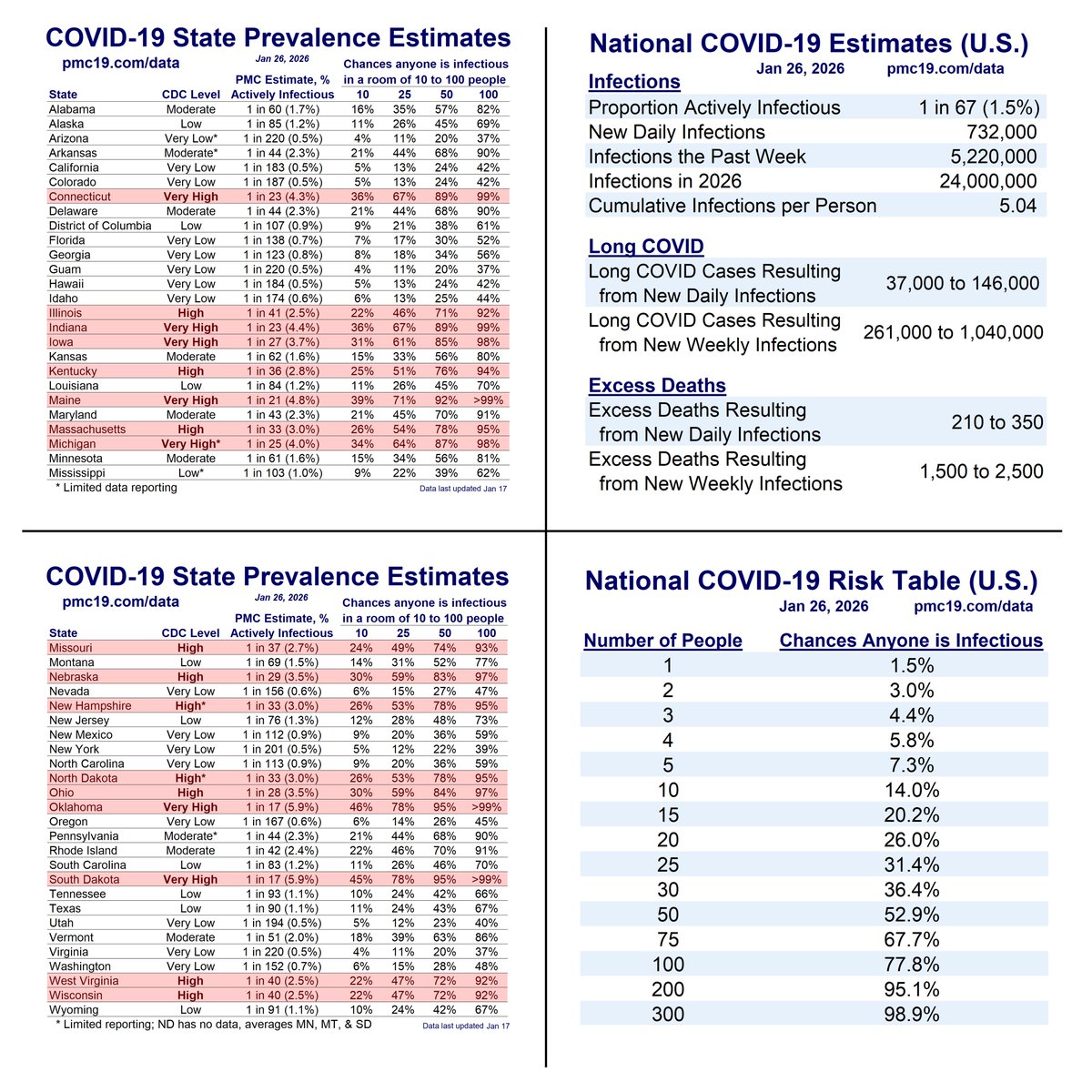
These are the chances of interacting with someone infectious on Dec 18, based on the total number of social contacts.
Interact with 10 people = 25% chance someone is infectious. This helps explain why so many kids are getting sick at school lately.
These are the chances of interacting with someone infectious on Dec 18, based on the total number of social contacts.
Interact with 10 people = 25% chance someone is infectious. This helps explain why so many kids are getting sick at school lately.

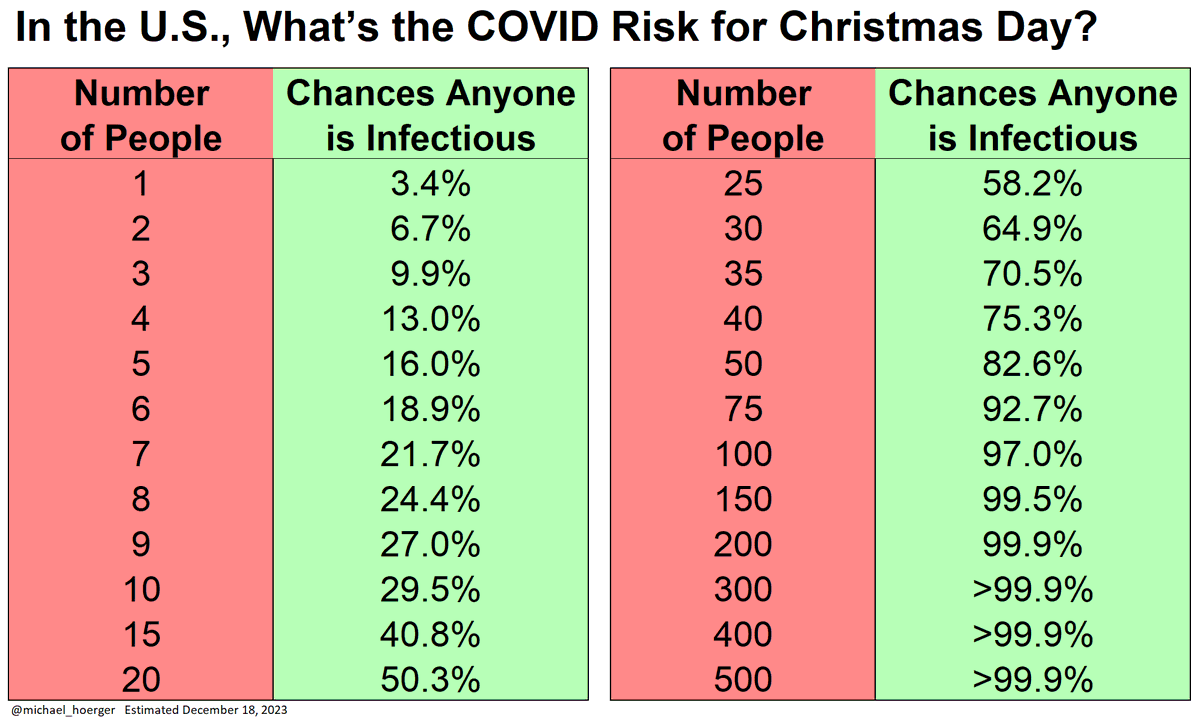
7/
A small Christmas gathering of 7-10 people means a 25% chance someone has infectious COVID
20 people = 50% chance
Flight or restaurant with 100 people = 97% chance someone has infectious COVID
A small Christmas gathering of 7-10 people means a 25% chance someone has infectious COVID
20 people = 50% chance
Flight or restaurant with 100 people = 97% chance someone has infectious COVID
8/
At a small New Year's Eve party or lunch the next day with 10 people, there's a 1 in 3 chance someone has infectious COVID.
In early January, we will approach peak transmission.
At a small New Year's Eve party or lunch the next day with 10 people, there's a 1 in 3 chance someone has infectious COVID.
In early January, we will approach peak transmission.

9/
Here's the full PMC Dashboard for Dec 18 to Jan 15.
You can read the full report here:
Thank you for your continued questions, suggestions, gratitude, and sharing across other platforms. pmc19.com/data/
Here's the full PMC Dashboard for Dec 18 to Jan 15.
You can read the full report here:
Thank you for your continued questions, suggestions, gratitude, and sharing across other platforms. pmc19.com/data/

10/
If you're using the PMC dashboard to help others, please post your success stories in the following Tweet.
We will make awards at the end of the year. The examples are inspirational.
If you're using the PMC dashboard to help others, please post your success stories in the following Tweet.
We will make awards at the end of the year. The examples are inspirational.
https://twitter.com/michael_hoerger/status/1732517951993979376
@threadreaderapp - please unroll!
• • •
Missing some Tweet in this thread? You can try to
force a refresh