Jeff Gilchrist Profile picture
Dec 31, 2023 60 tweets 17 min read Read on X
Outdoor Particulate Matter (#PM) Air Quality Monitoring

This thread explores the new Model X #outdoor PM air quality monitor made by #Canadian @IndianaTux at , what it does, costs, and examples showing the information it provides. #AQ #AirQuality 🧵1/ co2.click


Side profile photo of co2.click Model X outdoor air quality (AQ) monitor in weather resistant casing, along with a clip to help mount it to various locations. More info at: https://co2.click/
Graph from co2.click portal showing the last 48 hours of particulate matter (PM) 1.0, 2.5, 4.0, and 10 levels.
Graph of co2.click public view showing temperature, humidity, barometric pressure, and supported PM levels with 24 hour history graph. More info at: https://co2.click/
Screenshot of air quality map displaying results from co2.click monitors around the world. More info at: https://co2.click/
An unrolled one-page web view for this long thread that may be easier to read or share can be found here ( ). 2/
After all the major wildfire smoke events this past summer, I wanted to get an air quality monitor that was suitable for outdoors so I would be better informed what the PM levels were in my neighbourhood. 3/
The closest government PM monitoring station is about 20 km away in the downtown core and frequently does not reflect the same PM levels in my part of town. 4/
A common outdoor PM monitor is the PurpleAir but is very expensive and has import duty/taxes for people in Canada. Instead, I decided to purchase a Model X for about half the cost. More details on costs later in the thread. 5/co2.click
The Model X has a high quality Sensirion SPS30 PM sensor ( ) which uses laser scattering for precise measurements. This sensor provides actual measurements for PM1.0 and PM2.5 sizes, and extrapolates the values for PM4.0 and PM10 sizes. 6/sensirion.com/products/catal…
Model X also measures barometric pressure, temperature, and relative humidity with a Bosch BME280 sensor ( ). 7/bosch-sensortec.com/products/envir…
One of the more unique features of the Model X is that it provides free long-term data collection and storage in their cloud portal for 48 months which you can view via web browser or download the data in CSV format to keep indefinitely. 8/
You connect the Model X via WiFi to an Internet connection and it will collect data every minute and send it to the portal. 9/
The online connection also allows the device to download firmware updates with bug fixes and new features over time, and Model X supports the MQTT IoT messaging protocol ( ). 10/mqtt.org
Since the Model X was designed for outdoor use, you can see the components are encased in a weather proof container and powered by a USB-C cable. I placed mine on our porch away from any exhaust vents which also allowed me to plug the Model X into our external outlet there. 11/
Side profile photo of co2.click Model X outdoor air quality (AQ) monitor in weather resistant casing, along with a clip to help mount it to various locations. More info at: https://co2.click/
Bottom profile photo of co2.click Model X outdoor air quality (AQ) monitor in weather resistant casing, showing the air intake ports for the particulate matter (PM) sensor and USB-C connector for power. More info at: https://co2.click/
It is also possible to purchase a solar panel and battery kit to mount it more remotely away from electrical sockets. 12/
The portal is what really makes the Model X stand out with easy to access information and graphs. The main dashboard when you log in shows the latest reading of temperature, humidity, barometric pressure, and PM 1.0, 2.5, 4.0, and 10 levels. 13/ co2.click
Image of co2.click dashboard shows the latest reading of temperature, humidity, barometric pressure, and PM 1.0, 2.5, 4.0, and 10 levels. More info at: https://co2.click/
Particulate matter (PM) floats in the air in different sizes such as PM2.5 particles < 2.5 micrometres (um) from combustion, organic compounds, and metals and cause serious health problems ( ). 14/ epa.gov/pm-pollution/p…
Image showing difference in size of a human hair, fine beach sand, and PM2.5 and PM10 particles. Image from: https://www.epa.gov/pm-pollution/particulate-matter-pm-basics
Clicking on the "Graph" button allows you to view the data over various time frames including the last 1h, 5h, 12h, 24h, 48h, and 7 days. You can also configure the default time period for graphs depending on your preference. 15/
With "Last 7d" selected, you can see the low pressure system that came in with the readings on the top left of the graph, all the changes in humidity throughout the week in the middle, and the temperature fluctuations during the day and night at the bottom. 16/ Graph from co2.click portal showing the last 48 hours of temperature, humidity, and barometric pressure. More info at: https://co2.click/
If you want to hide one or more of the readings, you can click on the legend to remove that item from the graph. 17/
Clicking on the "Particulate Matter" tab brings you to a second graph, showing you all the PM readings, in this case over the last 48 hours. We were experiencing some kind of PM event in the city over a couple of days with levels rising to 30 ug/m3. 18/ Graph from co2.click portal showing the last 48 hours of particulate matter (PM) 1.0, 2.5, 4.0, and 10 levels. More info at: https://co2.click/
If you want to save a copy of the graph, click on the blue button in the bottom right corner with the arrow pointing down, this will download an image of the graph for you to keep and use. 19/
Having long-term air quality data stored lets you do some interesting analysis after the fact. While I was hoping our AQ troubles were over when summer finished, the city has had multiple high PM events over the past couple of months. 20/
There was one strange PM event in the middle of the night on Dec. 18, 2023 starting around 1:30am. PM levels instantly spiked to almost 60 ug/m3 then dropped to about 25 ug/m3 and then back to normal, only to spike to above 30 ug/m3 again just before 5am. 21/ Graph from co2.click portal showing a massive spike in particulate matter (PM) levels past 60 ug/m3 on Dec. 18, 2023. More info at: https://co2.click/
Sometimes you can have very local and temporary PM increases such as while you are mowing your lawn, but checking other PM sensors in the city, I was able to find the same shape and duration of PM spike in purple air sensors 5km away (8.5 ug/m3), 17km away (16 ug/m3). 22/
I'm not sure what that was, but it impacted multiple parts of the city.

There was also a high PM event that started on Christmas eve and lasted several days. You can see the PM2.5 levels getting above 50 quickly on Dec. 24th in the PM graph. 23/ Graph from co2.click portal showing a massive spike in particulate matter (PM) levels past 50 ug/m3 on Christmas Eve. More info at: https://co2.click/
It is helpful to have access to local PM readings since at least here in Ontario the air quality health index (AQHI) is an average of multiple pollutants and doesn't properly account for fast rising PM events. 24/
As you can see from the Ottawa AQHI readings, when PM levels were at 52 ug/m3, the AQHI index only reached 3 which Canada considers low risk even for at risk populations ( ). 25/ canada.ca/en/environment…
Graph from Air Quality Ontario portal showing air quality health index (AQHI) readings staying within the low risk levels. Image from ( https://www.airqualityontario.com/aqhi/today.php?stationid=51001 ).
The US EPA AQI standard has a PM2.5 specific conversion where the same 52 ug/m3 would be rated as orange which is unhealthy for sensitive groups and the slightly higher 60 ug/m3 from Dec. 18th would be rated as red or unhealthy for everyone ( ). 26/aqicn.org/calculator
While there is no safe level of PM2.5, the WHO recommends limiting levels to below 15 ug/m3 to reduce the burden of disease from stroke, heart disease, lung cancer, and both chronic and acute respiratory diseases, including asthma ( ). 27/who.int/news-room/fact…
For people who are at higher risk of PM pollution, it is recommended to watch the PM levels directly and not just the AQHI level on its own. 28/
I also have a Model E indoor air quality (IAQ) which I used to measure multiple locations inside my house to see how much PM from outside was leaking in during the Christmas PM event and found some surprising results. 29/co2.click
Since you can download your raw Model E and X monitor data, you can use it to make custom plots overlaying PM levels to more easily compare PM detected in multiple locations in the house during the PM event. 30/
Using the Model E IAQ monitor, we discovered that an unfinished section of the basement had much higher levels than the rest of the house. It seems more air from the outside leaks into this part of the basement (see red line). 31/ Click "Show replies" 👇 to continue. Graph of particulate matter (PM2.5) levels in various parts of the house during an outside PM event showing our basement had elevated levels compared to the rest of the house, especially in the unfinished section and was lowest in rooms with HEPA filters. More info at: https://co2.click/
A finished section of the basement (yellow line) had half the PM2.5 levels as the unfinished section, and after we put a HEPA filter in that room the levels dropped by half again (blue line). A couple of bedroom areas on the second floor had similarly low levels of PM2.5. 32/
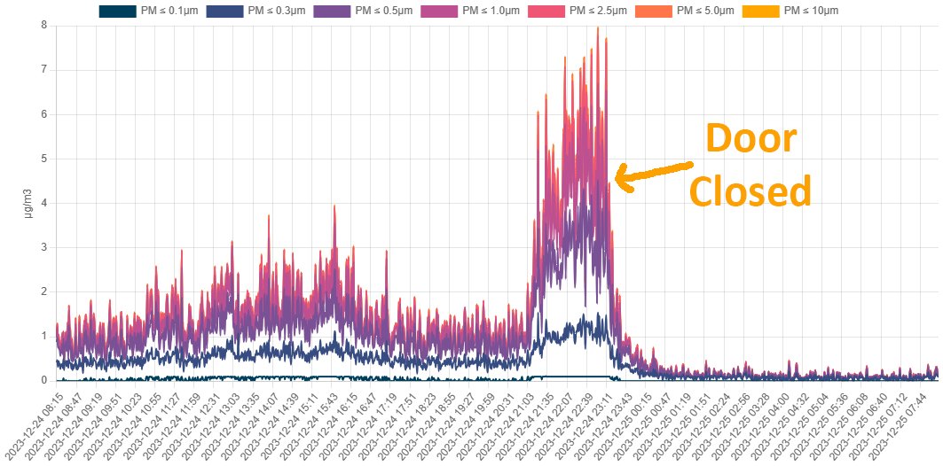
Here is the PM graph of the Model E in the basement hallway between the unfinished and finished sections. You can see the PM levels spiked up to 8 ug/m3 from the unfinished basement where the PM was leaking in. 33/  Graph of particulate matter (PM) levels spiking very quickly in the basement hallway to 8 ug/m3 and then dropping to almost nothing after closing the door to the unfinished section of the basement where the PM was leaking in. More info at: https://co2.click/
Sometimes just closing a door can make a huge difference and doing this quickly brought down PM levels to far below 1 ug/m3. Now we know during PM events to seal off that part of the basement from the rest 34/ Graph of particulate matter (PM) levels spiking very quickly in the basement hallway to 8 ug/m3 and then dropping to almost nothing after closing the door to the unfinished section of the basement where the PM was leaking in. More info at: https://co2.click/
It is not just external PM events you need to worry about. Cooking can also generate high levels of PM, and the Model X can be used indoors if you want. 35/
The two spikes you see in the graph are from microwave popcorn (PM 18 ug/m3) and cooking bacon inside an oven (PM 8 ug/mg) captured from the Model X in the hallway beside the kitchen. 36/ Graph of particulate matter (PM) levels spiking very quickly in the hallway beside the kitchen from microwave popcorn (PM 18 ug/m3) and cooking bacon inside an oven (PM 8 ug/mg). More info at: https://co2.click/
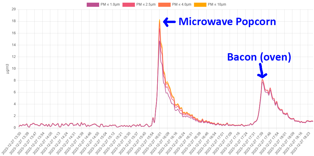
The PM also moves around the house from the kitchen, so please turn on any range/hood fans while cooking if you have them. 37/
Even the Model E in the basement picked up a similar level of PM from the microwave popcorn (PM 19 ug/m3) but much smaller amounts from the bacon (PM 2 ug/m3). 38/ Graph of particulate matter (PM) levels spiking very quickly in the basement from microwave popcorn (PM 18 ug/m3) and cooking bacon inside an oven (PM 8 ug/mg). More info at: https://co2.click/
The monitors also offer a nice feature that you can easily monitor your air quality readings remotely from a mobile device and even share the web link with other family members or friends if you want. 39/co2.click
The first is the public view which gives you a nice compact view of the most recent monitor reading along with graphs that show the patterns over the last 24 hours. 40/ Graph of co2.click public view showing temperature, humidity, barometric pressure, and supported PM levels with 24 hour history graph. More info at: https://co2.click/
You can choose to keep the link to the public view to yourself as well, only the owner of the device can generate a public view link. 41/
The second is helping others by making your sensor data available publicly on an air quality map. Businesses and organizations may want to report their indoor CO2 levels to the public so people know they take good ventilation seriously. 42/co2.click
Everyone can report their outdoor air quality levels so people who live in the area or will be visiting can get a better idea of the current state. 43/
The map is completely optional and can be enabled in the portal by going into the device "Configuration" and then choosing "Yes" for "Make this sensor public on the map". Selecting a location on the map creates a 2km wide circle for your monitor. 44/ co2.click
Screenshot showing how to enable your co2.click information on a public map for others to see the air quality in that part of town. More info at: https://co2.click/
If you are a business you can select your exact location which will show in the centre of the circle. If you are a homeowner but don't want to reveal your exact address, you can click on a location near your home... 45/
... such as within the 2km sphere so that people know what part of the city the air quality readings apply to. 46/
It is important to then select if your sensor is located Inside or Outside, you can give your sensor a descriptive name, and also choose if you want to make your public view link available from the map. 47/
sensors that opt-in for the map can be seen here ( ). There are filters to only show CO2 or PM sensors, and indoors or outdoors to help find information more easily, and colours to represent concentrations measured. 48/ co2.click
portal.co2.click/map.html
Screenshot of air quality map displaying results from co2.click monitors around the world. More info at: https://co2.click/
Clicking on the circle of a sensor brings up the latest readings and if enabled, a link to the Public View. 49/ Screenshot of the latest reading details from a co2.click monitor selected from the air quality map. More info at: https://co2.click/
What about the cost? The Model X outdoor AQ monitor is $199 Canadian dollars and currently free shipping to Canada and the continental USA ( ). 50/co2.click/products/Model…
The Model X will use any USB-C power adapter but if you need one, they can be purchased for $10 (USA/Canada) or $15 (Europe/UK/Australia/NZ) when ordering. 51/
On the other hand, importing a PurpleAir AQ monitor to Canada is much more expensive and costs $229 USD for the monitor (without power adapter) and $29.77 USD in taxes which converts at current rates to $343 Canadian dollars. 52/
Someone who purchased one also got hit with $58 in import duties so a total of $401, almost 2x the price of a Canada built Model X. 53/
Right now until the end of Dec. 31st, you can get another 15% off any of the AQ monitors for even more savings using the code 2023END ( ). 54/co2.click
For further reading on PM related pollution. The importance of indoor air quality ( ). 55/
Fun with Particulate Matter (PM) Sensors ( ). 56/
Wildfire PM2.5 Air Pollution and Equivalent Cigarettes ( ). 57/
Wildfire smoke - now extra toxic plumes from sun UV ( ). 58/
Ontario's Air Quality Health Index (AQHI) does not detect quick changing PM levels ( ). 59/
@threadreaderapp please unroll

• • •

Missing some Tweet in this thread? You can try to force a refresh
 

Keep Current with Jeff Gilchrist

Jeff Gilchrist Profile picture

Stay in touch and get notified when new unrolls are available from this author!

Read all threads

This Thread may be Removed Anytime!

PDF

Twitter may remove this content at anytime! Save it as PDF for later use!

Try unrolling a thread yourself!

how to unroll video
  1. Follow @ThreadReaderApp to mention us!

  2. From a Twitter thread mention us with a keyword "unroll"
@threadreaderapp unroll

Practice here first or read more on our help page!

More from @jeffgilchrist

Dec 31, 2023
2023 in Review

In case you missed them the first time, I'm looking back at what I thought were the most educational threads that I wrote over the past year starting with the oldest. 🧵1/ Image of person turning wooden 2023 blocks over to 2024. Image from: https://pixevety.com/2023-a-year-in-review-navigating-challenges-embracing-innovation-and-shaping-the-future/
Why do people get (re)infected over and over again? COVID actively evades your immune system by suppressing parts of it to become invisible. Part 1 ( ) and Part 2 ( ). 2/
What actually happens inside your body when you are sick? It is important to understand your body and immune system. Part 1 ( ) and Part 2 ( ). 3/
Read 10 tweets
Dec 29, 2023
#Variant update for #Ontario, #Canada

The EG.5.* "Eris" clan of variants is close to going under 50% of sequences. JN.1 "Pirola" has taken 1st place at 27% with HV.1 "Eris" down to 20%. The next closest is JG.3.2 "Eris" at 10%. Graph tools by @Mike_Honey_ 🧵1/

Sankey graph (height of each bar is # of sequences for that variant) showing top variants and their lineages over the past couple of months from PCR test genomic sequencing in Ontario, Canada. Visualization tool was created by @Mike_Honey_ ( https://app.powerbi.com/view?r=eyJrIjoiNzE5YzczODItMDQzMS00M2EzLWFjNWYtMjg3OTY3NTNhZDM3IiwidCI6ImRjMWYwNGY1LWMxZTUtNDQyOS1hODEyLTU3OTNiZTQ1YmY5ZCIsImMiOjEwfQ%3D%3D&pageName=ReportSection32240d6b62ba73667e98 )
Graph of top 7 COVID variants (JN.1, HV.1, JG.3.2, HV.1.6.1, HK.3, JD.1.1.1, JD.1.1) from PCR test genomic sequencing in Ontario, Canada. Visualization tool was created by @Mike_Honey_ ( https://app.powerbi.com/view?r=eyJrIjoiNzE5YzczODItMDQzMS00M2EzLWFjNWYtMjg3OTY3NTNhZDM3IiwidCI6ImRjMWYwNGY1LWMxZTUtNDQyOS1hODEyLTU3OTNiZTQ1YmY5ZCIsImMiOjEwfQ%3D%3D )
Graph of BA.2.86.* Pirola clan with JN.1 variant taking off from PCR test genomic sequencing in Ontario, Canada. Visualization tool was created by @Mike_Honey_ ( https://app.powerbi.com/view?r=eyJrIjoiNzE5YzczODItMDQzMS00M2EzLWFjNWYtMjg3OTY3NTNhZDM3IiwidCI6ImRjMWYwNGY1LWMxZTUtNDQyOS1hODEyLTU3OTNiZTQ1YmY5ZCIsImMiOjEwfQ%3D%3D
While most government agencies are not updating any public health data this week, thankfully scientists, lab techs, and @Mike_Honey_ are still working hard to provide new PCR sequencing data so we have a better understanding of variants circulating. 2/
You can find weekly Ontario stats including variants at ( ).

The visualization tool for variants was created by @Mike_Honey_ ( ). 3/covid.gilchrist.ca/Ontario.html
app.powerbi.com/view?r=eyJrIjo…
Read 5 tweets
Dec 21, 2023
#Variant update for #Ontario, #Canada

The EG.5.* "Eris" clan of variants is still most prevalent but declining. HV.1 "Eris" is still 1st with 22% but dropping rapidly while JN.1 "Pirola" is 2nd at almost 15% and JG.3.2 "Eris" at 11%. Graph tools by @Mike_Honey_ 🧵1/

Sankey graph (height of each bar is # of sequences for that variant) showing top variants and their lineages over the past couple of months from PCR test genomic sequencing in Ontario, Canada. Visualization tool was created by @Mike_Honey_ ( https://app.powerbi.com/view?r=eyJrIjoiNzE5YzczODItMDQzMS00M2EzLWFjNWYtMjg3OTY3NTNhZDM3IiwidCI6ImRjMWYwNGY1LWMxZTUtNDQyOS1hODEyLTU3OTNiZTQ1YmY5ZCIsImMiOjEwfQ%3D%3D&pageName=ReportSection32240d6b62ba73667e98
Graph of top 7 COVID variants (HV.1, JN.1, JG.3.2, HK.3, JD.1.1.1, JD.1.1, JG.3) from PCR test genomic sequencing in Ontario, Canada. Visualization tool was created by @Mike_Honey_ ( https://app.powerbi.com/view?r=eyJrIjoiNzE5YzczODItMDQzMS00M2EzLWFjNWYtMjg3OTY3NTNhZDM3IiwidCI6ImRjMWYwNGY1LWMxZTUtNDQyOS1hODEyLTU3OTNiZTQ1YmY5ZCIsImMiOjEwfQ%3D%3D )
Graph of BA.2.86.* Pirola clan with JN.1 variant taking off from PCR test genomic sequencing in Ontario, Canada. Visualization tool was created by @Mike_Honey_ ( https://app.powerbi.com/view?r=eyJrIjoiNzE5YzczODItMDQzMS00M2EzLWFjNWYtMjg3OTY3NTNhZDM3IiwidCI6ImRjMWYwNGY1LWMxZTUtNDQyOS1hODEyLTU3OTNiZTQ1YmY5ZCIsImMiOjEwfQ%3D%3D
You can find weekly Ontario stats including variants at ( ).

The visualization tool for variants was created by @Mike_Honey_ ( ). 2/covid.gilchrist.ca/Ontario.html
app.powerbi.com/view?r=eyJrIjo…
To learn how to see what variants are circulating in your area, please read this guide ( ). 3/
Read 4 tweets
Dec 17, 2023
If 1 in 13 people are infected in Ontario that means there is a 55% chance at least one person in your group of 10 is infected, jumps to 70% in groups of 15, 86.5% chance with 25 people and 98% for that office Christmas party of 50 people. Calculator
( ). docs.google.com/spreadsheets/d…

Chart showing if 1 in 13 people are infected in Ontario that means there is a 55% chance at least one person in your group of 10 is infected, jumps to 70% chance in groups of 15, 86.5% chance with 25 people and 98% chance for that office Christmas party of 50 people. Calculator available at: https://docs.google.com/spreadsheets/d/1qokCvvi6oRYRCKtrZuyeUmb5mt4LC9o8nKHLKoAUVAY/edit?usp=sharing
Did you know that with transmission levels this high, 100 people singing indoors for 90 minutes with no precautions is estimated to be the same COVID health risk as each person smoking 1,080 cigarettes ( )? covid19resources.ca/covid-hazard-i…
Cartoon explaining with transmission levels this high, 100 people singing indoors for 90 minutes with no precautions is estimated to be the same COVID health risk as each person smoking 1,080 cigarettes ( https://covid19resources.ca/covid-hazard-index/ )?
With almost record levels of transmission going on, please be extra careful during the holidays. Statistics Canada just released their latest report on Long COVID and found by people's 3rd COVID infection, 38% reported Long COVID symptoms (  ).www150.statcan.gc.ca/n1/pub/75-006-…
Read 5 tweets
Dec 3, 2023
Why do people seem to be getting sick more often now?

For yet another year we are already seeing earlier and significantly higher hospital admissions for respiratory illness than pre-pandemic levels. Are there new mysterious pathogens starting to attack us now? 🧵1/ Graphic of a person's body with a target on their chest and a COVID-19 arrow sticking in the bullseye, depicting an artistic representation of immune dysfunction. Prompt: "Create a graphic of immune dysfunction" by Microsoft Copilot.
Now that the excuses of lockdowns are starting to run out after 3 years, even the mainstream media are starting to understand and report what is going on ( ). H/T: @MeetJess 2/goodmorningamerica.com/wellness/video…
Dr Darien Sutton explains that the WHO and CDC are confirming the pathogens that are causing these increases in illness worldwide are not new but the usual suspects of RSV, COVID, adenovirus, strep pneumoniae and other bacteria including mycoplasma. 3/
Read 26 tweets
Dec 2, 2023
#Variant update for #Ontario, #Canada (Dec. 2, 2023)

[Fixed version] This sankey diagram shows the EG.5.1 "Eris" clan of variants are currently most prevalent: >70%. COVID-19 by far has the highest virus activity and still very little flu. Graph by @Mike_Honey_ 🧵1/
Sankey graph showing top variants and their lineages from PCR test genomic sequencing. Visualization tool was created by @Mike_Honey_ ( https://app.powerbi.com/view?r=eyJrIjoiNzE5YzczODItMDQzMS00M2EzLWFjNWYtMjg3OTY3NTNhZDM3IiwidCI6ImRjMWYwNGY1LWMxZTUtNDQyOS1hODEyLTU3OTNiZTQ1YmY5ZCIsImMiOjEwfQ%3D%3D&pageName=ReportSection32240d6b62ba73667e98 )
Table showing percentage positivity of respiratory virus activity in Ontario with COVID-19 at 20% positive Influenza at 2.8% (A) & 9% (B) positivity, with RSV in second at 8.7% positivity. Table from: https://www.publichealthontario.ca/en/Data-and-Analysis/Infectious-Disease/Respiratory-Virus-Tool
Looking at specific variants, it seems HV.1 from the EG.5.* [Eris] family peaked at 40% and now dropping so failed to achieve dominance while HK.3 is holding steady in 2nd place around 15%. JN.1 is now on the board in the top 7 however. 2/ Graph of 7 COVID variant frequencies from PCR test genomic sequencing. Visualization tool was created by @Mike_Honey_ ( https://app.powerbi.com/view?r=eyJrIjoiNzE5YzczODItMDQzMS00M2EzLWFjNWYtMjg3OTY3NTNhZDM3IiwidCI6ImRjMWYwNGY1LWMxZTUtNDQyOS1hODEyLTU3OTNiZTQ1YmY5ZCIsImMiOjEwfQ%3D%3D )
Looking more closely at the BA.2.86.* [Pirola] clan, the more immune evasive descendant JN.1 is increasing very rapidly and may overtake all the others in the next month. 3/ Graph of BA.2.86.* Pirola clan from PCR test genomic sequencing in Ontario. Visualization tool was created by @Mike_Honey_ ( https://app.powerbi.com/view?r=eyJrIjoiNzE5YzczODItMDQzMS00M2EzLWFjNWYtMjg3OTY3NTNhZDM3IiwidCI6ImRjMWYwNGY1LWMxZTUtNDQyOS1hODEyLTU3OTNiZTQ1YmY5ZCIsImMiOjEwfQ%3D%3D )
Read 13 tweets

Did Thread Reader help you today?

Support us! We are indie developers!


This site is made by just two indie developers on a laptop doing marketing, support and development! Read more about the story.

Become a Premium Member ($3/month or $30/year) and get exclusive features!

Become Premium

Don't want to be a Premium member but still want to support us?

Make a small donation by buying us coffee ($5) or help with server cost ($10)

Donate via Paypal

Or Donate anonymously using crypto!

Ethereum

0xfe58350B80634f60Fa6Dc149a72b4DFbc17D341E copy

Bitcoin

3ATGMxNzCUFzxpMCHL5sWSt4DVtS8UqXpi copy

Thank you for your support!

Follow Us!

:(