1/23
A long 🧵on the biggest economic issue not being discussed ... global shipping problems and potential return of goods inflation.
Below uses IMF Port call data on shipping traffic (via ship transponders and satellites).
@mercoglianos @johnkonradportwatch.imf.org/pages/port-mon…
A long 🧵on the biggest economic issue not being discussed ... global shipping problems and potential return of goods inflation.
Below uses IMF Port call data on shipping traffic (via ship transponders and satellites).
@mercoglianos @johnkonradportwatch.imf.org/pages/port-mon…
2/23
The Bab el-Mandeb is the 16 miles between Yemen and Djibouti, connecting the southern Red Sea with the Gulf of Aden.
This is where the Houthis are causing all the trouble.
BTW, Bab el-Mandeb roughly translates into "Gate of Tears" or "Gate of Grief."
How appropriate!
The Bab el-Mandeb is the 16 miles between Yemen and Djibouti, connecting the southern Red Sea with the Gulf of Aden.
This is where the Houthis are causing all the trouble.
BTW, Bab el-Mandeb roughly translates into "Gate of Tears" or "Gate of Grief."
How appropriate!

3/23
Between 12% and 15% of world shipping traverses the Red Sea. The Houthis are making an impact.
This chart shows how the volume of trade has collapsed. Updates should show it has fallen further.
FYI - March 2021 was Ever Given getting wedged in the Suez Canal.
Between 12% and 15% of world shipping traverses the Red Sea. The Houthis are making an impact.
This chart shows how the volume of trade has collapsed. Updates should show it has fallen further.
FYI - March 2021 was Ever Given getting wedged in the Suez Canal.

4/23
High-value cargo ship traffic is down 50% from late November.
Shipping insurance does not cover war risk; that insurance is now up 300% to 500% (0.2% to 0.7% of the value of the ship/cargo).
It is too expensive and risky to travel via this route.
High-value cargo ship traffic is down 50% from late November.
Shipping insurance does not cover war risk; that insurance is now up 300% to 500% (0.2% to 0.7% of the value of the ship/cargo).
It is too expensive and risky to travel via this route.

5/23
Tankers are impacted, but not to the degree that cargo ships are disrupted.
The Houthis are attacking cargo ships, not tankers.
Tankers are impacted, but not to the degree that cargo ships are disrupted.
The Houthis are attacking cargo ships, not tankers.

6/23
The Suez Canal is at the (northern) top of the Red Sea and connects it with the Eastern Mediterranean Sea.
The Suez Canal is at the (northern) top of the Red Sea and connects it with the Eastern Mediterranean Sea.

7/23
This Suez Canal is one of the most important shipping lanes in the world, if not the world's most important.
We are also seeing a drop off in shipping volume moving through it.
(Not as much as the Bab el-Mandeb as the Saudis have ports in the middle of the Red Sea.)
This Suez Canal is one of the most important shipping lanes in the world, if not the world's most important.
We are also seeing a drop off in shipping volume moving through it.
(Not as much as the Bab el-Mandeb as the Saudis have ports in the middle of the Red Sea.)

8/23
Overall, ship traffic through the Suez is down about 20 ships a day in the last 3 weeks. No container ships are in the Red Sea.
The Egyptians charge a $500k toll to pass through, so they are losing some $10m/day.
There have to be unhappy people in Cairo.
Overall, ship traffic through the Suez is down about 20 ships a day in the last 3 weeks. No container ships are in the Red Sea.
The Egyptians charge a $500k toll to pass through, so they are losing some $10m/day.
There have to be unhappy people in Cairo.

9/23
So, where are the ships going?
Around Africa and the Cape of Good Hope.
(Note Durban on the map)
So, where are the ships going?
Around Africa and the Cape of Good Hope.
(Note Durban on the map)

10/23
From Asia, going around the Cape of Good Hope (red), versus the Red Sea/Suez (green) adds about 10 days and 3,300 miles to a one-way trip.
From Asia, going around the Cape of Good Hope (red), versus the Red Sea/Suez (green) adds about 10 days and 3,300 miles to a one-way trip.

11/23
Ships are now reaching the Cape (Dec 25 to Jan 2 labels).
This number is expected to spike much higher in the coming days.
Ships are now reaching the Cape (Dec 25 to Jan 2 labels).
This number is expected to spike much higher in the coming days.

11/23
When they get there, they have to refuel in Durban, SA.
Refueling or bunker prices are skyrocketing to 6-year highs in anticipation of demand.
The facilities were not built for the huge armada heading its way. So, congestion delays.
oilmonster.com/bunker-fuel-pr…

When they get there, they have to refuel in Durban, SA.
Refueling or bunker prices are skyrocketing to 6-year highs in anticipation of demand.
The facilities were not built for the huge armada heading its way. So, congestion delays.
oilmonster.com/bunker-fuel-pr…

12/23
In addition to these shipping problems, there are continuing problems in the Panama Canal.
The Canal uses a series of locks and draws water from the lake Gutan.
In addition to these shipping problems, there are continuing problems in the Panama Canal.
The Canal uses a series of locks and draws water from the lake Gutan.

13/23
Every time the locks are used, they empty the equivalent of 400 swimming pools into the ocean.
Combine this water loss with the ongoing drought, and Lake Gutan is at its lowest in years.
(Cannot pump salt water back into a freshwater lake.)
Every time the locks are used, they empty the equivalent of 400 swimming pools into the ocean.
Combine this water loss with the ongoing drought, and Lake Gutan is at its lowest in years.
(Cannot pump salt water back into a freshwater lake.)

15/23
Consequently, the number of ships passing through the Canal is at COVID shutdown levels of 2020 (black line).
And many of these ships are not fully loaded to keep their drafts shallower.
Consequently, the number of ships passing through the Canal is at COVID shutdown levels of 2020 (black line).
And many of these ships are not fully loaded to keep their drafts shallower.

16/23
There are several shipping choke points around the world.
Much of the world's shipping travels through one of these points.
There are several shipping choke points around the world.
Much of the world's shipping travels through one of these points.

17/23
Add it up, and the number of cargo ships traversing all these choke points is at a three-year low.
Why? They are all on the high seas, taking longer routes to get to their destinations.
Add it up, and the number of cargo ships traversing all these choke points is at a three-year low.
Why? They are all on the high seas, taking longer routes to get to their destinations.

18/23
And the amount of IMPORT cargo reaching all worldwide ports has been plunging the last few weeks.
Currently, import volumes are as low as the COVID shutdowns.
And the amount of IMPORT cargo reaching all worldwide ports has been plunging the last few weeks.
Currently, import volumes are as low as the COVID shutdowns.

19/23
70% of all shipping is on long-term contracts ... a shuttle between ports (Asia and Europe).
If they have to go around Africa, that adds 20+ days to the route.
So, if a ship can make six runs yearly, the extra distance means it can only do 4 or 5 runs yearly.
70% of all shipping is on long-term contracts ... a shuttle between ports (Asia and Europe).
If they have to go around Africa, that adds 20+ days to the route.
So, if a ship can make six runs yearly, the extra distance means it can only do 4 or 5 runs yearly.

20/23
To make up for this shortfall of runs, excess shipping capacity is contracted on the "spot" market.
We have seen a massive spike in "spot" shipping rates in the last week (bottom panel).
To make up for this shortfall of runs, excess shipping capacity is contracted on the "spot" market.
We have seen a massive spike in "spot" shipping rates in the last week (bottom panel).

21/23
What happens when a ship docks in port? Those 15k boxes (TEUs) are unloaded.
They are put on a truck or rail and sent to an unpacking center where the containers are emptied.
Then, they are put on another truck or rail and sent to distribution centers.
From there, the goods are distributed all over the country to those who purchase those goods.
This is a massive logistical undertaking.
What makes it work is predictable schedules.
Now that ships will be weeks late, the logistical network will get out of balance, and delivery schedules will be a mess for months.
We will see this again?

22/23
Leading to goods inflation again?
See what goods inflation did into late 2022 when supply chains were messed up in 2020 and 2021.
Leading to goods inflation again?
See what goods inflation did into late 2022 when supply chains were messed up in 2020 and 2021.

23/23
Goods are fungible. They will be diverted from the US if they get higher prices in Europe.
So yes, if these shipping problems persist, they will impact the US.
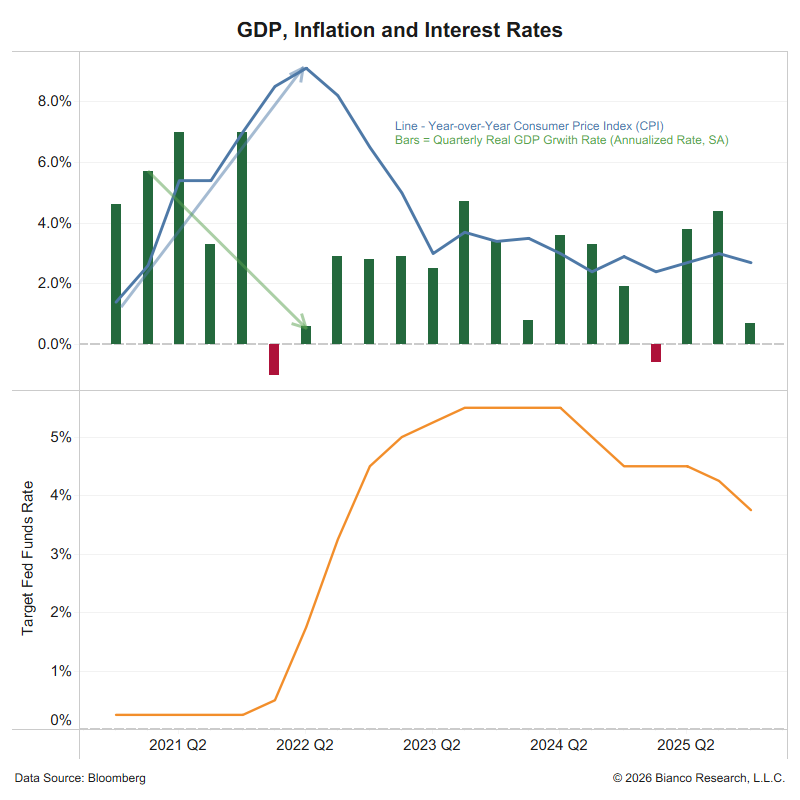
This could disrupt the "last mile" to 2% inflation and many Fed rate cuts in 2024.
Goods are fungible. They will be diverted from the US if they get higher prices in Europe.
So yes, if these shipping problems persist, they will impact the US.
This could disrupt the "last mile" to 2% inflation and many Fed rate cuts in 2024.
Bonus
Why doesn't the US Navy end the Houthi threat to shipping?
That involves picking a side in a Sunni/Shiite Arab civil war and the potential for civilian casualties.
Very tricky politically.
What about getting more involved in "defensively" protecting ships.
This means an open-ended commitment to using weapons that cost millions to stop Houthi weapons that cost thousands.
The US tried to get other countries to sign up to help (Operation Prosperity Guardian), but that effort has yet to be successful.
I got really good feedback on this thread. I'm glad it was snowing in Chicago yesterday, which kept me inside to finish it.
One follow-up. The problem is shipping, not "stuff"(goods).
In 2020/2021, the problem that led to the rise in goods inflation (chart below) was not a lack of stuff.
The problem was it was in all the wrong places.
* In China, in the shipping department of its manufacturer
* In a container anchored off San Pedro Bay, wait for a berth in the port of LA or Long Beach to unload
* in a stack of containers waiting to be unpacked in the yard of the port.
* In a distribution center because it arrived weeks late and had no delivery scheduled (because it missed it).
And remember, a lot of "stuff" is not end-user consumer goods that go straight to the shelves. It is parts and supplies that go into other products.
So even though US car production slowed from 209K in July 2020 to 84k in September 2021, all the parts to make 200k cars every month existed, they were all in the wrong places (see the list above). This is why production slowed. The Achilles Heel of "Just-in-Time."
Goods inflation spiked (chart below) because a lot of stuff has inelasticity. This is a fancy economics term, meaning you want it now and will pay up to get what is available.
This is why cars were trading well over sticker price in 2021; you needed one now and were not going to wait months or a year for all the stuff to get to the right places so manufacturing schedules could return to normal.
The current problems with shipping described in the thread above are worrisome. Are we about to have another round of stuff all in the wrong places? And when that happens, will people start paying up to get what is available, a.k.a. goods inflation?
With stock and bond prices rallying hard in the last few months, they have profits they can use to pay up.
The thread above shows that the shipping problems are a couple of weeks old. Tell me how long this disruption will last, and I'll tell you how bad goods inflation will get.
If it ended tomorrow, the answer is not that bad. But it does not look like it is ending tomorrow, and no apparent solution to getting stuff to the right place on time is currently visible. That visibility will come; these issues will not last forever.
How long will it take?
@mercoglianos @johnkonrad

• • •
Missing some Tweet in this thread? You can try to
force a refresh


