Jeff Gilchrist Profile picture
Jan 31 5 tweets 3 min read Read on X
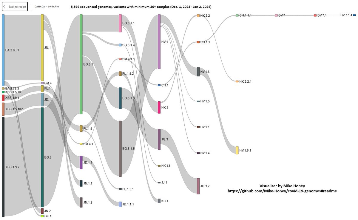
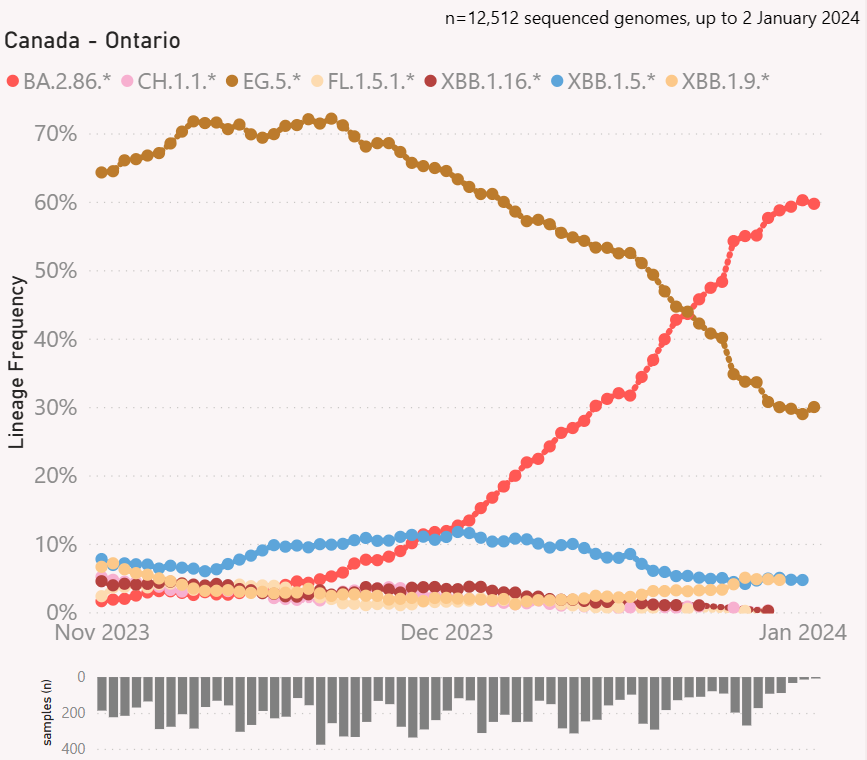
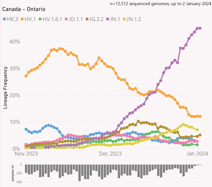
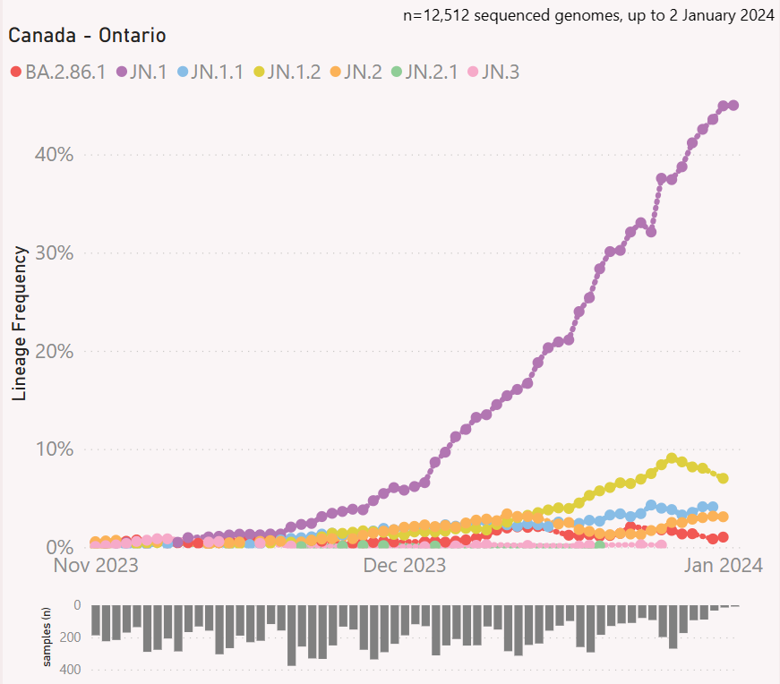
#Variant update for #Ontario, #Canada (to Jan. 24, 2024)

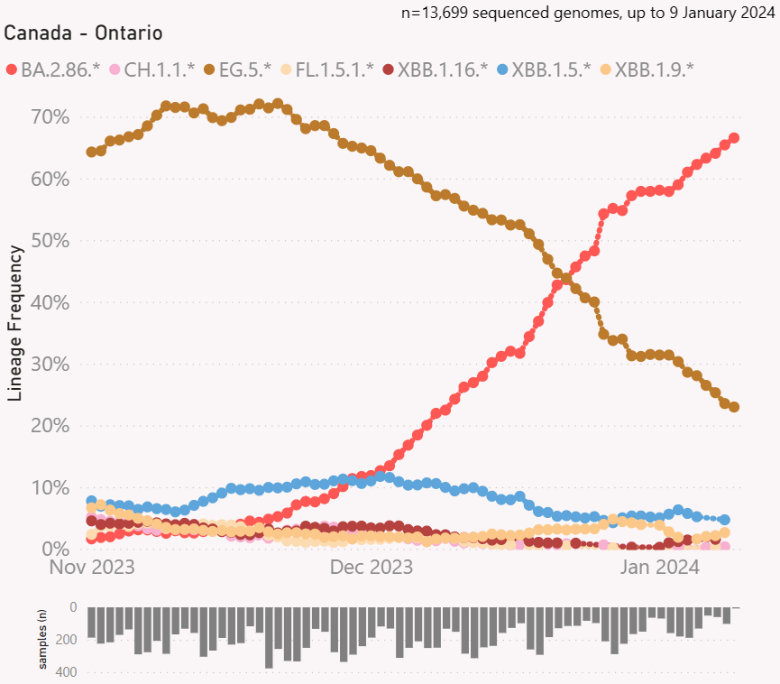
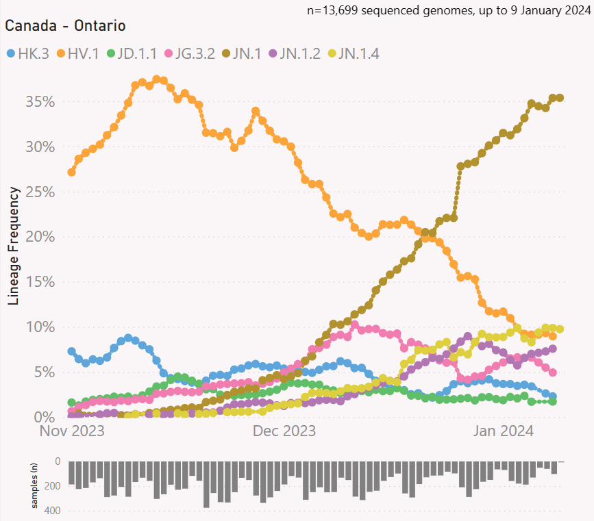
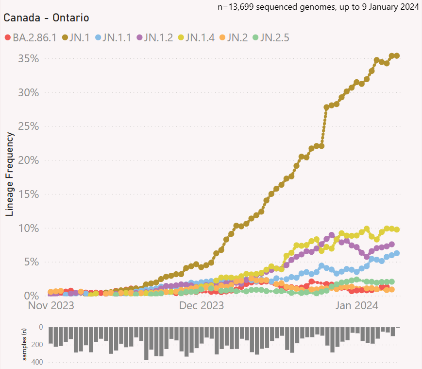
The BA.2.86.* #Pirola clan of variants has almost made a clean sweep at 90% of sequences. JN.1 "Pirola" surpasses 50% on its own with JN.1.4 a distant 2nd place with 12.5%. Graph tools by @Mike_Honey_

Sankey graph (height of each bar is # of sequences for that variant) showing top variants and their lineages over the past couple of months from PCR test genomic sequencing in Ontario, Canada. Visualization tool was created by @Mike_Honey_ ( https://app.powerbi.com/view?r=eyJrIjoiNzE5YzczODItMDQzMS00M2EzLWFjNWYtMjg3OTY3NTNhZDM3IiwidCI6ImRjMWYwNGY1LWMxZTUtNDQyOS1hODEyLTU3OTNiZTQ1YmY5ZCIsImMiOjEwfQ%3D%3D&pageName=ReportSection32240d6b62ba73667e98 )
Graph of top 7 COVID variant clans from PCR test genomic sequencing in Ontario, Canada. Visualization tool was created by @Mike_Honey_ ( https://app.powerbi.com/view?r=eyJrIjoiNzE5YzczODItMDQzMS00M2EzLWFjNWYtMjg3OTY3NTNhZDM3IiwidCI6ImRjMWYwNGY1LWMxZTUtNDQyOS1hODEyLTU3OTNiZTQ1YmY5ZCIsImMiOjEwfQ%3D%3D
Graph of top 7 COVID variants (HK.3, HV.1, JG.3.2, JN.1, JN.1.1, JN.1.2, JN.1.4) from PCR test genomic sequencing in Ontario, Canada. Visualization tool was created by @Mike_Honey_ ( https://app.powerbi.com/view?r=eyJrIjoiNzE5YzczODItMDQzMS00M2EzLWFjNWYtMjg3OTY3NTNhZDM3IiwidCI6ImRjMWYwNGY1LWMxZTUtNDQyOS1hODEyLTU3OTNiZTQ1YmY5ZCIsImMiOjEwfQ%3D%3D )
You can find weekly Ontario stats including variants at ( ) and ( ).

The visualization tool for variants was created by @Mike_Honey_ ( ).covid.gilchrist.ca/Ontario.html
gilchrist.great-site.net/jeff/COVID-19/…
app.powerbi.com/view?r=eyJrIjo…
To learn how to create a Sankey diagram of variants circulating in your area, please read this guide ( ).
To learn how to see what variants are circulating in your area, please read this guide ( ).
@threadreaderapp please unroll

• • •

Missing some Tweet in this thread? You can try to force a refresh
 

Keep Current with Jeff Gilchrist

Jeff Gilchrist Profile picture

Stay in touch and get notified when new unrolls are available from this author!

Read all threads

This Thread may be Removed Anytime!

PDF

Twitter may remove this content at anytime! Save it as PDF for later use!

Try unrolling a thread yourself!

how to unroll video
  1. Follow @ThreadReaderApp to mention us!

  2. From a Twitter thread mention us with a keyword "unroll"
@threadreaderapp unroll

Practice here first or read more on our help page!

More from @jeffgilchrist

Feb 1
COVID-19 hospitalization data no longer being updated in Ontario Respiratory Virus Tool

After making an inquiry to PHO about why there was so much missing hospital data, especially for Ottawa (see graph of only 3 cases reported since Aug.) I got this response...🧵1/ @Billius27 Graph showing mostly missing data for Ottawa Hospitalization in the Ontario Respiratory Virus Tool (OVRT) is available at ( https://www.publichealthontario.ca/en/Data-and-Analysis/Infectious-Disease/Respiratory-Virus-Tool ).
"Thank you for contacting Public Health Ontario (PHO).

The completeness of hospitalization (hospital admissions) data for COVID-19 cases, which PHO obtains from the provincial Case and Contact Management database (CCM), ... " 2/
"...has been declining over the course of the 2023-24 surveillance period. This means that hospital admissions data from CCM are more likely to misrepresent the COVID-19 hospitalization trends over time. " 3/
Read 10 tweets
Jan 27
Come read about our family adventure with the new game The Haunted Woods created by @stevemwilcox.

"In a far away land, there is a village surrounded by a sprawling forest. Once the forest was lush and vibrant, but it has grown dark and gloomy of late."🧵1/ Image of a haunted forest from the game The Haunted Woods created by Steve Wilcox @stevemwilcox.
"The villagers have taken to calling it The Haunted Woods and all who pass through it become cursed. But pass through it they must, for once every year the villagers need to make a pilgrimage to the The Sacred Well and return with its life-giving waters." 2/
An unrolled one-page web view for this long thread that may be easier to read or share can be found here ( ). 3/
Read 41 tweets
Jan 25
Virus update for Ottawa, Canada (Jan 24, 2024)

#Wastewater levels in #Ottawa are still very high and #Hospitalization *for* #COVID-19 declined somewhat during the holidays so it will be interesting to see what happens now that the JN.1 #Pirola variant has taken over. 🧵1/
Graph of wastewater levels in Ottawa, Ontario. Weekly stats available at ( http://covid.gilchrist.ca/Ottawa.html )
Graph of # of people currently hospitalized *for* COVID-19 in Ottawa, Ontario. Weekly stats available at ( http://covid.gilchrist.ca/Ottawa.html )
RSV levels in Ottawa wastewater continue to decline. Influenza A wastewater levels decreased over the holidays when schools were closed but now increasomg quickly again and still 40% higher than the peak of last year. 2/ Graph showing RSV levels decreased, Influenza A levels very high and low Influenza B wastewater levels in Ottawa, Ontario. Weekly stats available at ( http://covid.gilchrist.ca/Ottawa.html )
Our young children are especially vulnerable to respiratory virus infections. In Ottawa, despite children age 0-11 only making up 11% of the population, they accounted for 38% of respiratory related Emergency Department visits the week of Jan. 14 ( ). 3/ ottawapublichealth.ca/en/reports-res…
Graph showing % of total respiratory related ED visits by week in Ottawa, Ontario with children <12 making up almost 50% of all visits despite being only 11% of the population. Weekly stats available at ( http://covid.gilchrist.ca/Ottawa.html )
Read 5 tweets
Jan 20
#Variant update for #Ontario, #Canada (to Jan. 9, 2024)

The BA.2.86.* #Pirola clan of variants is now the majority of sequences at 66%. JN.1 "Pirola" keeps 1st place at 35% with the "birth" of JN.1.4 at 10% in 2nd and HV.1 #Eris at 9% in 3rd. Graph tools by @Mike_Honey_ 🧵1/

Sankey graph (height of each bar is # of sequences for that variant) showing top variants and their lineages over the past couple of months from PCR test genomic sequencing in Ontario, Canada. Visualization tool was created by @Mike_Honey_ ( https://app.powerbi.com/view?r=eyJrIjoiNzE5YzczODItMDQzMS00M2EzLWFjNWYtMjg3OTY3NTNhZDM3IiwidCI6ImRjMWYwNGY1LWMxZTUtNDQyOS1hODEyLTU3OTNiZTQ1YmY5ZCIsImMiOjEwfQ%3D%3D&pageName=ReportSection32240d6b62ba73667e98 )
Graph of top 7 COVID variant clans from PCR test genomic sequencing in Ontario, Canada. Visualization tool was created by @Mike_Honey_ ( https://app.powerbi.com/view?r=eyJrIjoiNzE5YzczODItMDQzMS00M2EzLWFjNWYtMjg3OTY3NTNhZDM3IiwidCI6ImRjMWYwNGY1LWMxZTUtNDQyOS1hODEyLTU3OTNiZTQ1YmY5ZCIsImMiOjEwfQ%3D%3D
Graph of top 7 COVID variants (HK.3, HV.1, JD.1.1, JG.3.2, JN.1, JN.1.2, JN.1.4) from PCR test genomic sequencing in Ontario, Canada. Visualization tool was created by @Mike_Honey_ ( https://app.powerbi.com/view?r=eyJrIjoiNzE5YzczODItMDQzMS00M2EzLWFjNWYtMjg3OTY3NTNhZDM3IiwidCI6ImRjMWYwNGY1LWMxZTUtNDQyOS1hODEyLTU3OTNiZTQ1YmY5ZCIsImMiOjEwfQ%3D%3D )
You can see that JN.1 "Pirola" took off very quickly but in early December multiple descendants emerged with JN.1.4 already taking 10% of sequenced cases, JN.1.2 at 8% and JN.1.1 at 6% so the family is growing quickly and may prevent JN.1 from hitting 50% on its own. 2/ Graph of top 7 BA.2.86.* Pirola family COVID variants (BA.2.86.1, JN.1, JN.1.1, JN.1.2, JN.1.4, JN.2, JN.2.5) from PCR test genomic sequencing in Ontario, Canada. Visualization tool was created by @Mike_Honey_ ( https://app.powerbi.com/view?r=eyJrIjoiNzE5YzczODItMDQzMS00M2EzLWFjNWYtMjg3OTY3NTNhZDM3IiwidCI6ImRjMWYwNGY1LWMxZTUtNDQyOS1hODEyLTU3OTNiZTQ1YmY5ZCIsImMiOjEwfQ%3D%3D )
To give you an idea of just how different the Pirola family of variants is, this antigenic cartography graph shows JN.1 way down in the far right corner, far away from the HV.1 Eris variant (mid-right) that JN.1 just displaced. H/T: @yunlong_cao 3/ Antigenic cartography chart showing the more distance between variants in the graph, the less cross-reactivity between the variants. Each box represents a 2x decrease in efficacy. Image from: https://twitter.com/yunlong_cao/status/1714694253530804588
Read 11 tweets
Jan 14
#Variant update for #Ontario, #Canada (to Jan. 2, 2023)

The BA.2.86.* #Pirola clan of variants is now the majority of sequences at 60%. JN.1 "Pirola" keeps 1st place at 45% with HV.1 #Eris a distant 2nd at 12%, then JN.1.2 at 7%. Graph tools by @Mike_Honey_ 🧵1/

Sankey graph (height of each bar is # of sequences for that variant) showing top variants and their lineages over the past couple of months from PCR test genomic sequencing in Ontario, Canada. Visualization tool was created by @Mike_Honey_ ( https://app.powerbi.com/view?r=eyJrIjoiNzE5YzczODItMDQzMS00M2EzLWFjNWYtMjg3OTY3NTNhZDM3IiwidCI6ImRjMWYwNGY1LWMxZTUtNDQyOS1hODEyLTU3OTNiZTQ1YmY5ZCIsImMiOjEwfQ%3D%3D&pageName=ReportSection32240d6b62ba73667e98 )
Graph of top 7 COVID variant clans from PCR test genomic sequencing in Ontario, Canada. Visualization tool was created by @Mike_Honey_ ( https://app.powerbi.com/view?r=eyJrIjoiNzE5YzczODItMDQzMS00M2EzLWFjNWYtMjg3OTY3NTNhZDM3IiwidCI6ImRjMWYwNGY1LWMxZTUtNDQyOS1hODEyLTU3OTNiZTQ1YmY5ZCIsImMiOjEwfQ%3D%3D
Graph of top 7 COVID variants (JN.1, HV.1, JN.1.2, JG.3.2, HK.3, JD.1.1, HV.1.6.1) from PCR test genomic sequencing in Ontario, Canada. Visualization tool was created by @Mike_Honey_ ( https://app.powerbi.com/view?r=eyJrIjoiNzE5YzczODItMDQzMS00M2EzLWFjNWYtMjg3OTY3NTNhZDM3IiwidCI6ImRjMWYwNGY1LWMxZTUtNDQyOS1hODEyLTU3OTNiZTQ1YmY5ZCIsImMiOjEwfQ%3D%3D )
The one page easier to share version of this thread can be found at ( ). 2/mastoreader.io/?url=https%3A%…
Despite transmission levels being high in Ontario for the past few months and so many people being infected with an EG.5.* "Eris" based variant, JN.1 "Pirola" was still able to come in and take over quickly. 3/ Graph of top 7 BA.2.86.* Pirola family COVID variants (BA.2.86.1, JN.1, JN.1.1, JN.1.2, JN.2, JN.2.1, JN.3) from PCR test genomic sequencing in Ontario, Canada. Visualization tool was created by @Mike_Honey_ ( https://app.powerbi.com/view?r=eyJrIjoiNzE5YzczODItMDQzMS00M2EzLWFjNWYtMjg3OTY3NTNhZDM3IiwidCI6ImRjMWYwNGY1LWMxZTUtNDQyOS1hODEyLTU3OTNiZTQ1YmY5ZCIsImMiOjEwfQ%3D%3D )
Read 12 tweets
Jan 11
How To: Create a Sankey diagram of variants circulating in your area

This thread will walk you through the process of using @Mike_Honey_'s visualization tool to generate a Sankey diagram for your country, province or State.🧵1/ Filtered Sankey diagram view with "Lineage Level" set to 3 and 11 and the Minimum # Samples per Lineage to show" to 60 and all labels shown. Visualization tool was created by Mike Honey @Mike_Honey_ ( https://app.powerbi.com/view?r=eyJrIjoiNzE5YzczODItMDQzMS00M2EzLWFjNWYtMjg3OTY3NTNhZDM3IiwidCI6ImRjMWYwNGY1LWMxZTUtNDQyOS1hODEyLTU3OTNiZTQ1YmY5ZCIsImMiOjEwfQ%3D%3D )
An unrolled one-page web view for this long thread that may be easier to read or share can be found here ( ). 2/
Step 1: Go to Mike's variant visualization tool ( ). By default, Australia is chosen so you need to select your region of interest. 3/app.powerbi.com/view?r=eyJrIjo…
Read 32 tweets

Did Thread Reader help you today?

Support us! We are indie developers!


This site is made by just two indie developers on a laptop doing marketing, support and development! Read more about the story.

Become a Premium Member ($3/month or $30/year) and get exclusive features!

Become Premium

Don't want to be a Premium member but still want to support us?

Make a small donation by buying us coffee ($5) or help with server cost ($10)

Donate via Paypal

Or Donate anonymously using crypto!

Ethereum

0xfe58350B80634f60Fa6Dc149a72b4DFbc17D341E copy

Bitcoin

3ATGMxNzCUFzxpMCHL5sWSt4DVtS8UqXpi copy

Thank you for your support!

Follow Us!

:(