Dr Clare Craig Profile picture
Feb 24 8 tweets 2 min read Read on X
I have buried myself deep in the ONS data today in an attempt to redeem myself after my mistake with accidentally including Wales in my sums earlier this week.

In brief, ONS have moved from predicting deaths based on previous years to modelling them.
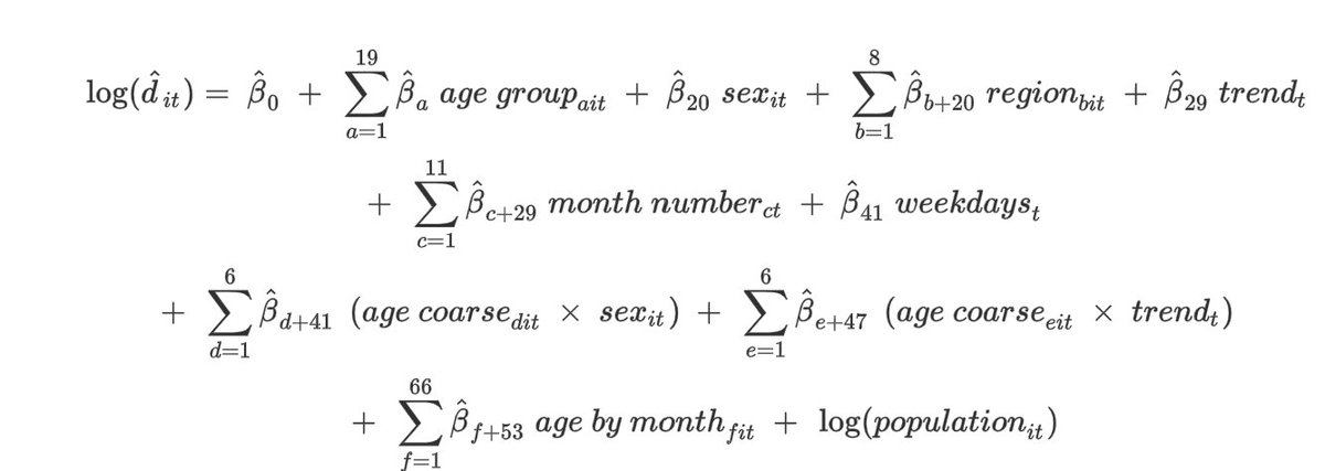
It look complex but... Image
it is mostly justifiable.

Each zigzag sigma symbol just means "add them all up".

The modelling calculates an estimate for lots of small groups and then adds them together.
That way each of

· 19 age groups,
· sex,
· 8 regions,
· the preceding trend in an age group (i.e. were deaths increasing or decreasing recently),
· the time of year (although they forgot the 12th month!),
· the day of the week

contribute to expected number of deaths. Image
Then it does get more complicated as these factors then get combined with each other.

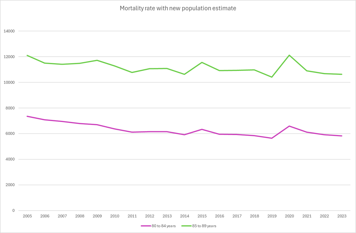
Broader age groups e.g. 30-69 yr olds (age coarse) are weighted to account for:

sex differences in death rates (men die more until only women are left),

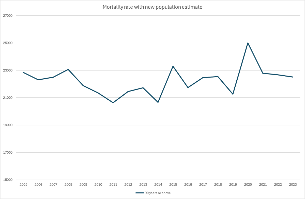
differences in trends between the sexes (deaths in men over 90 have been rapidly increasing thanks to survival)

and differences in seasonality (women die more in winter).Image
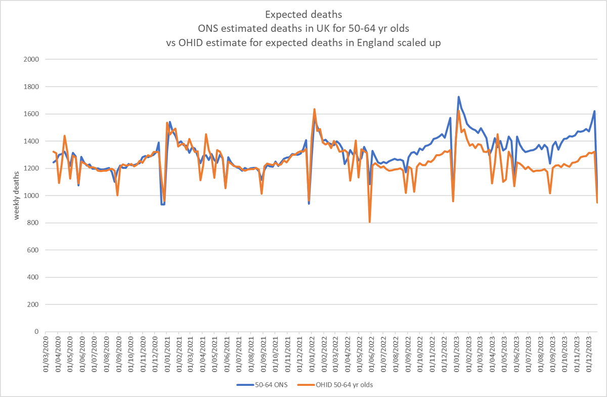
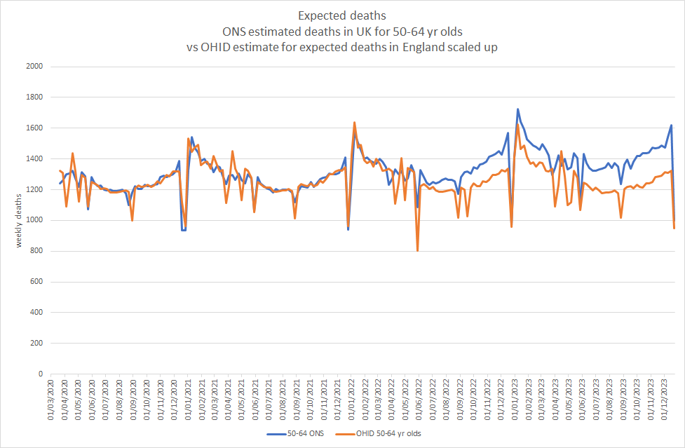
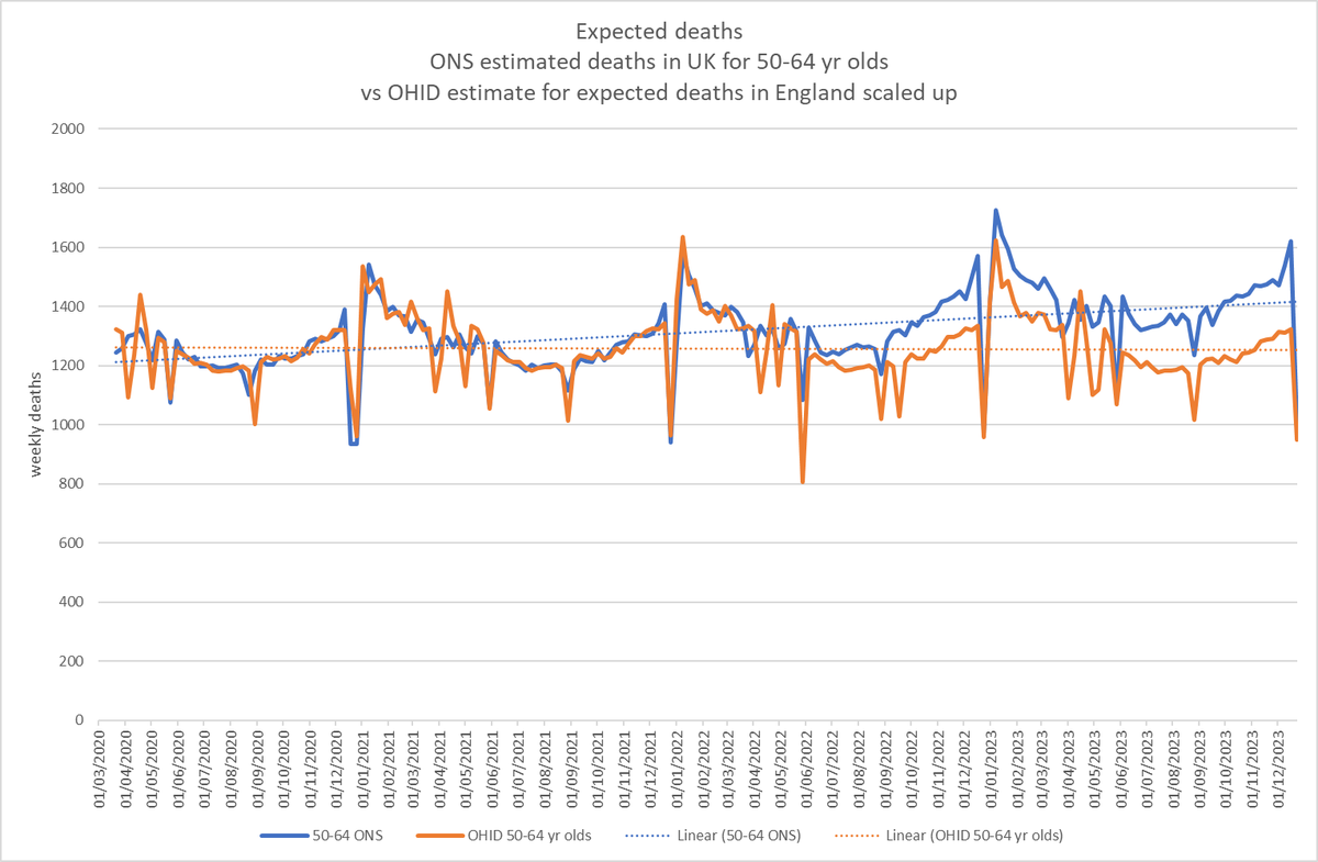
The problem arises with the "trend".

They define it as

"a linear time trend, modelled as a time index ranging from one to the number of periods in the dataset"

without specifying the length of a time period.
It means that increases in mortality over time (which might be of note) are incoroporated back into the model.

Deaths increase and the ONS then expects deaths to increase.

This circularity could provide the perfect way to hide a problem.
The @ONS needs to be clear about what time period they are using for this.

@Sarah__Caul
@ONS @Sarah__Caul @threadreaderapp please unroll

• • •

Missing some Tweet in this thread? You can try to force a refresh
 

Keep Current with Dr Clare Craig

Dr Clare Craig Profile picture

Stay in touch and get notified when new unrolls are available from this author!

Read all threads

This Thread may be Removed Anytime!

PDF

Twitter may remove this content at anytime! Save it as PDF for later use!

Try unrolling a thread yourself!

how to unroll video
  1. Follow @ThreadReaderApp to mention us!

  2. From a Twitter thread mention us with a keyword "unroll"
@threadreaderapp unroll

Practice here first or read more on our help page!

More from @ClareCraigPath

Feb 24
1/9 🧵

ONS aren’t the only gov agency to model expected deaths.

OHID do too.

Their method is simpler:
1. Take average from 2015-2019
2. Adjust for subsequent population growth
3. Adjust for subsequent ageing

The difference between these models is stark. Image
2/9

The ONS have not released their data for England by age only for the UK as a whole.

To compare with OHID I took the ratio of expected deaths in 2020 and 2021 and used that to scale the OHID England estimate to all of UK.

It goes off the rails in mid 2022. Image
3/9
The difference is ~ 7.5K extra deaths in 2023 that the ONS “expect” compared to OHID.

12% more than the OHID expectation!

For every 8 people that OHID expects to die, ONS will ignore another death and call it “expected”.

The dotted line shows the trend over time. Image
Read 10 tweets
Feb 22
This large hike in numbers is from the baby boomers feeding through and is evident when they switched categories before.

This is what it looks like over time for old and new methodology.

Let me explain in a couple more tweets. 🧵
Image
ONS have just expanded pop by ~5% for every age group since 2005.

A bigger population means a lower mortality rate (deaths per 100k people_.

This is what the mortality rates look like for each age group now.

Hard to see any impact from covid.

Here are over 90 yr olds: Image
80-89 yr olds: Image
Read 13 tweets
Feb 18
White blood clots occurred pre-covid panic in the arterial system.

They are white because there are few red blood cells in them - it's a sign they were made in a high flow environment.

Vaccine injury can contribute.

Here's how. 🧵

ncbi.nlm.nih.gov/pmc/articles/P…
Image
1. The mRNA platform results in foreign protein expression in endothelial cells and their consequent death. This creates a pro-thrombotic surface.

ncbi.nlm.nih.gov/pmc/articles/P…
2. Spike results in platelet activation.

The receptor binding domain (included intact in the vaccine) alone “could bind platelets, cause platelet activation, and potentiate platelet aggregation.”

in mice.


and here spj.science.org/doi/10.34133/r…
pesquisa.bvsalud.org/global-literat…
Read 17 tweets
Dec 9, 2023
Here's an interesting accusation.

1. I have never, ever promoted these products in any way.

2. I do not promote them now.

It all comes down to understanding the two biggest lies you were told about the virus.

The Tsunami Lie.

🧵
The lie we were told was that there was a novel virus and that everyone would catch it.

We were ALL susceptible, you see.

The lie was based on believing in the measles model of transmission. Image
When a population is naive to measles, it spreads and everyone will catch it.

This was seen in the Faroe Islands in 1846 where there hadn't been an outbreak for 65 years.

But it NOT true for influenza. Image
Read 31 tweets
Nov 9, 2023
I have been digging into what this graph means.

These are deaths of people from "other respiratory diseases."

Along comes a "deadly respiratory virus" and they stop dying?

Let's try and make sense of this. Image
There were three ways of being included in this data if you had a respiratory death:

1. Acute respiratory infection deaths
2. Chronic respiratory disease (which includes CPOD, empyhsema, asthma and bronchitis)
3. Other

Any of the above could also be described as a covid death.
The definition of other respiratory diseases in methodology section was any respiratory disease excluding the other two categories.

What's left... Image
Read 12 tweets
Oct 11, 2023
Study fails to define "unvaccinated".

If you add "boosted" and "fully vaccinated" to the "unvaccinated" you have every patient in the study.

Anyone with one dose was therefore "unvaccinated".

Singapore had cardiac problems before covid. hartgroup.org/singapore-is-a…

Image
Why did they choose the scale they chose for this graph in supplementary data? Image
Read 5 tweets

Did Thread Reader help you today?

Support us! We are indie developers!


This site is made by just two indie developers on a laptop doing marketing, support and development! Read more about the story.

Become a Premium Member ($3/month or $30/year) and get exclusive features!

Become Premium

Don't want to be a Premium member but still want to support us?

Make a small donation by buying us coffee ($5) or help with server cost ($10)

Donate via Paypal

Or Donate anonymously using crypto!

Ethereum

0xfe58350B80634f60Fa6Dc149a72b4DFbc17D341E copy

Bitcoin

3ATGMxNzCUFzxpMCHL5sWSt4DVtS8UqXpi copy

Thank you for your support!

Follow Us!

:(