views

I’m a Dutch science journalist, and I watched @climatethemovie.
It’s full of crap. 😂
Here’s my step-by-step walkthrough, translated by popular request! 👍
Enjoy the ride! 🧵
It’s full of crap. 😂
Here’s my step-by-step walkthrough, translated by popular request! 👍
Enjoy the ride! 🧵
2/ ...After a fairly ok summary "it was much warmer in prehistoric times than today" (sure, but who cares?)
Yup: first lie. ⚠️
This graph, of temperatures over the past 2000 years:
Yup: first lie. ⚠️
This graph, of temperatures over the past 2000 years:

3/ ...It’s a well known reconstruction, by Ljungqvist. 👇
Except... it’s TWENTY YEARS OLD. 🙄 jstor.org/stable/40930999
Except... it’s TWENTY YEARS OLD. 🙄 jstor.org/stable/40930999

4/ ...Today, we know that the ‘warm’ Medieval and Roman periods from the graph were actually REGIONAL.
Current warming (right) is EVERYWHERE:
Current warming (right) is EVERYWHERE:

5/ ...Modern reconstructions of temperatures since the year zero AD look more like this:
(see: ) nature.com/articles/natur…
(see: ) nature.com/articles/natur…

6/ ...Plus, the documentary LEAVES OUT the last bit of
Ljungqvist's graph.
Today, it would look like this 👇:
Ljungqvist's graph.
Today, it would look like this 👇:

7/ ...Hey! It’s the good old Central England Temp Record!
A classic, among climate skeptics. 🥳
Because it appears to show there has been *hardly any warming* since, say, 1650...
Until you take a closer look...📷
A classic, among climate skeptics. 🥳
Because it appears to show there has been *hardly any warming* since, say, 1650...
Until you take a closer look...📷

8/ ...A few things aren't right.
First of all, the real graph VERY CLEARLY shows warming is indeed happening...
First of all, the real graph VERY CLEARLY shows warming is indeed happening...

9/ ...And secondly: Central England is of course just a pinprick on the map. Lots of regional influence here.
Here’s the AVERAGE of measurements, on the Northern Hemisphere 😏:
Here’s the AVERAGE of measurements, on the Northern Hemisphere 😏:

10/ ...It doesn't get better than this. 🥳👇
Peak climate scepticism: "What we see is simply a recovery after the Little Ice Age". 🤷♂️
Um, nope.
Peak climate scepticism: "What we see is simply a recovery after the Little Ice Age". 🤷♂️
Um, nope.
11/ ...The Little Ice Age was probably the sum of several natural factors:
sun ☀️
volcanism 🌋
maybe sea current 🧜
And those factors are simply NOT doing the heavy lifting now.
Actually, the climate should cool DOWN a bit. 👇
sun ☀️
volcanism 🌋
maybe sea current 🧜
And those factors are simply NOT doing the heavy lifting now.
Actually, the climate should cool DOWN a bit. 👇

12/ ...Here's another nice one.
"In Central Park, temperatures haven’t changed since 1940! The normal temperature fluctuations are much greater." 🤔
No shit, Sherlock. 😂
"In Central Park, temperatures haven’t changed since 1940! The normal temperature fluctuations are much greater." 🤔
No shit, Sherlock. 😂
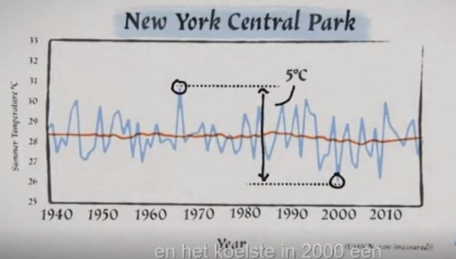
13/ It’s misleading. Central Park is hardly representative of the US.
Here's the national statistics.
Seems the world is warming up in the US too. 🥳
Here's the national statistics.
Seems the world is warming up in the US too. 🥳

14/ ...This also gives MORE temperature records.
Here’s a beautiful time series from @Datagraver 🏆, in my country. Of the number of daily temperature records.
Fewer and fewer COLD records each year. And more and more HEAT records...
Here’s a beautiful time series from @Datagraver 🏆, in my country. Of the number of daily temperature records.
Fewer and fewer COLD records each year. And more and more HEAT records...

(It's getting boring, I know. But hang in there! Just grab a nice tidbit here and there 🥳👍)
15/ ...Here's the next box to tick on the climate bullshit bingo card:
"The earth isn't warming up! It's just because the thermometers are more and more in the city!" 🥳
"The earth isn't warming up! It's just because the thermometers are more and more in the city!" 🥳
16/ ...Sure.
Then those buildings and parking lots have also been built… at sea? (blue) 🤔
Then those buildings and parking lots have also been built… at sea? (blue) 🤔

17/ (The fact that land masses heat up more than the sea is simply because the oceans cool themselves, by evaporation.)
carbonbrief.org/guest-post-why…
carbonbrief.org/guest-post-why…
18/ ...And of course, scientists DO COMPENSATE for urban heat, by comparing their measurements with rural areas (green 👇).
Interestingly, it often doesn't even matter that much.
Urban weather stations are often located in parks, etc.
Interestingly, it often doesn't even matter that much.
Urban weather stations are often located in parks, etc.

19/ ...Aaaaand, yes!! "CO2 is plant food" 🌿
Anyone Bingo yet? 🥳
(The point, of course, is that climate change is about the 46% of our CO2 emissions that is *NOT* absorbed by nature, and ends up in the atmosphere.)
Anyone Bingo yet? 🥳
(The point, of course, is that climate change is about the 46% of our CO2 emissions that is *NOT* absorbed by nature, and ends up in the atmosphere.)
20/ ...Even about something that is TRUE (plants absorb CO2), the documentary manages to get it wrong.
Wut? Did “all life nearly got extinct” during the Last Glacial Maximum? 🤔
Wut? Did “all life nearly got extinct” during the Last Glacial Maximum? 🤔
21/ ...The mighty mammoth begs to disagree. 😂
(Not to mention all prehistoric life in the tropics back then)
(Not to mention all prehistoric life in the tropics back then)

22/ ...Plus, it’s not like we’re running out of CO2. 🙄
Here’s the CO2 over the past 800,000 years.
Currently, we’re at 420 ppm.
Here’s the CO2 over the past 800,000 years.
Currently, we’re at 420 ppm.

23/ Another classic:
"There is a correlation between CO2 and temperature, but the other way around: CO2 only rises after temperature." 🤔
This is actually true. But only PARTLY.
"There is a correlation between CO2 and temperature, but the other way around: CO2 only rises after temperature." 🤔
This is actually true. But only PARTLY.
24/ ...Here’s CO2 (black) and temperature (blue), last 800,000 years. 👇
What usually happens:
Sun pokes up the system a bit => earth warms up => CO2 is released => warming accelerates. 💡
Often, CO2 is a *feedback*.
What usually happens:
Sun pokes up the system a bit => earth warms up => CO2 is released => warming accelerates. 💡
Often, CO2 is a *feedback*.

25/ ...But of course that does NOT mean that CO2 isn’t capable of warming the earth!
Just think of your house. Sun ☀️ often warms it up.
But that doesn’t mean your thermostat is useless.
There is simply *MORE THAN ONE WAY* to heat a house! 🥳
Just think of your house. Sun ☀️ often warms it up.
But that doesn’t mean your thermostat is useless.
There is simply *MORE THAN ONE WAY* to heat a house! 🥳

26/ ...Probably the best geological evidence for warming by greenhouse gases: the ‘PETM’, 56 million years ago. 👇
Methane erupted from the sea => VERY fast warming. 🥳
southampton.ac.uk/news/2022/03/a…
Methane erupted from the sea => VERY fast warming. 🥳
southampton.ac.uk/news/2022/03/a…
(Phew, almost half way through! Keep up!)
27/ ...Ok, another nice lie.
"Most of the warming occurred before 1940. And most of the CO2 emissions were AFTER that!"🤥
Not quite. 😏
"Most of the warming occurred before 1940. And most of the CO2 emissions were AFTER that!"🤥
Not quite. 😏
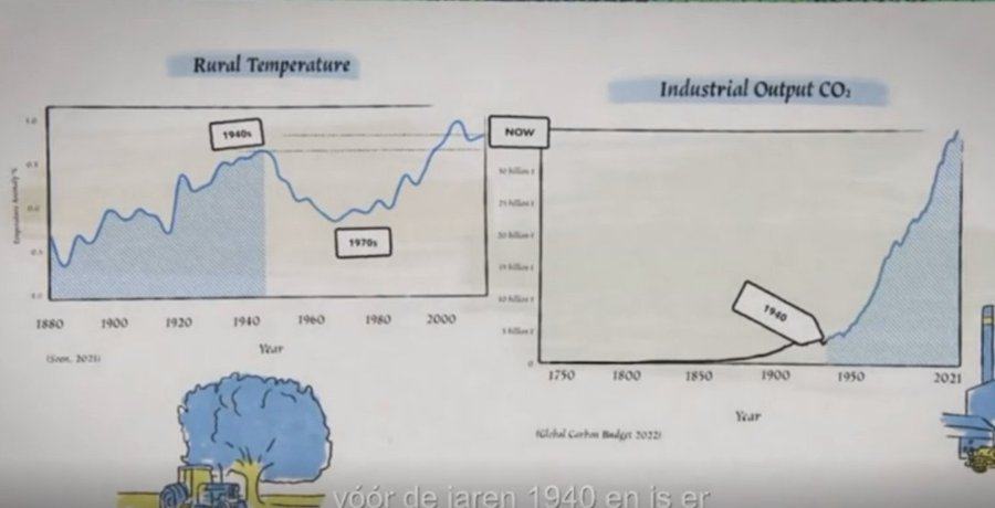
28/ ...This is because the left graph is simply WRONG (see this thread, 15-18).
And the right graph starts at 1750, giving the impression the line rises more steeply...
And the right graph starts at 1750, giving the impression the line rises more steeply...

29/ ...Here are the actual data.
As you can see: CO2 emissions and temperatures rise nicely in tandem.
As you can see: CO2 emissions and temperatures rise nicely in tandem.

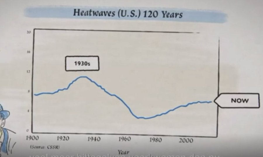
30/ ...Another classic: the 1930s were very warm! Dixit Steve Koonin.
Pants on fire. 🤥
Pants on fire. 🤥
31/ ...This was the case in *America* 👇, where due to poor land use there was the Dust Bowl drought...

32/ ...On a global scale, there wasn't much going on in the 1930s.

33/ ...Here's another one straight from the Climate Sceptic Bingo Card:
"It cooled down after the Second World War!" ✅
That's right. Except, it has nothing to do with CO2...
"It cooled down after the Second World War!" ✅
That's right. Except, it has nothing to do with CO2...
34/ ...The slight (!) decline was due to massive air pollution. Sulfur in particular blocks sunlight.

35/ ...Actually, I was surprised when I put the data together. 🤯
Top: sulfur emissions. Below: temperature.
The cool period EXACTLY matches the peak in sulfur emissions. 😳
Top: sulfur emissions. Below: temperature.
The cool period EXACTLY matches the peak in sulfur emissions. 😳

36/ ...And of course, this one is INEVITABLE.
"Climate models overestimate warming." 🥱
"Climate models overestimate warming." 🥱
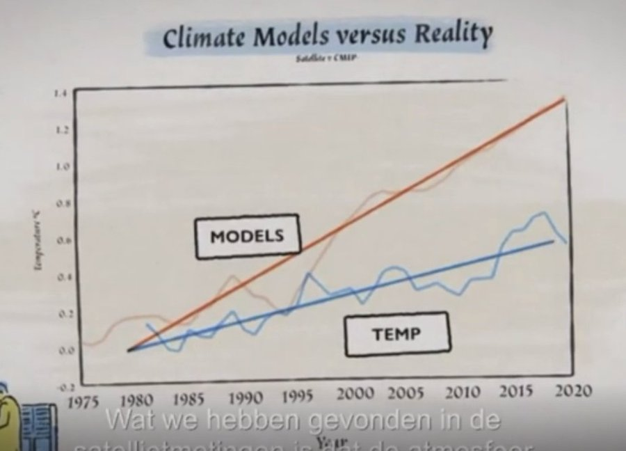
38/ ...What they show you, is John Christy's infamous, misleading graph. 👇
(For a detailed explanation why it's misleading, see ) shorturl.at/egimJ
(For a detailed explanation why it's misleading, see ) shorturl.at/egimJ

37/ ...Meanwhile, here's the reality. Actual warming vs models. (h/t @carbonbrief)
You can easily check this yourself.
You can easily check this yourself.
39/ And there’s… John Clauser!
A Nobel Prize Laureate! 🏆
Ok, for research into… quantum entanglement. 😂
A Nobel Prize Laureate! 🏆
Ok, for research into… quantum entanglement. 😂
40/ ...When I recently seriously asked Clauser to substantiate his claim, he couldn't provide it.
Worse: it turned out he didn’t *have a clue* about climate science. 🤦♂️
Here is my report: wp.me/p1hd3G-xA
Worse: it turned out he didn’t *have a clue* about climate science. 🤦♂️
Here is my report: wp.me/p1hd3G-xA
42/ Ok. So to summarize:
✅ There is no global warming;
✅ Global warming, which isn’t there, is NOT caused by CO2;
✅ CO2, which doesn't cause global warming that isn't happening, doesn’t come from humans. 🤔
So: what DOES cause this global warming that isn’t happening?
✅ There is no global warming;
✅ Global warming, which isn’t there, is NOT caused by CO2;
✅ CO2, which doesn't cause global warming that isn't happening, doesn’t come from humans. 🤔
So: what DOES cause this global warming that isn’t happening?

43/ “It must be cosmic particles creating extra clouds!” 📢
Well, no.
What they forgot to tell you is that the number of space particles actually DECREASES. 🙄
Well, no.
What they forgot to tell you is that the number of space particles actually DECREASES. 🙄

44/ “It's the sun!” 📢
Including an infamous, flawed sun reconstruction.
(see
) realclimate.org/index.php/arch…
Including an infamous, flawed sun reconstruction.
(see
) realclimate.org/index.php/arch…

45/ ...So, here's the data from NASA.
They happen to do some solar science, every once and a while. 🙄
No connection there...
They happen to do some solar science, every once and a while. 🙄
No connection there...

47/ ...Ok, extreme weather’s up next. ⛈️
It actually starts with a correct observation by @RossMcKitrick
It actually starts with a correct observation by @RossMcKitrick
48/ ...After which the documentary immediately falls back into Trick Mode again. 😖
"There used to be a lot more heat waves!" 📢
This was the US Dust Bowl, remember?
"There used to be a lot more heat waves!" 📢
This was the US Dust Bowl, remember?
49/ ..."Summers didn't get warmer, winters got milder" 🙄
Hey, it’s the Middle England Temperature series again!
Hey, it’s the Middle England Temperature series again!

50/ ...Of course, if you zoom out to the ENTIRE Northern Hemisphere, summers are indeed getting WARMER. 👍

51/ ..."The number of wildfires decreased this century!" 📢
True.
But that’s because people (in the tropics in particular) BURN LESS NATURE, according to the study.
… agupubs.onlinelibrary.wiley.com/doi/full/10.10
True.
But that’s because people (in the tropics in particular) BURN LESS NATURE, according to the study.
… agupubs.onlinelibrary.wiley.com/doi/full/10.10

52/ "The number of US wildfires is decreasing!" 📢
You betcha. It’s the Dust Bowl again. 🔥
More relevant is the INCREASE in US wildfires over the last 50 years.
Due to, among others, longer fire seasons. ⚠️
You betcha. It’s the Dust Bowl again. 🔥
More relevant is the INCREASE in US wildfires over the last 50 years.
Due to, among others, longer fire seasons. ⚠️

53/ "There’s no increase in hurricanes!" 📢
True, and as usual, misleading.
There are other increases. 💨
Such as faster increases in hurricane STRENGTH. Remember Acapulco? volkskrant.nl/ts-bf86526e/
True, and as usual, misleading.
There are other increases. 💨
Such as faster increases in hurricane STRENGTH. Remember Acapulco? volkskrant.nl/ts-bf86526e/

54/ "Antarctica didn't get any warmer!" 📢
No, not OVERALL. 🤦♂️
But the *edges*, which prevent the ice glaciers from slipping away, became more unstable... 🙄
nature.com/articles/s4155…
No, not OVERALL. 🤦♂️
But the *edges*, which prevent the ice glaciers from slipping away, became more unstable... 🙄
nature.com/articles/s4155…

55/ Only at the VERY END, the truth comes out. 👇
This documentary is NOT about climate science at all. 😐
It's about politics.
The boring, old stuff: right vs left. 🥱
This documentary is NOT about climate science at all. 😐
It's about politics.
The boring, old stuff: right vs left. 🥱
56/ “No big government!”
Of course, feel free to debate this 👍
But shall we leave the SCIENCE out?🙄
Needless to say, many of these folks are involved in Big Oil...
(h/t @thedisproof)
Of course, feel free to debate this 👍
But shall we leave the SCIENCE out?🙄
Needless to say, many of these folks are involved in Big Oil...
(h/t @thedisproof)
https://twitter.com/TheDisproof/status/1770035191240683878
59/ Anyway, (very) long thread short: lies, lies, lies. 🤦♂️
Putting out pathetic propaganda movies like this silly documentary just doesn't help. 😖
Putting out pathetic propaganda movies like this silly documentary just doesn't help. 😖
• • •
Missing some Tweet in this thread? You can try to
force a refresh