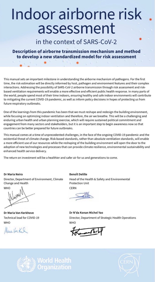
🚨 Indoor AIRBORNE Risk Assessment in the context of SARS-CoV-2 from the World Health Organisation (@WHO)
For clean air advocates, this is HUGE!
The WHO are finally saying, loud & proud: COVID IS AIRBORNE.
Let’s take a closer look at the details…🧵
🔗 iris.who.int/handle/10665/3…

For clean air advocates, this is HUGE!
The WHO are finally saying, loud & proud: COVID IS AIRBORNE.
Let’s take a closer look at the details…🧵
🔗 iris.who.int/handle/10665/3…
Foreword:
“We live immersed in an ocean of air, yet we hardly ever notice its presence. However, without air we would simply not be able to survive.”
“We must reshape & redesign the building environment, while focusing on optimizing indoor ventilation and the air we breathe.”
“We live immersed in an ocean of air, yet we hardly ever notice its presence. However, without air we would simply not be able to survive.”
“We must reshape & redesign the building environment, while focusing on optimizing indoor ventilation and the air we breathe.”

Introduction:
This purpose of this document is to introduce “an innovative method to quantify the risk of SARS-CoV-2 airborne transmission in indoor settings, thereby providing an alternative approach to developing ventilation requirements that lower the risk of infection.”
This purpose of this document is to introduce “an innovative method to quantify the risk of SARS-CoV-2 airborne transmission in indoor settings, thereby providing an alternative approach to developing ventilation requirements that lower the risk of infection.”

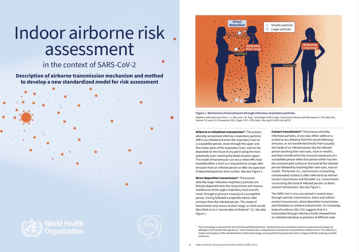
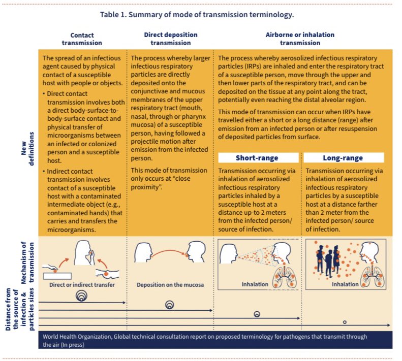
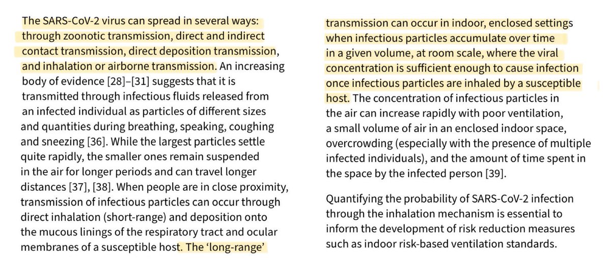
The document outlines the following major modes of transmission:
▪️Airborne: long-range (>2m)
▪️ Airborne: short-range (<2m)
▪️Direct deposition
▪️Contact (direct or indirect transfer)
▪️Airborne: long-range (>2m)
▪️ Airborne: short-range (<2m)
▪️Direct deposition
▪️Contact (direct or indirect transfer)
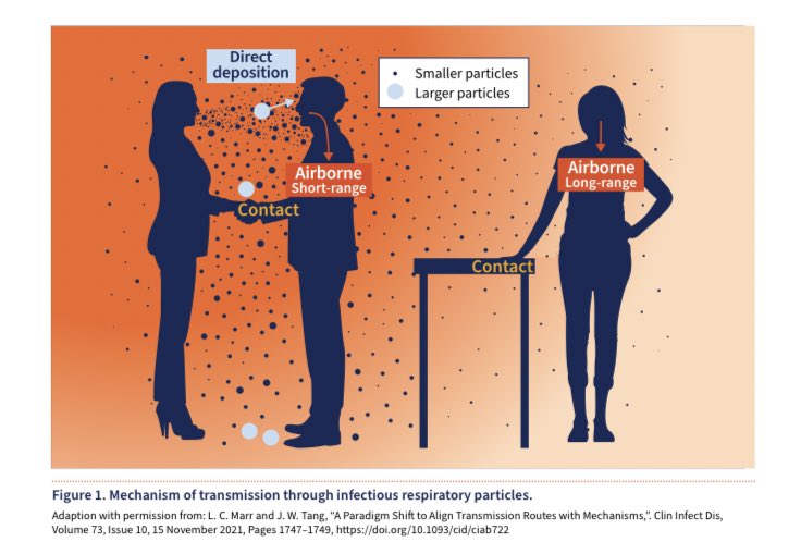
This is another graphic from the document which depicts the mechanisms of transmission:
▪️Airborne: long-range (>2m)
▪️ Airborne: short-range (<2m)
▪️Direct deposition
▪️Contact (direct or indirect transfer)
▪️Airborne: long-range (>2m)
▪️ Airborne: short-range (<2m)
▪️Direct deposition
▪️Contact (direct or indirect transfer)
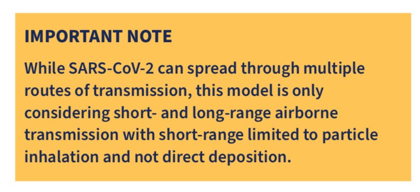
Important Note:
While SARS-CoV-2 can spread through multiple routes of transmission, the model outlined in this document only considers short- and long-range AIRBORNE transmission (with short-range limited to particle inhalation and not direct deposition).
While SARS-CoV-2 can spread through multiple routes of transmission, the model outlined in this document only considers short- and long-range AIRBORNE transmission (with short-range limited to particle inhalation and not direct deposition).
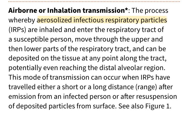
There’s also a handy explanation of “Airborne or Inhalation transmission”:
▪️“The process whereby aerosolized infectious respiratory particles are inhaled & enter the respiratory tract of a susceptible person.”
“Aerosolised” is the important word here - ie. NOT droplets.
▪️“The process whereby aerosolized infectious respiratory particles are inhaled & enter the respiratory tract of a susceptible person.”
“Aerosolised” is the important word here - ie. NOT droplets.
To better understand the difference between droplet & aerosol transmission and why it’s so critically important to recognise the importance of aerosol spread, this 45 second video from ABC News Australia does an excellent job of explaining it ⬇️
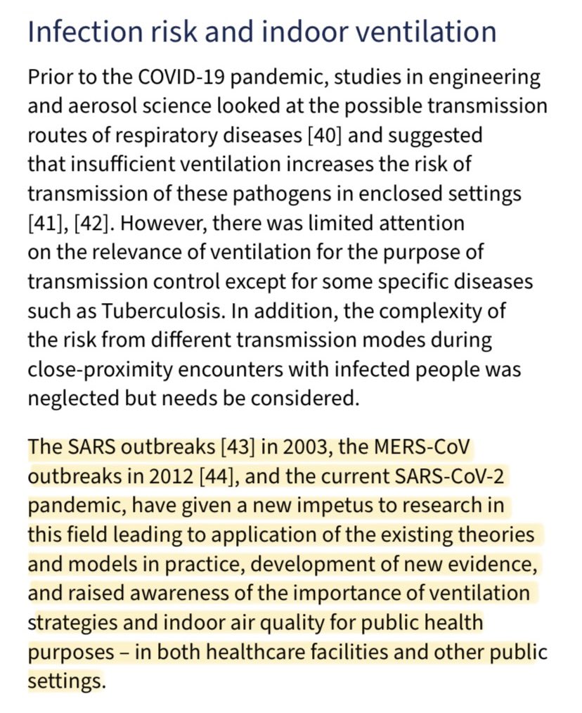
“Long-range transmission can occur in indoor, enclosed settings when infectious particles accumulate over time in a given volume, at room scale, where the viral concentration is sufficient enough to cause infection once infectious particles are inhaled by a susceptible host.”
The previous SARS/MERS outbreaks & the current Covid pandemic “have given a new impetus to researching airborne transmission”
In turn, this has “raised awareness of the importance of ventilation strategies for public health purposes - in both healthcare & other public settings”.
In turn, this has “raised awareness of the importance of ventilation strategies for public health purposes - in both healthcare & other public settings”.
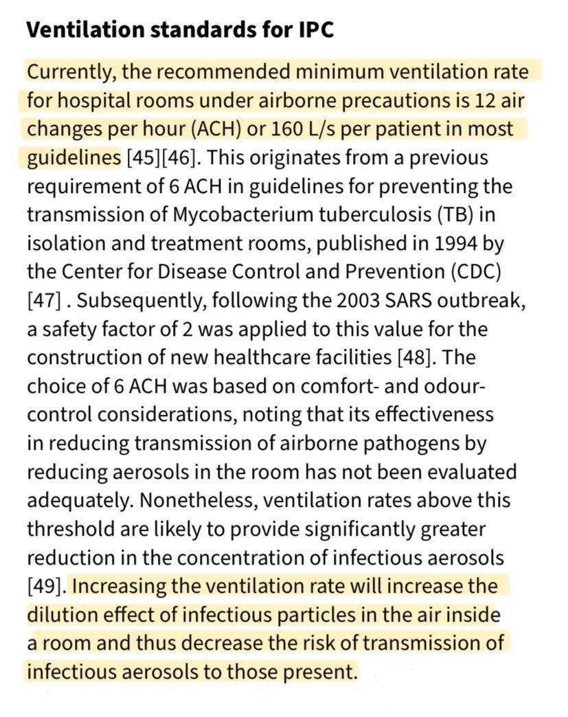
“Currently, the recommended minimum ventilation rate for hospital rooms under airborne precautions is 12 ACH or 160 L/s per patient in most guidelines.”
Increasing the ventilation rate decreases the risk of transmission of infectious aerosols to those present.
Increasing the ventilation rate decreases the risk of transmission of infectious aerosols to those present.
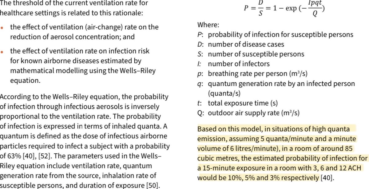
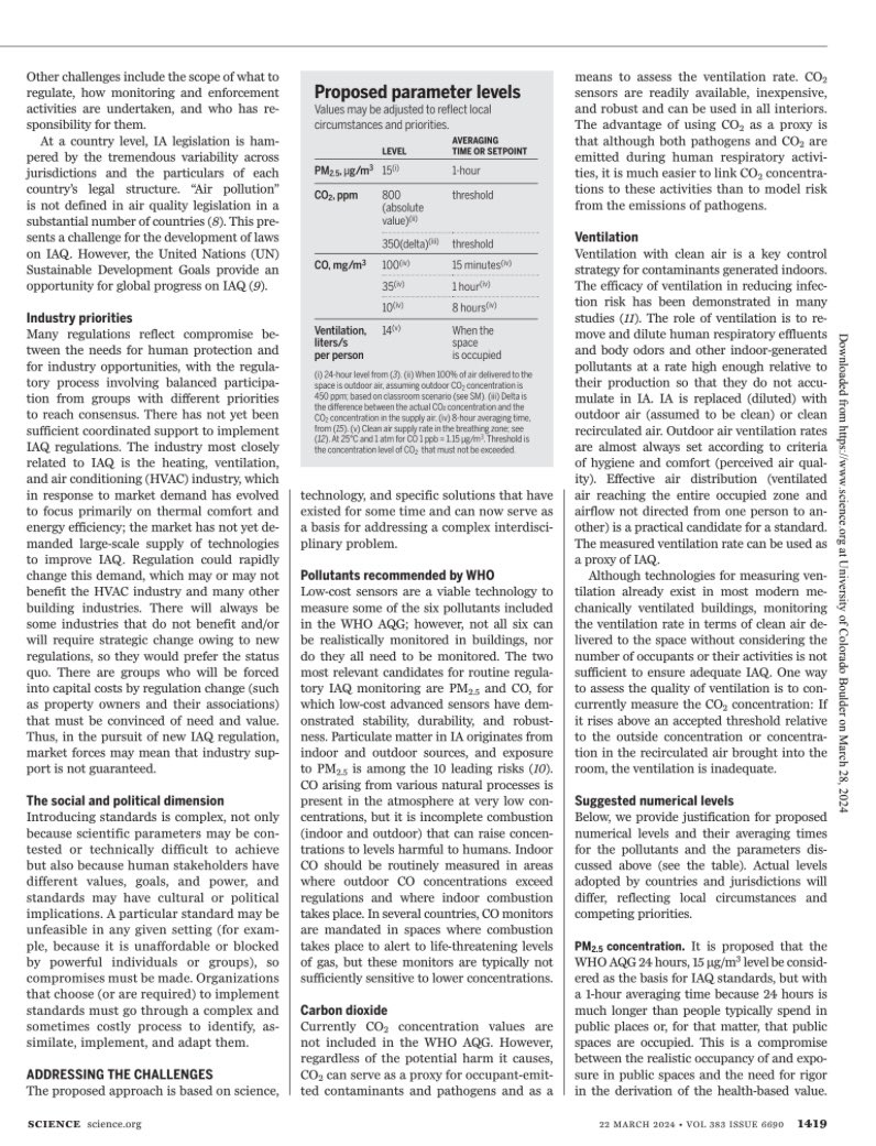
Based on the Wells-Riley equation, in situations of high quanta emission (assuming 5 quanta/min & a minute volume of 6 litres/min), in a room of ~85m3, the probability of infection for a 15-minute exposure in a room would be:
▪️3ACH ➡️ 10%
▪️6 ACH ➡️ 5%
▪️12 ACH ➡️ 3%
▪️3ACH ➡️ 10%
▪️6 ACH ➡️ 5%
▪️12 ACH ➡️ 3%
The document points out that scientific expertise has evolved significantly since the Wells-Riley equation was developed in the 20th century.
The Covid pandemic has highlighted the urgent need for improved methods of determining risk of airborne transmission in indoor spaces.
The Covid pandemic has highlighted the urgent need for improved methods of determining risk of airborne transmission in indoor spaces.
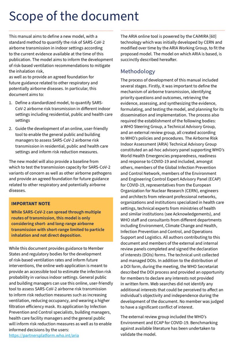
This newly published WHO manual therefore aims to define a new & improved model, with a standard method to quantify the risk of SARS-CoV-2 airborne transmission in indoor settings according to the current evidence available at the time of this publication.
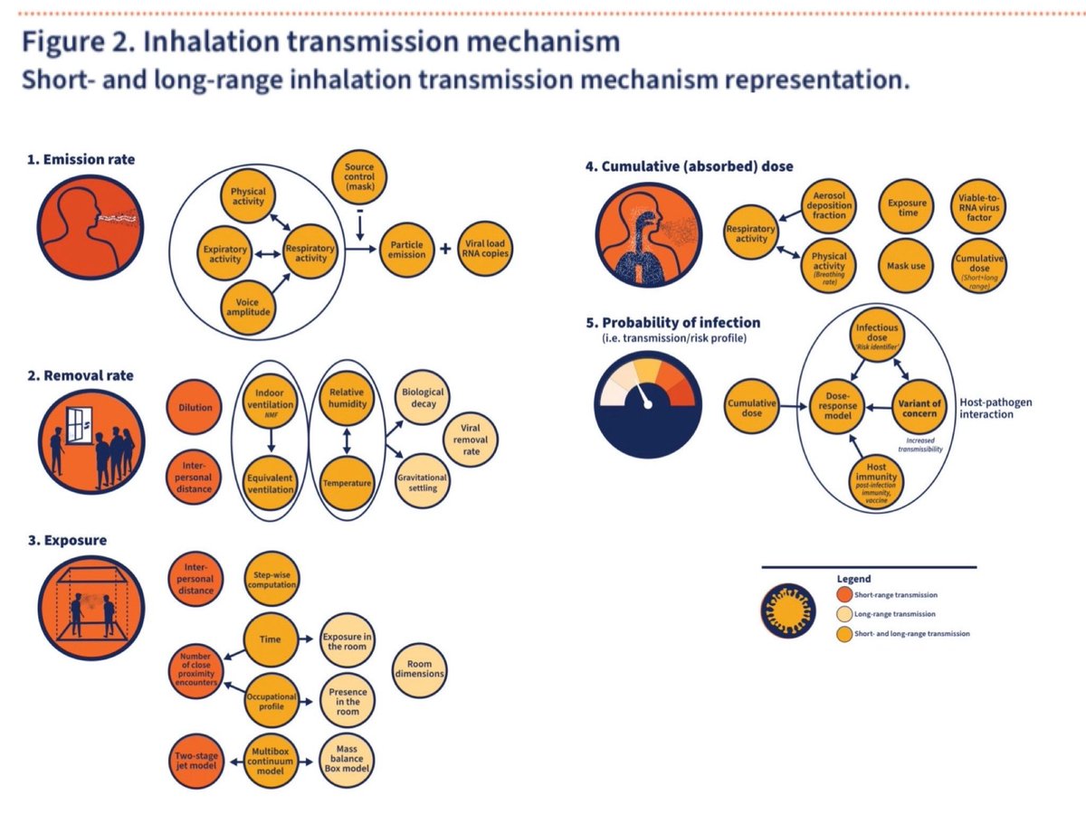
The WHO Technical Advisory Group have agreed to describe the airborne (inhalation) transmission mechanism as a 5 step process:
▪️1: Emission rate
▪️2: Removal rate
▪️3: Exposure
▪️4: Cumulative (absorbed) dose
▪️5: Probability of infection (transmission/risk profile)
▪️1: Emission rate
▪️2: Removal rate
▪️3: Exposure
▪️4: Cumulative (absorbed) dose
▪️5: Probability of infection (transmission/risk profile)
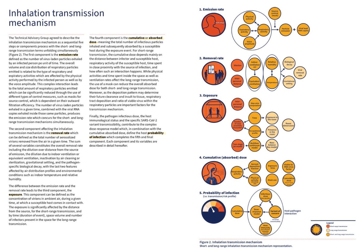
Here’s a closer look at those 5 components of the new WHO airborne transmission risk assessment model…
There’s a significant amount of detail on each of these components within the full document so it’s worth having a read to better understand it.
🔗 iris.who.int/handle/10665/3…
There’s a significant amount of detail on each of these components within the full document so it’s worth having a read to better understand it.
🔗 iris.who.int/handle/10665/3…
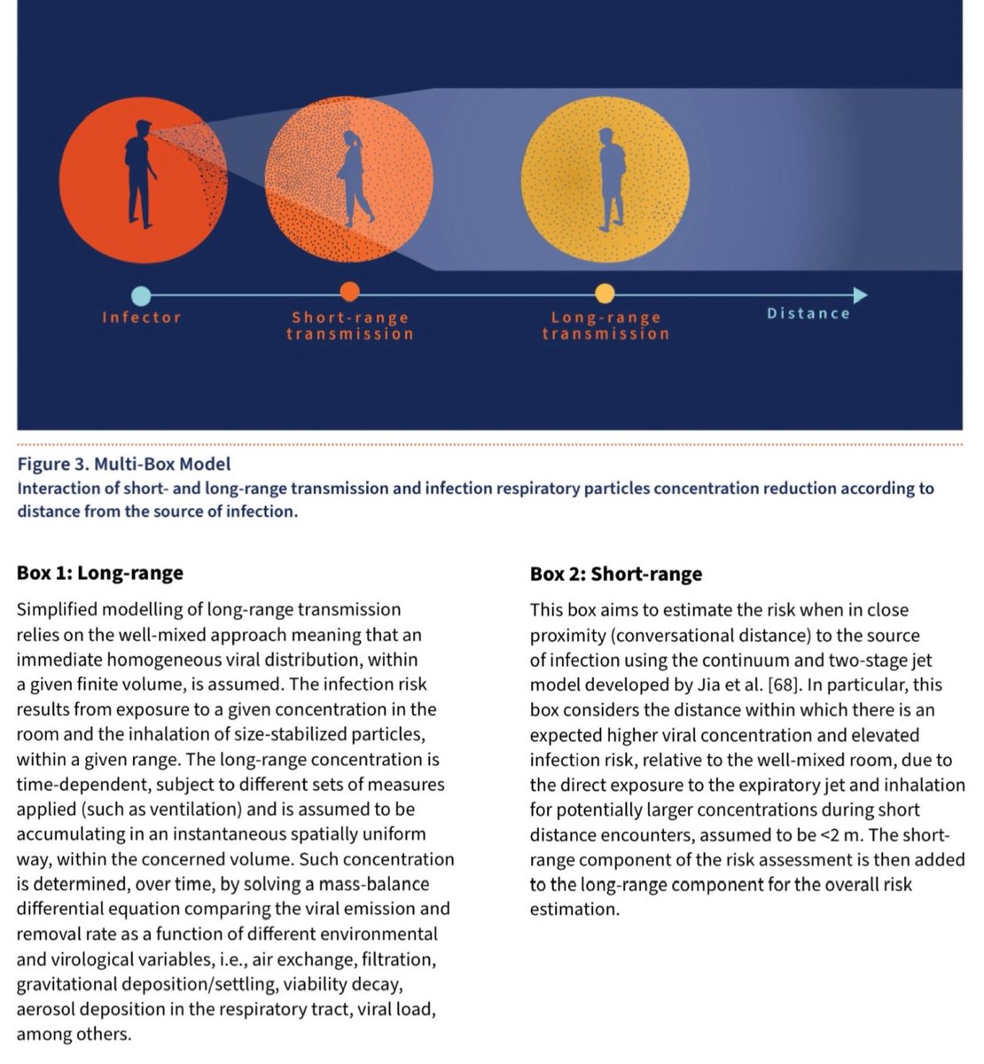
The WHO Technical Advisory Group also agreed that the new model should use a multi-box approach accounting separately for the long- and short-range contributions to airborne transmission:
🟡 Box 1 : Long-range (>2m)
🟠 Box 2: Short-range (<2m)
Box 1 + Box 2 = Overall risk
🟡 Box 1 : Long-range (>2m)
🟠 Box 2: Short-range (<2m)
Box 1 + Box 2 = Overall risk
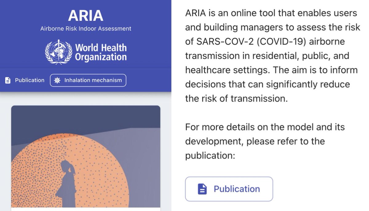
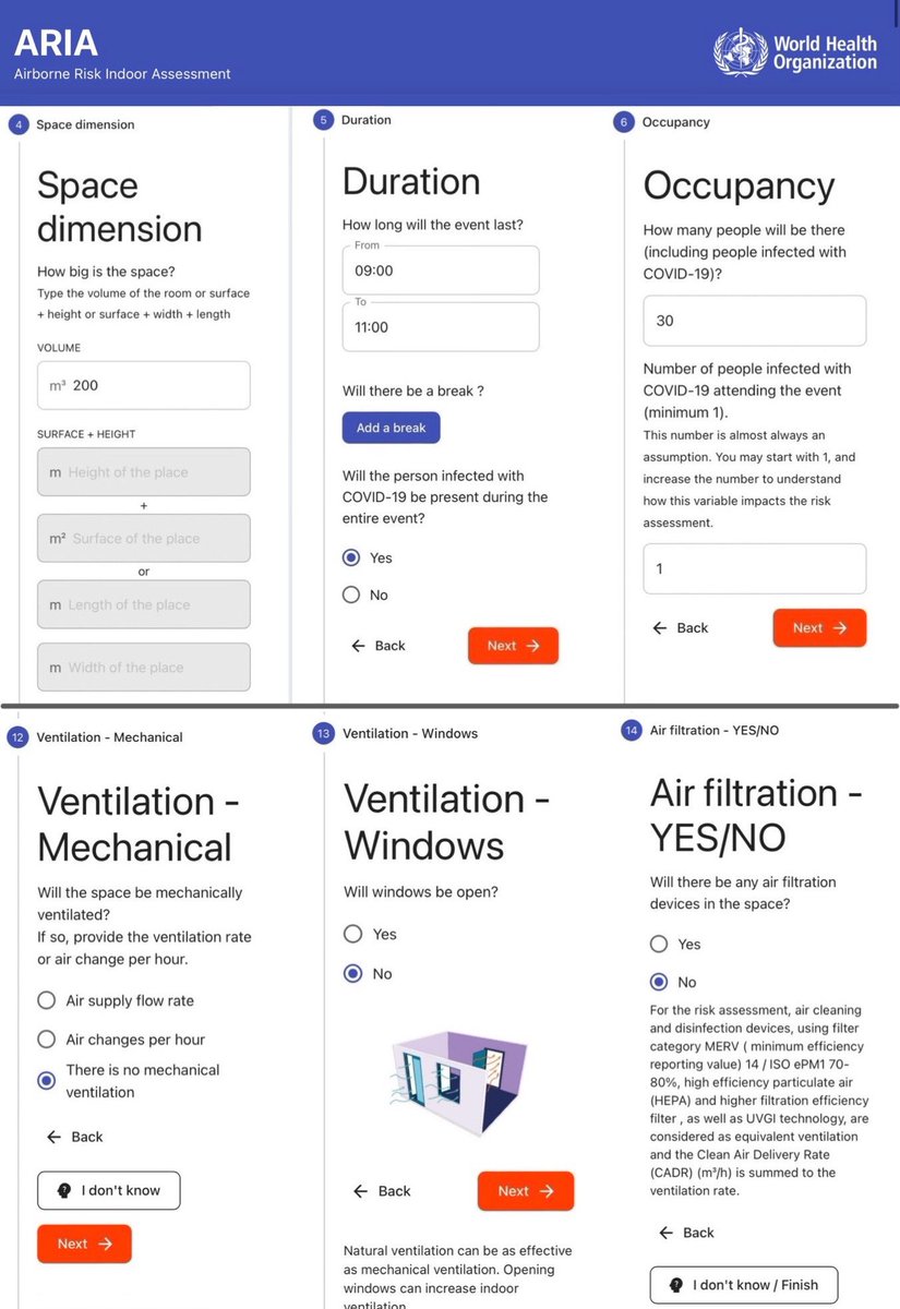
Having determined the components & parameters of the new model for assessing the risk of airborne transmission, this work has culminated in the development of an online tool which puts the principles into action:
▪️ARIA: AIRBORNE RISK INDOOR ASSESSMENT
partnersplatform.who.int/tools/aria/
▪️ARIA: AIRBORNE RISK INDOOR ASSESSMENT
partnersplatform.who.int/tools/aria/
The ARIA tool guides the user through a series of 14 sections to provide the input components to the risk assessment calculation, including:
▪️space dimension
▪️duration
▪️occupancy
▪️short range interactions
▪️masks
▪️ventilation
▪️air filtration
(This is not the full list).
▪️space dimension
▪️duration
▪️occupancy
▪️short range interactions
▪️masks
▪️ventilation
▪️air filtration
(This is not the full list).

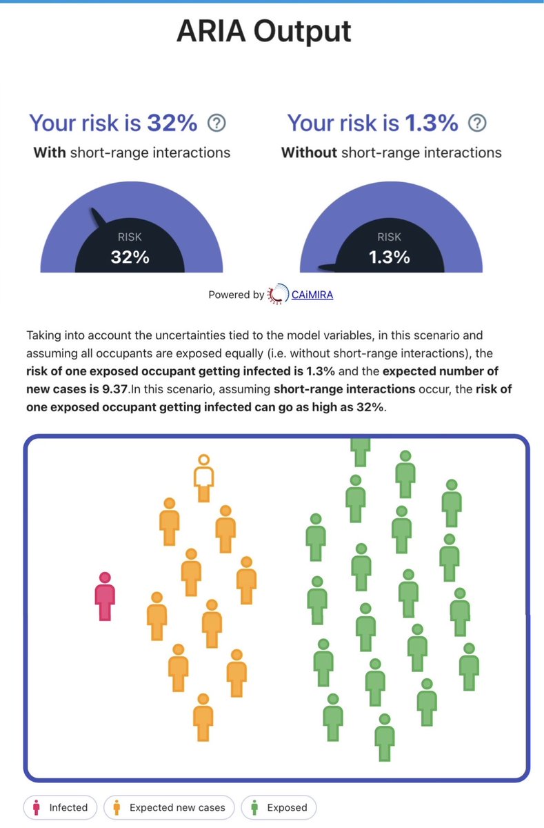
Once the questionnaire is completed, the tool then delivers a simple risk assessment summary.
In the example I used (30 kids in a 200m3 classroom for 2 hrs; 1 infected child; no windows open or air filters), the model estimated:
▪️32% risk per child
▪️9 kids would be infected
In the example I used (30 kids in a 200m3 classroom for 2 hrs; 1 infected child; no windows open or air filters), the model estimated:
▪️32% risk per child
▪️9 kids would be infected
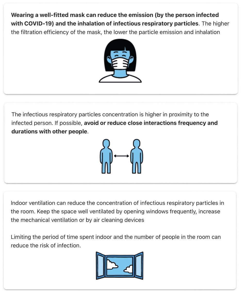
The results page also provides some simple suggestions for how you can reduce your risk, including:
▪️wearing a well-fitting mask
▪️reducing close interaction frequency & duration with others
▪️increasing ventilation
▪️using air cleaning devices
▪️limiting time spent indoors
▪️wearing a well-fitting mask
▪️reducing close interaction frequency & duration with others
▪️increasing ventilation
▪️using air cleaning devices
▪️limiting time spent indoors
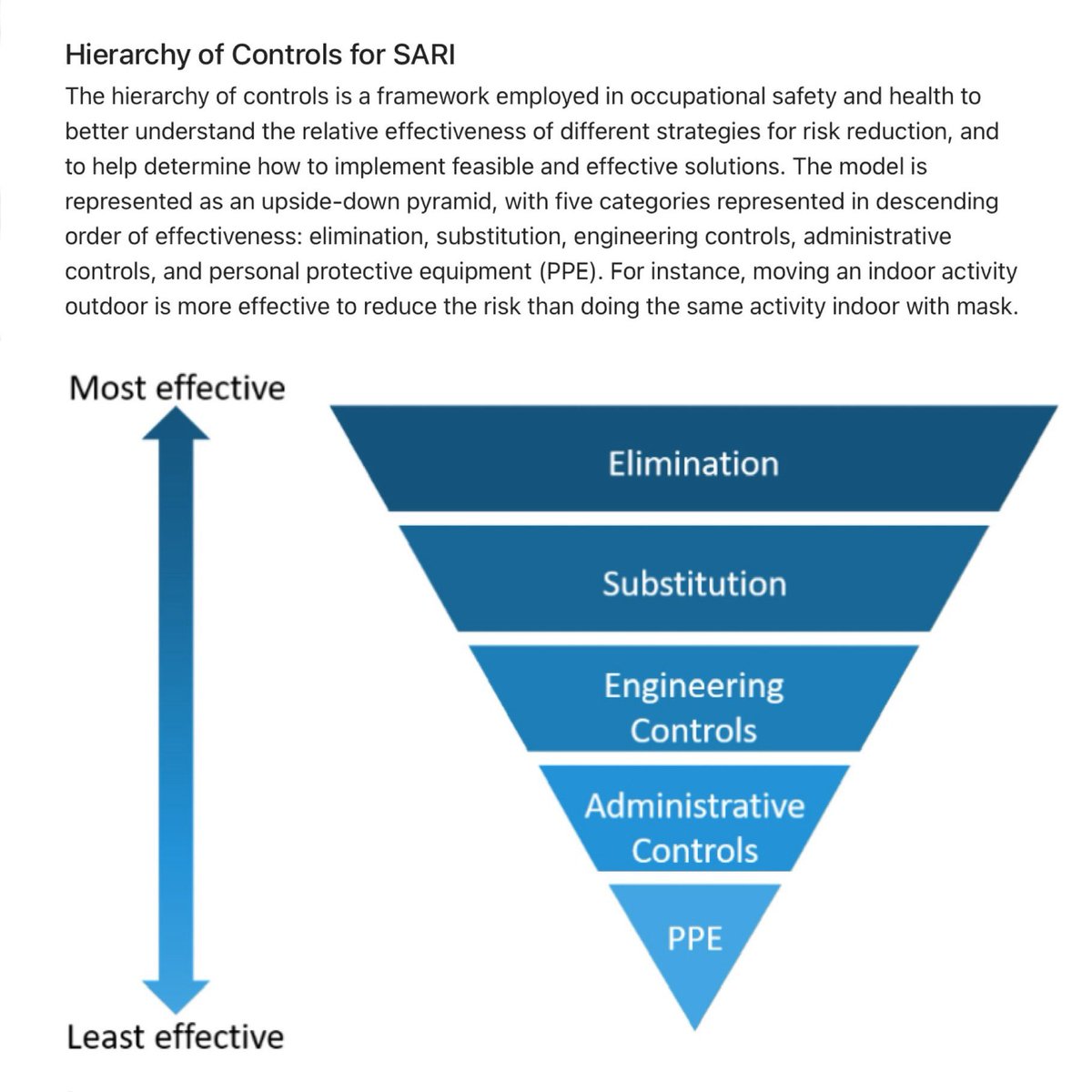
There’s even a handy diagram for the ‘Hierarchy of Controls’ which explains the relative effectiveness of different risk reduction strategies.
Elimination (physically removing the hazard) is the MOST effective strategy.
This is why sick people should be encouraged to stay home.
Elimination (physically removing the hazard) is the MOST effective strategy.
This is why sick people should be encouraged to stay home.
The ARIA tool is really easy to use.
There are lots of parameters which you can tweak (eg. Time spent silently breathing vs talking or shouting, the number & duration of close interactions etc).
Here’s the link so you can try it out for yourself!
🔗 partnersplatform.who.int/tools/aria/
There are lots of parameters which you can tweak (eg. Time spent silently breathing vs talking or shouting, the number & duration of close interactions etc).
Here’s the link so you can try it out for yourself!
🔗 partnersplatform.who.int/tools/aria/
My hope is that the publication of this document acts as a tipping point for a clean indoor air revolution.
No longer can our governments ignore this critical issue.
We MUST start optimising indoor ventilation.
The return on investment will be enormous for generations to come.
No longer can our governments ignore this critical issue.
We MUST start optimising indoor ventilation.
The return on investment will be enormous for generations to come.
In tandem with the release of this new WHO document, an important new paper has also just been published in ‘Science’ which puts forward a compelling argument on the pressing need to mandate indoor air quality in public buildings.
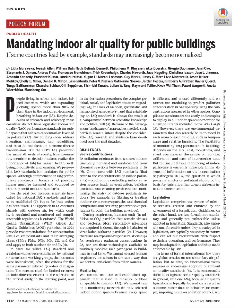
The list of co-authors of the Science article is an impressive who’s who of indoor air quality scientists & experts from around the world (43 in total!).
One of the authors, @jljcolorado, has put together a thread summarising the key points 🧵⬇️
One of the authors, @jljcolorado, has put together a thread summarising the key points 🧵⬇️
https://twitter.com/jljcolorado/status/1773449455896862745
The short video below features Prof Lidia Morawska explaining the importance of regulating the quality of the indoor air that we breathe.
Prof Morawska co-chaired the WHO ARIA Technical Advisory Group & is also one of the authors of the Science paper.
Prof Morawska co-chaired the WHO ARIA Technical Advisory Group & is also one of the authors of the Science paper.
https://twitter.com/science_academy/status/1773411329967051082
Two more of the experts who co-authored the Science paper (@j_g_allen & @linseymarr) featured in a CBS News show which tackled the topic of indoor air quality.
Below is one clip, but I’ve also pulled together a thread of multiple clips from the show ⬇️
Below is one clip, but I’ve also pulled together a thread of multiple clips from the show ⬇️
https://twitter.com/_catinthehat/status/1718798416463966436
• • •
Missing some Tweet in this thread? You can try to
force a refresh