1/15
What's going on with the bond market?
It is not pretty.
And if the bond market is ugly, everyone else suffers.
🧵
What's going on with the bond market?
It is not pretty.
And if the bond market is ugly, everyone else suffers.
🧵
2/15
First, let's remember how this year started.
On December 18, 2023, BofA published its December 2023 Global Fund Manager Survey.
This graphic shows that these managers were the most bullish on rates since they started asking the question 20 years ago (2003).
First, let's remember how this year started.
On December 18, 2023, BofA published its December 2023 Global Fund Manager Survey.
This graphic shows that these managers were the most bullish on rates since they started asking the question 20 years ago (2003).

3/15
Global fund managers agreed that 2024 would be the best time to be long-duration (lower rates) in the last 2 decades.
They were more bullish on rates now than on the 2008 financial crisis or the 2020 global economy shutdown (both were massive gains, if long-duration).
Global fund managers agreed that 2024 would be the best time to be long-duration (lower rates) in the last 2 decades.
They were more bullish on rates now than on the 2008 financial crisis or the 2020 global economy shutdown (both were massive gains, if long-duration).
4/15
How's it going? Bad!
Through April 15, the Bloomberg Domestic Agg Index YTD total return is -3.11% (blue)
This is the 49th year of data (1976). Only 1980, 1994, and 2022 were worse through April 15.
All those years were historically bad years.
Not good
How's it going? Bad!
Through April 15, the Bloomberg Domestic Agg Index YTD total return is -3.11% (blue)
This is the 49th year of data (1976). Only 1980, 1994, and 2022 were worse through April 15.
All those years were historically bad years.
Not good

5/15
Since it was a survey of GLOBAL managers, how is the Bloomberg GLOBAL Agg index doing? Also, bad!
YTD, it is down -4.25% (blue line)
This index started in 1990 (35 years ago). Only 2022 was worse; that was the worst year in the bond market since the Civil War (1865)!
Since it was a survey of GLOBAL managers, how is the Bloomberg GLOBAL Agg index doing? Also, bad!
YTD, it is down -4.25% (blue line)
This index started in 1990 (35 years ago). Only 2022 was worse; that was the worst year in the bond market since the Civil War (1865)!

6/15
And here is the 30-year Treasury Total Return.
YTD, it is down 9.80% (blue line).
The data starts in 1977, so 48 years of data. Only 2009, 2021, and 2022 were worse YTD through April 15.
Long TLT has been a horror show.
And here is the 30-year Treasury Total Return.
YTD, it is down 9.80% (blue line).
The data starts in 1977, so 48 years of data. Only 2009, 2021, and 2022 were worse YTD through April 15.
Long TLT has been a horror show.

7/15
If these global fund managers had a meeting in December to position to LOSE AS MUCH MONEY AS POSSIBLE, how would it differ from what they have done YTD?
Why so bad? Because of their assumptions, they have been way off the mark.
If these global fund managers had a meeting in December to position to LOSE AS MUCH MONEY AS POSSIBLE, how would it differ from what they have done YTD?
Why so bad? Because of their assumptions, they have been way off the mark.

9/15
They overwhelmingly thought the economy would have a soft landing.
As I like to say, "This was never the case."
They overwhelmingly thought the economy would have a soft landing.
As I like to say, "This was never the case."

10/15
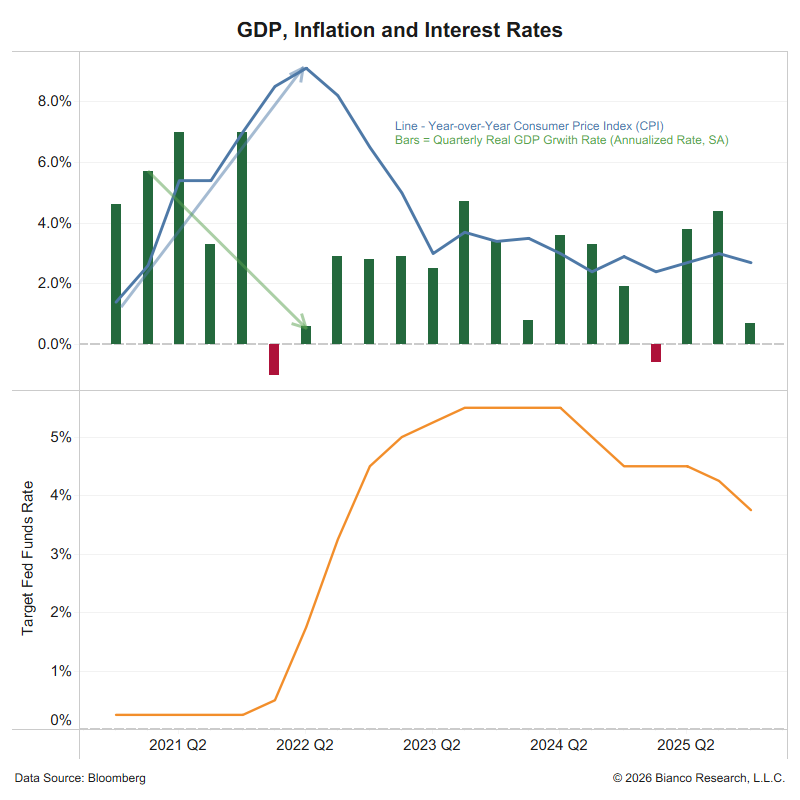
They were also 90% sure inflation would fall in 2024 leading to an equally high conviction that central banks (the Fed) would cut rates.
How does that look now on April 15!!
They were also 90% sure inflation would fall in 2024 leading to an equally high conviction that central banks (the Fed) would cut rates.
How does that look now on April 15!!

11/15
So, when does this bond sell-off stop?
To put it bluntly, saying "soft landing," "last mile to 2%," and "the Fed will cut three times in 2024" becomes embarrassing in public.
So, when does this bond sell-off stop?
To put it bluntly, saying "soft landing," "last mile to 2%," and "the Fed will cut three times in 2024" becomes embarrassing in public.
12/15
When we get to this point, it will signal that all the positioning for these outcomes, which is killing their performance YTD, has become too painful and has been reversed.
When we get to this point, it will signal that all the positioning for these outcomes, which is killing their performance YTD, has become too painful and has been reversed.
13/15
Interestingly, as I'm writing these posts, I have Bloomberg TV on in the background, and they have fund managers from organizations that manage trillions in assets, still talking about a "soft landing" and "last mile to 2%" and "three rate cuts in 2024."
Interestingly, as I'm writing these posts, I have Bloomberg TV on in the background, and they have fund managers from organizations that manage trillions in assets, still talking about a "soft landing" and "last mile to 2%" and "three rate cuts in 2024."
14/15
So, we are not there yet.
Global Fund managers still think reading from their 2024 outlooks published in January is a good idea.
They have yet to figure out that these are the roadmaps that got them into trouble in the first place.
So, we are not there yet.
Global Fund managers still think reading from their 2024 outlooks published in January is a good idea.
They have yet to figure out that these are the roadmaps that got them into trouble in the first place.
15/15
Final thought, when do higher rates "bother" the stock market?
When the 10-year hits 4.50%. Or starting last week.
See below ... the S&P 500 close today (April 15) was its lowest close since February 20.
Final thought, when do higher rates "bother" the stock market?
When the 10-year hits 4.50%. Or starting last week.
See below ... the S&P 500 close today (April 15) was its lowest close since February 20.

Here is the correct chart.

• • •
Missing some Tweet in this thread? You can try to
force a refresh