
Ok.
Look at this chart.
It's from the ONS Winter Covid Survey analysis.
Is it designed to be confusing?
Yes.
I think so.

Look at this chart.
It's from the ONS Winter Covid Survey analysis.
Is it designed to be confusing?
Yes.
I think so.

It's a chart of when people doing the survey who said they were experiencing symptoms of Long Covid said that their Long Covid symptoms started.

So it's a chart of *how many weeks ago* their Long Covid started.
Recent is at the top.
Long ago is at the bottom.
Recent is at the top.
Long ago is at the bottom.

So up top here you have a section of people who say they have been affected by symptoms of Long Covid for "4 to 11 weeks" and "12 to 25 weeks" (preceding March 7th)

That's short term Long Covid, as Long Covid goes.
Early days.
Lingering symptoms, initial new repercussions of the acute illness, new problems, dysfunctions.
Early days.
Lingering symptoms, initial new repercussions of the acute illness, new problems, dysfunctions.
That's not the part of this that I want to concentrate on.
Everyone knows there are short term repercussions of Covid, but the narrative pushed by the government is that:
a) they mostly clear up.
b) fewer people are developing Long Covid now.
a) they mostly clear up.
b) fewer people are developing Long Covid now.
This is important to understand.
They want you to believe that most of the people who developed Long Covid developed it a long time ago.
They want you to believe that most of the people who developed Long Covid developed it a long time ago.
The clue, I guess, is in the title of the chart:

"Figure 1: The majority of people self-reporting long COVID experienced symptoms over two years previously"
This is what they want you to believe.
This is what they want you to believe.
Do you understand that?
So this section here is *designed* to reinforce that understanding.

Look.
I'll erase the first two sections for you, so that it's really easy to see:
I'll erase the first two sections for you, so that it's really easy to see:

It looks like most of the people reporting symptoms lasting longer than 6 months developed them a long time ago... and then fewer and fewer have developed them since... right?
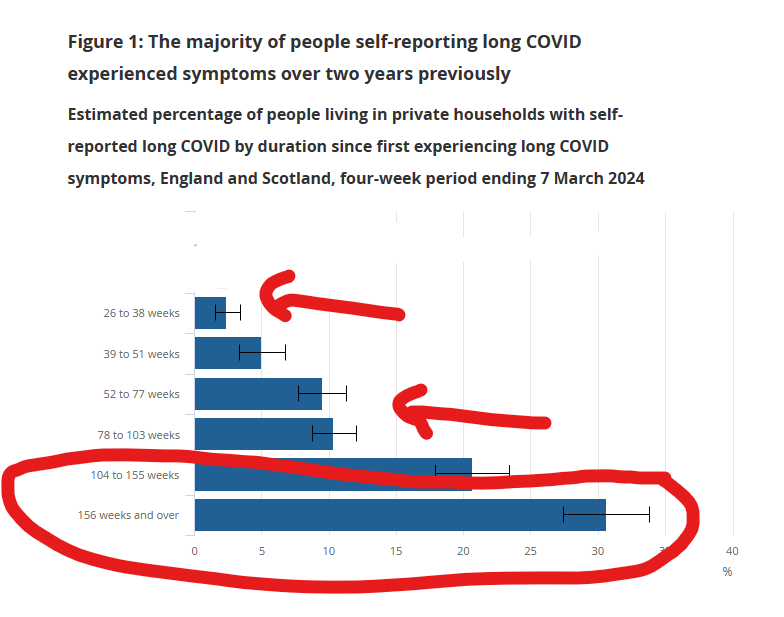
Except look CLOSELY at those numbers down the left.

What do you see?

They're all DIFFERENT lengths of time.

So the graph looks like you're comparing even time periods, but you're not.
How do you feel about this chart now that you know that?
How do you feel about this chart now that you know that?

Would you like to see the chart so that the percentages of people in those time periods are distributed evenly?
Now, I don't have the underlying data, so I can't break it down for you neatly, but here's *when* each of those time periods starts.
Now, I don't have the underlying data, so I can't break it down for you neatly, but here's *when* each of those time periods starts.

This group of Long Covid cases (orange) (that developed over 156 weeks prior) developed over this time period (green) of 58 weeks.

So that's 31% over a span of 58 weeks.
And then 5% of cases developed over the timespan of 39-51 weeks prior to the survey... that's over a timespan of 13 weeks.

So you want a graph that spreads out those columns of data over the number of weeks that they represent.
Are you braced for it?
Here it is.

Just look at that.

The moments at which people developed Long Covid are distributed evenly right the way across the time period from February 2020 to April 2023.

And then there was the first real lull since the start last summer, and then the Pirola wave.
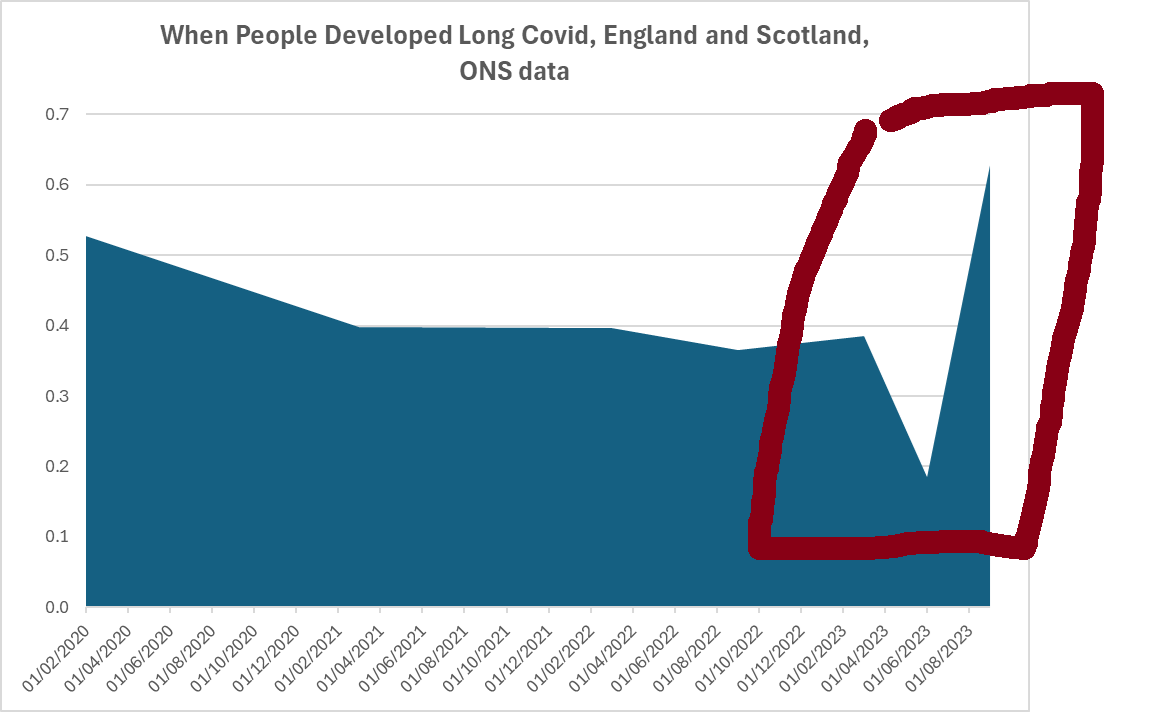
And if you display *all* the data in the ONS graph this way...

Now, I don't actually think that's how many people are going to permanently have Long Covid.

But the whole "most people who developed Long Covid developed it over two years ago"?
And "fewer people are developing Long Covid now"?
That's just bullshit, isn't it?
PS... any guesses for what happens here...
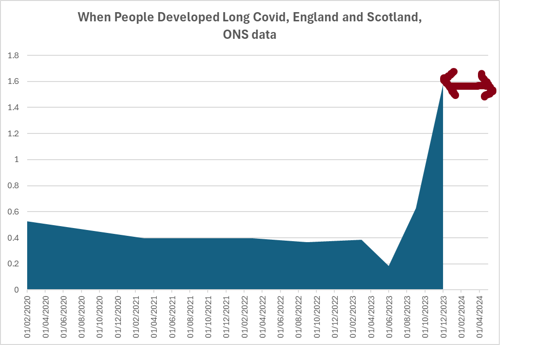
PS2...
Just going back to this graph, of when everyone who has Long Covid that lasted longer than 12 weeks up to march 2023...
Just going back to this graph, of when everyone who has Long Covid that lasted longer than 12 weeks up to march 2023...

If you take those two points, and add them together to distribute their data evenly across six months rather than two sets of 12 weeks...

The graph looks like this:

😕
And a bonus ten tweet thread here:
https://twitter.com/skeuomorphology/status/1785035433786695809?t=N7rEQh_S1xGfqAEFnx2OPw&s=19
My opinion on the survey?
I think it's a shambles.
Not a great source for any conclusions.
Which is a victory for the people who don't want to talk about Covid.
I think it's a shambles.
Not a great source for any conclusions.
Which is a victory for the people who don't want to talk about Covid.
Just saw this in a maths class. 😂

• • •
Missing some Tweet in this thread? You can try to
force a refresh


