Meta is using Facebook and mobile phone data to produce super-granular household wealth estimates.
Here’s what you need to know about the Relative Wealth Index:
Here’s what you need to know about the Relative Wealth Index:
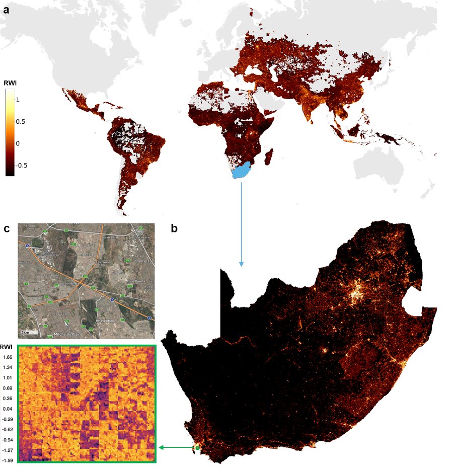
The Relative Wealth Index (RWI) is a geospatial measure, which shows wealth disparities within countries.
Main features:
• It's open source
• It measures 'asset-based' wealth
• It covers 135 countries in the world
• Data is provided at 2.4km resolution
Main features:
• It's open source
• It measures 'asset-based' wealth
• It covers 135 countries in the world
• Data is provided at 2.4km resolution
1. Methodolgy—Data Inputs:
It uses 'ground-truth' survey data from @DHSprogram (covering 1.4m households across 67,000 villages in 56 countries).
It then uses a range of alternative data:
• mobile phone data
• topographic maps
• aggregated Facebook connectivity data
It uses 'ground-truth' survey data from @DHSprogram (covering 1.4m households across 67,000 villages in 56 countries).
It then uses a range of alternative data:
• mobile phone data
• topographic maps
• aggregated Facebook connectivity data

@DHSprogram It also uses daytime satellite imagery, that's processed in a way I outline here:
https://twitter.com/yohaniddawela/status/1739983291032150192
@DHSprogram 2. Methodology—ML Models:
Machine learning (gradient boosting) is used to train a model on the relationship between the alternative data and survey data.
This is then used to predict wealth (out of sample) for 2.4km x 2.4km grids across 135 countries.
Machine learning (gradient boosting) is used to train a model on the relationship between the alternative data and survey data.
This is then used to predict wealth (out of sample) for 2.4km x 2.4km grids across 135 countries.

@DHSprogram Based on this, the RWI:
• is a relative index within each country at the time of the survey.
• has a mean value of zero and a standard deviation of one.
The scores cannot be compared across countries or over time.
• is a relative index within each country at the time of the survey.
• has a mean value of zero and a standard deviation of one.
The scores cannot be compared across countries or over time.
@DHSprogram Model accuracy:
The ML model explains 72% of the variation in wealth, as measured with independent census data from 15 countries.
However, when compared to coordinate-level data collected by the Nigerian government, the model explained 50% of variation (at the grid-level).
The ML model explains 72% of the variation in wealth, as measured with independent census data from 15 countries.
However, when compared to coordinate-level data collected by the Nigerian government, the model explained 50% of variation (at the grid-level).

@DHSprogram However there are a number of things to be aware of:
• larger errors in regions far from survey areas
• the model's accuracy is higher when data is aggregated to the local-government level
• larger errors in regions far from survey areas
• the model's accuracy is higher when data is aggregated to the local-government level
@DHSprogram Further questions on accuracy:
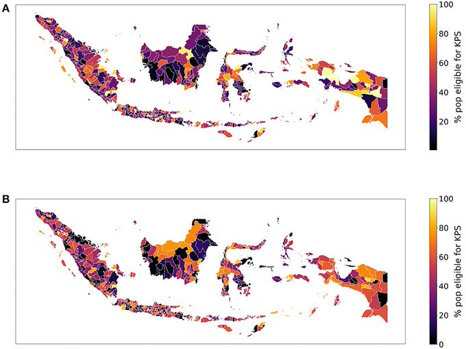
A study in 2023 looked at the RWI in Indonesia.
It found that using the RWI to pinpoint the poorest 14% of the population. showed mixed results.
The error rate was high—50.65%.
I.e. half of Indonesia's poorest regions were incorrectly identified
A study in 2023 looked at the RWI in Indonesia.
It found that using the RWI to pinpoint the poorest 14% of the population. showed mixed results.
The error rate was high—50.65%.
I.e. half of Indonesia's poorest regions were incorrectly identified
@DHSprogram And surprisingly, some areas RWI labeled as poorest were among the wealthiest.
@DHSprogram Takeaway:
Meta's RWI is a novel way of estimating asset-wealth at a household level.
But it still has limitations.
And this is the key message when seeking granular insights into wealth & GDP:
Nothing's perfect—it's just important to know what limitations each dataset has.
Meta's RWI is a novel way of estimating asset-wealth at a household level.
But it still has limitations.
And this is the key message when seeking granular insights into wealth & GDP:
Nothing's perfect—it's just important to know what limitations each dataset has.
@DHSprogram If you're interested in other ways of measuring local GDP, check out this post:
And give us a follow @yohaniddawela for more breakdowns on geospatial and economics topics.
And give us a follow @yohaniddawela for more breakdowns on geospatial and economics topics.
https://x.com/yohaniddawela/status/1782368514994581774
@DHSprogram Interested in going deeper?
I provide more in-depth tutorials and analyses in my newsletter.
You can subscribe here: yohan.so
I provide more in-depth tutorials and analyses in my newsletter.
You can subscribe here: yohan.so

• • •
Missing some Tweet in this thread? You can try to
force a refresh