
Sharing insights from the intersection of geospatial data science and economics | PhD in Economic Geography from @lsenews. Views are my own.

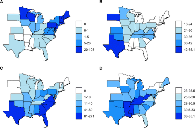 In simple terms, ecological fallacy is drawing conclusions about individuals from data that were aggregated over areas (e.g. counties, districts, grids).
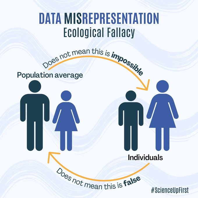
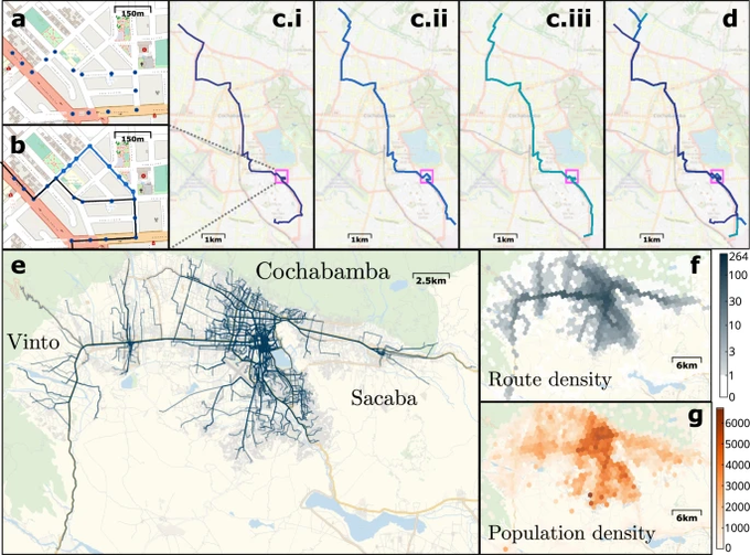 A paper in @NatureComms examines how informal public transport networks in lower-income countries self-organise without central planning.
 1. Aiddata
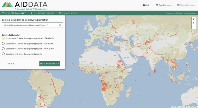
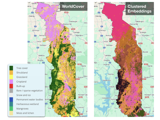 A new preprint from researchers evaluates the utility of geospatial embeddings for cropland mapping in Togo:
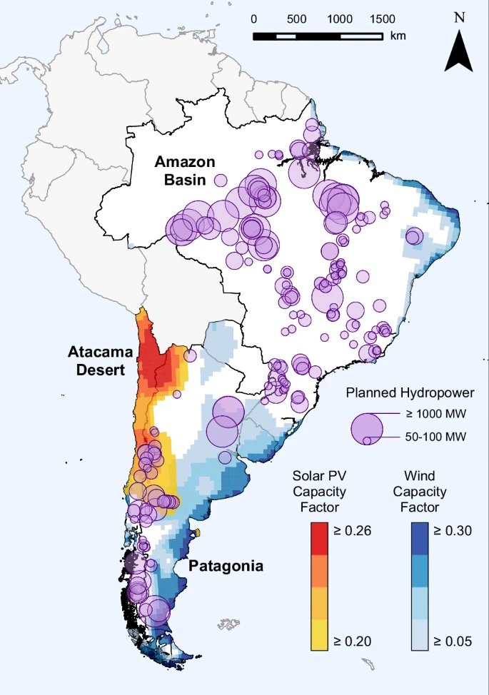 A new study in Nature Communications examines Argentina, Brazil, Chile, Paraguay, and Uruguay's electricity systems through 2050:
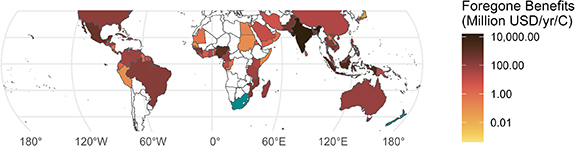 A new study in Environmental Research: Climate presents the first global analysis of how warming seas threaten mangrove restoration efforts:
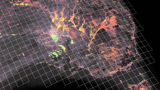
 ESA recently announced Zarr as the new format for Sentinel-1, 2 and 3.
 A new study in Nature Communications, analyses geocoded DHS data at a 5km resolution.
 The researchers combined:
 In spatial analysis, “support” refers to the unit of measurement in space.
 The first sub-national HDI dataset was actually published in @ScientificData in 2019.
 We have petabytes of satellite images.
 1. WorldPop (@WorldPopProject) provides data on:
 1. Meta provides granular estimates of household wealth for low and middle income countries.
 1. GADM
 In simple terms, ecological fallacy is drawing conclusions about individuals from data that were aggregated over areas (e.g. counties, districts, grids).
 To test the Google Scholar system, researchers created a fake academic and paid $300 to buy 50 citations.
 Back in 2016, Stanford's AI Lab pioneered a new method of measuring economic activity using daytime satellite images.
 Imagine you’re studying how income affects house prices in a city.
 A new paper in @NatureComms describes a novel way of detecting marine litter using satellite images.