Transform Data in Power BI in 7 steps (Complete Guide)
Day 3 of #PL300in14Days
Power Query Editor in Power BI Desktop allows you to shape (transform) your imported data.
You can accomplish actions such as renaming columns or tables, changing text to numbers, removing rows, setting the first row as headers, and much more.
Day 3 of #PL300in14Days
Power Query Editor in Power BI Desktop allows you to shape (transform) your imported data.
You can accomplish actions such as renaming columns or tables, changing text to numbers, removing rows, setting the first row as headers, and much more.
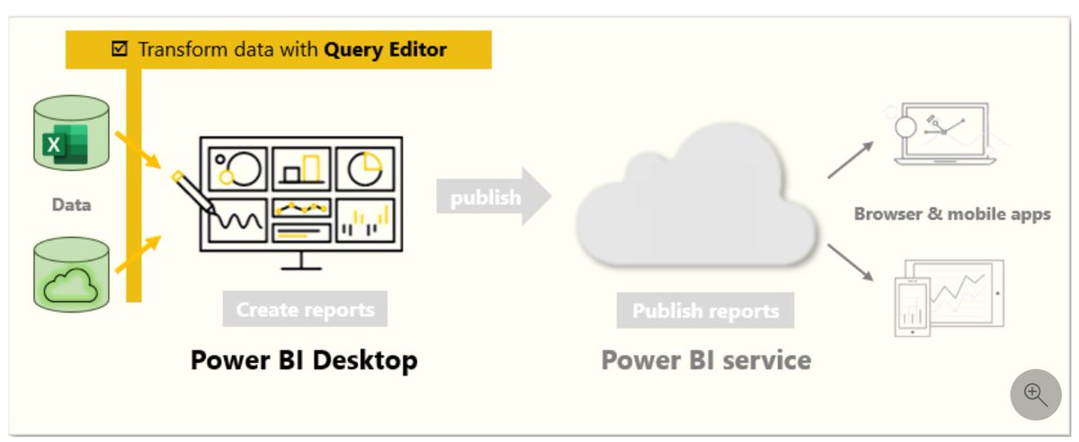
Get started with Power Query Editor
To start shaping your data, open Power Query Editor by selecting the Transform data option on the Home tab of Power BI Desktop.
In Power Query Editor, the data in your selected query displays in the middle of the screen and, on the left side, the Queries pane lists the available queries (tables).
When you work in Power Query Editor, all steps that you take to shape your data are recorded.
You can see a list of your steps on the right side of the screen, in the Query Settings pane, along with the query's properties.
In Power Query Editor, the right-click context menus and Transform tab in the ribbon provide many of the same options.

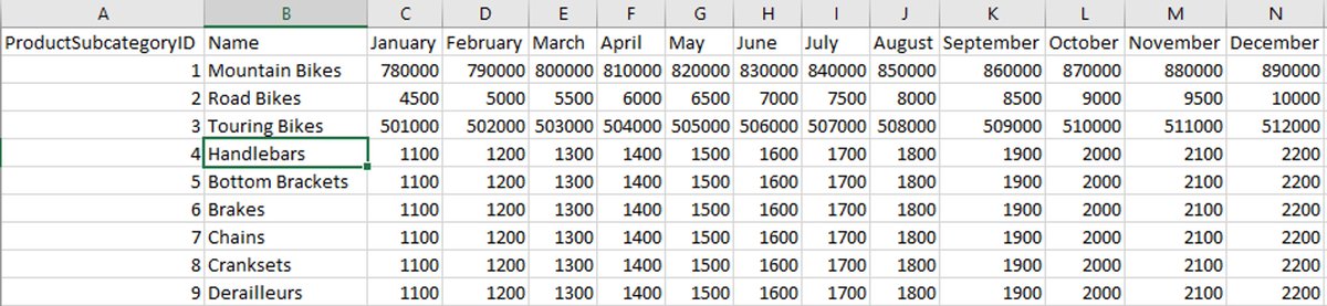
1. Identify column headers and names
The first step in shaping your initial data is to identify the column headers and names within the data and then evaluate where they are located to ensure that they are in the right place.
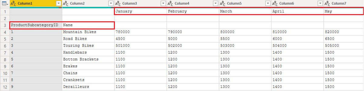
In the following screenshot, the source data in the csv file for SalesTarget (sample not provided) had a target categorized by products and a subcategory split by months, both of which are organized into columns.
However, you notice that the data did not import as expected.
Consequently, the data is difficult to read. A problem has occurred with the data in its current state because column headers are in different rows (marked in red), and several columns have undescriptive names, such as Column1, Column2, and so on.
When you have identified where the column headers and names are located, you can make changes to reorganize the data.
The first step in shaping your initial data is to identify the column headers and names within the data and then evaluate where they are located to ensure that they are in the right place.
In the following screenshot, the source data in the csv file for SalesTarget (sample not provided) had a target categorized by products and a subcategory split by months, both of which are organized into columns.
However, you notice that the data did not import as expected.
Consequently, the data is difficult to read. A problem has occurred with the data in its current state because column headers are in different rows (marked in red), and several columns have undescriptive names, such as Column1, Column2, and so on.
When you have identified where the column headers and names are located, you can make changes to reorganize the data.
2. Promote headers
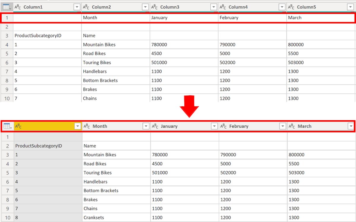
When a table is created in Power BI Desktop, Power Query Editor assumes that all data belongs in table rows. However, a data source might have a first row that contains column names.
To correct this inaccuracy, you need to promote the first table row into column headers.
You can promote headers in two ways:
by selecting the Use First Row as Headers option on the Home tab or by selecting the drop-down button next to Column1 and then selecting Use First Row as Headers.
The following image illustrates how the Use First Row as Headers feature impacts the data:

3. Rename columns
The next step in shaping your data is to examine the column headers.
You might discover that one or more columns have the wrong headers, a header has a spelling error, or the header naming convention is not consistent or user-friendly.
You can rename column headers in two ways. One approach is to right-click the header, select Rename, edit the name, and then press Enter.
Alternatively, you can double-click the column header and overwrite the name with the correct name.
You can also work around this issue by removing (skipping) the first two rows and then renaming the columns to the correct name.
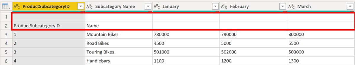
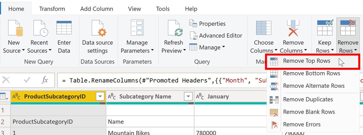
4. Remove top rows
When shaping your data, you might need to remove some of the top rows, for example, if they are blank or if they contain data that you do not need in your reports.
Continuing with the SalesTarget example, notice that the first row is blank (it has no data) and the second row has data that is no longer required.
To remove these excess rows, select Remove Rows > Remove Top Rows on the Home tab.
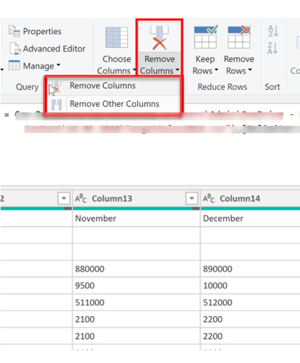
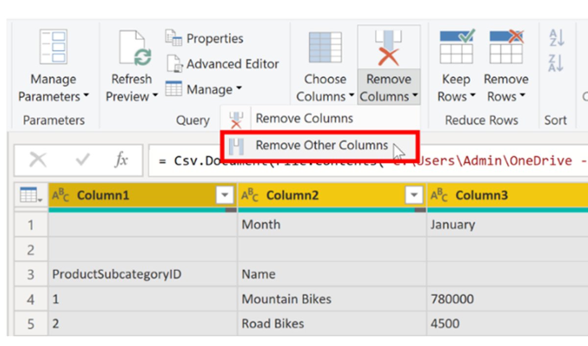
5. Remove columns
A key step in the data shaping process is to remove unnecessary columns.
It is much better to remove columns as early as possible.
You can remove columns in two ways.
The first method is to select the columns that you want to remove and then, on the Home tab, select Remove Columns.
Alternatively, you can select the columns that you want to keep and then, on the Home tab, select Remove Columns > Remove Other Columns.
6. Unpivot columns
Unpivoting is a useful feature of Power BI.
You can use this feature with data from any data source, but you would most often use it when importing data from Excel.
The following example shows a sample Excel document with sales data.
Though the data might initially make sense, it would be difficult to create a total of all sales combined from 2018 and 2019.
Your goal would then be to use this data in Power BI with three columns: Month, Year, and SalesAmount.
When you import the data into Power Query, it will look like the following image.
Next, rename the first column to Month.
This column was mislabeled because that header in Excel was labeling the 2018 and 2019 columns.
Highlight the 2018 and 2019 columns, select the Transform tab in Power Query, and then select Unpivot.
You can rename the Attribute column to Year and the Value column to SalesAmount.
Unpivoting streamlines the process of creating DAX measures on the data later.
By completing this process, you have now created a simpler way of slicing the data with the Year and Month columns.


7. Pivot columns
If the data that you are shaping is flat (in other words, it has a lot of detail but is not organized or grouped in any way), the lack of structure can complicate your ability to identify patterns in the data.
You can use the Pivot Column feature to convert your flat data into a table that contains an aggregate value for each unique value in a column.
For example, you might want to use this feature to summarize data by using different math functions such as Count, Minimum, Maximum, Median, Average, or Sum.
In the SalesTarget example, you can pivot the columns to get the quantity of product subcategories in each product category.
On the Transform tab, select Transform > Pivot Columns.
On the Pivot Column window that displays, select a column from the Values Column list, such as the Subcategory name.
Expand the advanced options and select an option from the Aggregate Value Function list, such as Count (All), and then select OK.
The following image illustrates how the Pivot Column feature changes the way that the data is organized.


Power Query Editor records all steps that you take to shape your data, and the list of steps are shown in the Query Settings pane.
If you have made all the required changes, select Close & Apply to close Power Query Editor and apply your changes to your semantic model.
However, before you select Close & Apply, you can take further steps to clean up and transform your data in Power Query Editor.
If you have made all the required changes, select Close & Apply to close Power Query Editor and apply your changes to your semantic model.
However, before you select Close & Apply, you can take further steps to clean up and transform your data in Power Query Editor.
Want to learn more topics like this?
I pick a topic and write about it in an easy-to-understand way in my Newsletter every week!
Consider subscribing to it!
Join 2200+ readers:
sasi.beehiiv.com/subscribe
I pick a topic and write about it in an easy-to-understand way in my Newsletter every week!
Consider subscribing to it!
Join 2200+ readers:
sasi.beehiiv.com/subscribe
• • •
Missing some Tweet in this thread? You can try to
force a refresh