You may have seen stories recently about 'the rise of drug resistant superbugs'.
There was even one expert yesterday saying that they could make the covid pandemic look minor.
Well.
Here's a little thread about the timings of these superbug waves in England.
There was even one expert yesterday saying that they could make the covid pandemic look minor.
Well.
Here's a little thread about the timings of these superbug waves in England.
There's quite a wide range of potential drug resistant superbugs - microbes that include bacteria, fungi, protozoans, and viruses.
Let's leave the others aside for a minute, and concentrate on the bacteria.
Primarily because the UK government have been publishing some data on the number of cases of drug-resistant bacteria for the last three years.
Primarily because the UK government have been publishing some data on the number of cases of drug-resistant bacteria for the last three years.
And the data is important.
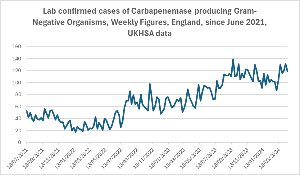
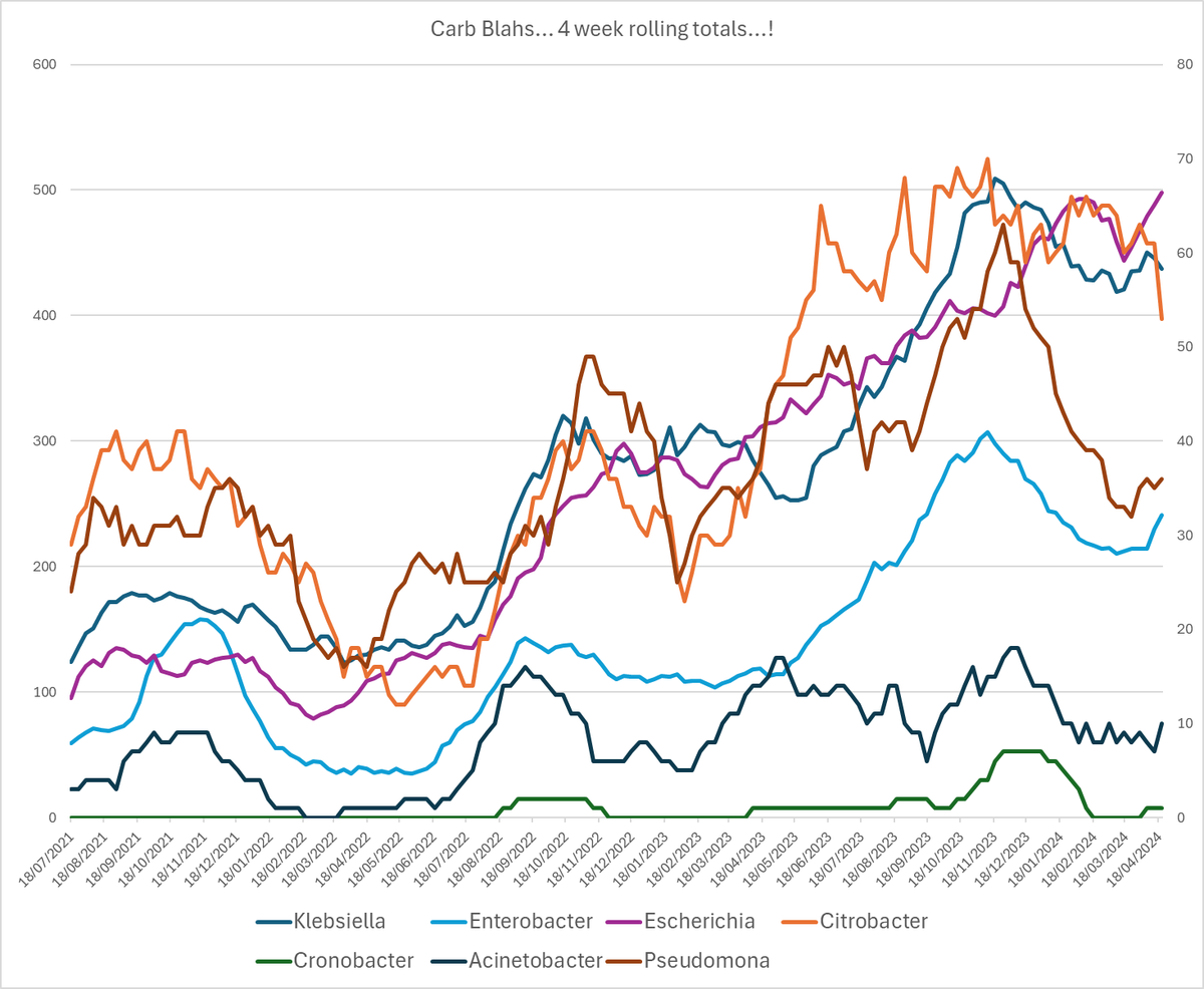
I'll tell you what, let's have a quick glance at the raw case numbers they've published week on week.
Yeah. I know it's messy, but even when it's messy you can see there's a some bad trends in just three years. 

Before we tidy that up, let me tell you what you're looking at.
These are 'carbapenemase-producing' bacteria.
These are 'carbapenemase-producing' bacteria.

*Carbapenem* is a powerful anti-microbial (an anti-microbial is an antibiotic, something that kills a lifeform or stops it reproducing).
And *Carbapenemases* are enzymes that bacteria have discovered can deal with *Carbapenem*.
And *Carbapenemases* are enzymes that bacteria have discovered can deal with *Carbapenem*.
There's two main things concerning about this:
Drugs that use carbapenem are kind of some of the last line of defence against these bugs.
Drugs that use carbapenem are kind of some of the last line of defence against these bugs.
But also, what's a little crazy is that one bacteria species that has figured out how to use carbapenemases can pass that ability to another different species of bacteria.
So the number of bacteria with the ability to use *carbapenemases* against *carbapenems* is growing.
And not only that, but they're also figuring out multiple ways of using them, and passing those different abilities to each other too.
So these are the carbapenemase producing bacteria in the raw data, week on week.
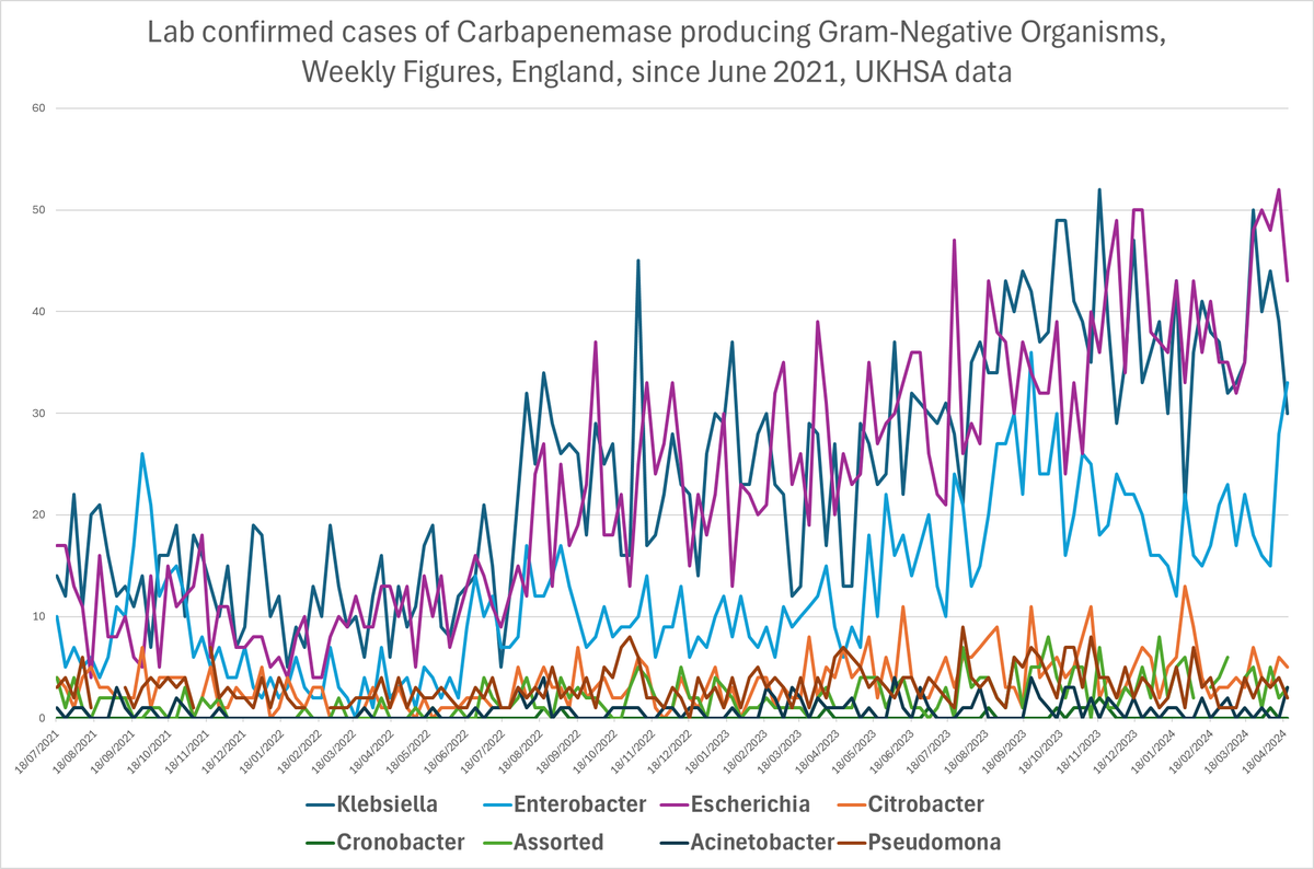
I guess if you're a UKHSA bod looking at that, you probably can't see anything apart from the growth, right?
Lump them all together, and you get this:
Messy.
Growing, but messy.
Growing, but messy.
No obvious trends apart from 'up', maybe.
Except... when you look at the individual varieties things start to shake out.
And there are some *very* clear trends.
You want to see?
First of all, you need to remove some of the *noise* from the graph.
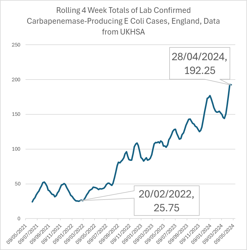
Instead of seeing the number of cases each week, you can change the data displayed to the number of cases of each one in the last four weeks.
Instead of seeing the number of cases each week, you can change the data displayed to the number of cases of each one in the last four weeks.
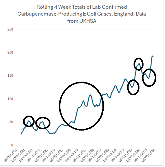
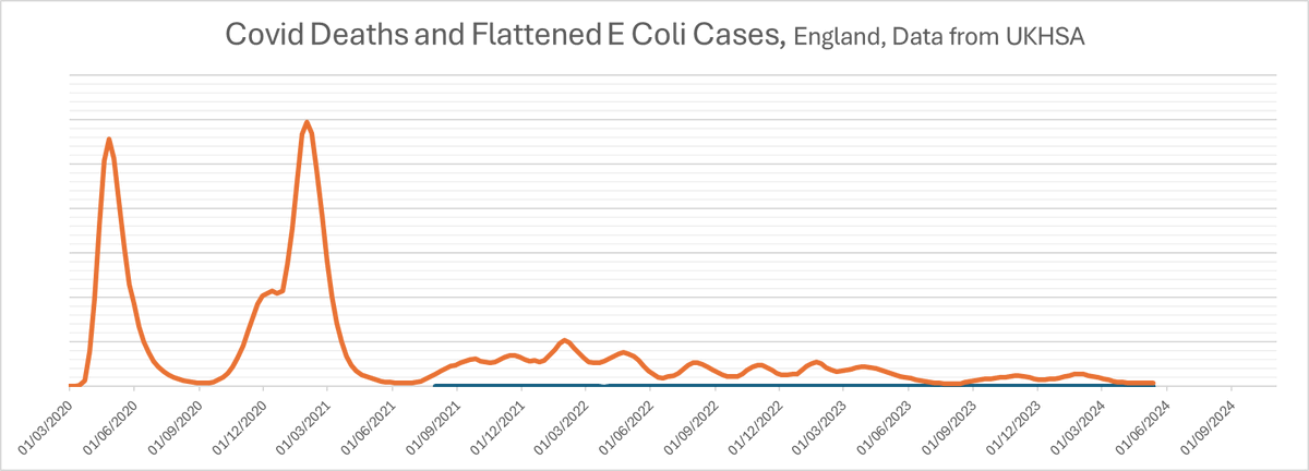
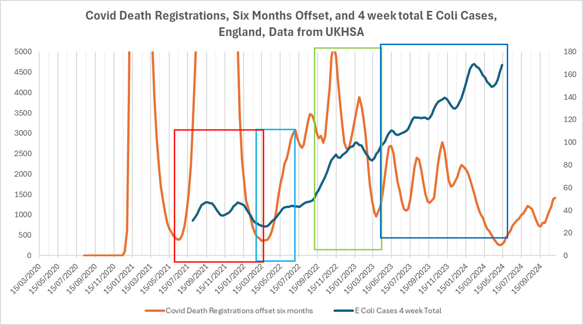
So here's 4 week rolling totals of cases of Escherichia Coli, more commonly known as E Coli, that have been tested and been found to be producing a carbapenemase, smoothed to make it easier to see.
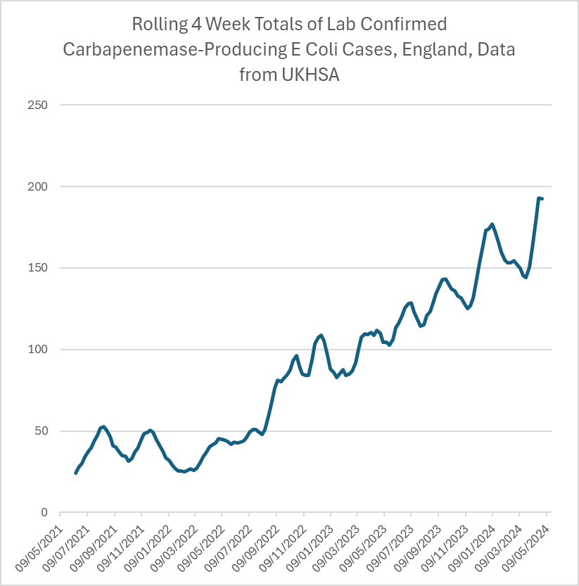
That's not a cumulative graph.
That's monthly Drug Resistant E Coli cases growing by a factor of FOUR in TWENTY MONTHS.
That's monthly Drug Resistant E Coli cases growing by a factor of FOUR in TWENTY MONTHS.
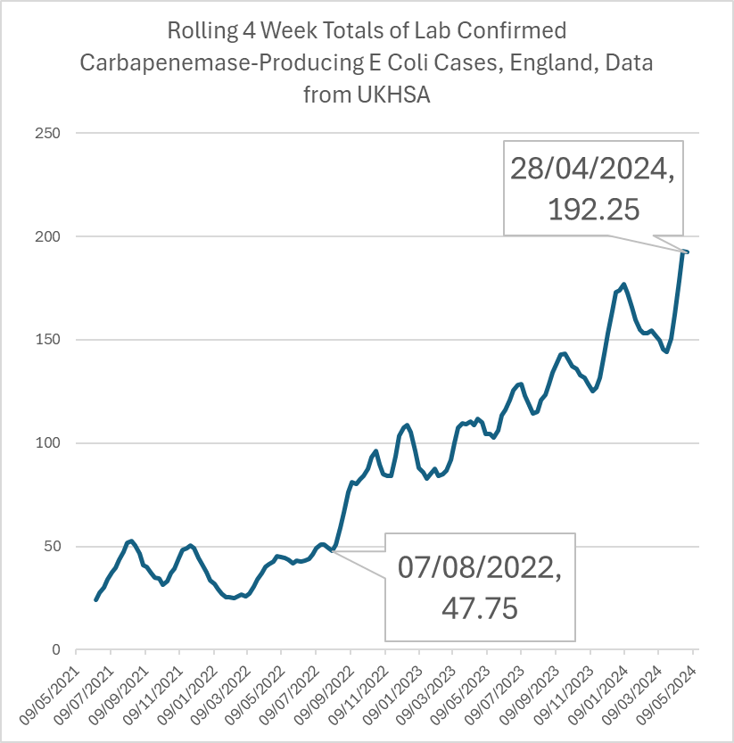
And I was being generous about which low point I chose.
So if you've been following me for a while, you may know what's coming.
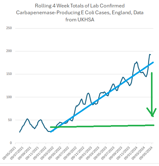
There's a shape to this graph, isn't there?
There's a shape to this graph, isn't there?

This line has a shape.
It has a pattern.
Peaks and troughs, coming with a changing frequency.
So it's not seasonal, or annual.
It has a pattern.
Peaks and troughs, coming with a changing frequency.
So it's not seasonal, or annual.
Now, that line is steadily increasing, which makes it harder to see the peaks and troughs.
So I'm going to make it into a horizontal line so you can see it more easily.
So I'm going to make it into a horizontal line so you can see it more easily.
If you want to know, the right hand side of the graph is five times higher than the data on the left, so I'll divide each week's data by an increasing amount... from 1 to 5... to make it...
...look like this.
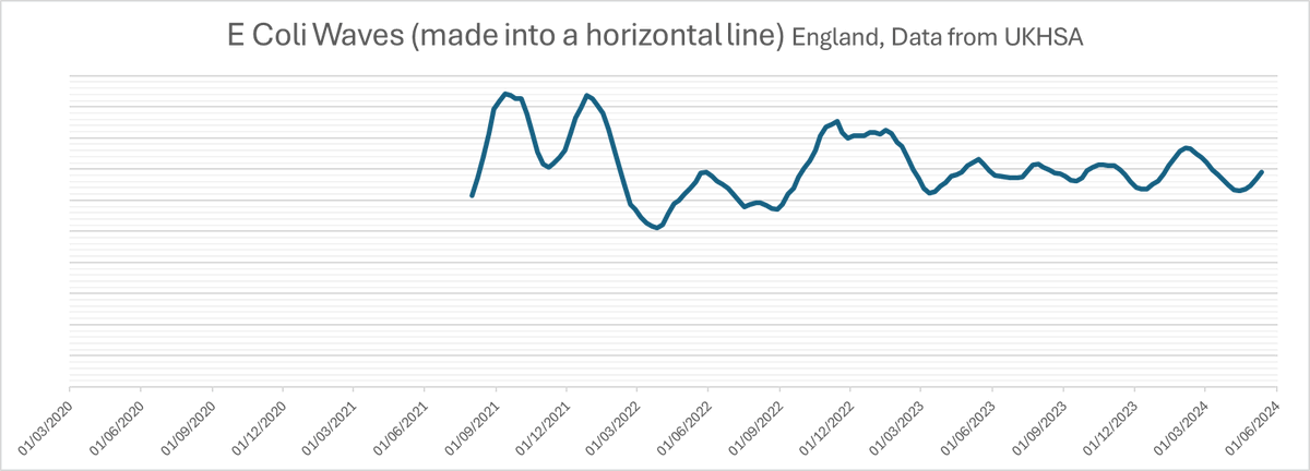
Now that may look like cheating, but you can see that the two lines show the peaks and troughs at exactly the same moment in time.
It's just making the line horizontal.
It's just making the line horizontal.
And it's the TIMING of the waves that's important.
Why?
Because something else comes in waves, doesn't it.
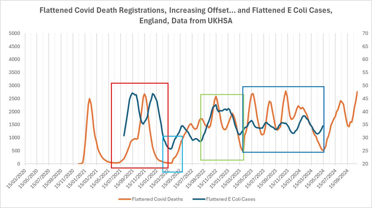
Let's add in Covid.
So... there are the covid deaths on the same graph...
Now, again, I'm going to cheat a bit.
I can do this because I'm not a scientist, I'm a bird.
Please don't do this in your next phd:
I can do this because I'm not a scientist, I'm a bird.
Please don't do this in your next phd:
There are five basic stages of this graph.
Something happens at the end of each box.
Something happens at the end of each box.

At the end of the first box, the red one, we enter the "most people have been vaccinated or infected phase".

Then at the end of the green box, we reduce testing.

Then at the end of the blue box, we reduce testing again.
Then at the end of the yellow box, we reduce recording of testing.
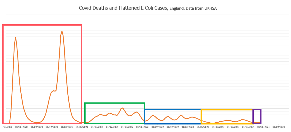
We're in the purple box.

So, I'm going to apply a rough rule of thumb to again **make that line flat so each part is comparable**.
I think it's ok to do this, because we know that registered deaths are not an accurate reflection of the number of cases, and neither is testing... but look all we're after here is the **shape**.
And here it is.
The E Coli cases are just an infintessimally tiny line on the bottom, but remember, they're growing, and we want to know why, so let's put the *flattened e coli cases* onto a different scale...
<PHEW> I hear you say, as you wipe the sweat off your brow, there's no link there at all!
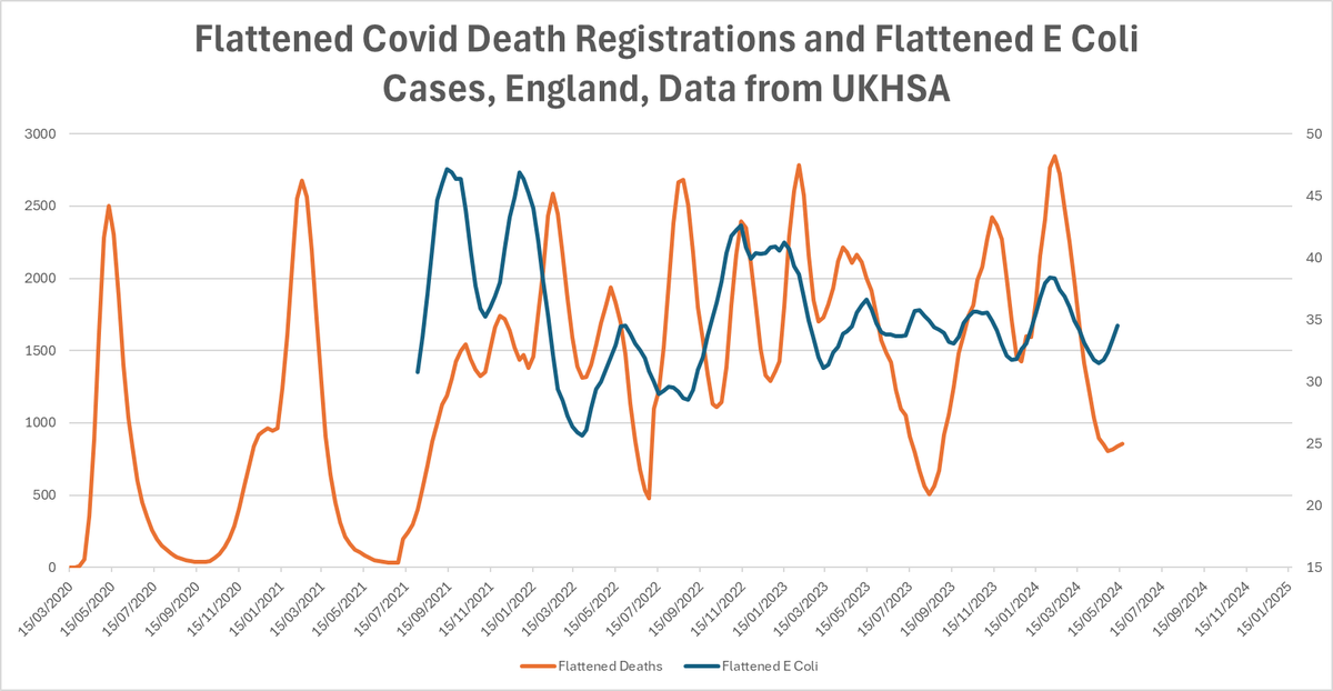
Except... we know that some of the effects of covid come *after* the infection... what if there's some kind of lag between the covid wave cause and the E Coli effect?
So if you try and line up the first peak of deaths with the first peak of e coli, so the deaths are offset by a whole 18 months, nothing really fits at all.
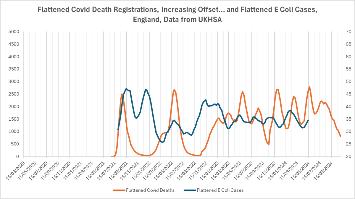
But if you line up the two base troughs either side of the wide second wave with the two troughs either side of the wide first double peak of Coli cases... (red)... everything starts to correlate.
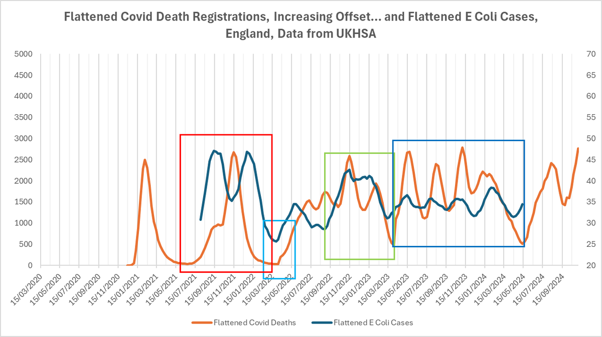
The width of the base in that first red box (I'll come back to the double peak in a moment).

The shape of the next climb in light blue.

The string of correlating peaks (with ever so slightly varying degrees of delay) through the light blue, green, and dark blue boxes.
1, 2, 3, 4, 5, 6, 7, 8...
And the corelation in the troughs too.
1, 2, 3, 4, 5, 6, 7, 8...
And the corelation in the troughs too.

Or correlation even.
That graph is offset by 26 weeks.
And we know that there's generally a delay in registration of covid deaths after infections by about 3 weeks.
And we know that there's generally a delay in registration of covid deaths after infections by about 3 weeks.
So you're looking at roughly 30 weeks - seven to eight months, between the peaks of covid infections and the peaks of e coli cases confirmed by lab.
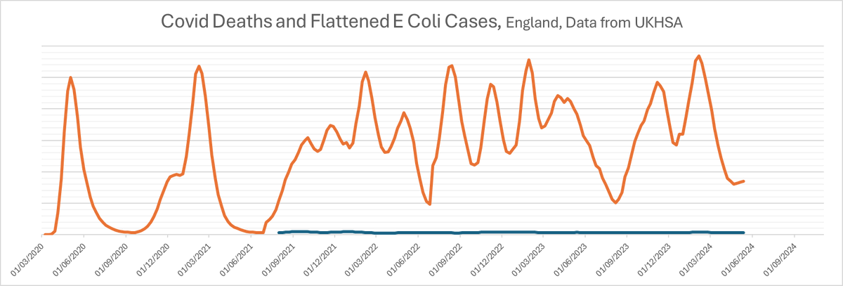
But remember... they actually look like this:
And so if the cause is a wave of covid infections, and the effect is a wave of drug resistant E Coli cases, the effect is getting greater.
(While we're here, random side note, did you notice that during each of those green, blue, and orange boxes, while testing remained consistent the number of deaths in each wave increased?)

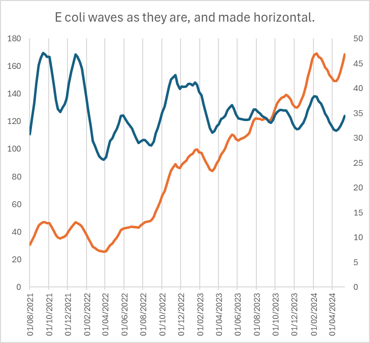
So, we just looked at E Coli, here are the rest:
They've all got wave features, and most of them correlate with each other and with the covid waves.
They've all got wave features, and most of them correlate with each other and with the covid waves.
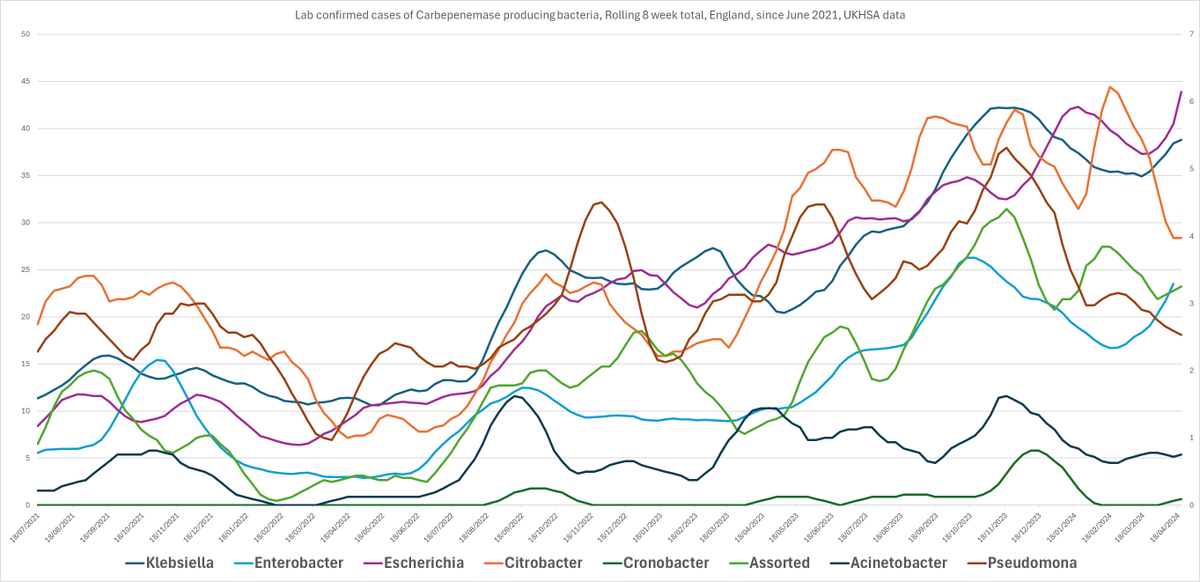
Here they are:
Oh, one note - Klebsiella, Enterobacter, and Escherichia Coli are on the left hand scale.
The rest are on the right hand scale.
There aren't as many of them.
The rest are on the right hand scale.
There aren't as many of them.
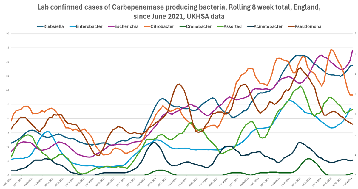
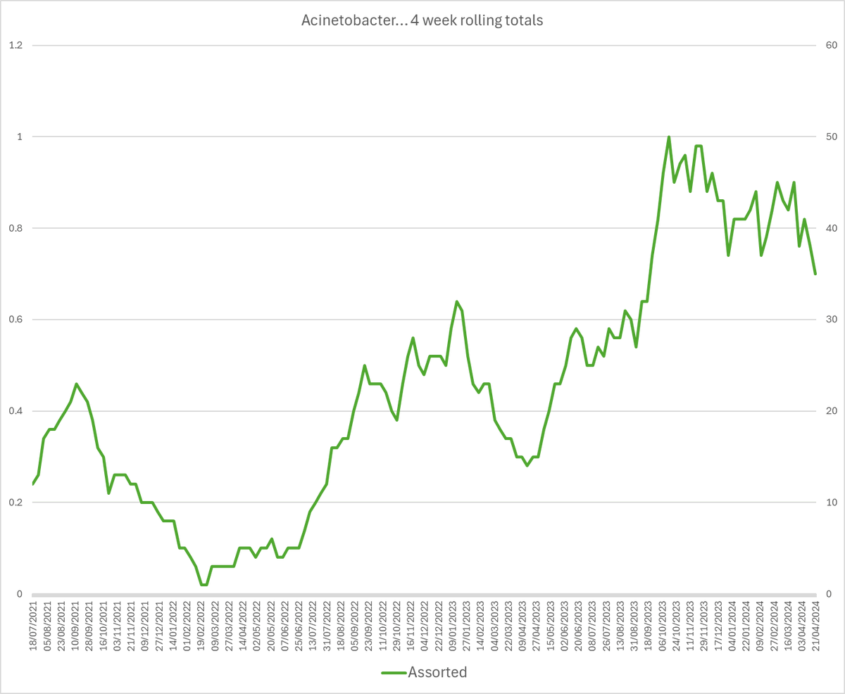
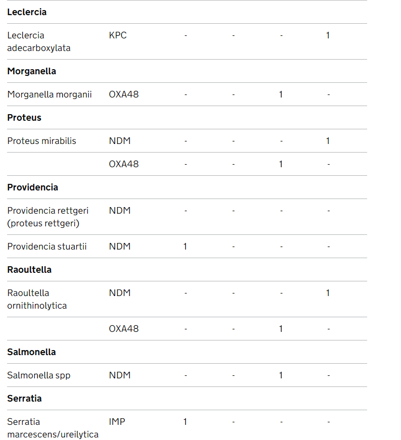
And I lumped Leclercia, Morganella, Proteus, Providencia, Raoultella, Salmonella, and Serratia into 'Assorted', because they're aren't many of them.
But you know there will be, right?
Especially if we allow Covid to keep ripping through in huge waves.
Here they are.
Sow Covid.
Reap drug resistant bacterial infections.
Sow Covid.
Reap drug resistant bacterial infections.
Now, here we hit the big old question.
Why is Covid doing this?
Why is Covid doing this?
And if you've got this far and you don't think Covid is doing it, good on you for sticking with it. I'm impressed.
Well, it's no secret that Covid harms the immune system.
And it's no secret that these drug resistant bacteria exploit people with immune dysfunction immunodeficiency and immune damage.
And it's no secret that Covid has been damaging the mucosa that normally acts as a barrier against these opportunistic bacteria in gut and lung and mouth and bladder and everywhere where these bugs normally hang around.
Normally your body can deal with them.
But it looks like a lot of people are having difficulty with them after their covid infections.
A crazily growing number of them:

So next time you see the UKHSA banging on about antibiotics in pigs, ask yourself why they haven't made this very obvious link too.
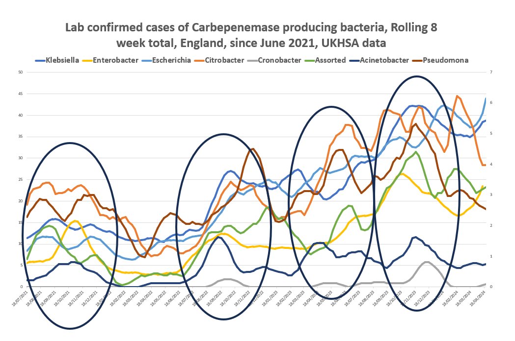
Note - I said I'd come back to the double peak in the first red box.
Here's the unadjusted graph.
I think there's a possibility that the massive peak of deaths took out some of the people who might have developed E Coli from that wave.
I don't know.
I think there's a possibility that the massive peak of deaths took out some of the people who might have developed E Coli from that wave.
I don't know.

But with the unsmoothed data, the double peak is less pronounced, and you can see that the other drug resistant bacteria had just a single peak then, except the pseudomonas...
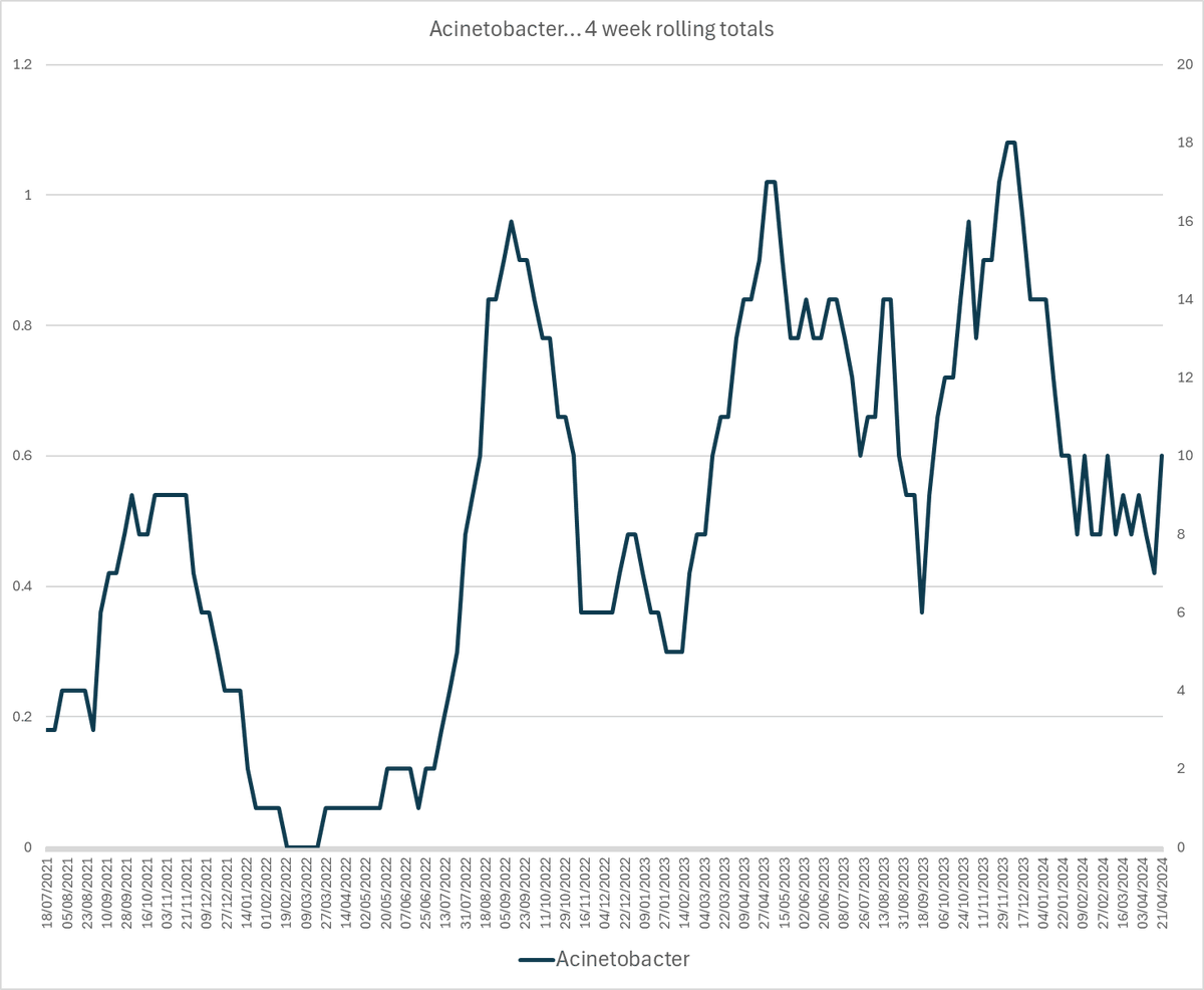
And the bacterial group that is showing the least sign of growth... the acetinobacters... the precision of those peaks... ouch.
And those 'assorteds'...
I think this is the group that might have the UKHSA pooping themselves.
I think this is the group that might have the UKHSA pooping themselves.
Because right back at the beginning of this thread, I said that the problem is that **other bacteria** can learn this defence.
And the numbers of bacteria that are doing it... are increasing by the month.
It might only look like ones and twos...
But that's the way it always starts.
@Schall_abweiser Maybe spreadsheets don't always help.
I certainly feel intimately connected with that data.
I certainly feel intimately connected with that data.
• • •
Missing some Tweet in this thread? You can try to
force a refresh