We got our churn rate from a whopping 12.3% peak down to 2.7%.
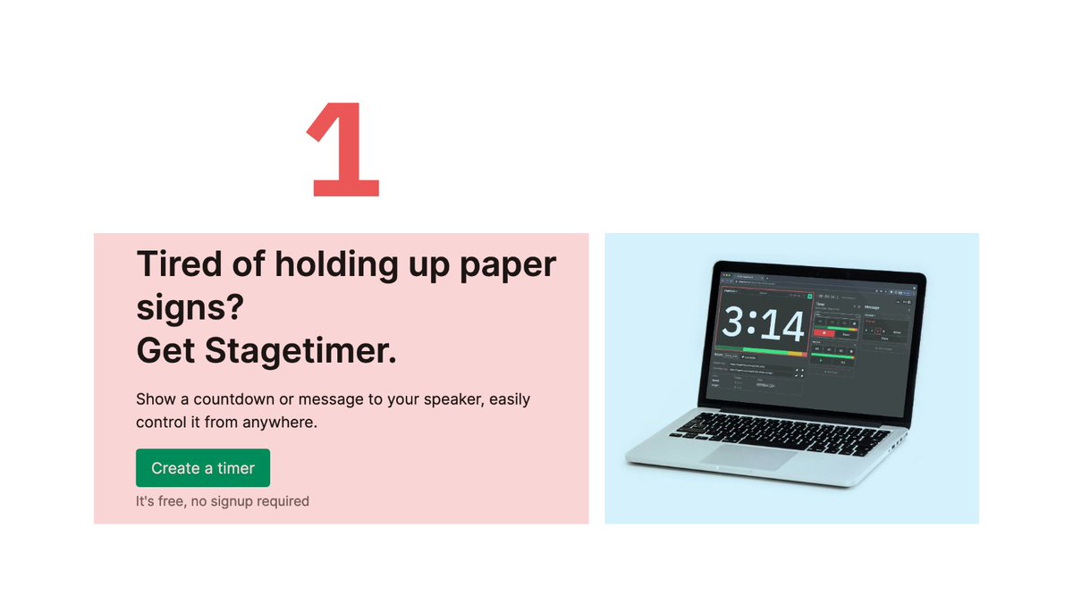
I'm the founder of Stagetimer, a bootstrapped $10k+ MRR B2B app and this is how we reduced our churn sustainably in 3 steps, and the lesson learned... 👇
I'm the founder of Stagetimer, a bootstrapped $10k+ MRR B2B app and this is how we reduced our churn sustainably in 3 steps, and the lesson learned... 👇

Step 1:
Analyzed why people churn. Found no. 1 reason is usage pattern of our product. Most people use it for a single event and then cancel.
We already had a dedicated 10-day "Event" plan, but users preferred the 30 days of the monthly plan.
Analyzed why people churn. Found no. 1 reason is usage pattern of our product. Most people use it for a single event and then cancel.
We already had a dedicated 10-day "Event" plan, but users preferred the 30 days of the monthly plan.
Step 2:
Asking ourselves "Is churn bad?"
A: Yes. Of every 10 users, one forgot to cancel and either got mad at us and/or requested their money back.
-> Huge extra customer support and refund fees
Asking ourselves "Is churn bad?"
A: Yes. Of every 10 users, one forgot to cancel and either got mad at us and/or requested their money back.
-> Huge extra customer support and refund fees
Step 3:
We made changes to pricing:
-> Remove monthly subscription
-> Extend "Event" plan to 30 days (no recurring payment)
-> Keep yearly plan as is
We made changes to pricing:
-> Remove monthly subscription
-> Extend "Event" plan to 30 days (no recurring payment)
-> Keep yearly plan as is
Result:
Churn went down from 12.3% to 2.7%.
MRR growth down also, but still net positive.
Overall revenue stayed the same.
Less customer complaints -> More happy customers!
Churn went down from 12.3% to 2.7%.
MRR growth down also, but still net positive.
Overall revenue stayed the same.
Less customer complaints -> More happy customers!
Lesson:
Everyone wants subscription revenue but in the long run it's better to choose the type of pricing that works best for your users.
Everyone wants subscription revenue but in the long run it's better to choose the type of pricing that works best for your users.
@threadreaderapp unroll
• • •
Missing some Tweet in this thread? You can try to
force a refresh