1/8
🧵on what I see in the Spot BTC 13F filings
Conclusions
I feared the Spot BTC ETFs were effectively "orange FOMO poker chips." The Q1 13F filings only further convinced me this was the case. Only ~3% of the outstanding ETF mkt Cap was held by Investment Advisors, completely blowing up the narrative that "the Boomers are coming." They might over time (as in years) but did not in Q1.
~10% is held by hedge funds, and ~85% by non-institutional investors (read: retail).
I was concerned that the substantial volume in the Spot ETF could cannibalize on-chain volume. The Q1 earnings of $COIN indicated that this concern might be a reality.
Pulling money off-chain into the Tradfi world in the form of an orange FOMO poker chip will not get digital assets to the promised land of a new decentralized financial system. If anything, it is getting in the way of this goal.
Understand I have been a long cryptos for over seven years and have been an advocate for them. But, in my opinion, the way these instruments are being traded and promoted, is not going to help build a new financial system. At best, it happens in spite of them. At worst, they get in the way.
@EricBalchunas @JSeyff @MattHougan_ @NateGeraci @profplum99 @TrustlessState @RyanSAdams @LynAldenContact @nlw @APompliano @nic__carter @JuliaLaRoche
2/8
Anyone with over 5% beneficial ownership or at least $100 million in assets must file a 13F within 45 days of the end of the quarter. This was May 15. ~7,000 were filed.
What did we learn from the Spot BTC ETF filings? The table below shows some top-line results.
The shaded blue area shows the Investment Advisors' holdings. They are very small, between 2.5% and 4% (and 8.81% for $GBTC). A recent Citi report says the AVERAGE ETF is about 35% owned by investment advisors.
Throughout the quarter, we were confidently told boomers were calling their wealth managers and telling them to get into BTC. This is not the case for 95+% of the Spot BTC ETF holdings.
What was a surprise was the size of the hedge fund holdings. They were larger than anticipated. But here they were very concentrated in two or three very large HFs accounting for about half the total 13F holdings.
Why these funds are trading this massive size is anyone's guess.
* Arbitraging the funds or on-chain to ETF?
* Directional Degen bets?
* Or they bought into the long-term narrative in Q1.
My guess is a combination of the first two and very little of the last.

3/8
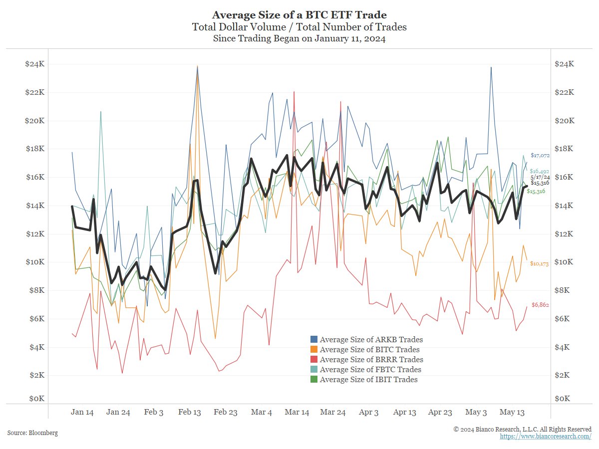
What about the ~85% of the Spot BTC ETFs not covered by 13F filings? Could they have been boomers adopting BTC over the long-term narrative?
I would say no for two reasons.
The chart to the right shows that the average BTC trade is just $15.3k (blue), Far less than everything else. The chart to the left shows all the Spot ETF individually.
These are all at the level of small-time retail "degen-ing."

4/8
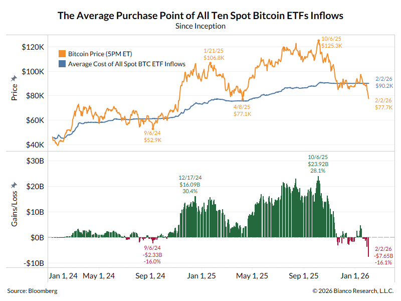
But how do we know this is not just small-term players adopting the long-term narrative? I would argue if it was, then the cumulative flows (top panel below) would not go up and down with price, as this chart shows.
There is an old saying in the mutual fund/ETF world that "flows follow performance." This chart suggests that flows are chasing momentum, or maybe, in part. causing it.
The flows do not show signs of the relentless bid that many think these instruments have. They did this for five weeks, and the price rallied just 25%. When the cumulative flows stopped, the price advance also stopped.
If anything, it is concerning that the headlong rush into Spot BTC ETFs "only" drove this price back to the old high (of November 2021) and not $100k.

5/8
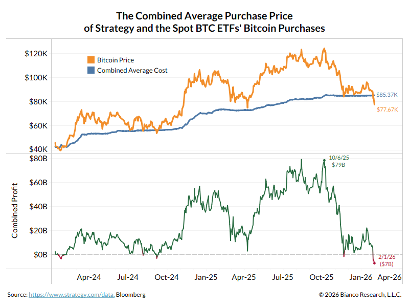
The average purchase price they hold BTC at is around $58 to $59K. When the price went to this level on May 1, these ETFs had record outflows (chart above).
Now that the price is well above this average price, outflows stopped. This is Degen behavior.
The average purchase price they hold BTC at is around $58 to $59K. When the price went to this level on May 1, these ETFs had record outflows (chart above).
Now that the price is well above this average price, outflows stopped. This is Degen behavior.

6/8
My other concern was that these instruments would not lead to on-chain adoption but instead drag money back into the tradfi world. $COIN Q1 earnings offered hints this might be the case.
--
Coinbase Revenue Surges to $1.64 Billion – But Retail Volume Just 50% of 2021 Levels
Armstrong highlighted Coinbase’s ongoing effort to simplify the use of crypto tools. He pointed out that traditional onboarding methods for crypto wallets, like the 12-word phrase, are overly technical for a broad audience and pose challenges in terms of security and user-friendliness.
Armstrong discussed the development of “pass keys” as part of the Smart Wallet initiative. It will leverage biometric technology, such as fingerprint verification, to enhance the user experience.
--
Analyzing Coinbase’s Q1 financial metrics for 2021 and 2024 reveals more about the business.
In Q1 2024, net revenue is nearly stable at $1.588b, slightly down from $1.597b in Q1 2021, representing a 0.5% decrease from three years earlier.
What is noteworthy is that retail trading volume dropped significantly. The figure fell to $56b in Q1 2024 from $120b in Q1 2021. This is a massive 53% fall from the earlier volume, reflecting decreased retail activity. Conversely, institutional trading volume increased to $256b in Q1 2024, up from $215b in Q1 2021. This means that Coinbase has balanced institutional growth to offset some retail decline.ccn.com/news/crypto/co…
7/8
Above is $COIN telling us that retail still thinks on-chain is too hard, and $COIN is too limiting? They would rather own BTC in a Tradfi brokerage account?
In other words, are they content with a receipt (ETF) that trades on the NYSE that they own BTC in a regulated account rather than adopting the new financial system directly?
If so, this is a problem for the long-term narrative of BTC.
8/8
So, after the filings, I see these ETFs as orange FOMO poker chips and not true tools for adopting a new financial system. If the goal is to develop a new financial system, an ETF dragging money back into the Tradfi world is not getting to that promised land.
Again, a new decentralized financial system is needed, and the digital world is making great strides.
But getting everyone to Degen into regulated products, on regulated exchanges, and letting Gary Gensler and Larry Fink set the rules is not getting to that land. It gets in the way.
Added later.
Assuming @EricBalchunas wrote this ...
He is correct that on-chain is not realistic, as stated.
But if the goal is to create a new decentralized financial system, driving everyone back into Tradfi and giving them an "orange chip" will rekt the digital world.
Assuming @EricBalchunas wrote this ...
He is correct that on-chain is not realistic, as stated.
But if the goal is to create a new decentralized financial system, driving everyone back into Tradfi and giving them an "orange chip" will rekt the digital world.

• • •
Missing some Tweet in this thread? You can try to
force a refresh