In this THREAD I will explain “Fibonacci”
1. Fibonacci Retracement
2. Trend identification
3. How to label Fibonacci
4. Fibonacci Levels
5. Fibonacci Expansion
6. $ETH Liquidity Analysis
🧵(1/9)
1. Fibonacci Retracement
2. Trend identification
3. How to label Fibonacci
4. Fibonacci Levels
5. Fibonacci Expansion
6. $ETH Liquidity Analysis
🧵(1/9)

1. Fibonacci Retracement
Fibonacci Retracement Levels are based on ratios used to identify potential reversal points on a price chart.
Retracement levels also are used as Support and Resistance.
Fibonacci Retracement Levels are based on ratios used to identify potential reversal points on a price chart.
Retracement levels also are used as Support and Resistance.

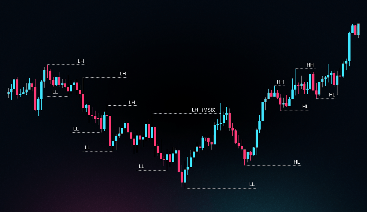
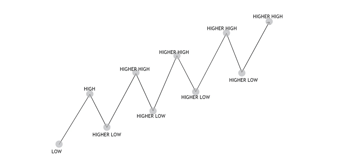
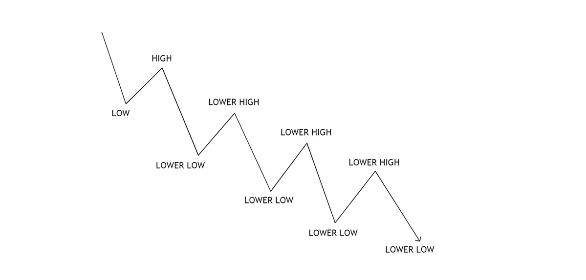
2. Trend Identification
We MUST identify the TREND of the price before drawing Fibonacci.
How do we Identify a TREND?
If price is followed by HH and HL, the trend is BULLISH.
If price is followed by a LH and LL, the trend is Bearish.
We MUST identify the TREND of the price before drawing Fibonacci.
How do we Identify a TREND?
If price is followed by HH and HL, the trend is BULLISH.
If price is followed by a LH and LL, the trend is Bearish.

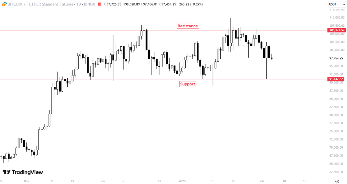
3. How to label Fibonacci
This is an example of Fibonacci Retracement.
We mark from the Swing HIGH of the present Market Structure to the Swing LOW.
You HAVE to find the local HIGH and BOTTOM of your MS.
This is the only correct way to label Fibonacci Retracement.
This is an example of Fibonacci Retracement.
We mark from the Swing HIGH of the present Market Structure to the Swing LOW.
You HAVE to find the local HIGH and BOTTOM of your MS.
This is the only correct way to label Fibonacci Retracement.

3.2 How to label Fibonacci
Fibonacci Expansion:
Begin point of the trendline must be placed at a recent Swing Low, end point at recent Swing High.
The extension line starts at the end point of the trendline and can be plotted to any point of chart.
Fibonacci Expansion:
Begin point of the trendline must be placed at a recent Swing Low, end point at recent Swing High.
The extension line starts at the end point of the trendline and can be plotted to any point of chart.

4. Fibonacci Levels
Fibonacci Levels there main use, is to act as Support and Resistance.
0.5 Level is acting as Resistance. After price breaks that level, turns to BULLISH.
0.726 Level is acting as Support. Price makes a double bottom and bounces from there.
Fibonacci Levels there main use, is to act as Support and Resistance.
0.5 Level is acting as Resistance. After price breaks that level, turns to BULLISH.
0.726 Level is acting as Support. Price makes a double bottom and bounces from there.

5. Fibonacci Expansion
Is used to establish profit targets or estimate how far a price may travel after a pullback is finished.
These levels are based on Fibonacci ratios (as percentages).
Common Fibonacci extension levels are 61.8%, 100%, 161.8%, 200%, and 261.8%.
Is used to establish profit targets or estimate how far a price may travel after a pullback is finished.
These levels are based on Fibonacci ratios (as percentages).
Common Fibonacci extension levels are 61.8%, 100%, 161.8%, 200%, and 261.8%.

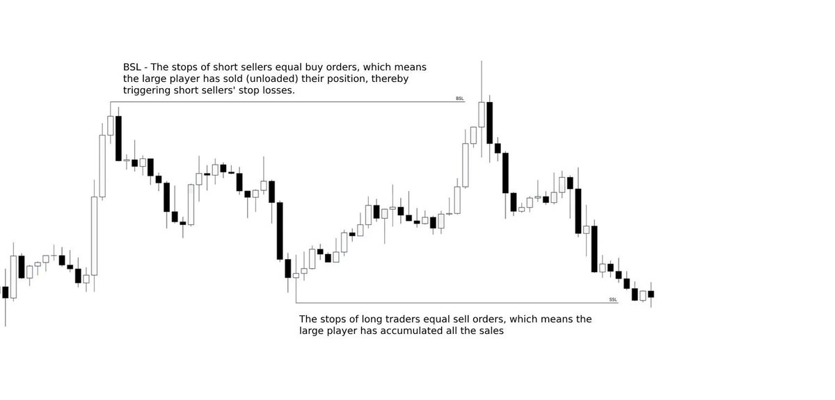
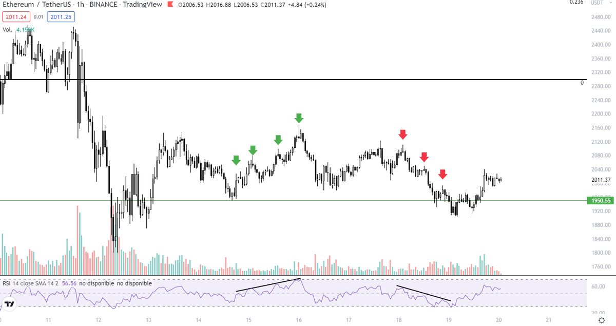
6. $ETH Liquidity Analysis
$ETH Is looking BULLISH in LTF.
The current resistance is at $3200, I expect a retracement there once we hit that pool of Liquidity.
Current Support that MUST hold for a bullish continuation, is at $2800-2900
I expect $ETH to reach $3200 from here
$ETH Is looking BULLISH in LTF.
The current resistance is at $3200, I expect a retracement there once we hit that pool of Liquidity.
Current Support that MUST hold for a bullish continuation, is at $2800-2900
I expect $ETH to reach $3200 from here

6.1 $ETH Liquidity Analysis
In this Heatmap the Resistance and Support in HTF are clearer.
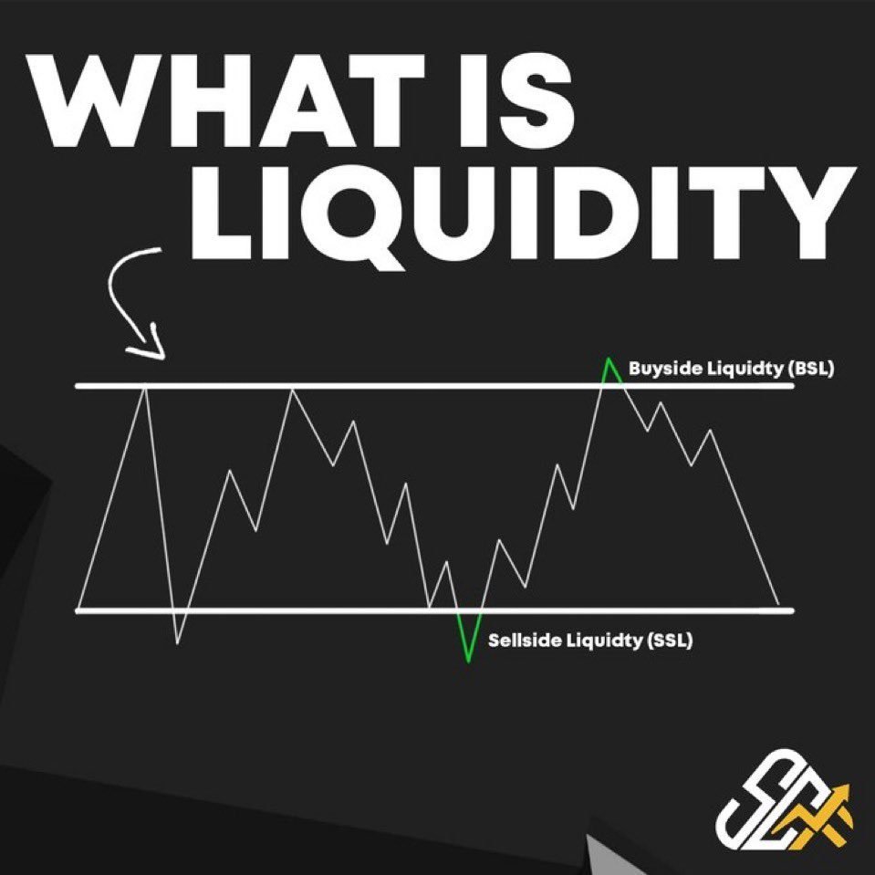
When you are trading Altcoins, watch for the Pools of Liquidity. Price always moves where there's liquidity.
Identify Liquidity as a magnet in price.
In this Heatmap the Resistance and Support in HTF are clearer.
When you are trading Altcoins, watch for the Pools of Liquidity. Price always moves where there's liquidity.
Identify Liquidity as a magnet in price.

• • •
Missing some Tweet in this thread? You can try to
force a refresh