CryptoSoulz Profile picture
Jun 17 8 tweets 3 min read Read on X
In this THREAD I will explain “Price Action”

1. Formation of a Candlestick
2. Power of Three
3. OLHC
4. OHLC
5. Trading examples

🧵(1/8) Image
1. Formation of a Candlestick

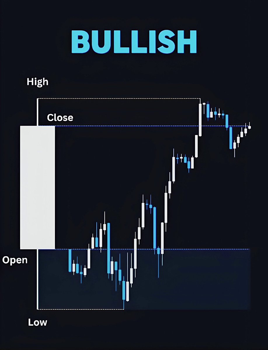
The first candlestick is BEARISH, they OPEN from TOP to BOTTOM.

The second candlestick is BULLISH, they OPEN from BOTTOM to TOP.

Highs and lows are equal positioned in both candlesticks Image
2. PO3

Is a strong and proven trading strategy that focuses on 3 main phases: Accumulation, Manipulation and Distribution.

PO3 goal is to make informed decisions in bullish and bearish markets.

It can be used in different TF.
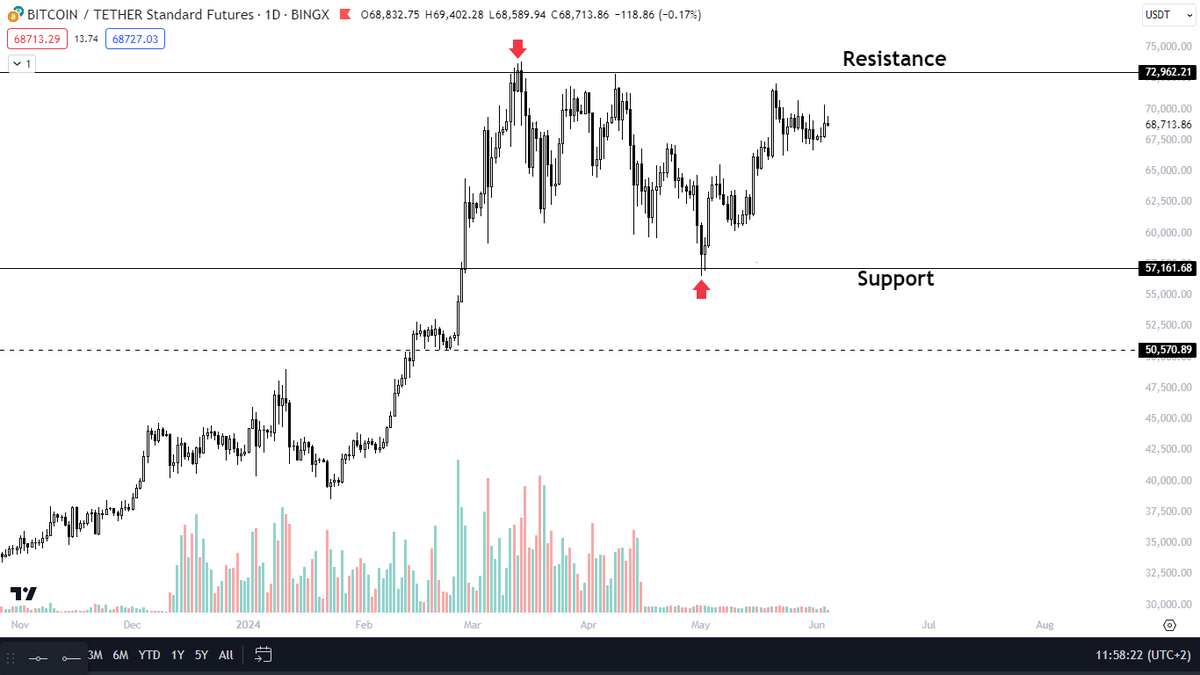
 Image
3. OLHC

OLHC stands for Open, Low, High, Close.

As the name suggests, this type of candlestick chart shows the opening, closing, highest, and lowest prices of an asset within a specific TF. Image
4. OHLC

An open-high-low-close chart is used to illustrate movements in the price of a financial instrument over time.

Each vertical line on the chart shows the price range (the highest and lowest prices) over one unit of time Image
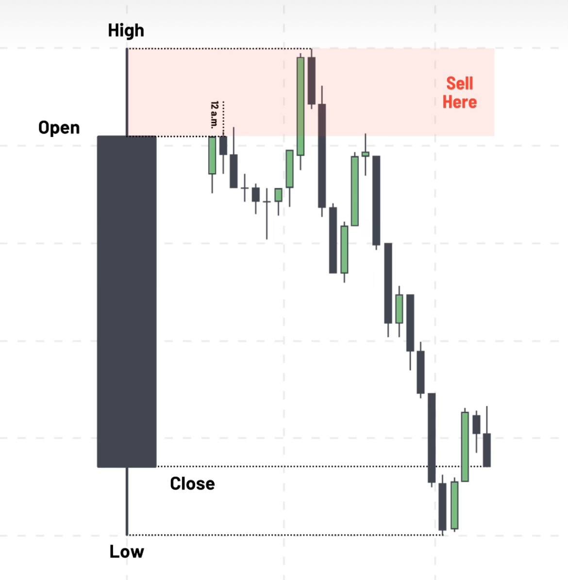
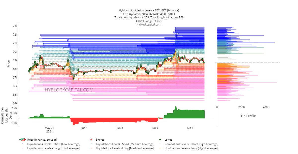
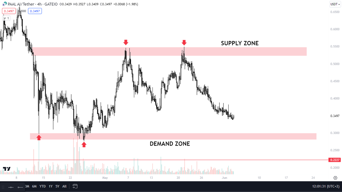
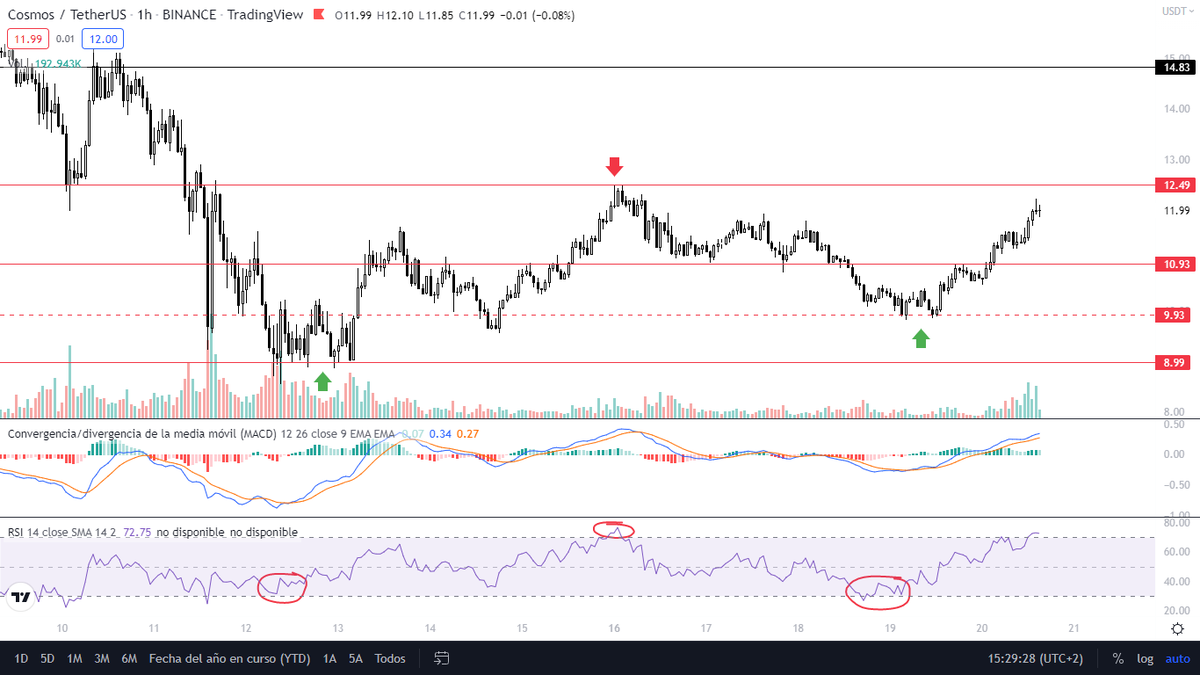
5. Trading Examples (OLHC)

Price arrives to Sell Side Liquidity.

This would be a ideal ZONE to accumulate or enter.

If not, wait for a displacement to occur and enter in the next FVG retest. Image
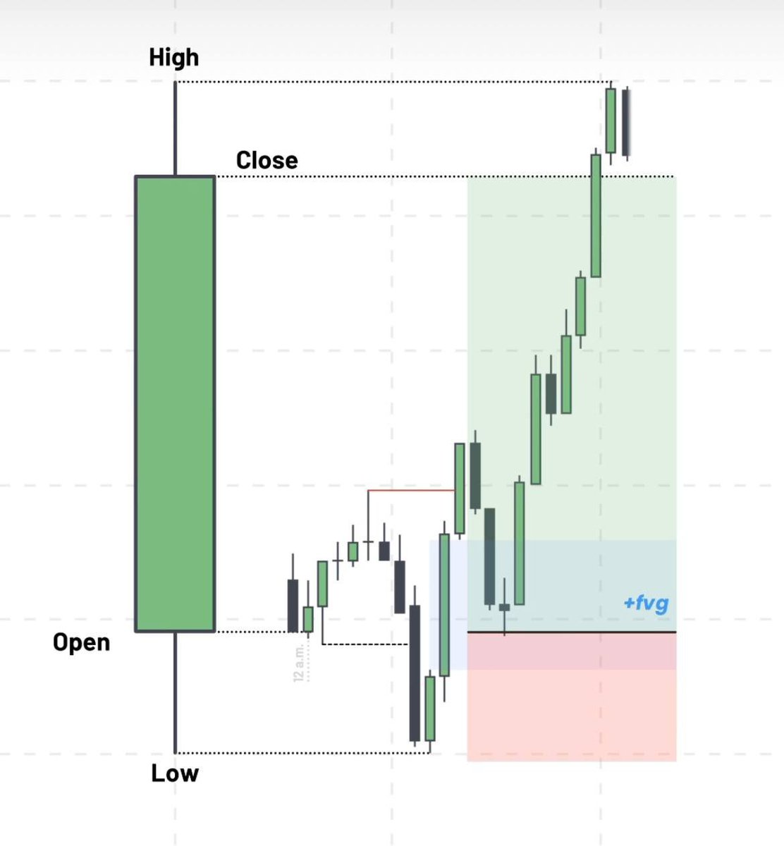
5.1 Trading Examples (OLHC)

We enter the trade when price retests FVG and take it as a Support.

Stop Loss should be placed BELOW Sell Side Liquidity. Image
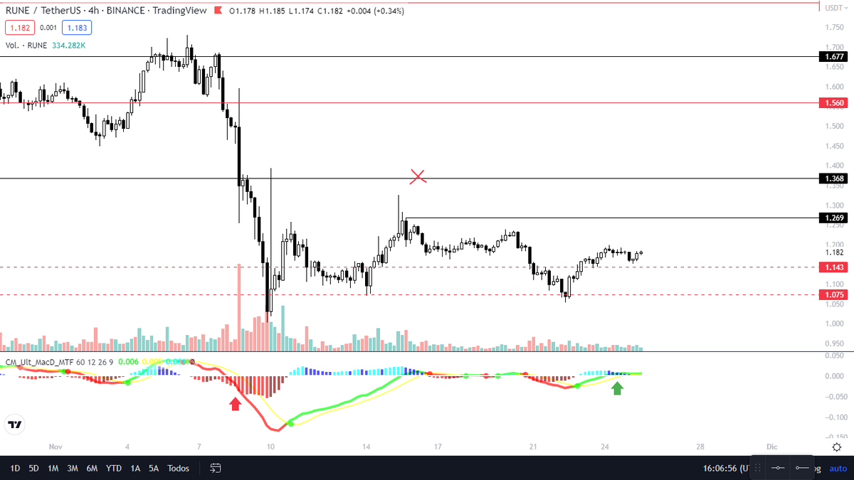
5.2 Trading Examples (OLHC)

Price should expand to Highs from the Lows taken.

This is an example of how price moves where the Liquidity is.

Stop loss always below Daily low.

TP always on the Close or Highs of the day. Image

• • •

Missing some Tweet in this thread? You can try to force a refresh
 

Keep Current with CryptoSoulz

CryptoSoulz Profile picture

Stay in touch and get notified when new unrolls are available from this author!

Read all threads

This Thread may be Removed Anytime!

PDF

Twitter may remove this content at anytime! Save it as PDF for later use!

Try unrolling a thread yourself!

how to unroll video
  1. Follow @ThreadReaderApp to mention us!

  2. From a Twitter thread mention us with a keyword "unroll"
@threadreaderapp unroll

Practice here first or read more on our help page!

More from @SoulzBTC

Jun 4
In this THREAD I will analyze $BTC

1. HTF Analysis
2. Liquidation Levels
3. Liquidation Heatmap
4. Bitcoin Whales

🧵(1/6)
Image
Image
1. HTF Analysis

$BTC is currently in a range in HTF.

Since Bitcoin made a retest in that support marked has been creating a serios of HH and HL.

That means the structure now, inside this range is BULLISH.

$BTC MUST break resistance for a bullish continuation. Image
1.1 HTF Analysis

$BTC has his main Liquidity Pools at:

$75,000 as current Resistance
$55,000 as current Support

I expect Bitcoin to keep pushing the price higher from here.

If $BTC dumps and retest $55,000 and lose it, we will be BEARISH in HTF. Image
Read 6 tweets
Jun 3
In this THREAD I will explain “Supply and Demand”

1. Supply Zone
2. Demand Zone
3. Order Flow
4. Imbalance
5. FVG Buy Entry Model

🧵(1/8) Image
1. Supply Zone

In a Supply zone, there is an excess of sellers, causing the price to drop.

This occurs when supply exceeds demand and traders are willing to sell at a lower price.

When price reaches a supply zone, it may struggle to move higher and could potentially reverse Image
2. Demand Zone

In a Demand zone, there is an excess of buyers, causing the price to rise.

This occurs when demand exceeds supply, and traders are willing to buy at a higher price

When price reaches a demand zone, it may struggle to move lower and could potentially reverse. Image
Read 8 tweets
May 31
In this THREAD I will explain “Trading Liquidity”

1. Relative Equal High
2. Relative Equal Low
3. MACD
4. Open Interest
5. $ETH Liquidity Analysis

🧵(1/7) Image
1. Relative Equal Highs

The equal highs can be useful in detecting potential changes in trend direction.

It's a sign that the current trend might be losing steam.

Equal highs can indicate potential areas for pullbacks or corrections before the trend continues Image
2. Relative Equal Lows

Equal Lows levels are significant as they indicate potential reversal points or areas of consolidation in the market.

The first candle shows a strong move in the current direction, and the second candle pauses the previous candlestick price action. Image
Read 7 tweets
May 29
In this THREAD I will explain “Basic Trading Indicators”

1. RSI + MACD
2. Divergence
3. OI
4. SMA
5. EMA
6. Stochastic Oscillator

🧵(1/9) Image
1. RSI + MACD

Both seek to identify early the creation of a bullish or bearish trend.

To alert the trader on whether he should buy or sell a certain position.

Therefore, the analysis of only one of the indicators may be insufficient. Image
1.1 MACD HISTOGRAM

The MACD histogram (known as MACDh) measures the distance between the two MACD curves.

It indicates if the trend is bullish or bearish. You can combine it with the RSI

It also tells us if there is buying pressure or if there is selling pressure. Image
Read 9 tweets
May 27
In this THREAD I will explain “Elliott Wave”

1. Elliott Wave Theory
2. Basic Wave
3. Corrective Wave
4. Elliott Wave Cycle

🧵(1/8) Image
1. Elliot Wave Theory

The Elliott Wave Theory suggests that price movements can be reasonably predicted by studying price history as the markets move in wave patterns

Like ocean waves, the movements are repetitive, rhythmic, and timely. Image
2. Basic Motive Wave

A wave that always advances in the direction of the trend of one larger degree. It's subdivided into five smaller waves.

Waves 1, 3 and 5 in the Motive Wave are called “actionary” sub-waves.

Waves 2 and 4 are called “corrective” sub-waves. Image
Read 8 tweets
May 25
In this THREAD I will explain “Basic Trading Indicators”

1. MACD
2. RSI
3. Bollinger Bands
4. EMA
5. VWAP
6. Volume

🧵(1/10) Image
1. MACD

MACD measures the convergence and divergence over time of two moving averages of the price of an asset.

MACD indicates the separation between the value of two moving averages with different calculation periods. Image
1.1 MACD

When the crossing of the MACD line with the Signal line occurs from the bottom up, the trend will be bullish.

When the crossing of the MACD line with the Signal line occurs from top to bottom, the trend will be bearish. Image
Read 10 tweets

Did Thread Reader help you today?

Support us! We are indie developers!


This site is made by just two indie developers on a laptop doing marketing, support and development! Read more about the story.

Become a Premium Member ($3/month or $30/year) and get exclusive features!

Become Premium

Don't want to be a Premium member but still want to support us?

Make a small donation by buying us coffee ($5) or help with server cost ($10)

Donate via Paypal

Or Donate anonymously using crypto!

Ethereum

0xfe58350B80634f60Fa6Dc149a72b4DFbc17D341E copy

Bitcoin

3ATGMxNzCUFzxpMCHL5sWSt4DVtS8UqXpi copy

Thank you for your support!

Follow Us!

:(