Slide Deck - Discussion of "Masking Policies at National Cancer Institute–Designated Cancer Centers During Winter 2023 to 2024 COVID-19 Surge"
x.com/i/spaces/1OdKr…
x.com/i/spaces/1OdKr…
2/ 

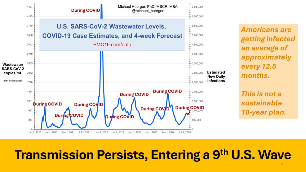
3/
5/
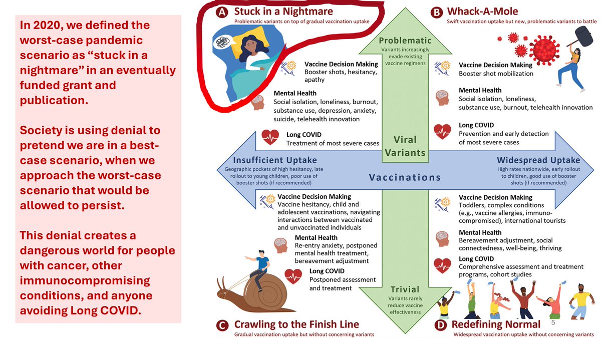
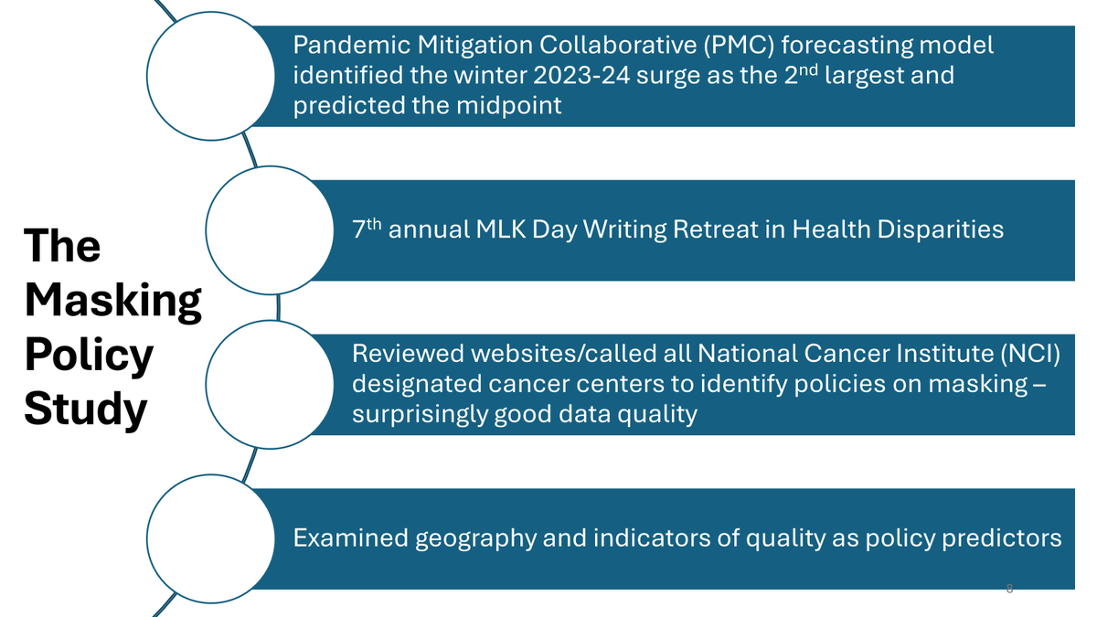
"Scenario planning: a framework for mitigating uncertainty in implementing strategic behavioral medicine initiatives during the COVID-19 pandemic"
ncbi.nlm.nih.gov/pmc/articles/P…
"Scenario planning: a framework for mitigating uncertainty in implementing strategic behavioral medicine initiatives during the COVID-19 pandemic"
ncbi.nlm.nih.gov/pmc/articles/P…
6/
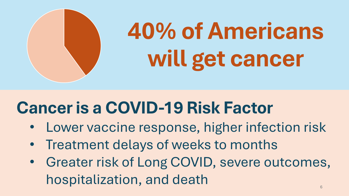
Cancer is a COVID-19 risk factor.
Cancer is a COVID-19 risk factor.
7/
8/
9/
10/
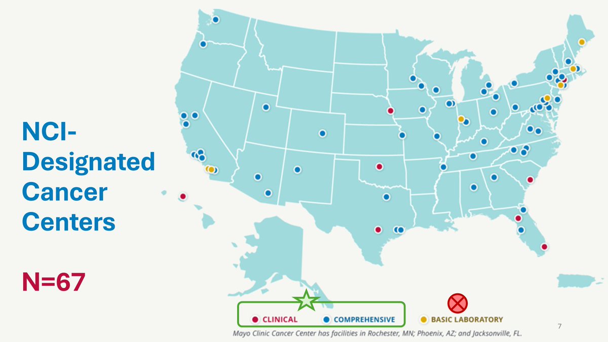
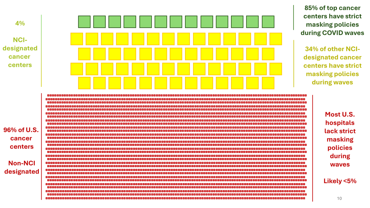
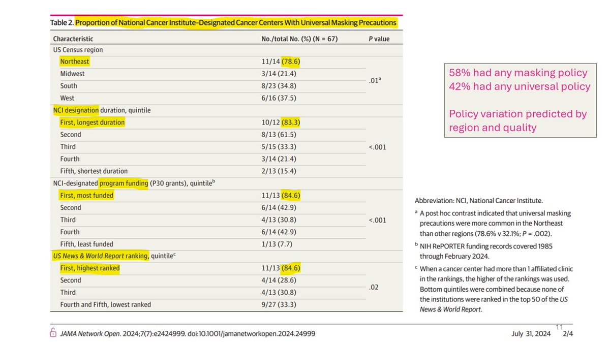
NCI-designated cancer centers comprise approximately 4% of U.S. cancer centers.
At the NCI-designated cancer centers, about 85% of those in the top quintile had universal masking policies in winter 2023-24, as did about 34% of other NCI-designated centers.
NCI-designated cancer centers comprise approximately 4% of U.S. cancer centers.
At the NCI-designated cancer centers, about 85% of those in the top quintile had universal masking policies in winter 2023-24, as did about 34% of other NCI-designated centers.
11/
42% of NCI-designated cancer centers had universal masking policies during the winter 2023-24 surge, but numbers were significantly higher in the northeast and at centers with higher quality indicators.
42% of NCI-designated cancer centers had universal masking policies during the winter 2023-24 surge, but numbers were significantly higher in the northeast and at centers with higher quality indicators.
12/
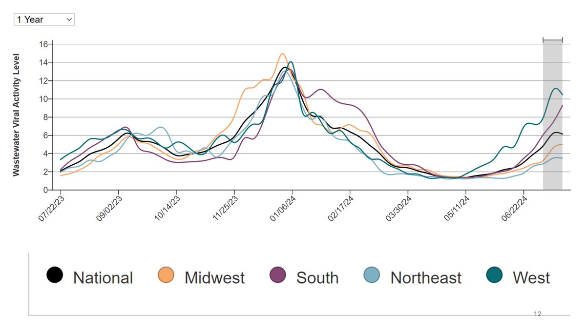
The Midwest and South lagged on masks in healthcare, despite higher overall transmission during the winter 2023-24 surge.
The Midwest and South lagged on masks in healthcare, despite higher overall transmission during the winter 2023-24 surge.
13/
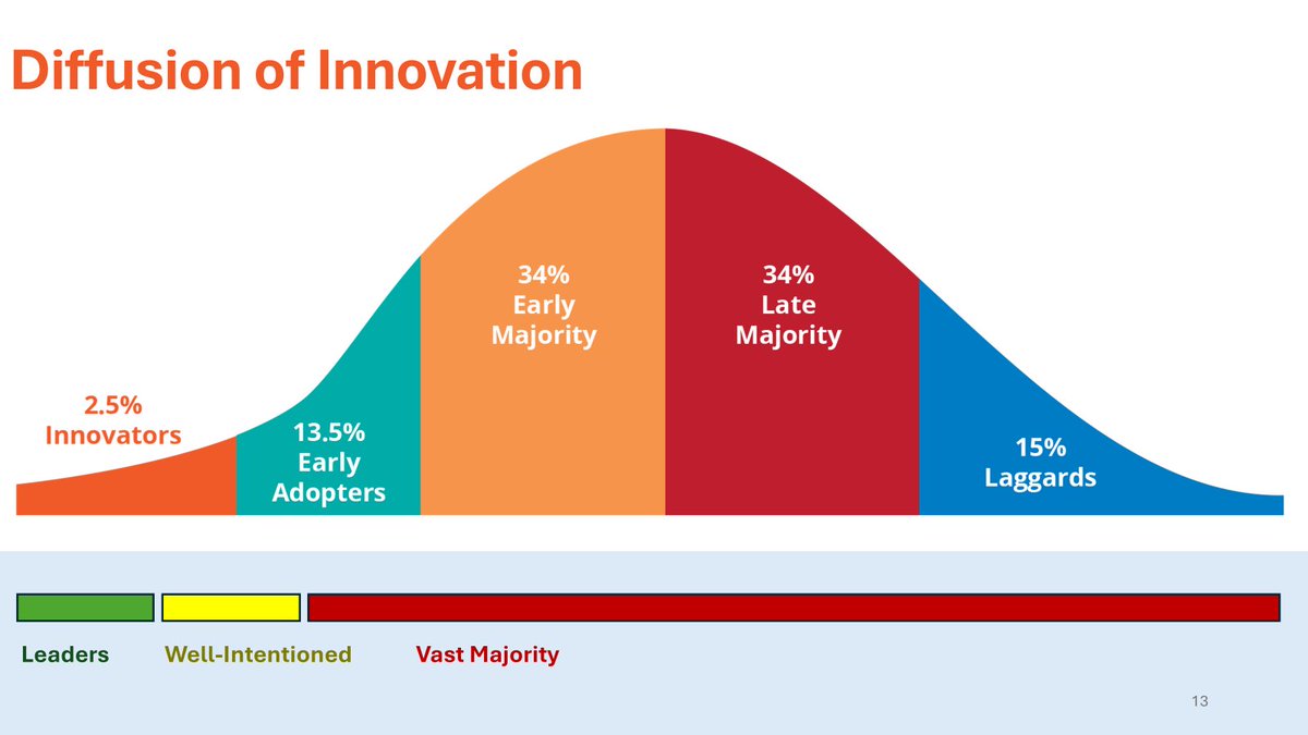
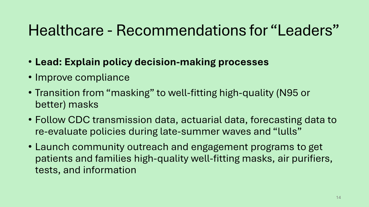
Apply the "Diffusion of Innovation" framework to organizational changes surrounding airborne illness transmission
Apply the "Diffusion of Innovation" framework to organizational changes surrounding airborne illness transmission
14/
15/
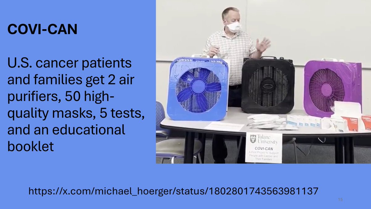
COVI-CAN
The Covid Defense Kit for patients undergoing cancer treatment and their families.
COVI-CAN
The Covid Defense Kit for patients undergoing cancer treatment and their families.
https://x.com/michael_hoerger/status/1802801743563981137
16/
17/
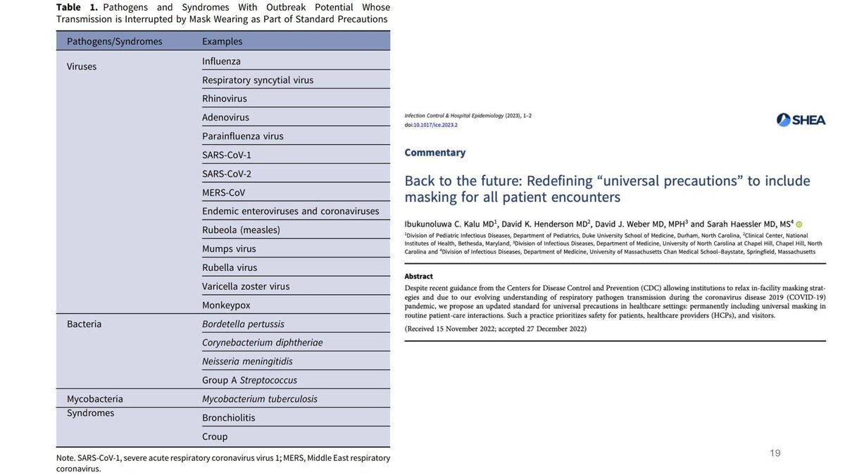
19/
"Back to the future: Redefining 'universal precautions' to include masking for all patient encounters"
"Back to the future: Redefining 'universal precautions' to include masking for all patient encounters"
20/
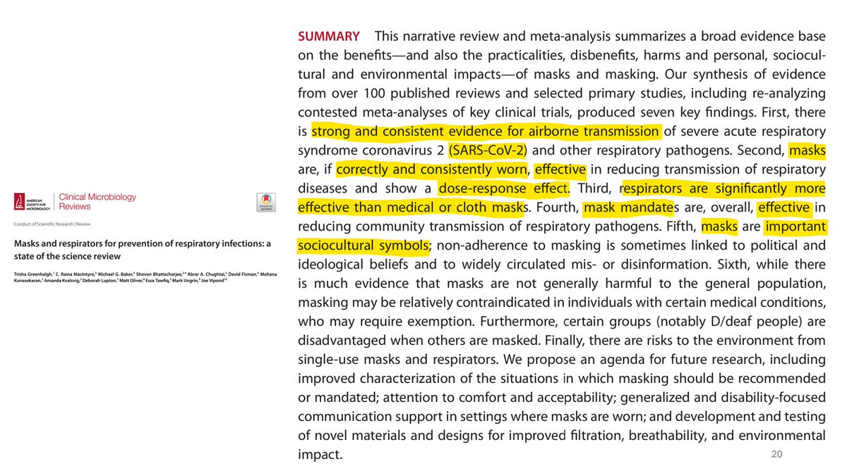
"Masks and respirators for prevention of respiratory infections: a state of the science review"
pubmed.ncbi.nlm.nih.gov/38775460/
"Masks and respirators for prevention of respiratory infections: a state of the science review"
pubmed.ncbi.nlm.nih.gov/38775460/
21/
22/

23/
24/
25/
• • •
Missing some Tweet in this thread? You can try to
force a refresh