Body blows keep coming for UBI fans. $1k/month transfers had no effect on net worth or credit access. All the money was ploughed straight into consumption, recipients actually went more into debt. nber.org/papers/w32784
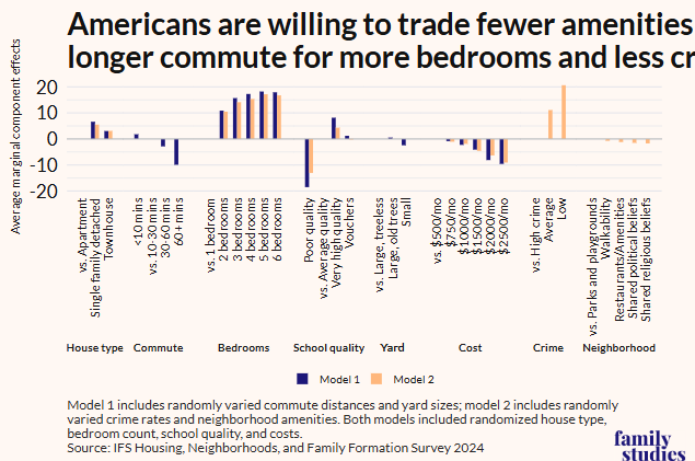
For reference: most spending categories rose by similar percents: UBI recipients did NOT necessarily prioritize immediate needs. In fact, they disproportionately gave their UBI away.
Now as an aside.
The average UBI recipient here got $35,000 in total transfers.
They spent $$11,000 of it on increased spending.
They reduce work by $12,000.
That accounts for $23,000.
So their net worth SHOULD have gone up by $12,000!'
Instead it fell $1,000.
????
Did they just.... light $13,000 on fire?
Is the income decline underestimated?
Is the spending increase underestimated?
Did they invest money in terrible assets?
• • •
Missing some Tweet in this thread? You can try to
force a refresh
the Good Samaritan is a story in which a Levite and a priest de-prioritize the needs of their physically close neighbor in order to do the abstract good of maintaining purity for physically non-proximate neighbors
let the reader understand
okay i will spell it out for the reader:
the Levite and priest downrate the nearby injured man, plausibly to remain ritually pure, they have duties elsewhere, people who need them more.
the Samaritan says, screw the abstract distant need, this person is right in front of me
we have a tendency to only observe the Samaritan/Jewish distinction and thus see how the story lauds crossing of cultural lines
but there's also the proximate/nonproximate distinction working, and the story privileges your physical neighbor
Last week, I said it was actually very simple: nobody's getting married.
Today, @jburnmurdoch has followed where that thread leads and shows that around the world, coupling is crashing, and where coupling falls, so do births.
We've been saying this for quite a while at @FamStudies .
Here's a post I wrote laying out this exact argument (and with some of the same types of graphs! @jburnmurdoch links to this post; it's where some of his graph ideas came from) in 2018! ifstudies.org/blog/no-ring-n…
The @nytimes has a striking piece on intimate partner homicide during pregnancy. It's a terrible tragedy.
They also don't seem to actually present any data on it. Look at these charts and see if you can spot what's missing.
First, obviously, none of the actual data shown indicates the person committing the homicide was a partner. Undoubtedly, much of it was! But it's not easy to guess how much of it.
Second, this graph has multiple errors.
First, the correct denominator for pregnancy-associated deaths is not per live birth, but per person-year spent pregnant.
Here's the data by age of man with standard errors, 1999-2023. You can see from the big standard errors in 1999 and 2003, and the incorrect age gradient in 2003, that the early samples were small and perhaps unreliable.
The NHANES documentation does change between the 2003/04 and the 2011/12 editions for the lab methods section on sex hormone assays, but I'm not science nerd enough to know if it was really a substantive change.
But what I can say is sample size changed massively:
Practically speaking, what happened here is simple.
The 1999-2004 samples were almost trivially small and perhaps not very well done. Methods changes to 2011-12, which resulted in a lower estimate.
Methods have been more consistent since 2011, and overall T levels have RISEN.