Mike Hoerger, PhD MSCR MBA Profile picture
Aug 10 4 tweets 1 min read Read on X
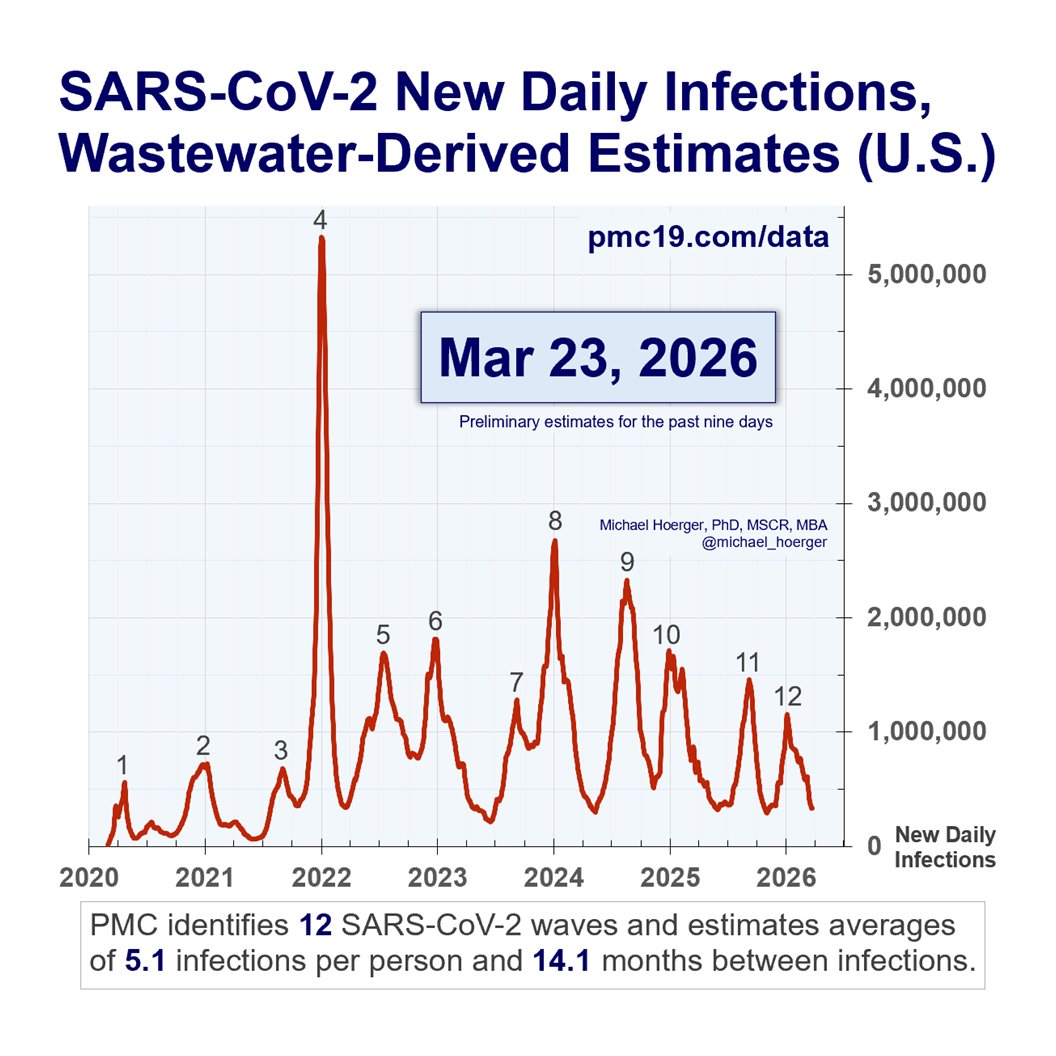
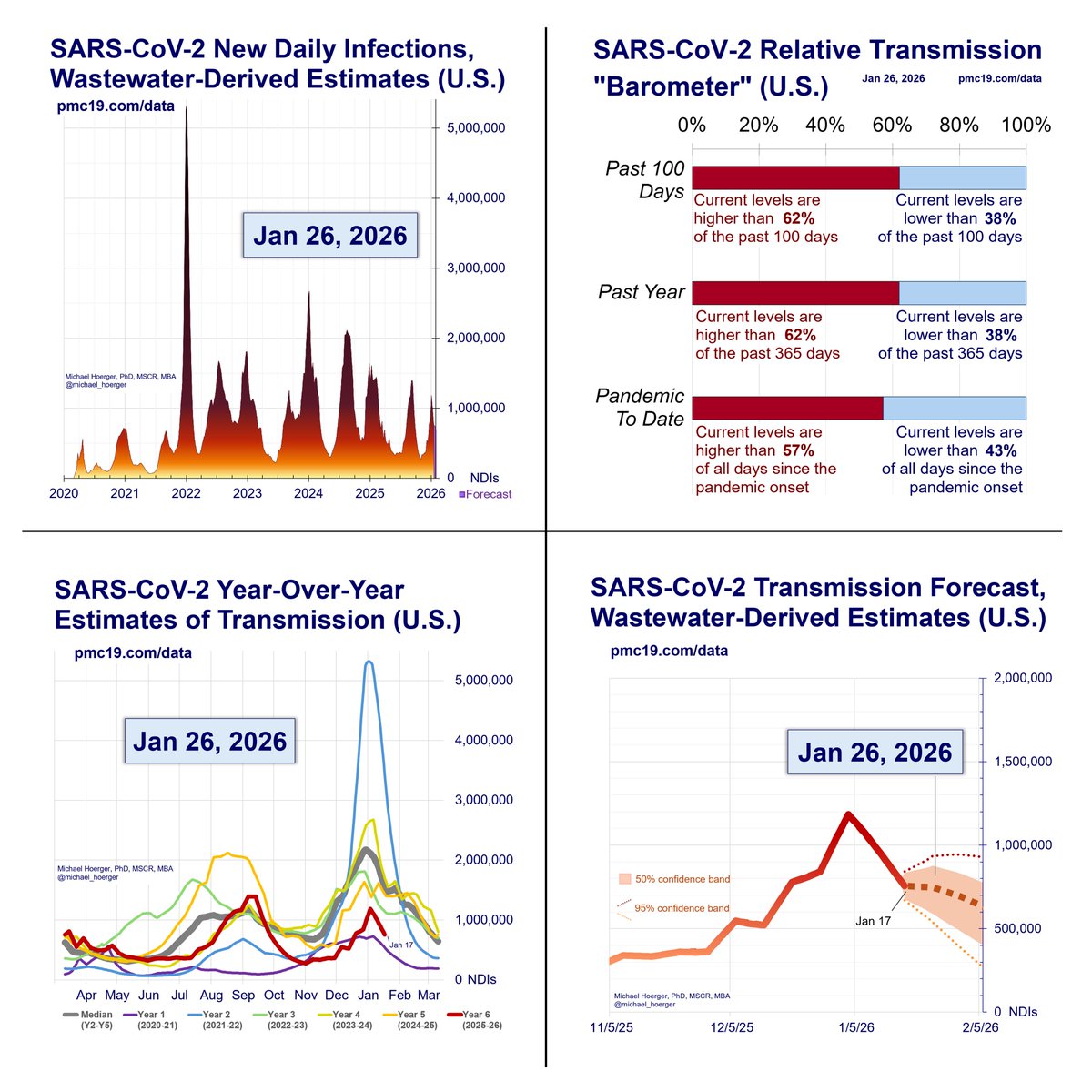
Just plugged today's CDC numbers into my new forecasting model (releases Mon). My initial reaction was "Jesus Christ. That's bad. That's really really bad."

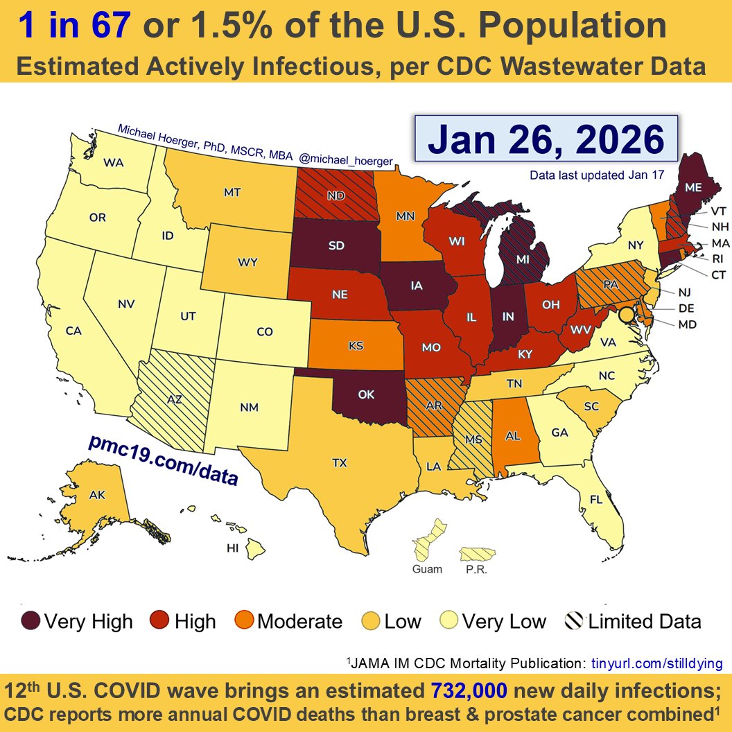
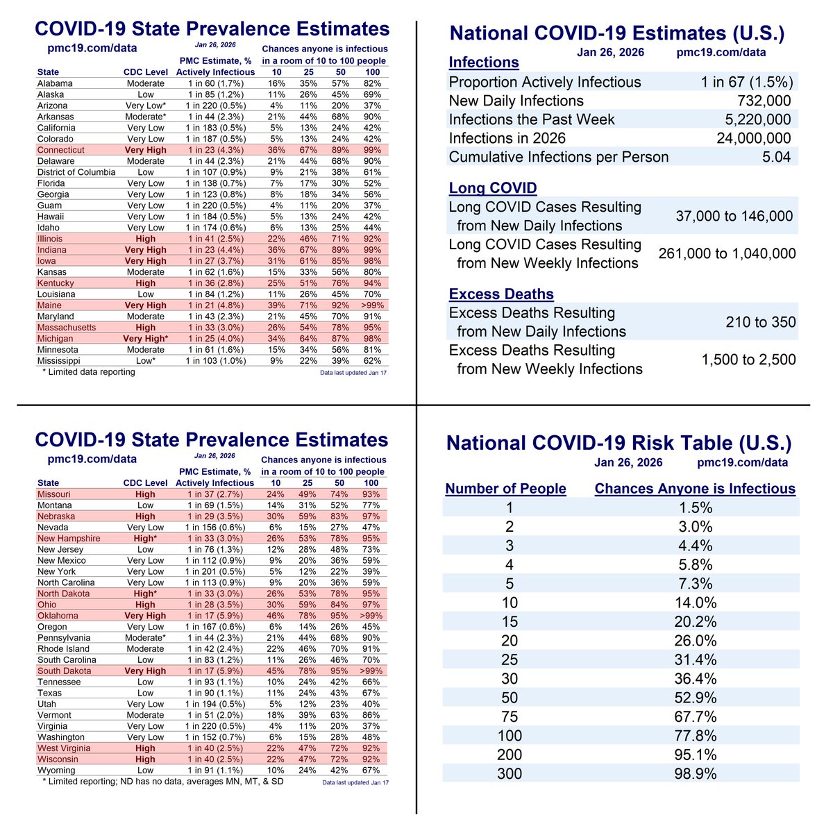
If you live in the West in particular, it's currently about as bad as last winter. About 1 in 23 infectious out West. CDC regional COVID-19 transmission graph. The West region is nearly identical to last winter's peak.
Those of us modeling have been talking about the late-summer wave -- all year -- as a given.

The 1-day isolation policy, the lack of a twice-annual updated vax, & the vilification of masks are emblematic of #LaissezFairePublicHealth. A wintery summer surge is the result.
I hope the present numbers are revised downward, but there is no reason to suspect that. In my view, the current estimates are as likely to be overestimates as underestimates.
Here's the updated CDC COVID "heat" map released today, recolored with dark red to equal more transmission. Highest transmission: West coast, Utah, Wyoming, Minnesota, Oklahoma, Texas, Louisiana, Arkansas, Florida, Carolinas

• • •

Missing some Tweet in this thread? You can try to force a refresh
 

Keep Current with Mike Hoerger, PhD MSCR MBA

Mike Hoerger, PhD MSCR MBA Profile picture

Stay in touch and get notified when new unrolls are available from this author!

Read all threads

This Thread may be Removed Anytime!

PDF

Twitter may remove this content at anytime! Save it as PDF for later use!

Try unrolling a thread yourself!

how to unroll video
  1. Follow @ThreadReaderApp to mention us!

  2. From a Twitter thread mention us with a keyword "unroll"
@threadreaderapp unroll

Practice here first or read more on our help page!

More from @michael_hoerger

Aug 12
BREAKING: Version 2.0 of the PMC COVID-19 Forecasting Model, August 12, 2024
🧵1/7

The U.S. now tops 1.3 million daily infections. 2.8% of the population (1 in 36) are actively infectious.


Deep Dive on Version 2.0 of the Model...

Welcome to version 2.0 of the PMC Model. The “C” in PMC is for Collaborative, and the work to improve this model is grounded in feedback from readers like you over the past year. Thank you for your support.

What’s New?

In short, the new model has substantial data quality improvements by combining multiple data sources for estimating transmission in unique ways that will hopefully increase forecasting accuracy, provide a truer representation of what has happened and is happening during the pandemic, and linkages to some statistics you will find helpful in day-to-day decision making.

Here is a deeper dive into the changes (skip to next section if desired). The new model is designed to provide a “true” picture of what has happened during the pandemic. It integrates three main data sources: the IHME true case estimation model, Biobot SARS-CoV-2 wastewater surveillance data, and the current CDC NWSS SARS-CoV-2 wastewater data. IHME provided a comprehensive case estimation model through April 1, 2023. Biobot was the CDC wastewater subcontractor through last fall and continues to do extensive non-CDC wastewater work. The CDC NWSS data are currently subcontracted with Verily, a subsidiary of Alphabet, which is the parent company of Google. Over the past year, we have seen Biobot scale back their public data and visualizations, and Verily has made steady improvements in their work with the CDC.

We previously relied solely on Biobot for forecasting and a Biobot-IHME data linkage for case estimation. It was a Biobot-heavy model. The current model is not tied strictly to any data set, but rather the PMC’s best estimate of the truth, a true-case model that uses multiple data sources in the spirit of IHME’s original work in this area. Essentially, we link all three data sources, which have been active over different points of the pandemic to derive a composite “PMC” indicator of true levels of transmission. The indicator is weighted based on which data sources were available and their perceived quality at each point in time. We scale this composite PMC indicator to the metric the CDC uses when helpful for comparisons with their website, and scale it with the true case estimates of the IHME otherwise, as true cases are more relevant than arbitrary wastewater metrics.

A great feature of the model is that it continues to integrate real-time data from Biobot and the CDC. From the perspective of Classical Test Theory, this is a huge advantage, as it provides a much more reliable indicator of what is currently happening with transmission. Both sources often make retroactive corrections for the most recent week’s data, sometimes sizable, and pitting the two indicators against one another reduces measurement error on average, which offers vital improvements in forecasting.

What are the Biggest Improvements in the Model?

· Accuracy in Real-Time Data – In integrating two active surveillance data sources, the real-time data will be more accurate. The biggest predictor of next week’s transmission levels, and the shape of how transmission is increasing or decreasing, accelerating or decelerating, is the current week’s real-time data. If the real-time data are off by 5% or 10%, the big-picture take on the forecast will still be reasonable, but a more precise estimate allows for greater accuracy in estimating the height and timing of waves.
· Regional Statistics – We are already integrating some regional data. Like you, we miss the vast and high-quality regional data and visualizations Biobot provided. We are hoping to take back some of those advantages through the new model and will improve them over time.
· Credibility – Although Biobot and CDC have unique strengths and limitations, a clear strength of adding the current CDC data set is that many people prefer to defer to the credibility of the CDC. The PMC model can be characterized fairly as a “CDC-derived case estimation and forecasting model,” which should lend more credence with those who are not deep enough in the weeds to evaluate the data as critically and prefer appeals to authority. We also provide some statistics that will allow you to draw more useful inferences from the CDC website.

What’s the Same in the Current Model?

The analytic assumptions underlying the forecasting model remain the same. It uses regression-based techniques common across all industries, using a combination of historic data (median levels of transmission for each day of the year) and emerging data from the past four weeks to characterize how transmission is growing or shrinking. Holidays and routine patterns of behavior that map on well to a calendar are “baked in” to the historic data. “New variants” and atypical patterns of behavior are baked into the data on recent patterns of transmission. It’s a top-down big picture model.

What are the Biggest Drawbacks of the New Model?

· Disruptions in Longitudinal Comparisons – You will notice some inconsistencies between the current and prior model that use additional data to form more accurate estimates, which is sometimes frustrating. A few examples. In the early pandemic, we estimated cases linking Biobot to IHME case estimates. Biobot transmission estimates were a bit “hotter” than others during that time period, the IHME estimates “cooler.” Our composite model depicts each of the first 4 waves somewhat smaller, which we believe provides a better picture of the “truth” as we can estimate it, but it is annoying psychologically to re-envision what has happened. This also throws off some of the big-picture statistics; for example, as of August 12, 2024, we estimate that Americans have had about 3.3 infections on average. A few months ago, we estimated nearly 3.5, so this is consistent with “cooler” picture of early-pandemic transmission. Presently, the CDC transmission estimates are running much hotter than those of Biobot, leading to estimates of a larger and earlier peak in the present wave. We would have preferred the CDC re-up with Biobot at the potential contract renewal to promote continuity in the data, but these sorts of changes in model estimation are the expected consequences of such a transition.

· Constantly-updating Historical Data – The CDC updates all of their historical estimates of transmission frequently, any time a new site comes on board, and twice annually to standardize the data longitudinally. This can sometimes create weird issues, where transmission is going up, but real-time values are lower than what was reported in real time the prior week because recent data were corrected downward. It will also throw off some of the helpful statistics we provide. These are minor nuisances, but be aware of them in case you spot something that seems strange.
· Documentation of Accuracy – We have excellent data on the accuracy of the prior model and will submit a report for publication shortly. All prior reports are publicly available. Many report quick facts on longitudinal accuracy, international comparisons, use in news articles, and references to use in peer-reviewed scientific journal articles. We cannot document the real-time accuracy of the new model yet, but know that when using historical data, the model accounts for 98% of the variability in wastewater transmission 1-week into the future, which is 2% higher than our prior model. The vast majority of forecasting errors have been and will continue to be based on inaccuracies in the real-time data wastewater surveillance companies report, and the model changes reduce those issues. We hope you will trust our history and that the methodologic changes represent improvements.

What Improvements Should We Expect in the Future?

There are many improvements we hope to roll out in the future. These include changes based on your feedback, the addition of confidence intervals in some of the graphs, and regional forecasting models. We may incorporate additional data sets if they can improve real-time estimates of current transmission.pmc19.com/data/Figure showing transmission throughout the entire pandemic, shows we are entering a 9th wave and provides CDC levels as well as the PMC estimate of daily infections, now at 3.3 million.
🧵2/7

Our graph of year-over-year transmission shows we have likely never had such high COVID transmission in mid-August.

Many classrooms will have a >50% chance someone is infectious. Expect K-12 schools and universities to be hotbeds for COVID outbreaks unless they are using serious multilayered mitigation.

🔹Indoor air quality that meets ASHRAE Standard 241 (if they have never heard of this or cannot explain how they are meeting the standard, they likely are not meeting the standard).
🔹Surveillance testing.
🔹Free on-demand testing.
🔹Universal masking.

This is uncharted territory in terms of such low mitigation coupled with high transmission with school starting. The possibility of a slightly larger wave than what we forecast remains.Figure showing year-over-year Covid transmission. We are presently just below the largest peak for a summer all-time, and we have never seen transmission this high in mid-August.
🧵3/7

Let's zoom in on the current wave. We're at our highest level of transmission since the winter surge, with 1.3 million daily infections.

Note, our model now combines Biobot and CDC data. Biobot still has the peak coming in early Sept, and so did the CDC until a huge spike this week.

By including two data sources, it helps counterbalance against errors in their real-time reporting, but we could still see some volatility in the size and date of the peak at this point.

Of course, different locations peak at different times.

You'll note that Aug 12 appears in the "forecasted" zone. That's because even wastewater data experience lags in reporting.Figure shows the most recent year of transmission. We're presently at 1.3 million daily infections, and likely closing in on the peak of this summer's wave.   Graph says "past 12 months," but it really shows the past 11 and includes a 1-month forecast. I'll fix that for next week.
Read 8 tweets
Aug 1
Slide Deck - Discussion of "Masking Policies at National Cancer Institute–Designated Cancer Centers During Winter 2023 to 2024 COVID-19 Surge"

x.com/i/spaces/1OdKr…
2/ “It takes 15 years to translate beneficial interventions into widespread practice. We need to improve understanding of the airborne transmission of COVID to accelerate that timeline. Patients cannot wait.”-Michael Hoerger, PhD, MSCR, MBAMedical Scientist
Read 26 tweets
Jul 25
PMC COVID-19 Forecast, Jul 25, 2024 (U.S.)

The U.S. is hovering around 900,000 daily infections.

Nearly 2% of the U.S. population is actively infectious with COVID. Ultimately, such infections are expected to result in >40,000 new daily #LongCovid cases.

#YallMasking?
1/CURRENT ESTIMATES FOR July 26, 2024 Wastewater Levels (copies/mL) 634 New Daily Cases 922,000 % of Population Infectious 1.93% (1 in 52 people) New Daily Long COVID Cases  4-WEEK FORECAST FOR August 23, 2024 Wastewater Levels (copies/mL) 668 (5% higher) New Daily Cases 934,000 % of Population Infectious 1.95% (1 in 51 people) New Daily Long COVID Cases 47,000 to 187,000
In the rising 9th U.S. Covid wave, we have higher transmission than 69% of the pandemic, lower than during 31% of the pandemic.

In a deck of cards, imagine the J, Q, K, & Ace as days with higher transmission, all other cards the days with lower transmission.
2/ There is more COVID-19 transmission today        than during 69% of the pandemic.  CURRENT ESTIMATES FOR July 26, 2024 Wastewater Levels (copies/mL) 634 New Daily Cases 922,000 % of Population Infectious 1.93% (1 in 52 people) New Daily Long COVID Cases 46,000 to 184,000  WEEKLY ESTIMATES FOR July 26, 2024 New Weekly Cases 6,500,000 New Weekly Long COVID Cases 323,000 to 1,291,000  2024 CUMULATIVE ESTIMATES AS OF July 26, 2024 Total 2024 Cases To Date 149,473,220 Total 2024 Long COVID Cases To Date 7,474,000 to 29,895,000
How many people will you interact with this week? Here are the chances at least one of those people is infectious with Covid.

20 people? --> 1 in 3 chance
100-300 on an airplane? --> 85-99% chance

Wear a well-fitting high-quality mask (respirator) to avoid breathing virus.
3/ How Does Risk Increase with More Social Contacts?	 Number of People  |  Chances Anyone is Infectious	 1	1.9% 2	3.8% 3	5.7% 4	7.5% 5	9.3% 6	11.0% 7	12.7% 8	14.4% 9	16.1% 10	17.7% 15	25.3% 20	32.3% 25	38.6% 30	44.3% 35	49.4% 40	54.1% 50	62.2% 75	76.8% 100	85.7% 150	94.6% 200	98.0% 300	99.7% 400	>99.9% 500	>99.9%
Read 4 tweets
Jul 20
Long COVID Risk Tables

You probably saw this week's NEJM article on #LongCOVID. We did a special section on it in this week's PMC COVID-19 Forecasting Report (pgs 6-8).


THREAD of tables. 🧵🔢

1/

Details:
Our model continues to provide estimates of Long COVID cases that will ultimately result from each day’s infections.

We provide a credible interval that 5-20% of infections will result in Long COVID.

This week, Al-Aly and colleagues reported in the New England Journal that in the more recent era of the pandemic, vaccinated individuals have a 3.5% chance of developing Long COVID from a particular infection.

They focused on medically documented new serious health conditions. We continue to view 5% as a useful lower bound for two reasons.

Long COVID chances were higher in unvaccinated individuals in their study, and there were no analyses based on time since last vaccination.

With many Americans still unvaccinated and many not vaccinated in the past year, the true estimate for a 2024 infection could well surpass 5% for a medically documented new serious health condition.

Moreover, Long COVID is a heterogeneous condition, and many cases are likely not medically documented, especially at the less debilitating end of the spectrum.

The following tables show the risk of ever developing Long COVID from an infection assuming 3.5%, 5.0%, and 20.0% rates.

These statistics document the seriousness of Long COVID with Americans getting infected nearly once a year (average of 12.5 months by our estimates).

However, it is also important to know that some effects are enduring, and others more likely to improve, so many with Long COVID will improve.

Many will also have repeated bouts of Long COVID, likely with different phenotypes.pmc19.com/data/
If you assume 3.5% of people get Long COVID per infection, the risk grows sizably with reinfections, which are happening nearly once per year. Avg of 9 infections/American the next decade.

In the previous Tweet, we note how 3.5% is an obvious underestimate.

2/ What are the chances of developing new Long COVID?	 Number of Infections  |  Chances of Long Covid	 1	3.5% 2	6.9% 3	10.1% 4	13.3% 5	16.3% 6	19.2% 7	22.1% 8	24.8% 9	27.4% 10	30.0% 15	41.4% 20	51.0% 25	59.0% 30	65.7% 35	71.3% 40	76.0% 50	83.2% 75	93.1% 100	97.2% 150	99.5% 200	>99.9% 300	>99.9% 400	>99.9% 500	>99.9%
Based on that 3.5% estimate, a more realistic low-ball estimate of serious long COVID is 5-7%, given that not all serious new health conditions are documented in medical records & rates are higher among those unvaxxed or not recently vaxxed.

Bad decade (9 inf's) ahead.

3/ What are the chances of developing new Long COVID?	 Number of Infections  |  Chances of Long Covid	 1	5.0% 2	9.8% 3	14.3% 4	18.5% 5	22.6% 6	26.5% 7	30.2% 8	33.7% 9	37.0% 10	40.1% 15	53.7% 20	64.2% 25	72.3% 30	78.5% 35	83.4% 40	87.1% 50	92.3% 75	97.9% 100	99.4% 150	>99.9% 200	>99.9% 300	>99.9% 400	>99.9% 500	>99.9%
Read 6 tweets
Jun 28
PMC COVID-19 Forecast, June 28, 2024 (U.S.)

You've got about 1 good month left for higher risk medical and dental visits.

Expect 500,000 to 600,000 infections/day the next month -- in a summer "lull."

1/CURRENT ESTIMATES FOR June 28, 2024 Wastewater Levels (copies/mL) 367 New Daily Cases 534,000 % of Population Infectious 1.12% (1 in 90 people) New Daily Long COVID Cases  4-WEEK FORECAST FOR July 26, 2024 Wastewater Levels (copies/mL) 415 (13% higher) New Daily Cases 586,000 % of Population Infectious 1.23% (1 in 82 people) New Daily Long COVID Cases 29,000 to 117,000
PMC COVID-19 Forecast, June 28, 2024 (U.S.)

1.1% of the U.S. is actively infectious (1 in 90). We're looking at 3.7 million infections/week and 187,000+ resulting Long COVID cases/week.

That's 129 million infections in 2024 so far.

2/There is more COVID-19 transmission today	        than during 44% of the pandemic.	 	 CURRENT ESTIMATES FOR	 June 28, 2024	 Wastewater Levels (copies/mL)	 367	 New Daily Cases	 534,000	 % of Population Infectious	 1.12% (1 in 90 people)	 New Daily Long COVID Cases	 27,000 to 107,000	 	 WEEKLY ESTIMATES FOR	 June 28, 2024	 New Weekly Cases	 3,700,000	 New Weekly Long COVID Cases	 187,000 to 748,000	 	 2024 CUMULATIVE ESTIMATES AS OF	 June 28, 2024	 Total 2024 Cases To Date	 129,801,250	 Total 2024 Long COVID Cases To Date	 6,490,000 to 25,960,000	 	 4-WEEK FORECAST FOR	 July 26, 2024	 Wastew...
PMC COVID-19 Forecast, June 28, 2024 (U.S.)

How does transmission compare to late June in past years?

2023: 1.9x higher today
2022: 2.3x higher in 2022 (BA.2 surge) than today
2021: 5.6x higher today
2020: 2.8x higher today

We're in a hot "lull" with #backtoschool soon.

3/Zoomed in version of "whole pandemic" graph from the prior Tweet. The rates show how transmission varies presently versus this time in prior years.
Read 6 tweets
Apr 29
PMC COVID-19 Forecast, April 29, 2024 (U.S.)

Transmission continues to decline. About 1 in 161 people in the U.S. are infectious, the lowest levels since July 1. Transmission levels are higher than during 27% of the pandemic, but a good time to catch up on delayed care.
1/4 There is more COVID-19 transmission today	        than during 27.7% of the pandemic.	 	 CURRENT ESTIMATES FOR	 April 29, 2024	 Wastewater Levels (copies/mL)	 203	 New Daily Cases	 296,000	 % of Population Infectious	 0.62% (1 in 161 people)	 New Daily Long COVID Cases	 15,000 to 59,000	 	 WEEKLY ESTIMATES FOR	 April 29, 2024	 New Weekly Cases	 2,100,000	 New Weekly Long COVID Cases	 104,000 to 414,000	 	 2024 CUMULATIVE ESTIMATES AS OF	 April 29, 2024	 Total 2024 Cases To Date	 105,544,710	 Total 2024 Long COVID Cases To Date	 5,277,000 to 21,109,000	 	 4-WEEK FORECAST FOR	 May 27, 2024	 Wa...
I have some concerns about Biobot's real-time data quality at the moment. Their real-time data have over-reported levels the past 8 weeks (11% last week, previously 6%, 10%, 7%, 5%, 9%, 4%, 5%) relative to later corrections. Huge bias!
2/4
Qualitatively, the over-reporting in real-time data lead me to believe there's a 50-50 chance we see a May "wavelet" versus continued decline for a couple months. Some of the county-level Biobot data seem implausible (e.g., levels of "3" in Mason County, WA, but others too).
3/4 Mason County, WA Levels of 3 copies/mL, per Biobot. About 1 in 10,000 actively infectious, if accurate.
Read 4 tweets

Did Thread Reader help you today?

Support us! We are indie developers!


This site is made by just two indie developers on a laptop doing marketing, support and development! Read more about the story.

Become a Premium Member ($3/month or $30/year) and get exclusive features!

Become Premium

Don't want to be a Premium member but still want to support us?

Make a small donation by buying us coffee ($5) or help with server cost ($10)

Donate via Paypal

Or Donate anonymously using crypto!

Ethereum

0xfe58350B80634f60Fa6Dc149a72b4DFbc17D341E copy

Bitcoin

3ATGMxNzCUFzxpMCHL5sWSt4DVtS8UqXpi copy

Thank you for your support!

Follow Us!

:(