How bad are Richard Lynn's 2002 national IQ estimates?
They correlate at r = 0.93 with our current best estimates.
It turns out that they're really not bad, and they don't provide evidence of systematic bias on his part🧵
They correlate at r = 0.93 with our current best estimates.
It turns out that they're really not bad, and they don't provide evidence of systematic bias on his part🧵
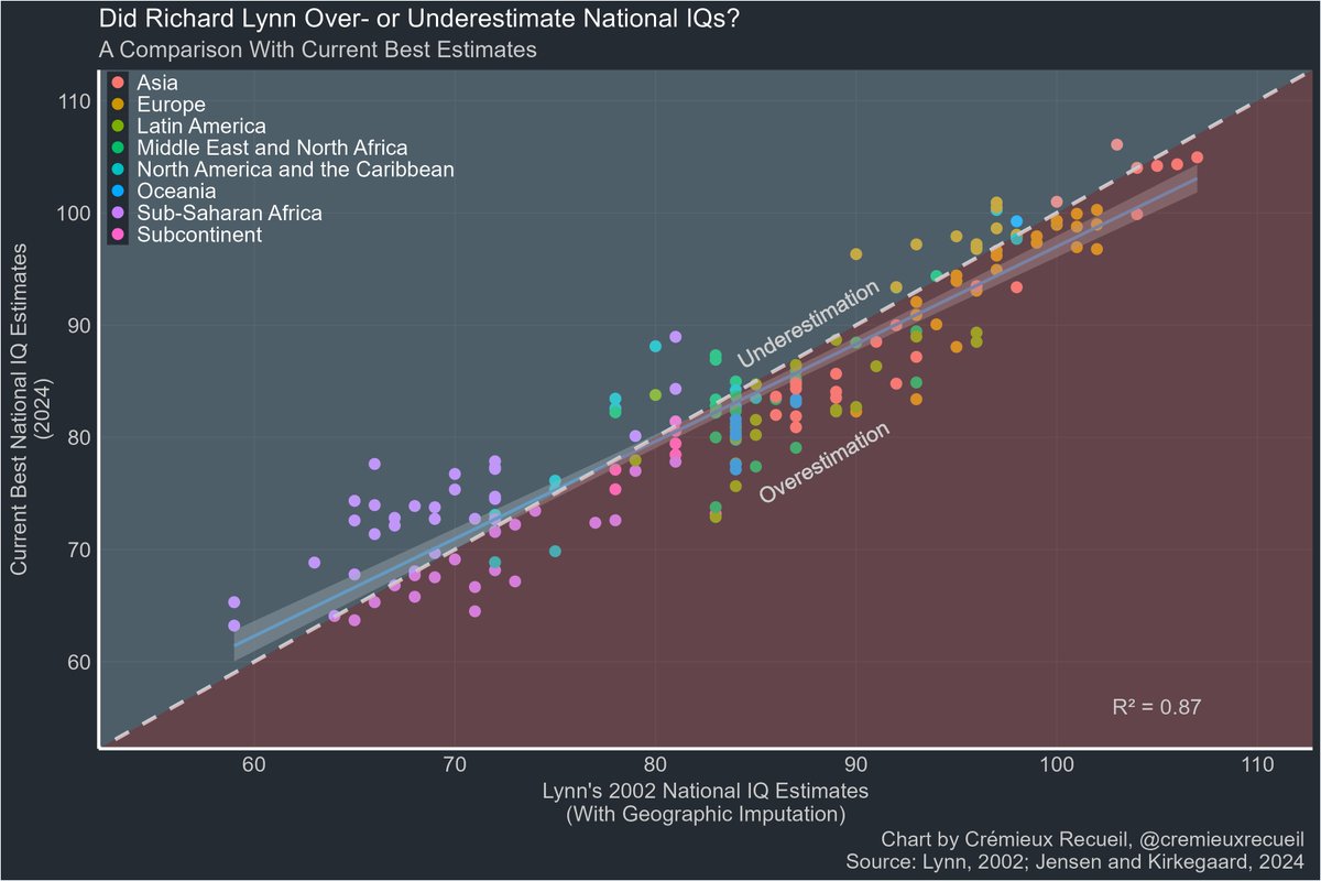
In this data, Lynn overestimated national IQs relative to the current best estimates by an average of 0.97 points.
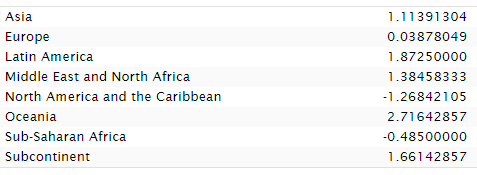
The biggest overestimation took place in Latin America, where IQs were overestimated by an average of 4.2 points. Sub-Saharan Africa was underestimated by 1.89 pts.
The biggest overestimation took place in Latin America, where IQs were overestimated by an average of 4.2 points. Sub-Saharan Africa was underestimated by 1.89 pts.
Bias?
If you look at the plot again, you'll see that I used Lynn's infamously geographically imputed estimates.
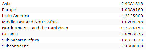
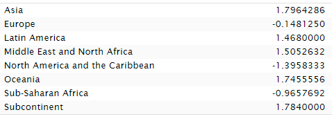
That's true! I wanted completeness. What do the non-imputed estimates look like? Similar, but Africa does worse. Lynn's imputation helped Sub-Saharan Africa!
If you look at the plot again, you'll see that I used Lynn's infamously geographically imputed estimates.
That's true! I wanted completeness. What do the non-imputed estimates look like? Similar, but Africa does worse. Lynn's imputation helped Sub-Saharan Africa!
If Lynn was biased, then his bias had minimal effect, and his much-disdained imputation resulted in underperforming Sub-Saharan Africa doing a bit better. Asia also got a boost from imputation.
The evidence that Lynn was systematically biased in favor of Europeans? Not here.
The evidence that Lynn was systematically biased in favor of Europeans? Not here.
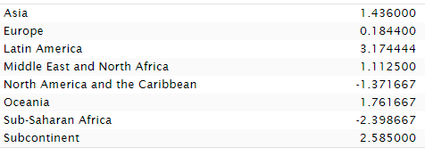
Fast forward to 2012 and Lynn had new estimates that are vastly more consistent with modern ones. In fact, they correlate at 0.96 with 2024's best estimates.
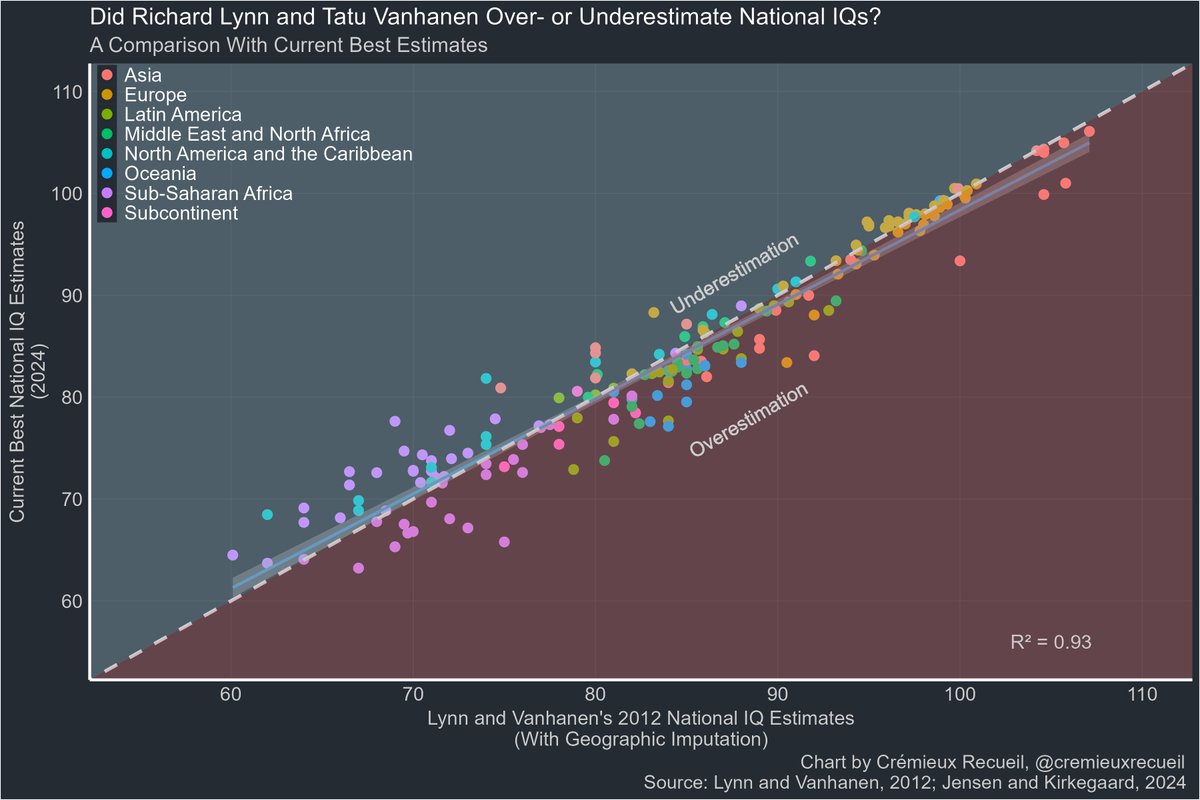
With geographic imputation, the 2012 data minimally underestimates Sub-Saharan Africa and once again, whatever bias there is, is larger with respect to Latin America, overestimating it.
But across all regions, there's just very little average misestimation.
But across all regions, there's just very little average misestimation.
Undo the imputation and, once again... we see that Lynn's preferred methods improved the standing of Sub-Saharan Africans.
There's really just nothing here. Aggregately, Lynn overestimated national IQs by 0.41 points without imputation and 0.51 with. Not much to worry about.
There's really just nothing here. Aggregately, Lynn overestimated national IQs by 0.41 points without imputation and 0.51 with. Not much to worry about.
The plain fact is that whatever bias Lynn might have had didn't impact his results much. Rank orders and exact estimates are highly stable across sources and time.
Want to learn more? See:
Want to learn more? See:
https://x.com/cremieuxrecueil/status/1804288348200055267
See this too, and note that it depicts rank correlations:
https://x.com/cremieuxrecueil/status/1793408297648959738
See this as well, on how very diverse data produces the same results:
https://x.com/cremieuxrecueil/status/1659274232189132835
And finally, see for the source of our current best estimates.sebjenseb.net/p/most-accurat…
It also might need to be noted: these numbers can theoretically change over time, even if they don't tend to, so this potential evidence for meager bias on Lynn's part in sample selection and against in methods might be due to changes over time in population IQs or data quality.
It might be worth looking into that more, but the possibility of bias is incredibly meager and limited either way, so putting in that effort couldn't reveal much of anything regardless of the direction of any possible revealed bias in the estimates (not to imply bias in estimates means personal biases were responsible, to be clear).
It might be worth looking into that more, but the possibility of bias is incredibly meager and limited either way, so putting in that effort couldn't reveal much of anything regardless of the direction of any possible revealed bias in the estimates (not to imply bias in estimates means personal biases were responsible, to be clear).
Some people messaged me to say they had issues with interpreting the charts because of problems distinguishing shaded-over colors.
If that sounds like you, don't worry, because here are versions with different layering:
If that sounds like you, don't worry, because here are versions with different layering:


• • •
Missing some Tweet in this thread? You can try to
force a refresh