PMC COVID-19 Forecasting Model, Sept 9, 2024
🧵1/7
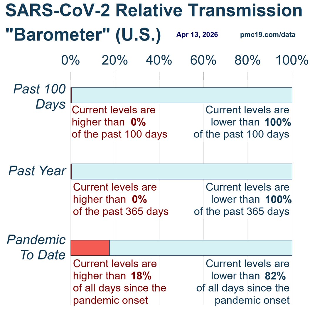
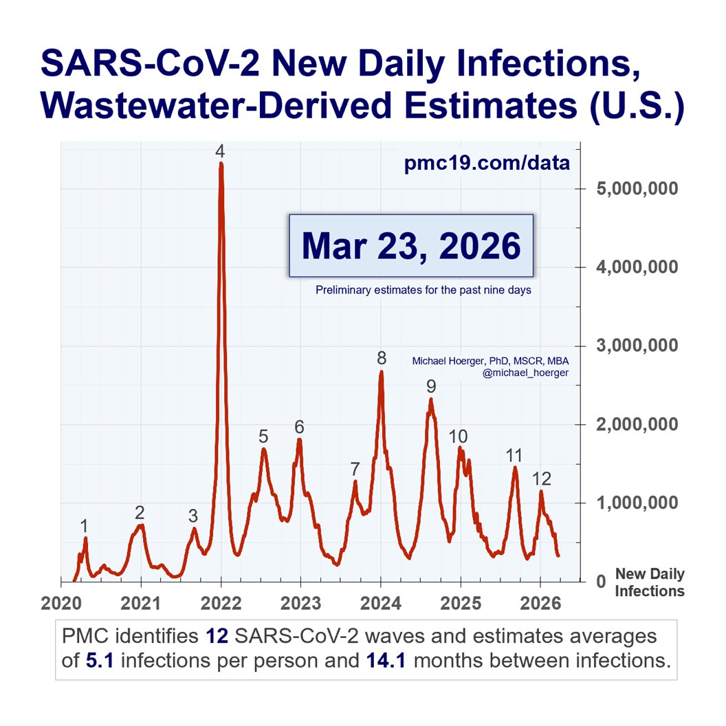
Nationally, we appear to have passed the peak of our late-summer wave, and it's not pretty.
At peak:
🔹>1.3 million daily infections
🔹2.8% (1 in 36) actively infectious
🔹Transmission higher than 90.5% of the pandemic
We are showing a peak around Aug 10, but as you look closely at the graph and in later Tweets, you'll see it was bimodal, with near-identical transmission on Aug 10 and Aug 24.
The CDC consistently corrects historical data, so in hindsight, we might expect the official peak date to flip to the 24th, or for the stats on the 10th to jump higher.
We had expected that Friday's data release might show this was the largest summer peak all-time (by the slimmest of margins), but the prior week's data were retroactively corrected downward by about 5%.
This is a common occurrence, which is why it's important to focus on the big-picture forecast (very bad transmission the remainder of 2024) as opposed to minute details.
Let's walk through the details in this Thread....
🧵1/7
Nationally, we appear to have passed the peak of our late-summer wave, and it's not pretty.
At peak:
🔹>1.3 million daily infections
🔹2.8% (1 in 36) actively infectious
🔹Transmission higher than 90.5% of the pandemic
We are showing a peak around Aug 10, but as you look closely at the graph and in later Tweets, you'll see it was bimodal, with near-identical transmission on Aug 10 and Aug 24.
The CDC consistently corrects historical data, so in hindsight, we might expect the official peak date to flip to the 24th, or for the stats on the 10th to jump higher.
We had expected that Friday's data release might show this was the largest summer peak all-time (by the slimmest of margins), but the prior week's data were retroactively corrected downward by about 5%.
This is a common occurrence, which is why it's important to focus on the big-picture forecast (very bad transmission the remainder of 2024) as opposed to minute details.
Let's walk through the details in this Thread....

PMC COVID-19 Forecasting Model, Sept 9, 2024
🧵2/7
The current year-over-year graph on Covid transmission is troubling. We just had the worst August of Covid transmission in the U.S.
We are likely to have our worst September, worst October, and potentially worst November of transmission.
We expect to bottom out around 850,000 daily infections in early November, before the winter surge picks up.
These new monthly records for Covid transmission are the consequence of #LaissezFairePublicHealth, especially the 1-day isolation policy, but more generally that public health officials are not describing transmission frankly and the need for multi-layered mitigation.

PMC COVID-19 Forecasting Model, Sept 9, 2024
🧵3/7
Zooming in, see the forest for the trees: About 74 days in a row with 1 million daily infections.
The peak date is somewhat arbitrary, and either Aug 10 or 24 may be estimated the peak in hindsight.
🧵3/7
Zooming in, see the forest for the trees: About 74 days in a row with 1 million daily infections.
The peak date is somewhat arbitrary, and either Aug 10 or 24 may be estimated the peak in hindsight.

PMC COVID-19 Forecasting Model, Sept 9, 2024
🧵4/7
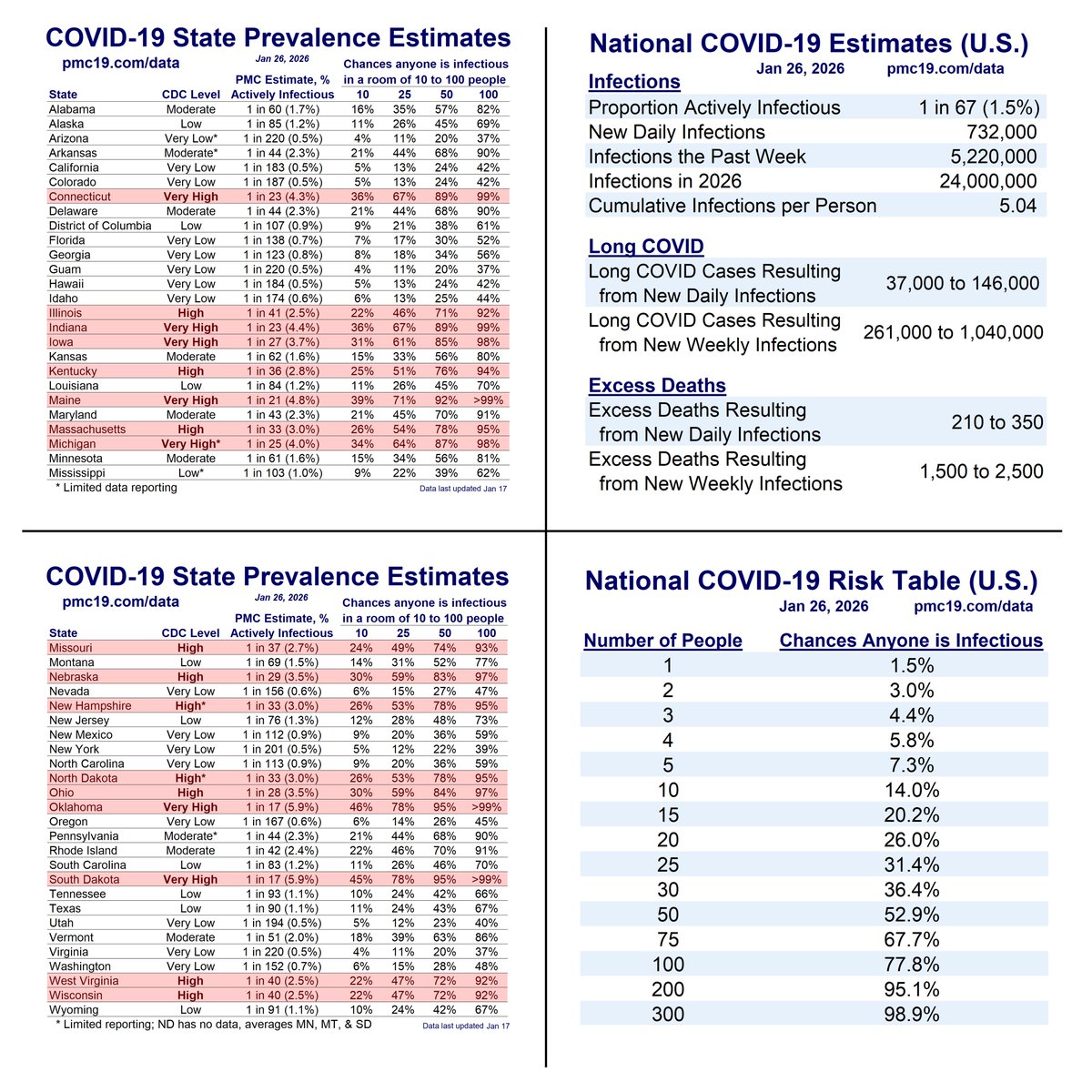
Statistics to reinforce the significance of the ongoing pandemic:
🔹1.1 million daily infections on average the next month
🔹2.2% (1 in 45) actively infectious any given day of the next month
🔹High-risk in classroom-sized settings
🔹>1.5 million resulting Long COVID cases from infections derived during the next month
🧵4/7
Statistics to reinforce the significance of the ongoing pandemic:
🔹1.1 million daily infections on average the next month
🔹2.2% (1 in 45) actively infectious any given day of the next month
🔹High-risk in classroom-sized settings
🔹>1.5 million resulting Long COVID cases from infections derived during the next month

PMC COVID-19 Forecasting Model, Sept 9, 2024
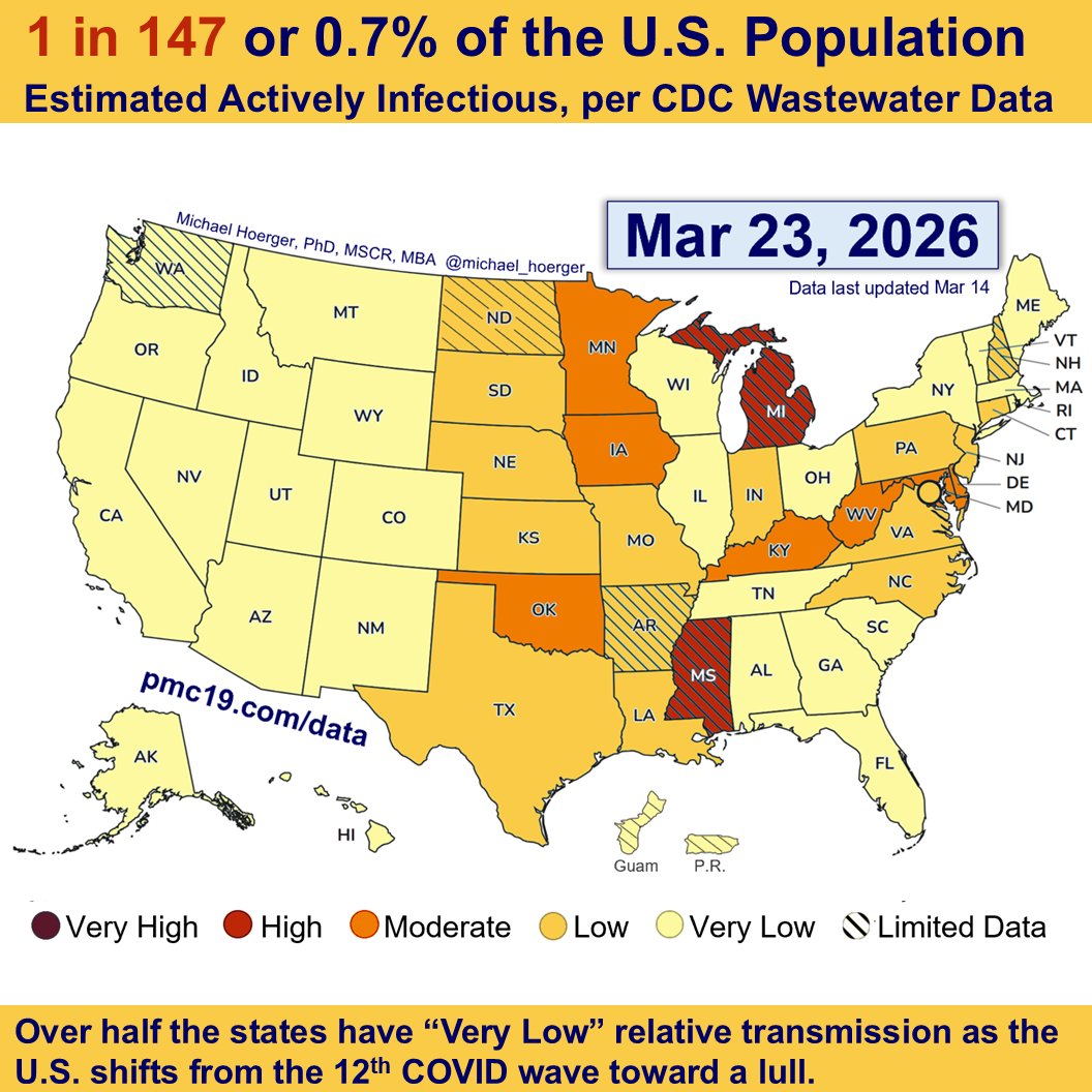
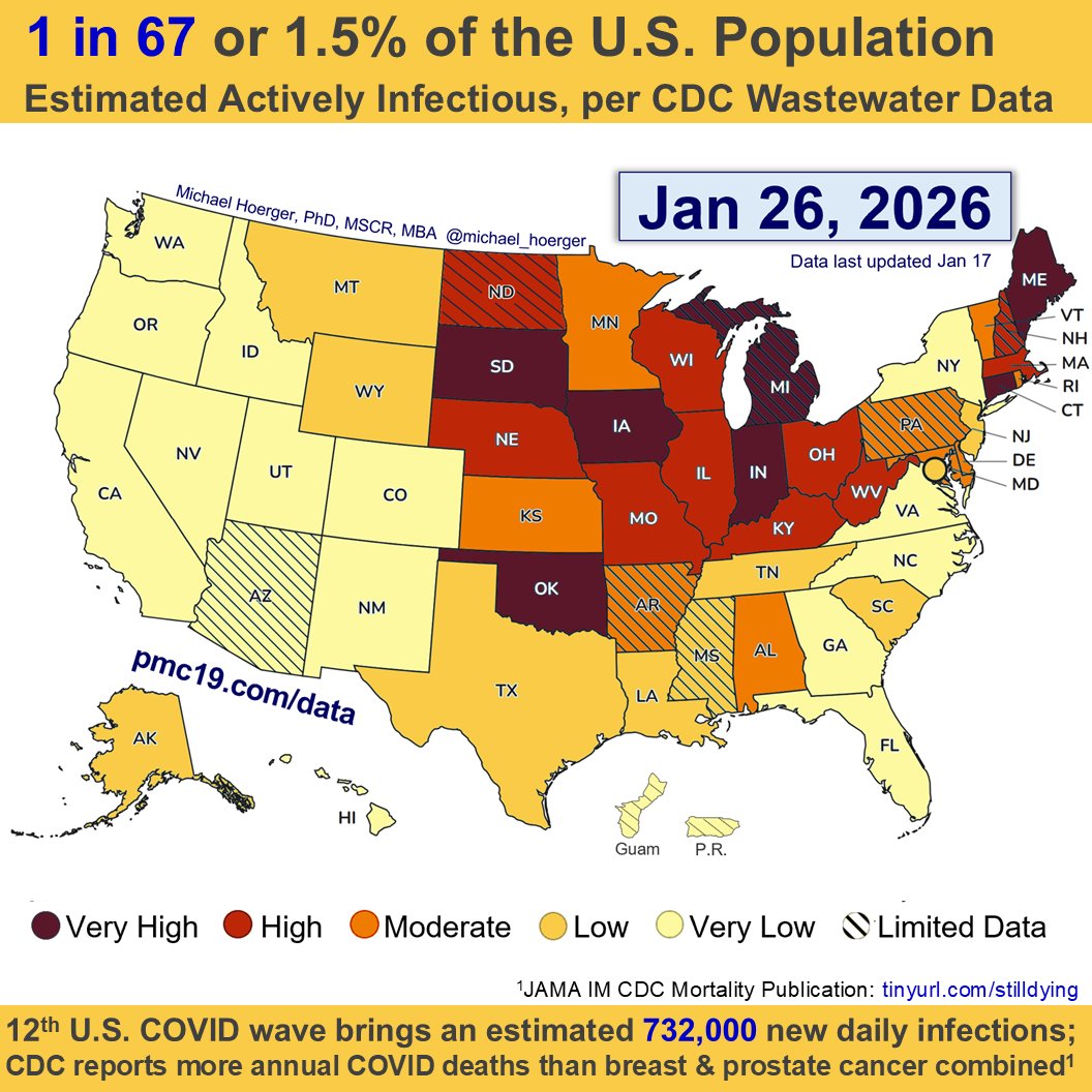
🧵5/7
This is the current heat map for Covid transmission. We released this Friday, given the ongoing debate about the CDC coloring their map in cool blue using the same data.
🧵5/7
This is the current heat map for Covid transmission. We released this Friday, given the ongoing debate about the CDC coloring their map in cool blue using the same data.
https://x.com/michael_hoerger/status/1832394888656384159
PMC COVID-19 Forecasting Model, Sept 9, 2024
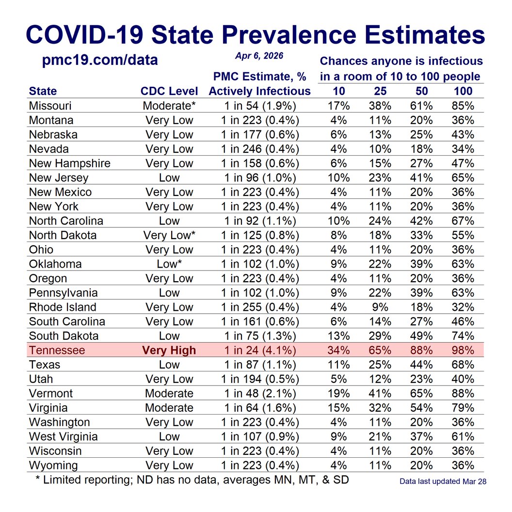
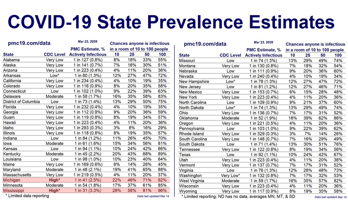
🧵6/7
Here are regional estimates of transmission. Note that you can estimate the percent of your state actively infectious by looking up the CDC Level on their website and multiplying it by 0.330.
These are approximate estimates and higher quality in states with more and longer-standing wastewater sites.
Go here, select a state from the drop-down:
For example, in Louisiana the most recently-reported CDC Level is 8.31.
8.31 * 0.330 = 2.74, signifying that 2.74% of the state is estimated to be actively infectious with Covid.
Take 100 divided by that number to get the "1 in ____" statistic. For example, 100/2.74 = 36.45, signifying that 1 in 36 people in Louisiana are estimated to be actively infectious.
Watch your decimals, and remember these formulas can't just be thrown at any random wastewater tracker.cdc.gov/nwss/rv/COVID1…

PMC COVID-19 Forecasting Model, Sept 9, 2024
🧵7/7
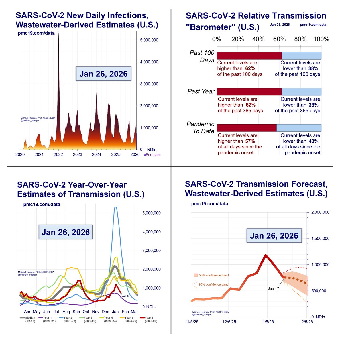
Here's the complete dashboard. Use, crop, improve, and share as desired across other platforms and the web. Tag me if helpful.
Read the full report and technical appendix online:
pmc19.com/data
🧵7/7
Here's the complete dashboard. Use, crop, improve, and share as desired across other platforms and the web. Tag me if helpful.
Read the full report and technical appendix online:
pmc19.com/data

• • •
Missing some Tweet in this thread? You can try to
force a refresh