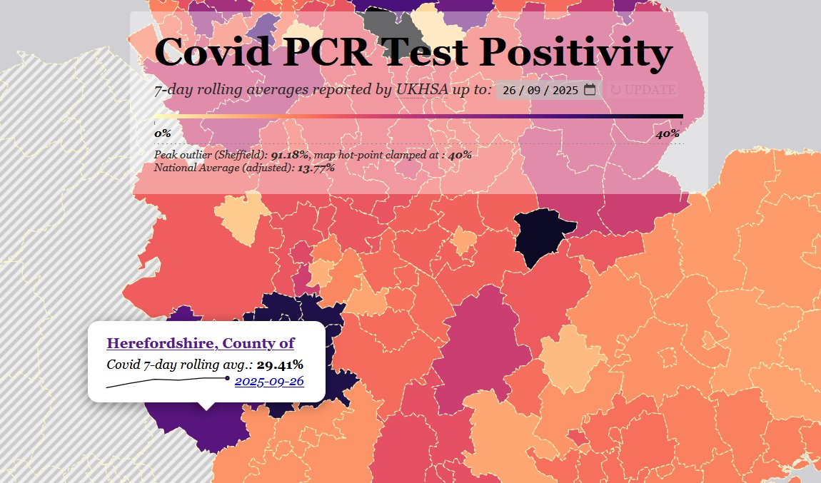
This week's UKHSA data is out, and so our Covid PCR Positivity map has automatically updated with the fresh data.
We've also added a couple of features; I'll explain how they work.
🧵 >>>
1/8
We've also added a couple of features; I'll explain how they work.
🧵 >>>
1/8

When you click on an area now, you're shown a trendline for over the last 7 days, so that you can determine if prevalence is rising or falling locally.
2/8
2/8

Clicking on the name of the local authority will take you straight to the UKHSA dashboard testing page, where you can see if testing is being done consistently.
The number of people tested over the last 7 days is always incomplete, & is adjusted upwards the following week.
3/8
The number of people tested over the last 7 days is always incomplete, & is adjusted upwards the following week.
3/8


Clicking on the date will take you to the API result, so you can verify for yourself that what the map shows you is accurate.
4/8
4/8

In some areas, the county council is split into lower-tier borough or district councils, such as here: Worthing Borough Council, in West Sussex County Council.
The % and trendline shown is for West Sussex as a whole.
5/8
The % and trendline shown is for West Sussex as a whole.
5/8

If you click on the name, Worthing, you're taken straight to the UKHSA dashboard page for that lower-tier area.
As you can see, that area has not reported results for a month. So on the map, we're sticking with the more reliable % for the whole county.
6/8
As you can see, that area has not reported results for a month. So on the map, we're sticking with the more reliable % for the whole county.
6/8

We've had a few questions about what we can really learn from PCR positivity.
I've posted a lot over the last 18 months about how well PCR positivity tracks prevalence and the shape of waves, even after testing was massively cut back.
7/8
I've posted a lot over the last 18 months about how well PCR positivity tracks prevalence and the shape of waves, even after testing was massively cut back.
7/8
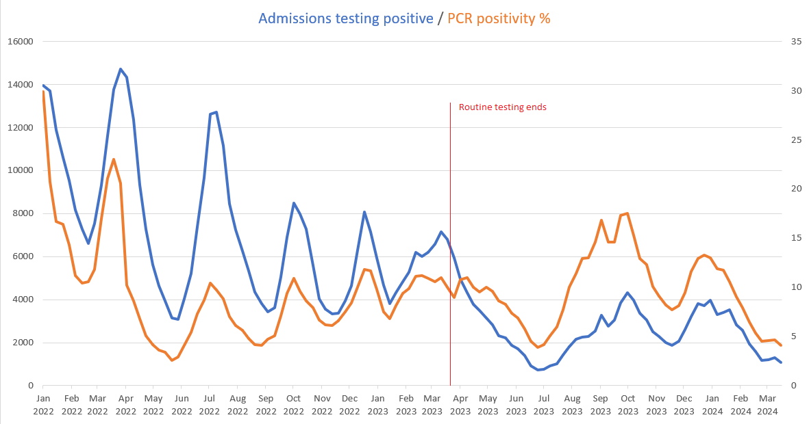
But I'd also like to draw people's attention to Adam Kucharski's new paper, in which he demonstrates that PCR prevalence in a small community - Premier League footballers - tracked national prevalence as measured by the ONS remarkably precisely.
8/8
8/8
https://x.com/adamjkucharski/status/1833037052750811580

(and for those who don't have the link to the map, posted last week: )jamestindall.info/skeuomorpholog…
• • •
Missing some Tweet in this thread? You can try to
force a refresh