
literary history | philosophy of tech | EXTREME METAPHORS: Interviews with JG Ballard https://t.co/sbJlT3r4Dz | VITAL SIGNALS https://t.co/CtAl2Ir8oi
 There is of course plenty of variation across the country, so please do check the map itself.
 When you click on a Scottish local area, there is no trendline, as the data is delivered as a weekly total.
 Hospital stats have been updated to the end of September - so, ten days ago.
 Most areas that weren't reporting in the south have started again, except Kent and E Sussex.
 This national average is our attempt to compensate for the number of areas that are not reporting.
 At the height of the October wave last year, every single area in England bar one was reporting test results regularly.
 National positivity started climbing again 10 days ago and was 9.25% as of last Friday.
 Last week Thurrock & Medway were headed for 20%+; this week they're reporting 0%.
 The upturn has been particularly sudden and sharp, from 5.9 to 7.26% over the last week.
 In the north, Teeside, Tyneside, and Cumbria all look quite alarming.
 We're now seeing the cluster that was in Oxfordshire spread very widely and in all compass directions.
 (By the way, I'm aware that UKHSA say it's at 4.9%.
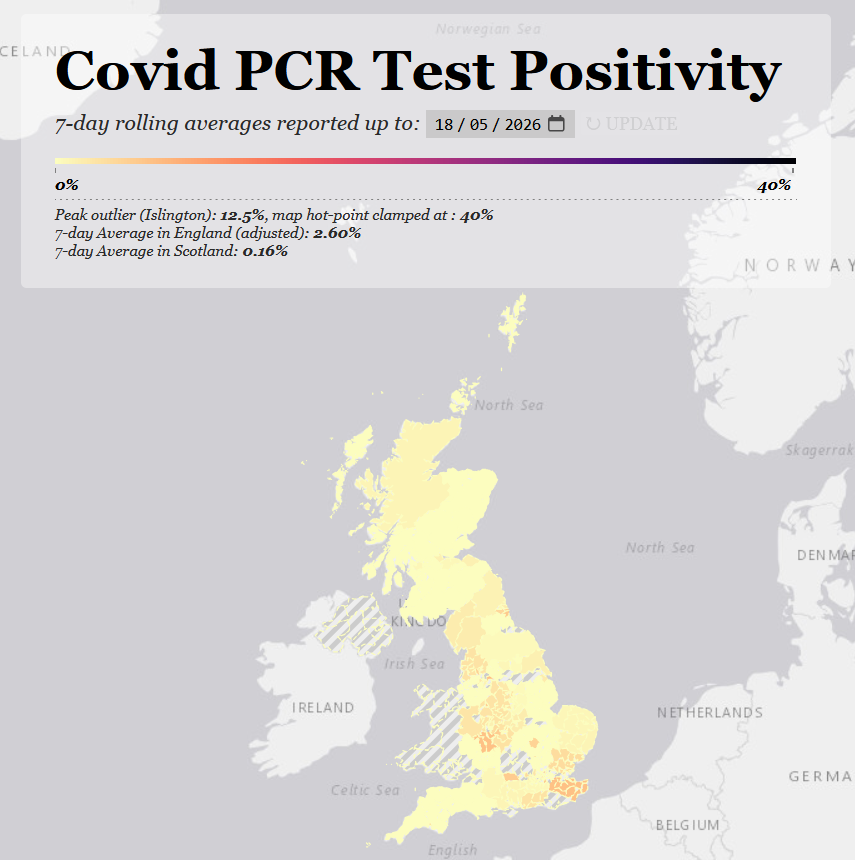
 The peak outlier is Medway, but when we check the data it seems they've just decided to start reporting again, based on few tests, after nearly 3 months.
 A good amount of the rise has been in the North-East and Yorkshire.
 First the good news.
 There's rising positivity across the Midlands, with admissions doubling over the last week in Birmingham, Leics., Worcs., Derby and also further SW in Gloucs.

 If you've been following me the last few weeks, you'll know I had concerns about one area misreporting.
 Initially it looks as though the map reflects the reduced positivity reported by UKHSA this week, down to 11.32%, in line with the decline shown by NOIDs on Monday.

 The first thing I want to note is that the refresh has broken all the links on the Covid PCR positivity map.
 When you click on an area now, you're shown a trendline for over the last 7 days, so that you can determine if prevalence is rising or falling locally.