Ok.
There is a lie going round that things are back to normal.
That Covid is over and not affecting us any more.
I'd like to share a few charts to address that.
If you don't want to read a long thread, here's the quick answer:
No
We're not back to normal.
Nowhere even close.
There is a lie going round that things are back to normal.
That Covid is over and not affecting us any more.
I'd like to share a few charts to address that.
If you don't want to read a long thread, here's the quick answer:
No
We're not back to normal.
Nowhere even close.
At least, things aren't back to normal *here*.
I don't have time to figure out if things are back to normal where you are.
Maybe they are.
If so, good for you.
I don't have time to figure out if things are back to normal where you are.
Maybe they are.
If so, good for you.
Let's look at it first in terms of sickness.
Not many organisations publish their sickness absences.
But fortunately the largest employer in my country, NHS England, publishes theirs.
Not many organisations publish their sickness absences.
But fortunately the largest employer in my country, NHS England, publishes theirs.
Random fact: The NHS is actually the seventh largest employer in the entire world.
Which is great, because it means they have a huge number of employees which means lots of data to work with.
Which is great, because it means they have a huge number of employees which means lots of data to work with.
Because it's so large, it's representative of the working population, to some degree.
The data comes from here:
digital.nhs.uk/data-and-infor…
The data comes from here:
digital.nhs.uk/data-and-infor…
And you can download it yourself and check it all out by scrolling down to here and finding it: 

Here's a little graph I made from some of the data.
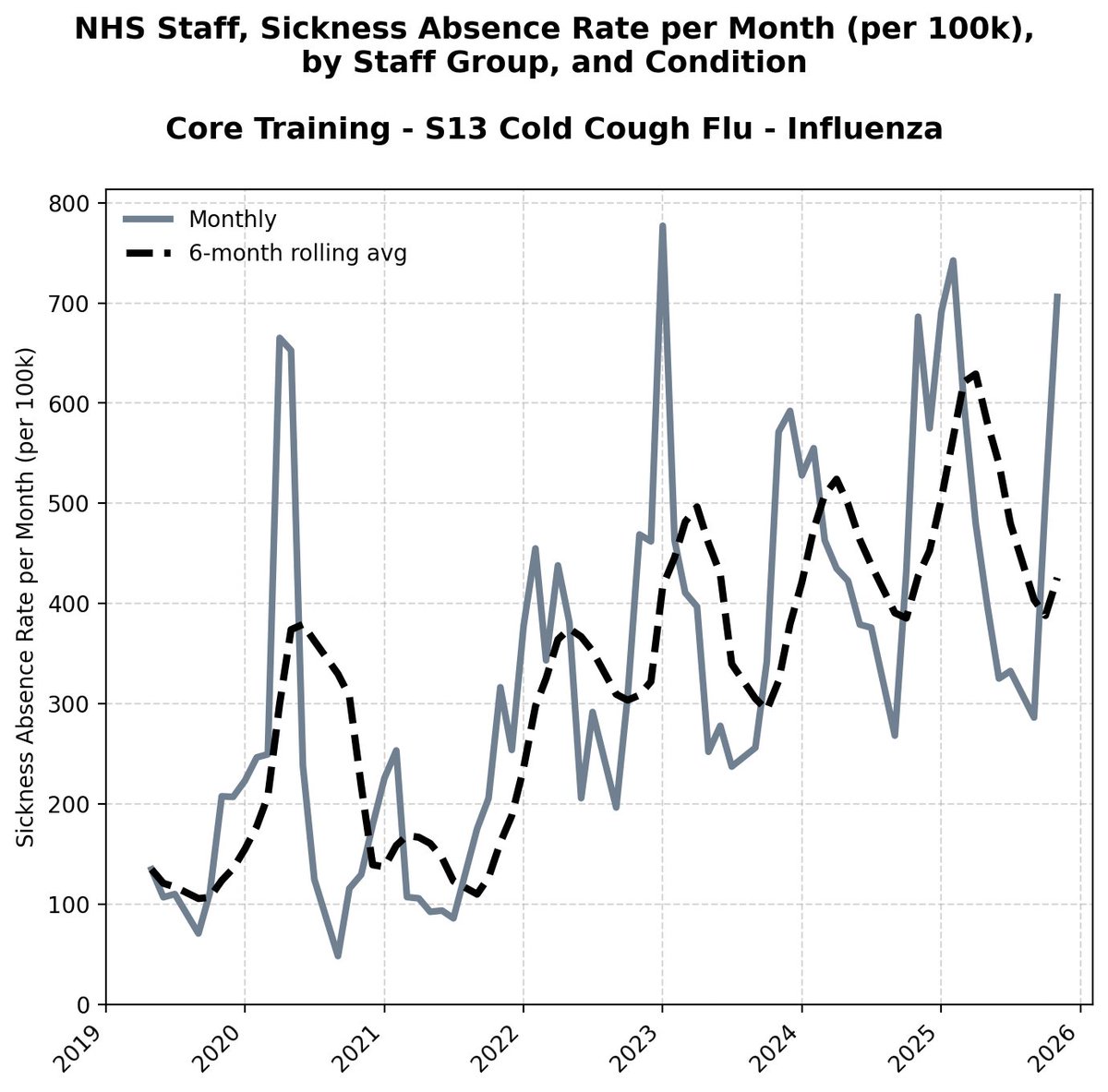
It's the monthly sickness rate in the 'ambulance' section of NHS England.
It's the monthly sickness rate in the 'ambulance' section of NHS England.

You can make it too.
Go to Table 3 along the bottom.
Select the data for the dates and the data for the monthly sickness rate by organisation for ambulance, and insert, and recommended charts, and line chart and bingo, there you are.
Go to Table 3 along the bottom.
Select the data for the dates and the data for the monthly sickness rate by organisation for ambulance, and insert, and recommended charts, and line chart and bingo, there you are.

This stuff isn't secret or mysterious.
You don't have to have a degree to do this stuff.
You don't have to have a degree to do this stuff.
So there you go, you get this graph.
It's a bit jiggly jaggly because you get seasonal causes of illness - things like flu and rsv circulate each year.
It's a bit jiggly jaggly because you get seasonal causes of illness - things like flu and rsv circulate each year.

There's all sorts of things you can see in there.
That data goes back to 2010, so you can see stuff like the fact that there's a curious high trough in the summer of 2014.
For some reason the levels of absence didn't drop in the normal way.
Someone may know why, but not me.
That data goes back to 2010, so you can see stuff like the fact that there's a curious high trough in the summer of 2014.
For some reason the levels of absence didn't drop in the normal way.
Someone may know why, but not me.

Let's just look at the period leading up to the covid pandemic.

What can you see there?
I can see a general drop in the average... a general drop in the height of the peaks... and a general drop in the height of the troughs.
People were slowly spending less time off work sick.
I can see a general drop in the average... a general drop in the height of the peaks... and a general drop in the height of the troughs.
People were slowly spending less time off work sick.

Do I know why?
No.
But I do know what happened next.
No.
But I do know what happened next.
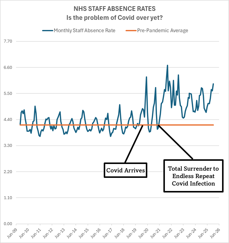
Yep. The pandemic.

And for the folk who don't know, each of those spikes is a covid wave. Not a lockdown, or a vaccine, or a solar flare, or a nicholas cage movie.


But while we're being told in the media that covid is over, and things are back to normal, do things look like they're back to normal when you look at absences in the ambulance organisations?

NOT YET.
Not by any means.
Not by any means.

You can smooth that graph out too, to remove the seasonal peaks.
Create a new column on that page in E, then add a little formula in to add the twelve months of the year and divide by 12, and you get a rolling average.
Copy that cell's contents to all the column above...
Create a new column on that page in E, then add a little formula in to add the twelve months of the year and divide by 12, and you get a rolling average.
Copy that cell's contents to all the column above...

Then you get a rolling average, so each data point is the average of the preceding 12 months absences.
Here's your new graph.
Back to normal?
No. Not at all.
Here's your new graph.
Back to normal?
No. Not at all.

COVID WAVES ARE CAUSING HUGE INCREASES IN ABSENCES NOW.

And look where the troughs are... the *best times now* are worse than the *worst times then*.
That is just nuts.
That is just nuts.

Maybe that's just ambulance drivers, though, right? Maybe they're a sickly bunch.
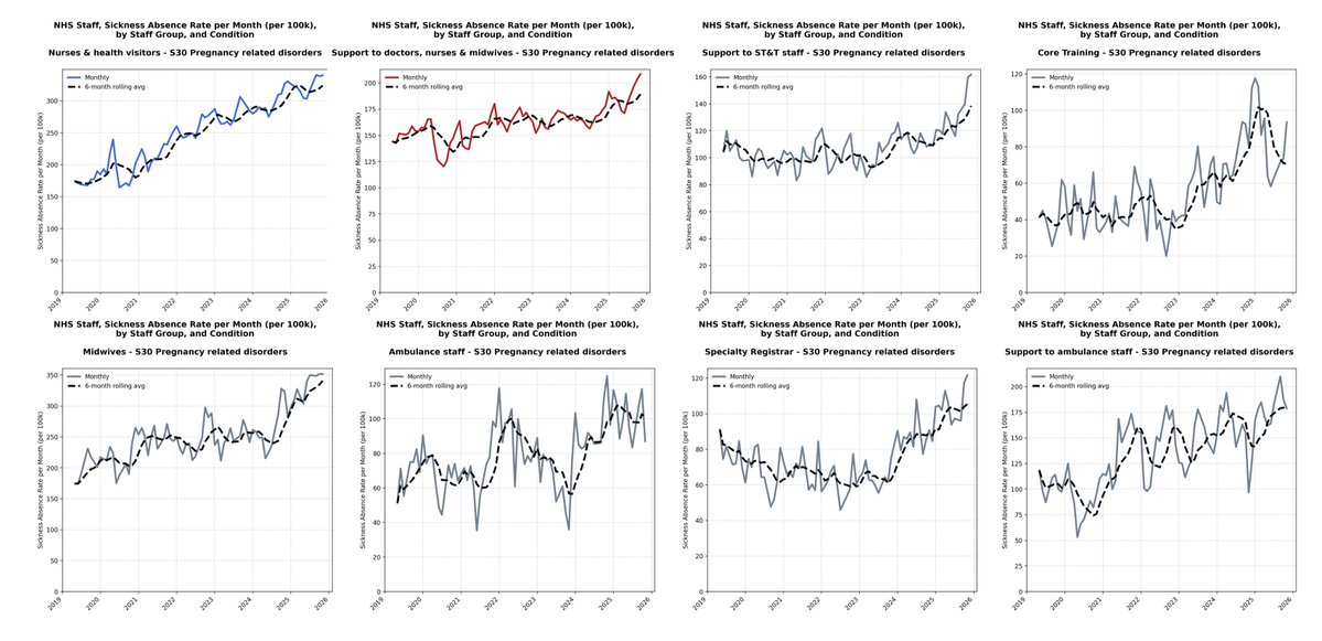
Flick to Table Two. This data only goes back to 2017, but let's make some graphs out of those sickness rates by staff grade:
HCHS doctors, all grades.
Is it back to normal?
Is it over?
Again... those peaks are all covid waves.
EVERY ONE.
HCHS doctors, all grades.
Is it back to normal?
Is it over?
Again... those peaks are all covid waves.
EVERY ONE.

Is Covid over for Specialty Registrars?
Remember:
EVERY PEAK ON THE GRAPH IS A COVID WAVE, INCLUDING THE MOST RECENT LONG BULGE.
It's almost a doubling in the rate of sickness from pre-covid.
Remember:
EVERY PEAK ON THE GRAPH IS A COVID WAVE, INCLUDING THE MOST RECENT LONG BULGE.
It's almost a doubling in the rate of sickness from pre-covid.

And, again, you might want to come into this and blame vaccines or lockdowns.
The lockdowns (which were short and not absolute) stopped these two peaks from going through the roof.
The first would have been twenty times worse.
The lockdowns (which were short and not absolute) stopped these two peaks from going through the roof.
The first would have been twenty times worse.

And, again, the first peak there is before vaccines were introduced.
The second peak was partly prevented by the vaccine roll-out.
The second peak was partly prevented by the vaccine roll-out.

But, sadly, the vaccines don't actually prevent all illness.
So Covid waves are still causing massive waves of absence.
So Covid waves are still causing massive waves of absence.

I'm off to a meeting, I'll be back with more afterwards.
Let's get a whole load of these out the way:
(apologies for the random 'HCHS' on some of these graph titles)
(apologies for the random 'HCHS' on some of these graph titles)


And a few more:


Notice that managers did much better during the bit that everyone calls 'the pandemic'?
Sometimes it's nice to be a manager.
Until, of course, you start catching covid repeatedly and things get worse...
Sometimes it's nice to be a manager.
Until, of course, you start catching covid repeatedly and things get worse...

Apart from the managers in their cushy little world, the rest got hammered and are still getting hammered.
Some of them with absence rates a couple of times what they were before Covid, or above what you might expect them to be.
Some of them with absence rates a couple of times what they were before Covid, or above what you might expect them to be.
But let's just go back to this one for a moment...
You'll find a lot of people blaming other stuff for the things that Covid is doing.
(and the date of the JN.1 wave at the right hand end of this graph is corrected on this from the earlier version)
You'll find a lot of people blaming other stuff for the things that Covid is doing.
(and the date of the JN.1 wave at the right hand end of this graph is corrected on this from the earlier version)

But, and I emphasise this again as hard as I can - every spike in the absence chart below after the start of 2020 is a covid spike.
They all correlate.
*but* this chart shows up one huge media and government lie.
They all correlate.
*but* this chart shows up one huge media and government lie.

The government love to pump the lie that this is an accurate representation of covid cases.

But from the first red arrow onwards, and then steadily over the course of the second red arrow, testing was withdrawn.
That first red arrow... is here:

So the peaks from then on correlate in terms of timing... and you can stop testing... but you can't hide sickness absence.

I mean... there it is:

Right, I'm out for a bit again. Off to visit a family to prepare for the funeral of someone who died of a 'mystery chest infection' a couple of weeks ago.
Such a mystery.
I'll be back later to look at the problem from a different angle:
Deaths.
Such a mystery.
I'll be back later to look at the problem from a different angle:
Deaths.
I've only got a few minutes, so I'll add a little, then add some more tomorrow. You may want to bookmark this to come back for a look later.
There's three sources for the data in the next section.
The first is the UK Government weekly deaths data:
ons.gov.uk/peoplepopulati…
The first is the UK Government weekly deaths data:
ons.gov.uk/peoplepopulati…
Here's all the deaths registered in England and Wales over the last 10 years.
They're displayed in a way that shows the total number of deaths in the previous 12 weeks.
So any point on the graph shows you how many people's deaths have been registered in the last 3 months.
They're displayed in a way that shows the total number of deaths in the previous 12 weeks.
So any point on the graph shows you how many people's deaths have been registered in the last 3 months.

The thing about this is that it's not as immediately obvious what's going on.
And this is *all deaths*.
Deaths of kids, of which there are mercifully few, and deaths of 80+ year olds, of which there are lots.
And this is *all deaths*.
Deaths of kids, of which there are mercifully few, and deaths of 80+ year olds, of which there are lots.

So total deaths are skewed vastly by what's going on with older people.
Here's over 90s female versus 1-4s female.
You can't even see the variation in orange.
Here's over 90s female versus 1-4s female.
You can't even see the variation in orange.

So if there is a year with more or fewer deaths of older people, it massively influences the overall graph.
But here is that overall picture.
You can see the gradually growing number of deaths that continues a trend from before the pandemic.
You can see the gradually growing number of deaths that continues a trend from before the pandemic.

This isn't supposed to be a massively scientific pair of lines I've added, but just a rough guide to see where things are at. You can see that in the case of both deaths of men and deaths of women, we might be considered to be below where we might have been pre-pandemic.

And the number of people dying might be considered totally normal or better than normal because we've got both a growing population and a growing older population and an older population. If that makes sense.

It's normal for there to be an increase in deaths when there are more older people.
But remember I said that the graphs of total deaths are skewed by the numbers of deaths of the oldest people?
So, let's zoom in on the people of working age, and start with the deaths of men of working age:
Look at this.
And think about the original question: "Are we back to normal yet?"
And think about the original question: "Are we back to normal yet?"

Ow.

Erm.

But there's a problem here as well.
Because the size of the group of people aged 30-69 is growing too.
More people aged 30-69 means more deaths.
Because the size of the group of people aged 30-69 is growing too.
More people aged 30-69 means more deaths.
So you need to know how many people there are in each week or year, so you can work out what proportion of people are dying.
Fortunately there are people who track this sort of thing.
And they publish their data and their workings.
So if you go to this page and zoom down to the bottom, you can find the most recent weekly and quarterly updates, and you can make your own graphs.
actuaries.org.uk/learn-and-deve…
And they publish their data and their workings.
So if you go to this page and zoom down to the bottom, you can find the most recent weekly and quarterly updates, and you can make your own graphs.
actuaries.org.uk/learn-and-deve…
Like this one.

Here it is with a trend line.

Is the pandemic over for older working age men?

Are things 'back to normal'?
Hmm.
Hmm.

I don't think so.
I'm off out again, but tomorrow, I'll address a couple of problems with the above workings, and look at the problem from a couple more angles.
But, for now, are things back to normal?
Are Covid waves still causing extra deaths?
They are for working age men at least.
They are for working age men at least.

See for yourself.
Look at the graphs.
Download the data.
Work with it.
Look at the graphs.
Download the data.
Work with it.
Tomorrow: disability, and why some people are saying things *are* back to normal, and why I think they're wrong.
Bookmark this, and I'll see you then.
Now, think about this again for a second.
This is a graph of the people *in work* who can't work due to illness.
This is a graph of the people *in work* who can't work due to illness.

Sadly, Covid doesn't just make you ill in the short term.
Covid can cause disability, and covid can cause death.
We don't actually know how many people *aren't* represented on this graph because they are now off work permanently disabled or dead.
But we do have an idea about the overall increase in people off work disabled here.
Is that back to normal?
Is that back to normal?
Not by any means.

"FIGURE 2.4: THE CHANGE IN ECONOMIC INACTIVITY DUE TO SICKNESS FROM 2020 CREATED 900,000 'MISSING WORKERS' BY THE BEGINNING OF 2024
Excess economic inactivity due to sickness versus pre-Covid trend"
Excess economic inactivity due to sickness versus pre-Covid trend"

Is that still getting worse?
As far as we can tell, yes.
As far as we can tell, yes.
So this graph 👇 isn't even telling the full story.

I've seen estimates that 200,000 of the total 1,300,000 employed by the NHS had been forced out of work due to long term illness since the start of the pandemic.
I'm still trying to track down more information on that, so if you can give a more accurate number, please do.
I'm still trying to track down more information on that, so if you can give a more accurate number, please do.
But whatever the exact number, the sickness absence rates *don't include* people who are now disabled or dead.
And are those working age people still dying from covid?
Yes.

At least, the elevated mortality started by covid has not yet ended.

And, again, those peaks of deaths, those peaks of illness all come with Covid waves.
Not vaccine roll outs
Not lockdowns
Not hay-fever season
Covid waves.
Not vaccine roll outs
Not lockdowns
Not hay-fever season
Covid waves.
So, is it over?
Is it mild?
Is it normal?
No.
Is it mild?
Is it normal?
No.
More to follow later.
Time for a school assembly.
Time for a school assembly.
• • •
Missing some Tweet in this thread? You can try to
force a refresh