The latest Pfizer safety report shows a massive cardiovascular signal
and also shows some very odd data.
Let's start with the first. 🧵
and also shows some very odd data.
Let's start with the first. 🧵
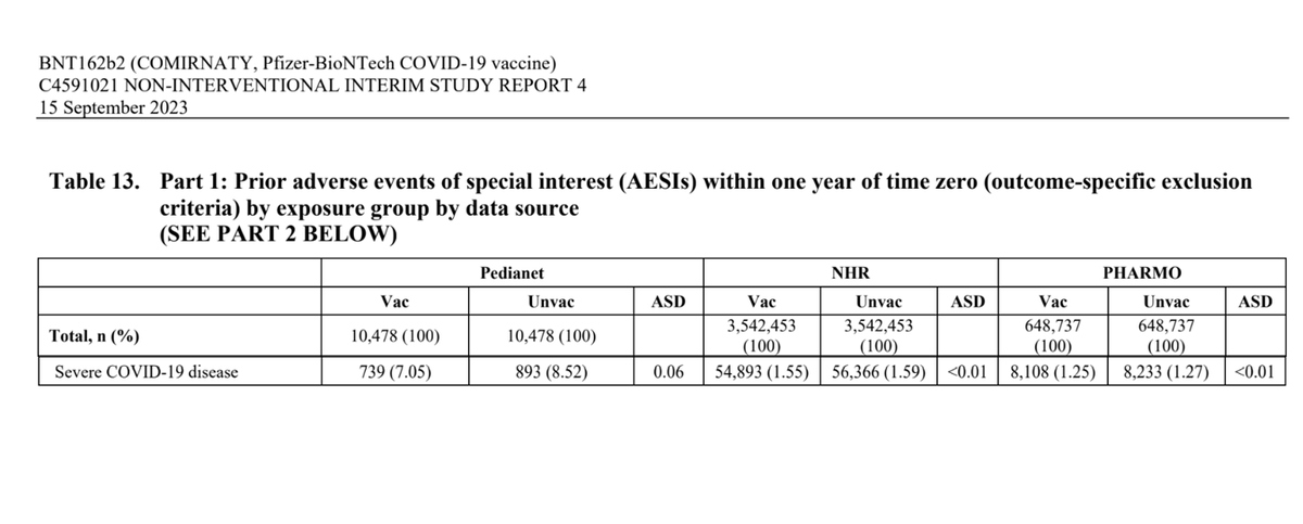
NHR and PHARMO are different European databases.
The total number of cardiovascular events of any type works out at a risk of
1 in 264 for NHR
and
1 in 362 for PHARMO
The total number of cardiovascular events of any type works out at a risk of
1 in 264 for NHR
and
1 in 362 for PHARMO

By contrast the claimed risk of severe covid was reduced by
1 in 2403 for NHR
and
1 in 5181 for PHARMO
1 in 2403 for NHR
and
1 in 5181 for PHARMO
Pfizer admit there is a signal in the PHARMO database but they have a plan to make it disappear...
"it could be possible to model some constructive bias analysis to correct this in the final analysis."
"it could be possible to model some constructive bias analysis to correct this in the final analysis."

If you had a new set of aircraft and there was a report of a problem from one country - would you ignore it because the others had not reported a problem?
Would you fudge the data from the concerning country by modelling it to look like the other countries?
Would you fudge the data from the concerning country by modelling it to look like the other countries?
There are differences between these datasets.
People in the PHARMO dataset were healthier - they had a far lower incidence of death, for example.
Signals are easier to see in healthier datasets because they are less likely to be lost in the background noise.
People in the PHARMO dataset were healthier - they had a far lower incidence of death, for example.
Signals are easier to see in healthier datasets because they are less likely to be lost in the background noise.

You may wonder why the deaths are higher in the unvaccinated.
The well recognised healthy vaccinee effect means that those who are about to die reject the vaccine and end up inflating the mortality of the unvaccinated.
The well recognised healthy vaccinee effect means that those who are about to die reject the vaccine and end up inflating the mortality of the unvaccinated.
However, Pfizer did not do analysis having excluded this period.
They also did no analysis by age group except for myocarditis.
Because of low background rates in younger age groups signals would be more obvious if these were analysed separately.
They also did no analysis by age group except for myocarditis.
Because of low background rates in younger age groups signals would be more obvious if these were analysed separately.
One way to reduce the risk of this bias would be to only look at people who were sick in the week before vaccination or matching (if unvaccinated).
This was the plan (although maybe they meant it as an exclusion criteria?):
This was the plan (although maybe they meant it as an exclusion criteria?):

Until the EMA stopped it.
They did not ask for analysis only of those who had contact with health care system prior to injection or matching!
They did not ask for analysis only of those who had contact with health care system prior to injection or matching!

Now for the odd data.
Given the healthy vaccinee effect, the unvaccinated should have higher rates of any condition in the first 60 days.
But they do not.
Given the healthy vaccinee effect, the unvaccinated should have higher rates of any condition in the first 60 days.
But they do not.

What is more odd is that the number of people is huge at the beginning but rapidly reduces.
This is because the unvaccinated are matched to the vaccinated. When they get vaccinated that pairing is dropped.
That should mean huge numbers of events in the first 60 days. e.g.
This is because the unvaccinated are matched to the vaccinated. When they get vaccinated that pairing is dropped.
That should mean huge numbers of events in the first 60 days. e.g.

Independent evidence is consistent in showing a higher rate of covid in the first two weeks.
Pfizer claims the opposite (except for PHARMO)!
Pfizer claims the opposite (except for PHARMO)!

Despite the clear issues there are still really concerning signals like this one:
https://x.com/ClareCraigPath/status/1842568054355464210
They weren't even looking at myocarditis / pericarditis until asked to in December 2021!

Independent scientists need to be doing this work not companies with a vested interest.
But governments have made the data available only to the latter!
But governments have made the data available only to the latter!
• • •
Missing some Tweet in this thread? You can try to
force a refresh