⚠️NEW UKHSA DASHBOARD⚠️

Its prime purpose appears to be to minimise the impact of Covid.

Why else would this ⬇️ be your landing page?
▪️Positivity rate for flu & RSV
▪️Cases for Covid

Come on @UKHSA, this isn’t clever or funny.

Why not show comparable metrics?

🧵 Image
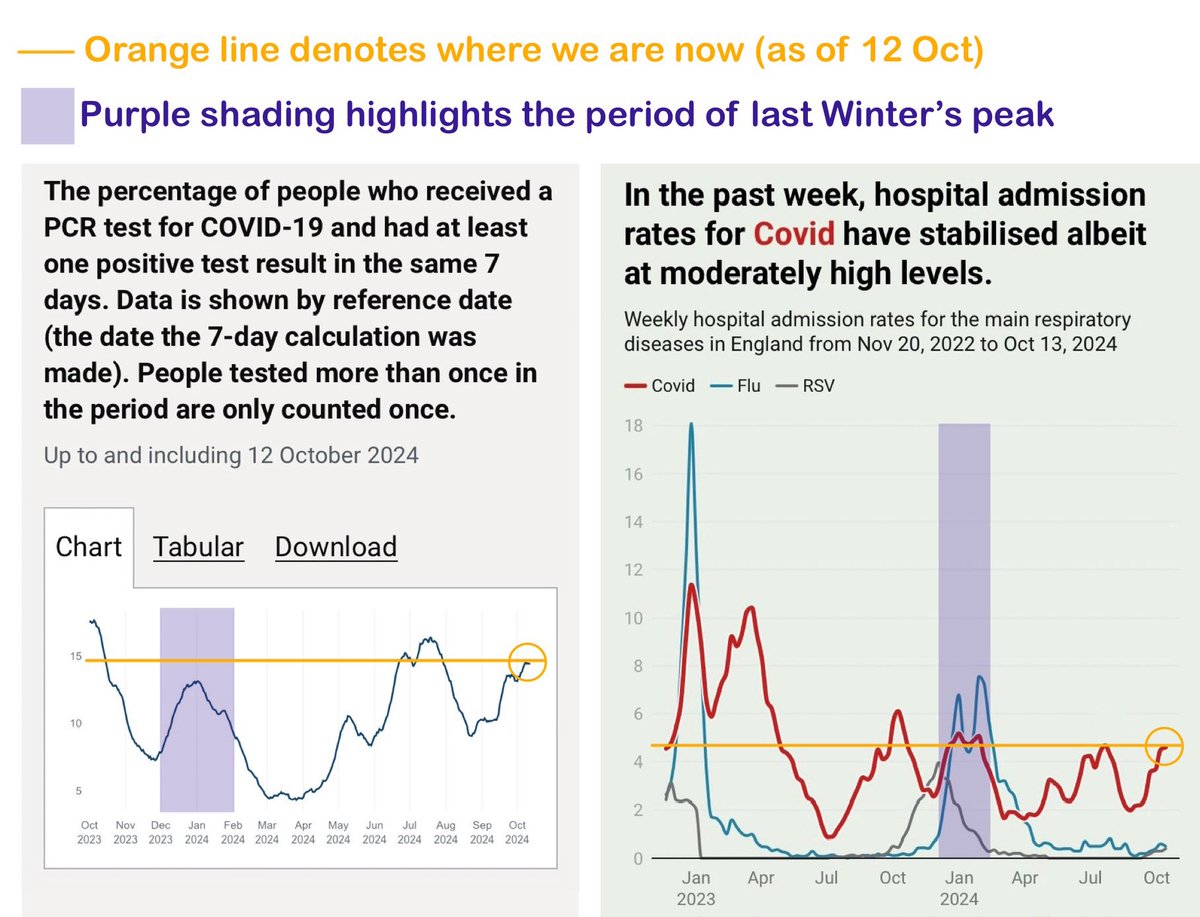
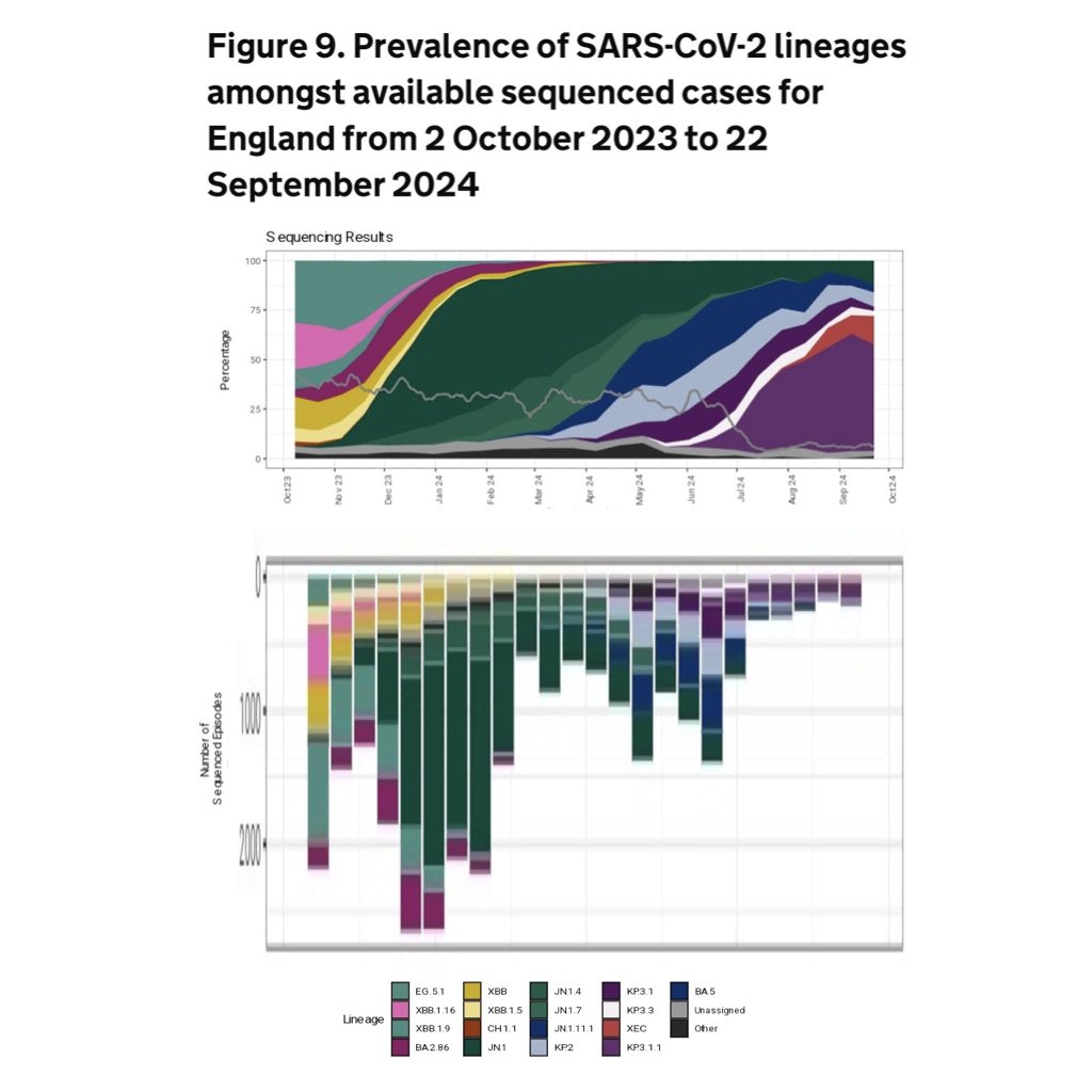
…because when you *do* show comparable metrics, it’s not nearly such a rosy story in terms of the current Covid situation, is it?

Can someone please remind me what the point of a ‘Health Security Agency’ is?

Isn’t it to keep the public informed about potential health risks? Image
Why on earth are UKHSA trying to hide the truth?

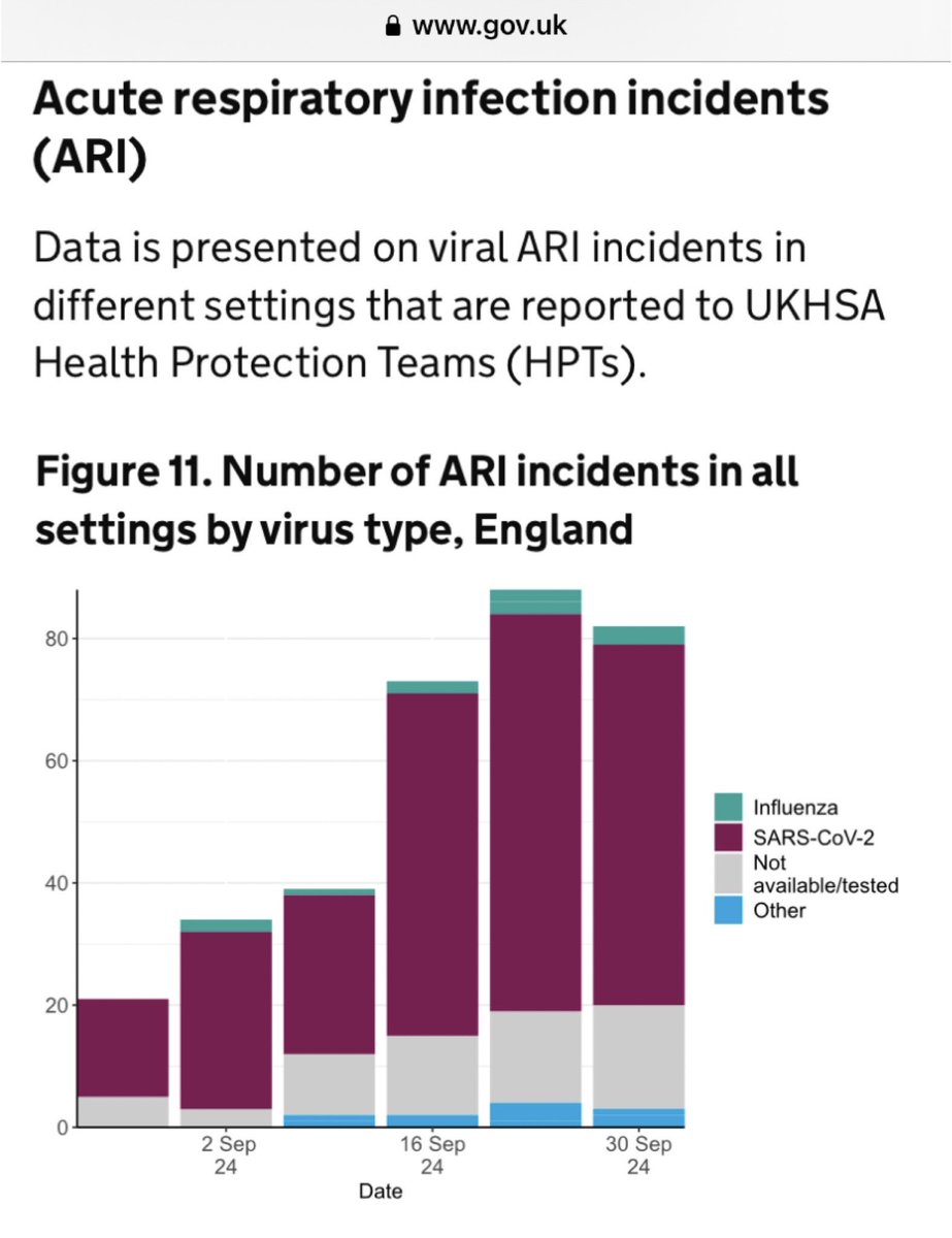
Covid cases data is absolutely meaningless.

The LFT test reporting portal was closed back in February this year so the *only* cases which can even be reported now are PCR tests in hospital (plus a few research studies). Image
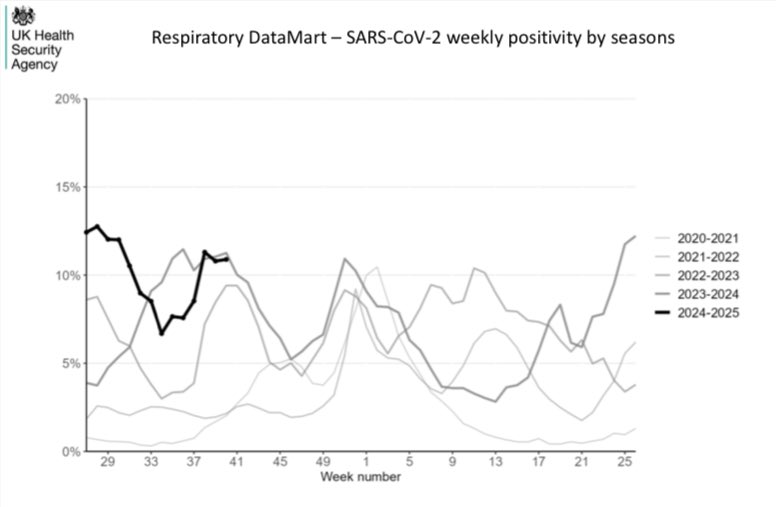
Anyone paying attention knows all too well that Covid is absolutely rife right now.

It’s tearing through schools, hospitals & workplaces.

Covid hospitalisations are almost as high now as they were at the very peak of last Winter.

Here’s my take on the current situation 🧵⬇️
I guess I should also post a link to this new UKHSA dashboard.

Here it is:


Viewer caution advised! ⚠️ukhsa-dashboard.data.gov.uk
Two more points to add…

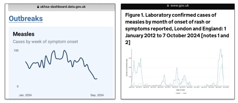
The ‘Outbreaks’ section of the new dashboard provides the reassuring news that Measles cases are now declining…

…but also does a truly outstanding job of hiding the fact that we’ve just come through the biggest Measles outbreak in well over a decade. Image
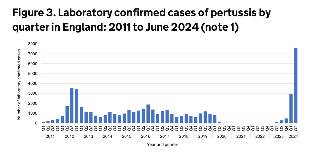
And, as for Pertussis (also known as whooping cough)… well… I guess they decided it was best not to mention that one at all! Image
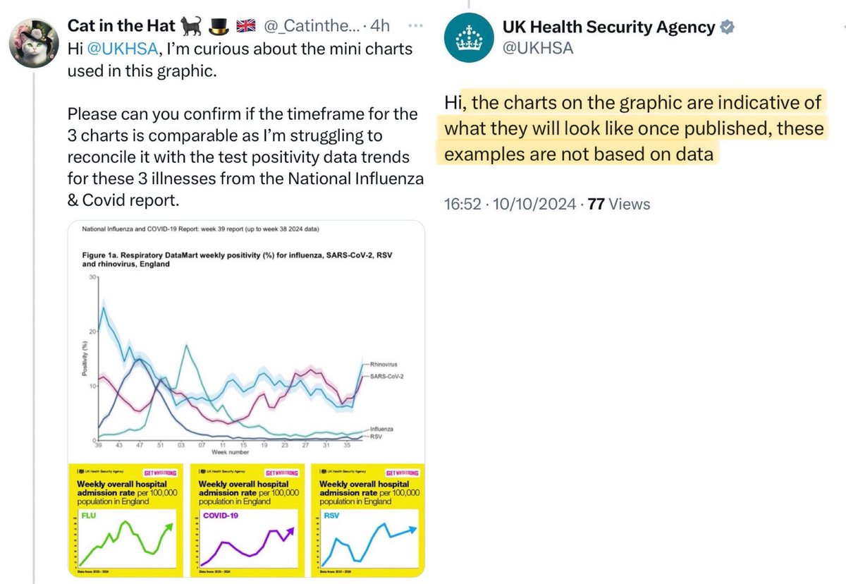
And let’s not forget, this new dashboard comes hot on the heels of the debacle a few weeks ago where @UKHSA admitted to publishing charts for Covid, flu & RSV which were not actually based on any real data at all - despite the fact the charts were labelled ‘Data from 2023-24’. Image

• • •

Missing some Tweet in this thread? You can try to force a refresh
 

Keep Current with Cat in the Hat 🐈‍⬛ 🎩 🇬🇧

Cat in the Hat 🐈‍⬛ 🎩 🇬🇧 Profile picture

Stay in touch and get notified when new unrolls are available from this author!

Read all threads

This Thread may be Removed Anytime!

PDF

Twitter may remove this content at anytime! Save it as PDF for later use!

Try unrolling a thread yourself!

how to unroll video
  1. Follow @ThreadReaderApp to mention us!

  2. From a Twitter thread mention us with a keyword "unroll"
@threadreaderapp unroll

Practice here first or read more on our help page!

More from @_CatintheHat

Oct 22
COVID PREVALENCE IN ENGLAND

A few folks have asked me what my best guess is re: Covid prevalence right now.

The truth is, we can’t be sure.

Covid surveillance has diminished so far that there’s no robust data anymore.

But there are at least a few clues from these two charts… Image
These charts show the two most robust metrics available:
1. PCR positivity rate
2. Covid hospitalisations.

Now let’s compare where we are now vs the peak of last Winter’s wave.

▪️Last Winter’s wave is highlighted in purple.

▪️The orange line is where we are now (as of 12 Oct). Image
So what can we deduce from these two charts?

▪️Covid PCR test positivity rate is HIGHER now than last Winter’s peak.

▪️Covid hospital admission rate (red line on chart on the right) is slightly LOWER now than last Winter’s peak. Image
Read 25 tweets
Oct 18
EXCESS DEATHS (England & Wales):

Whenever you see ‘excess death’ figures for 2024, remember that the ‘excess’ is calculated against an estimated ‘expected’ value…

…so if the ‘expected’ value is wrong, then the ‘excess’ figure will be meaningless.

And it *is* wrong…

1/ Image
…unless you believe that there’ll be MORE deaths this year than the very worst & most deadly period of the pandemic in 2020?

(It’s actually quite worrying that the experts at ONS believe that the effect of the ongoing pandemic on mortality rates to be THAT significant).

/2
I really hope the @ONS team who designed the new model for estimating ‘expected’ & ‘excess’ deaths take some time to review their model because it’s quite clearly not working as it should…

…and is resulting in some deceptively optimistic figures for excess deaths.

/3
Read 5 tweets
Oct 16
Government guidance tells parents that it’s totally fine to send children to school if they have Covid symptoms and that children should NOT be tested for Covid (unless specifically told to do so by a doctor).

Who thinks this policy will help IMPROVE pupil attendance rates? 🤔
Link to current government guidance for people with symptoms of a respiratory virus, including Covid-19:

gov.uk/guidance/peopl…Image
It’s worth noting that the primary driver of the school attendance crisis is ILLNESS.

Around HALF of all pupil absences are due to illness & illness absences are still 40% higher than pre-pandemic.

It will be hard to improve attendance without addressing high rates of illness. Image
Read 5 tweets
Oct 11
There’s a couple of interesting charts in this week’s National flu & Covid surveillance report.

1. This chart shows Acute Respiratory Infection incidents:

🟢 See that tiny green sliver at the top of each bar? That’s FLU.

🟣 See that huge purple band in each bar? That’s COVID. Image
2. This chart looks at the seasonality of Covid.

➡️ There is NO seasonality to Covid.

It comes in waves throughout the year, in any season - Spring, Summer, Autumn and Winter.

The height of the peaks is just as bad (sometimes worse) in Summer vs Winter. Image
3. This chart shows the results of Covid sequencing in England.

The bars at the bottom show how many samples were sequenced for Covid every 2 weeks (I’ve stretched it out so you can see the trend clearly).

The sequencing volume has SIGNIFICANTLY reduced vs this time last year. Image
Read 5 tweets
Oct 6
Back in Nov 2021, the govt released a campaign across digital channels, radio & newspapers highlighting how Covid particles are AIRBORNE & hang in the air like smoke.

The campaign was titled: “STOP COVID-19 HANGING AROUND”

Below is one of the short films from the campaign ⬇️
More details about this nationwide campaign to “STOP COVID-19 HANGING AROUND” can be found at the link below:

gov.uk/government/new…Image
Unfortunately, Grant Shapps blocked the “STOP COVID-19 HANGING AROUND” adverts on public transport over concerns it might scare people.

One source said “the smoke analogy was ill conceived because buses have sealed windows & it could confuse passengers”.

dailymail.co.uk/news/article-1…Image
Read 10 tweets
Oct 6
COVID INQUIRY

I’ve posted a number of tweets from the Inquiry hearing on 16 Sept.

This was the day that Dr Lisa Ritchie took the stand. She chaired the IPC Cell which wrote the Covid infection control guidance for UK hospitals.

I’ve collated all the tweets in this thread 🧵
Just to give a little background, Dr Lisa Ritchie is nurse who specialises in Infection Prevention & Control (IPC).

She is currently Head of IPC at NHS England.

Her title is Dr because she has a PhD, but she is not a medically qualified doctor.

dailyrecord.co.uk/news/local-new…Image
In this clip, Dr Ritchie explains how the IPC guidance was based on the ‘consensus’ of IPC Cell members…

…but no formal votes were ever taken to confirm the consensus position and it was up to the Chair (her) to summarise what she believed to be the consensus of the group.
Read 24 tweets

Did Thread Reader help you today?

Support us! We are indie developers!


This site is made by just two indie developers on a laptop doing marketing, support and development! Read more about the story.

Become a Premium Member ($3/month or $30/year) and get exclusive features!

Become Premium

Don't want to be a Premium member but still want to support us?

Make a small donation by buying us coffee ($5) or help with server cost ($10)

Donate via Paypal

Or Donate anonymously using crypto!

Ethereum

0xfe58350B80634f60Fa6Dc149a72b4DFbc17D341E copy

Bitcoin

3ATGMxNzCUFzxpMCHL5sWSt4DVtS8UqXpi copy

Thank you for your support!

Follow Us!

:(